Adobe Ink & Slide Review: The iPad Stylus Grows Up
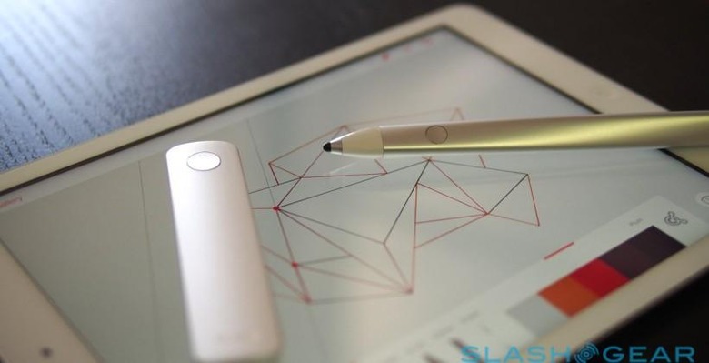
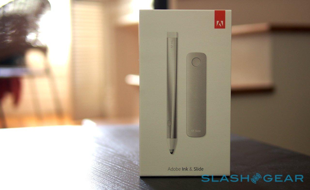
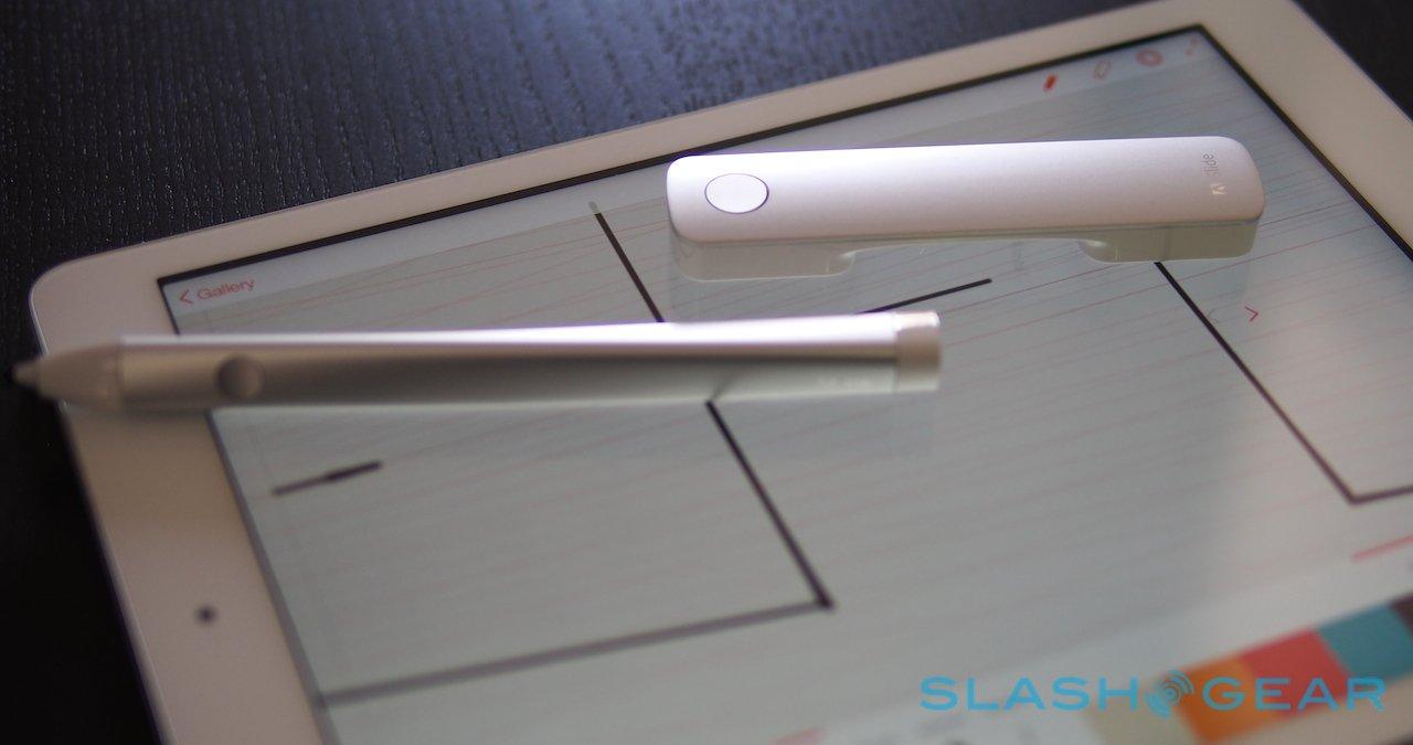
Adobe got tired of waiting for a great stylus for the iPad, and so it took on the challenge itself, coming up with Adobe Ink and its companion ruler, Slide. Pens for the iPad aren't new, but neither have they been especially proficient, but Adobe is aiming to change all that with slickly designed hardware and tightly-integrated software. I've been using Adobe Ink & Slide with the iPad Air for the past few weeks; read on for my full verdict.
Adobe Ink
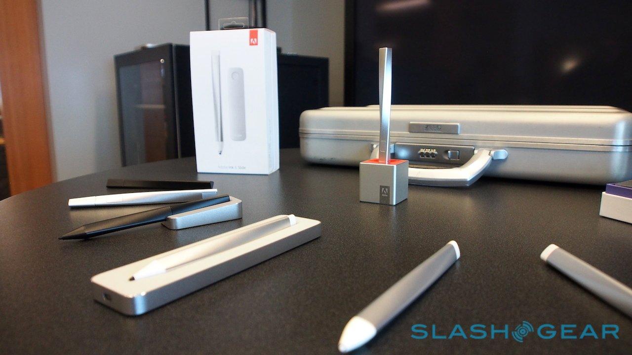
From a company obsessed with design tools, it's perhaps no surprise that not only is Ink beautifully designed, but even the way the stylus is presented. Still, given its been a while since Adobe had a boxed product to offer, you have to give the firm some kudos.
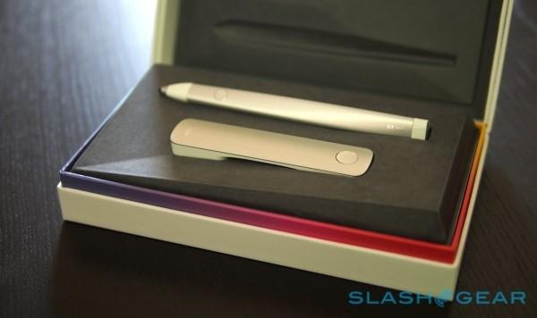
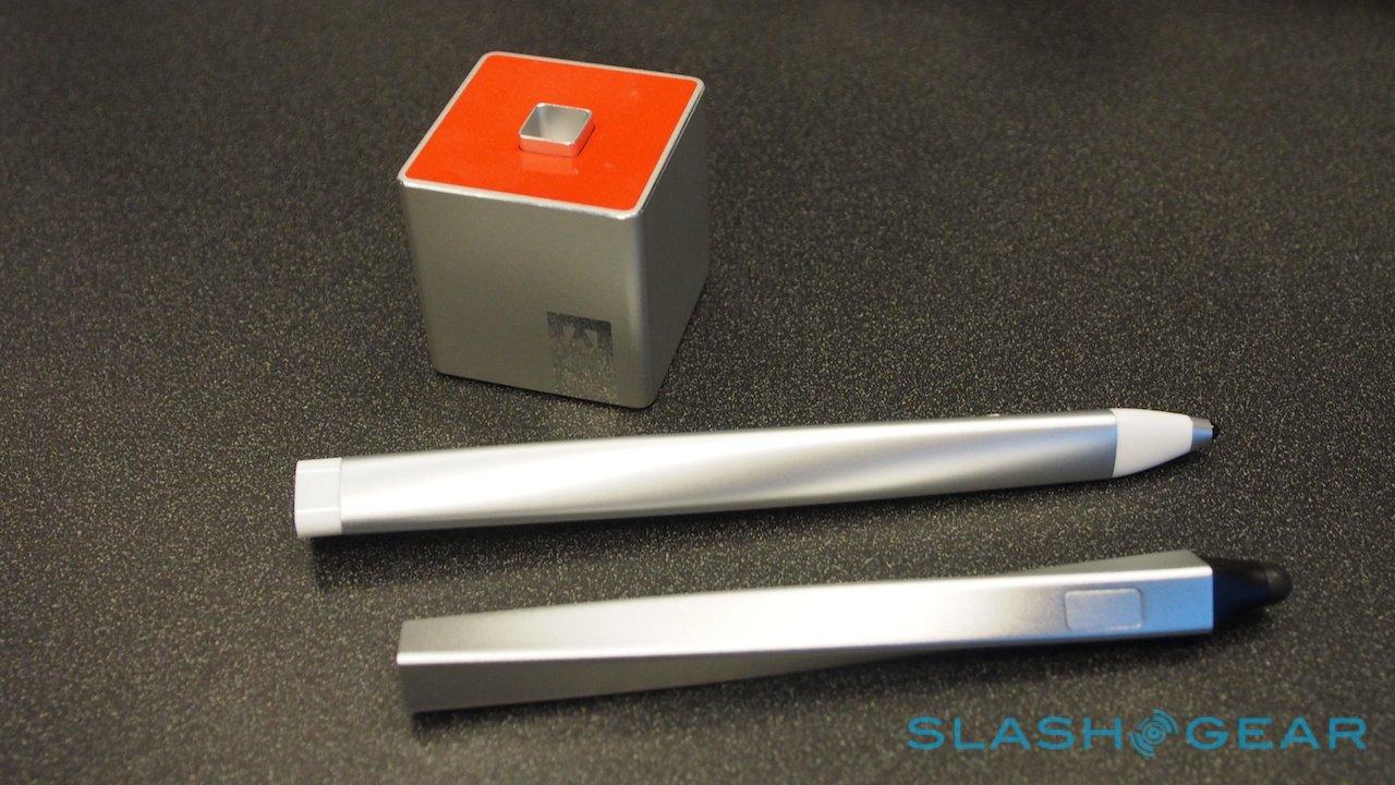
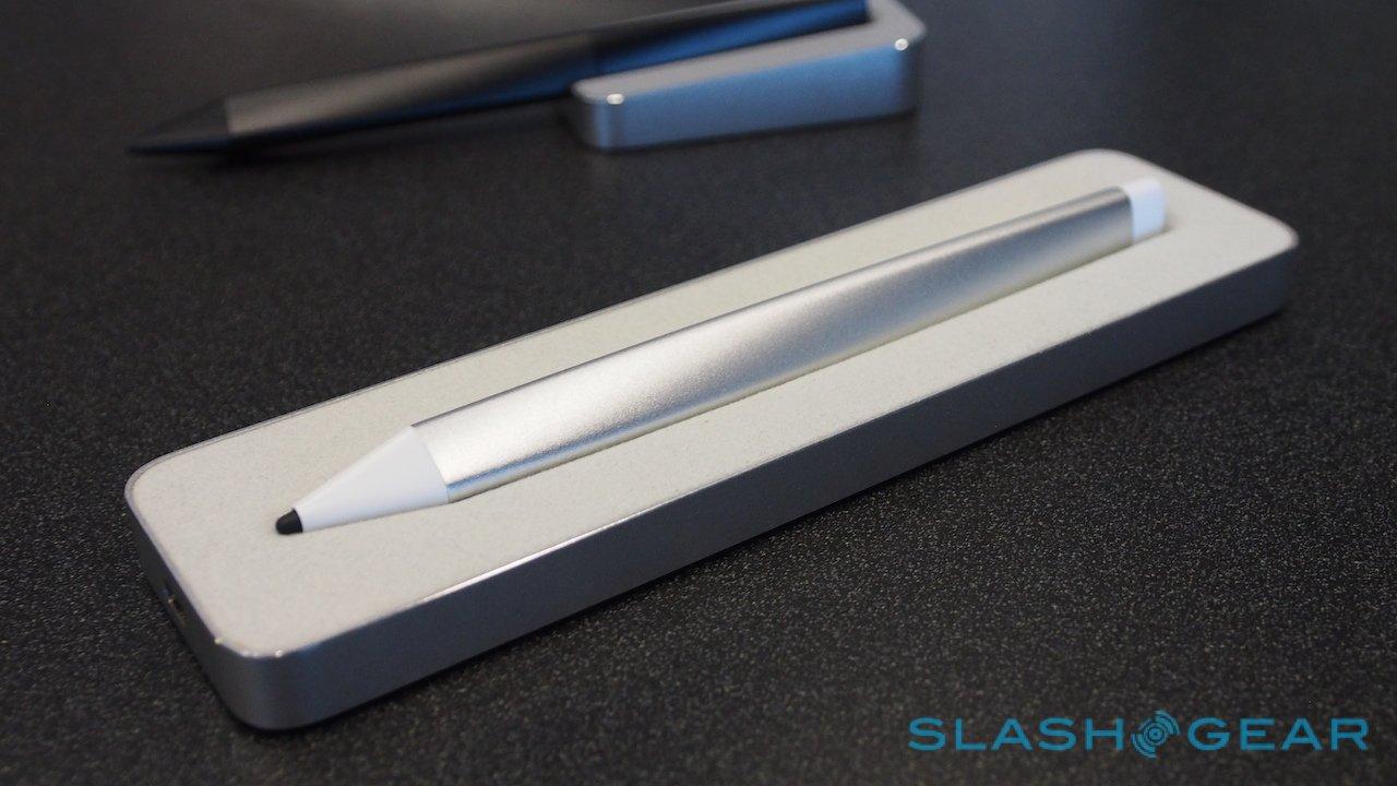
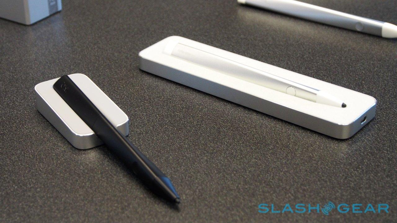
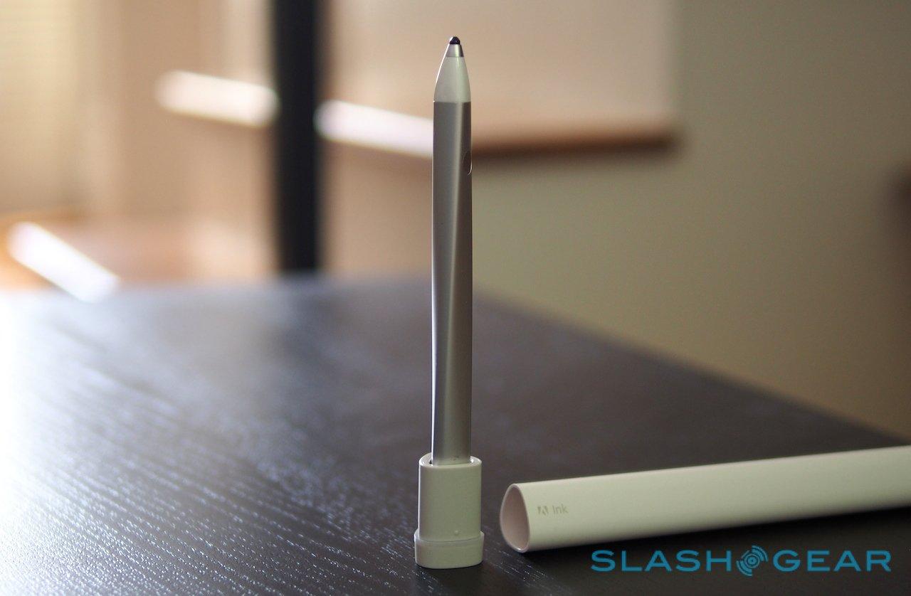
As well as Ink itself, inside the clamshell box you get a combination carry case and charger – with a neat colored LED ring that shows charging status – and the USB cable to use with it; you also get Slide, more on which in the next section. An hour's charge is good for up to eight hours of use.
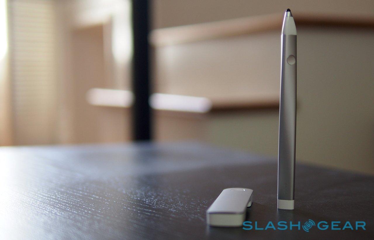
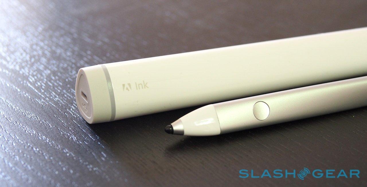
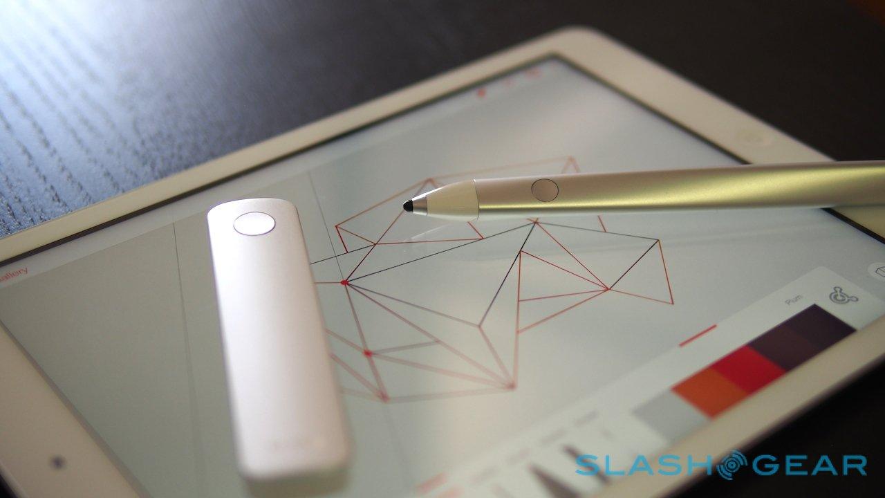
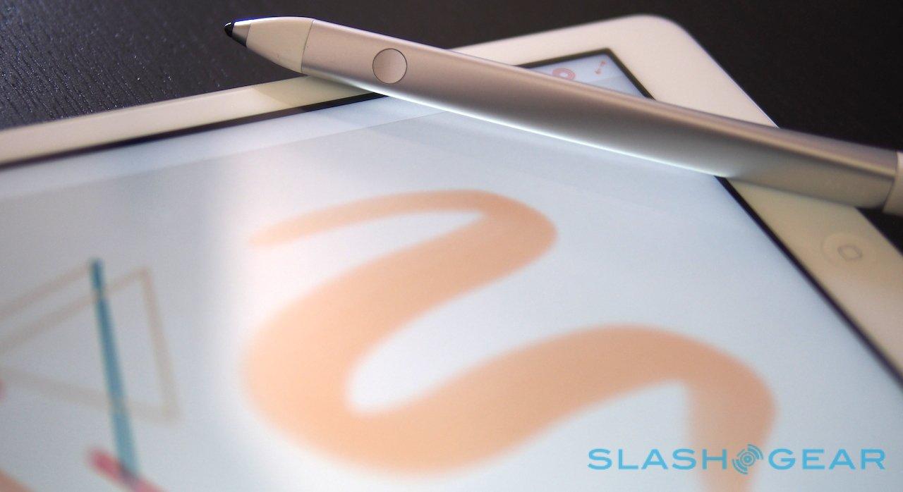
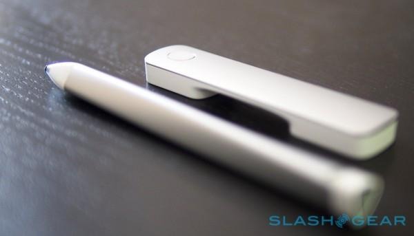
Adobe's pen is a single length of aluminum with a triangular cross section and a slight twist – fashioned, in fact, using hydroforming, where high-pressure water forces a metal tube to distort to a mold – with a nib on one end and a multi-color LED on the other. The triangle LED is surrounded by three charging pads, which magnetically clasp to the charging case.
A single button is on the barrel, for your forefinger to press, and is the only physical control on the whole thing. Of course, the main event is the nib, which uses Adonit's PixelPoint technology. The company approached Adobe after seeing the prototype of Ink in action, promising that its stylus system could slim the nib down from the 6mm of the development model to just 2mm.
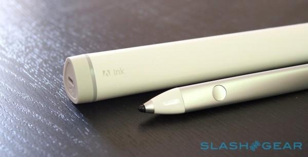
That means you have more visibility of what's under the tip, and leaves Ink feeling less like a passive stylus with a simple rubber cap. Unlike those passive styli, too, Ink supports pressure sensitivity – hundreds of levels, in fact – communicated over a Bluetooth LE connection to an iPad 4, iPad Air, iPad Mini, or iPad Mini with Retina display (running iOS 7+).
Ink will in fact work as a basic navigation tool on, say, an iPhone. However, you don't get the custom Adobe apps, or indeed the pressure sensitivity.
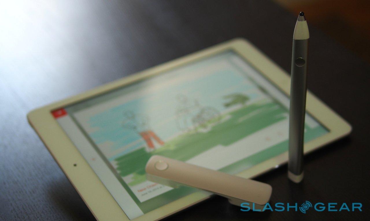
In the hand it's surprisingly pen-like, light and solid. The brushed metal finish is smooth but easily gripped, and the nib is hard and glides nicely across the glass display of the iPad, rather than catching like some rubber nibs can.
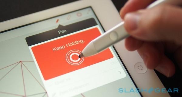
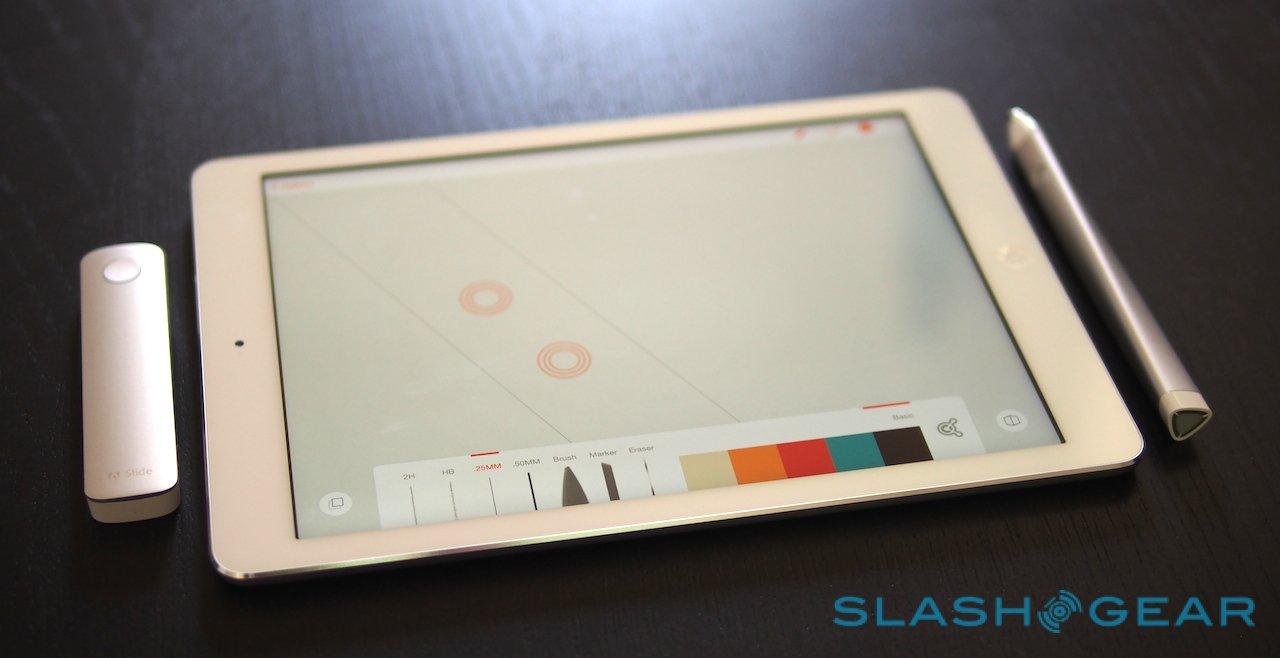
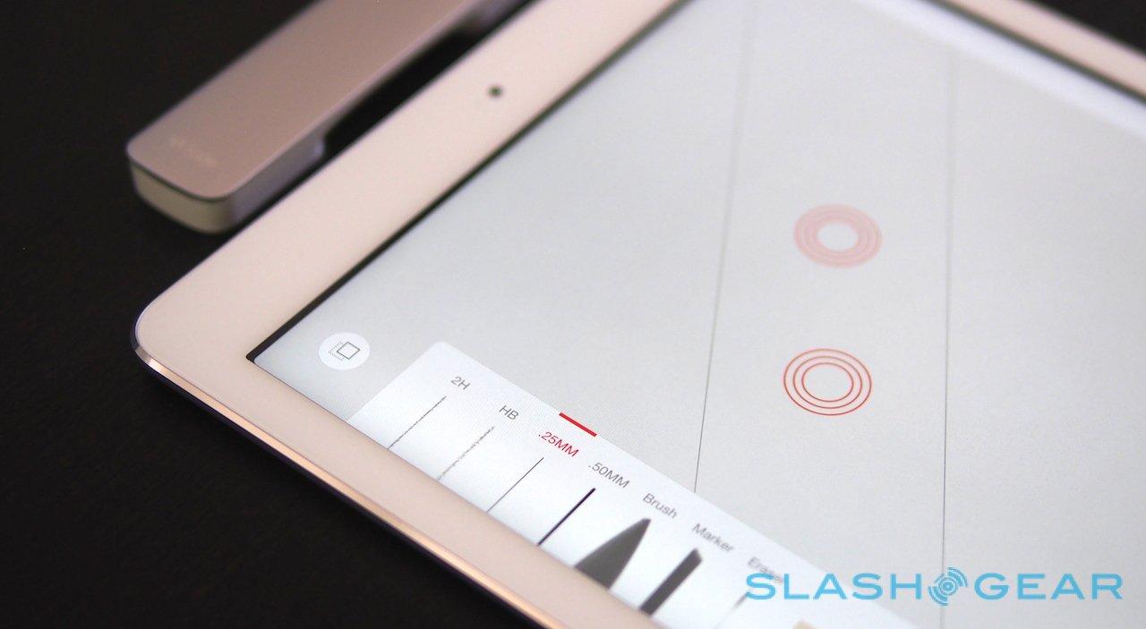
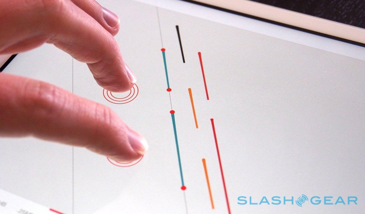
Adobe has developed a new pairing system for Ink, rather than expecting people to dig through the iOS settings pane. Its apps have a pairing "target": you hold the nib there, in the middle of the circle, and after a couple of seconds it connects them.
Although it's simple for the user, there's actually a lot of technology going on in the background. Adobe's apps look out for a pressure broadcast communicated over Bluetooth, and then checks the time-signature of the tap to make sure the right Ink is being linked to. From the settings, you can then set how you hold your pen – right or left hand, and in three different positions – as well as give it a name and even set the color of the LED.
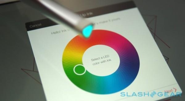
That color is used as an identifier, flashing when you double-click the barrel button. Adobe's argument is that artists can be collaborative, and so they don't want to inadvertently pick up someone else's (ostensibly identical) Ink by mistake.
It's also important because Ink works as a system of identity as well as a drawing implement, tied to a user's Creative Cloud account. A free account is required initially – netting you 2GB of storage space, too – and then Ink uses that to store custom Adobe Kuler color sets, a cloud clipboard of snipped sketches which can be pasted into documents anew, and to log the user into the apps on any iPad.
So, you can hand over your iPad running Adobe Line or Sketch to another Ink user, and they can log in with a tap and see all their existing art, any clipboard items, and all of their pen settings.
The downside to Ink is that the system needs to be made specifically compatible with an app in order for all that to work. You can't just pick up any art software from the App Store and expect to get, say, pressure sensitivity. Adobe is promising APIs for third-party developers to get involved, however.
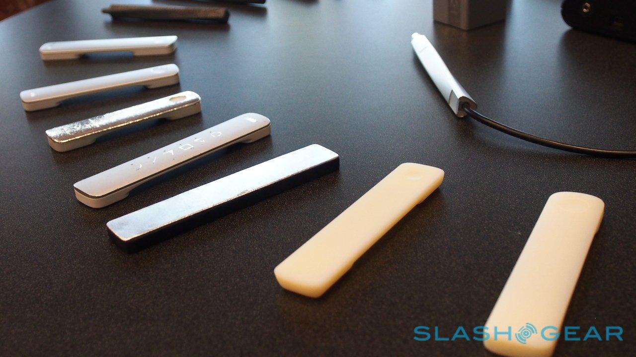
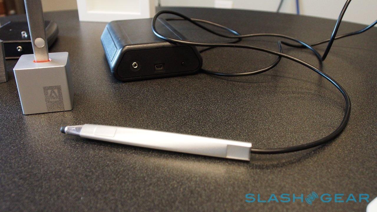
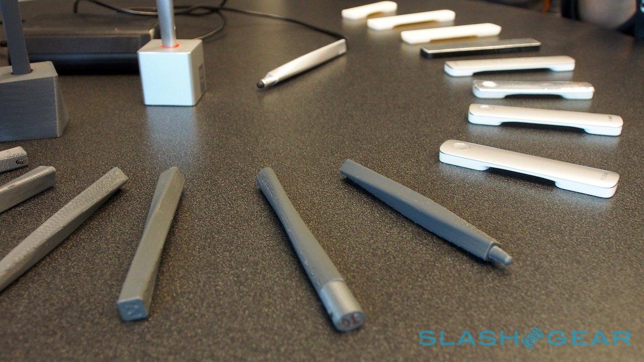
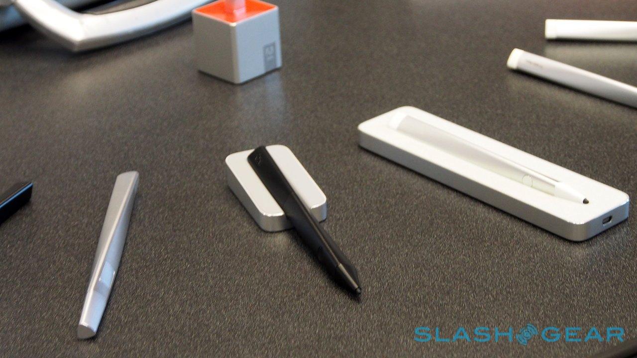
Adobe Ink & Slide Prototypes:
Adobe Slide
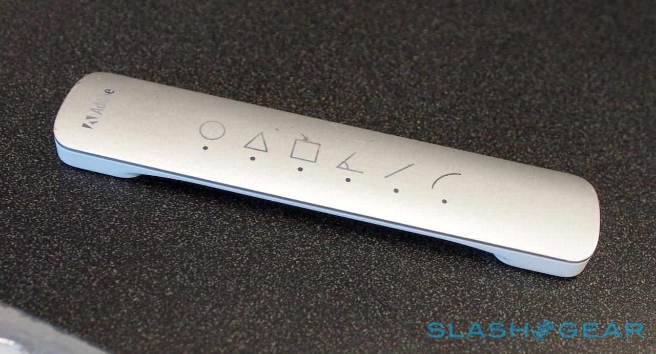
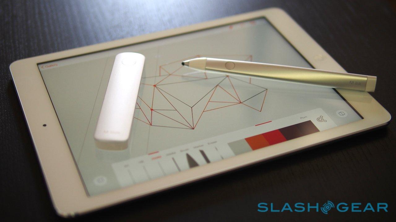
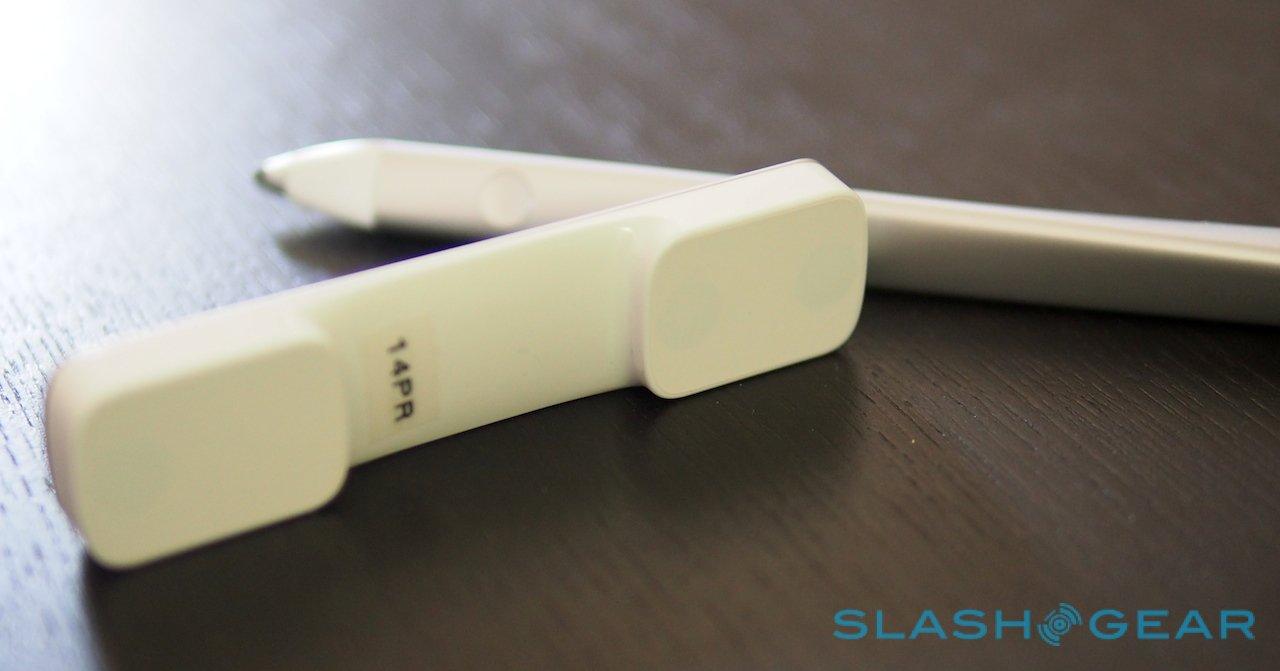
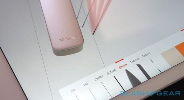
If Ink is deceptively complex, then Slide is the opposite. A simple bar – aluminum on top, white plastic on the bottom – it requires no power to operate.
In fact, it works by mimicking points of finger contact on the iPad's capacitive touchscreen. The two "feet" each have a capacitive nub hidden inside; when the user touches the metal top, the capacitance of their fingers allows the iPad to spot the contacts.
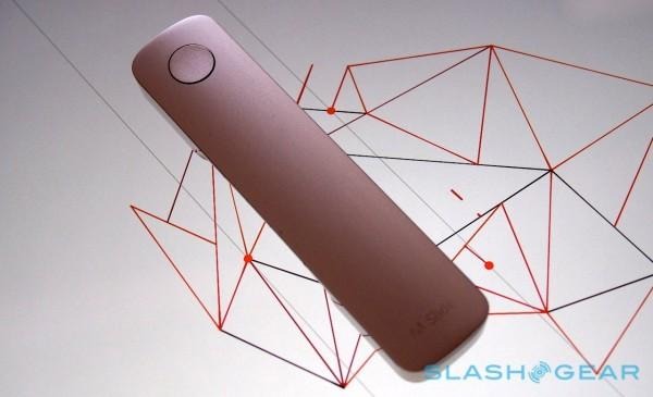
Pressing the button effectively lowers a third point to the display, which Adobe's apps recognize as a trigger.
While it's simple in theory, that doesn't mean Adobe threw it together. Earlier versions of Slide had several buttons along the top, as well as being thinner: the low-profile design was changed for one 2mm thicker, after 3D prototyping showed a little extra depth made it more ergonomically friendly.

Slide suits the iPad Air well, the 9.7-inch screen giving plenty of space for it to move around. On an iPad mini, however, it's a little more cramped, and I found myself wishing it was slightly narrower as it felt like a large amount of the screen was being blocked from view.
It's also worth noting that, while Ink gets a case, Slide does not; the expectation is that you simply dump it in your bag as well. Still, it feels sturdy and unlikely to break, and even if you were to lose it, Line and Sketch both have software alternatives.
Adobe Line and Sketch
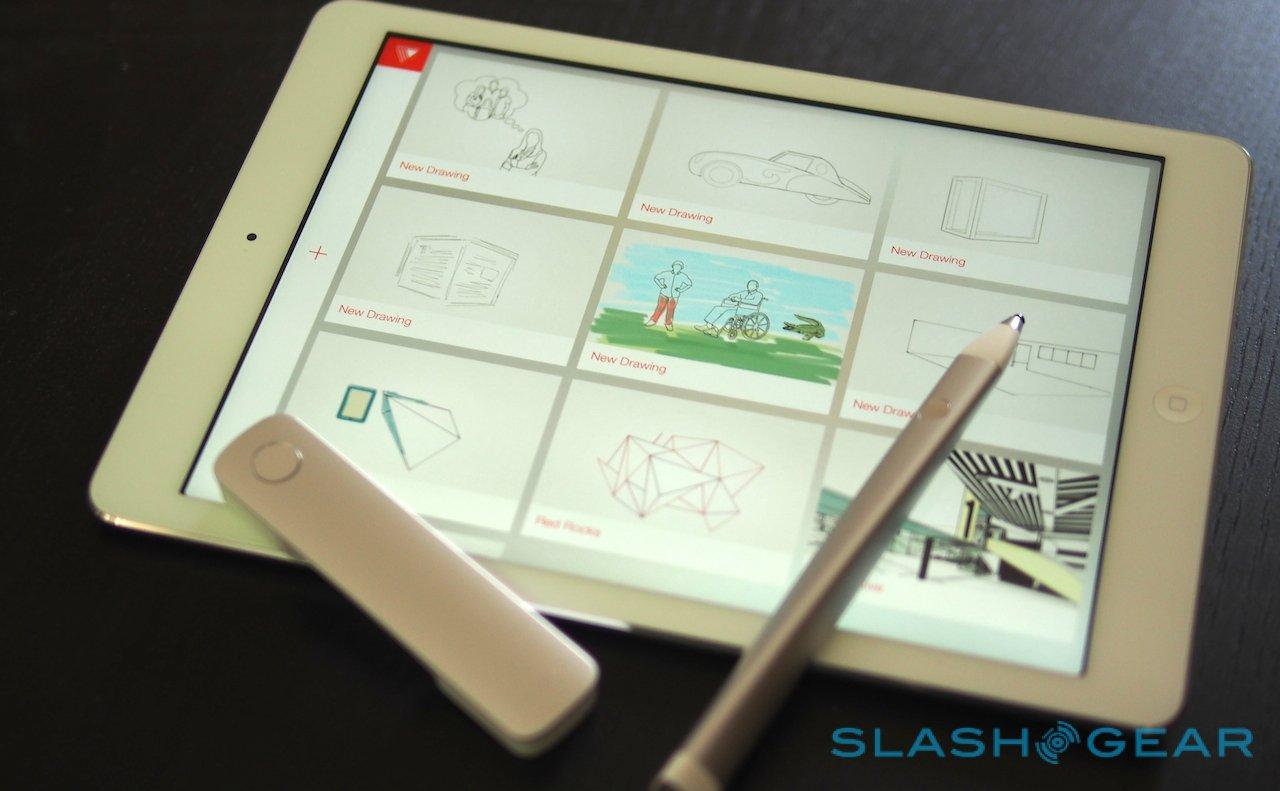
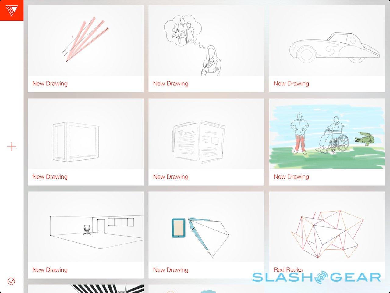
Line is billed as a modern approach to drawing and drafting, supporting both freeform sketching and more structured work. For the amateur artists – like myself – it works as a playpen for exploring, but it's also capable of some impressive results when paired with the right skills, and eventually Adobe will add exporting to its desktop apps like Illustrator. For the moment, exports get a PNG for sharing, while an SVG file is backed up to Creative Cloud.

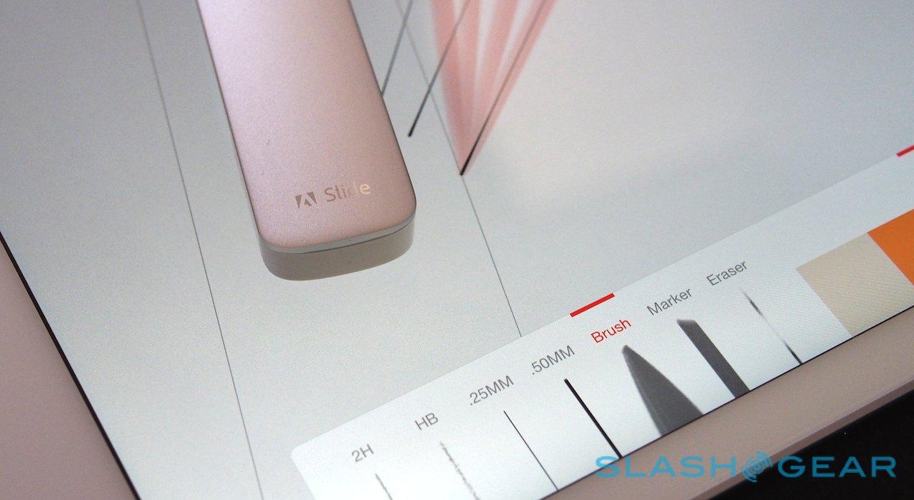
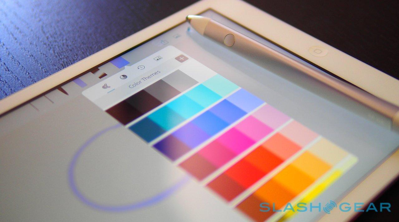
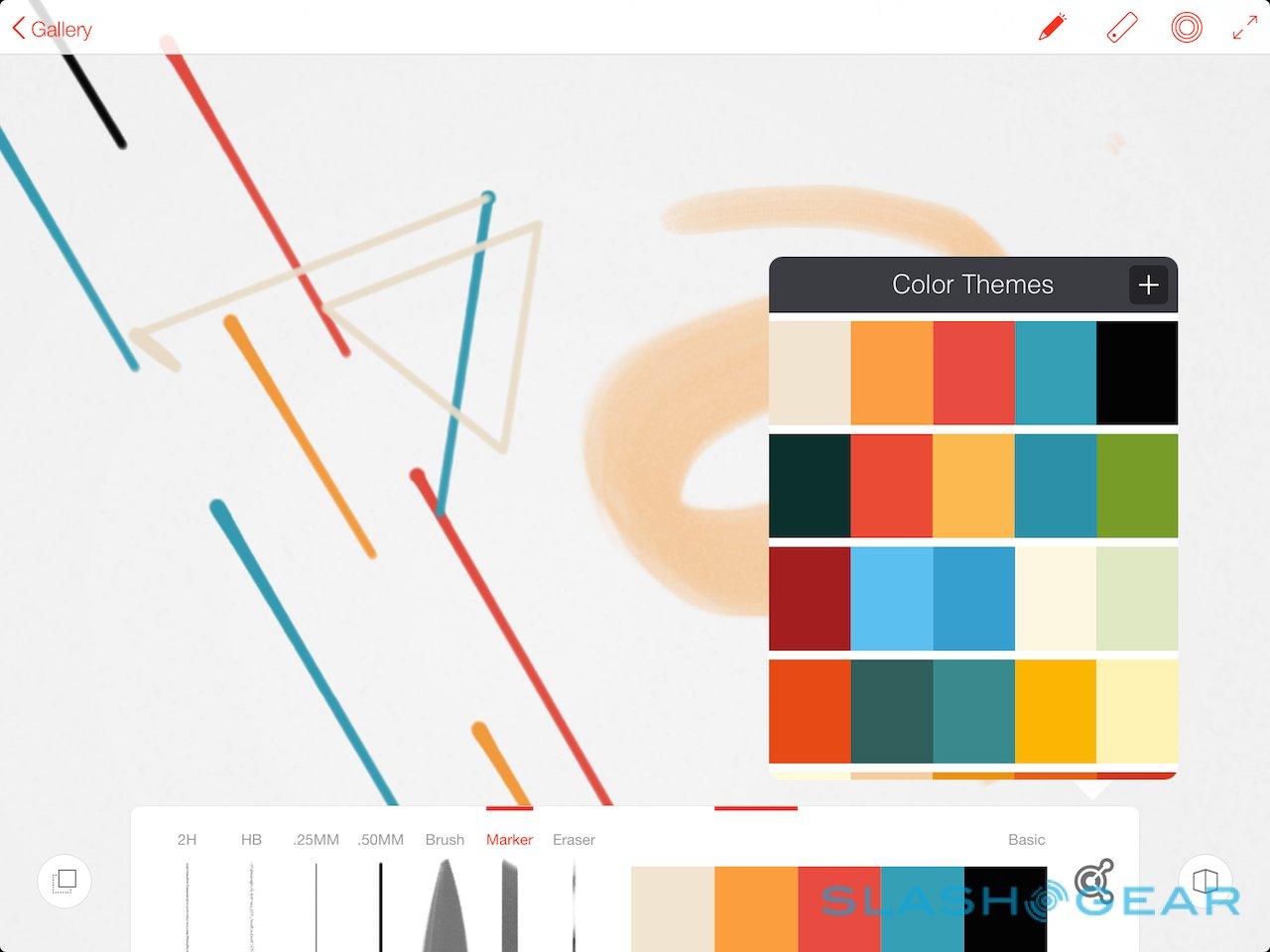
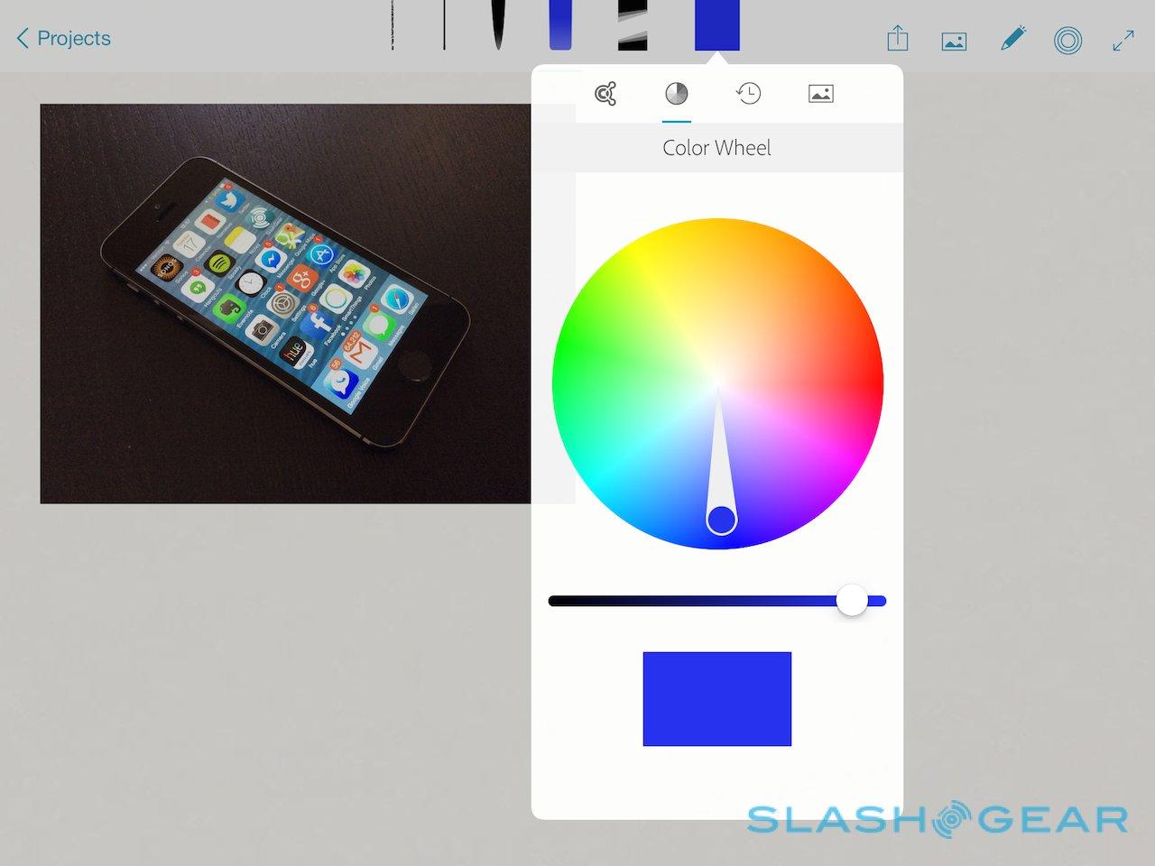
At its simplest, Line allows you to choose between 2H and HB pencils, .25mm and .5mm pens, a marker, and a brush, with a choice of either a full color wheel or preconfigured colors sets. The digital ink blends and merges as the marks you leave cross, while pressing harder with Ink makes for thicker lines.
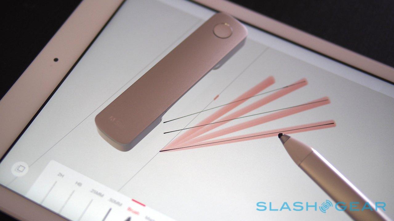
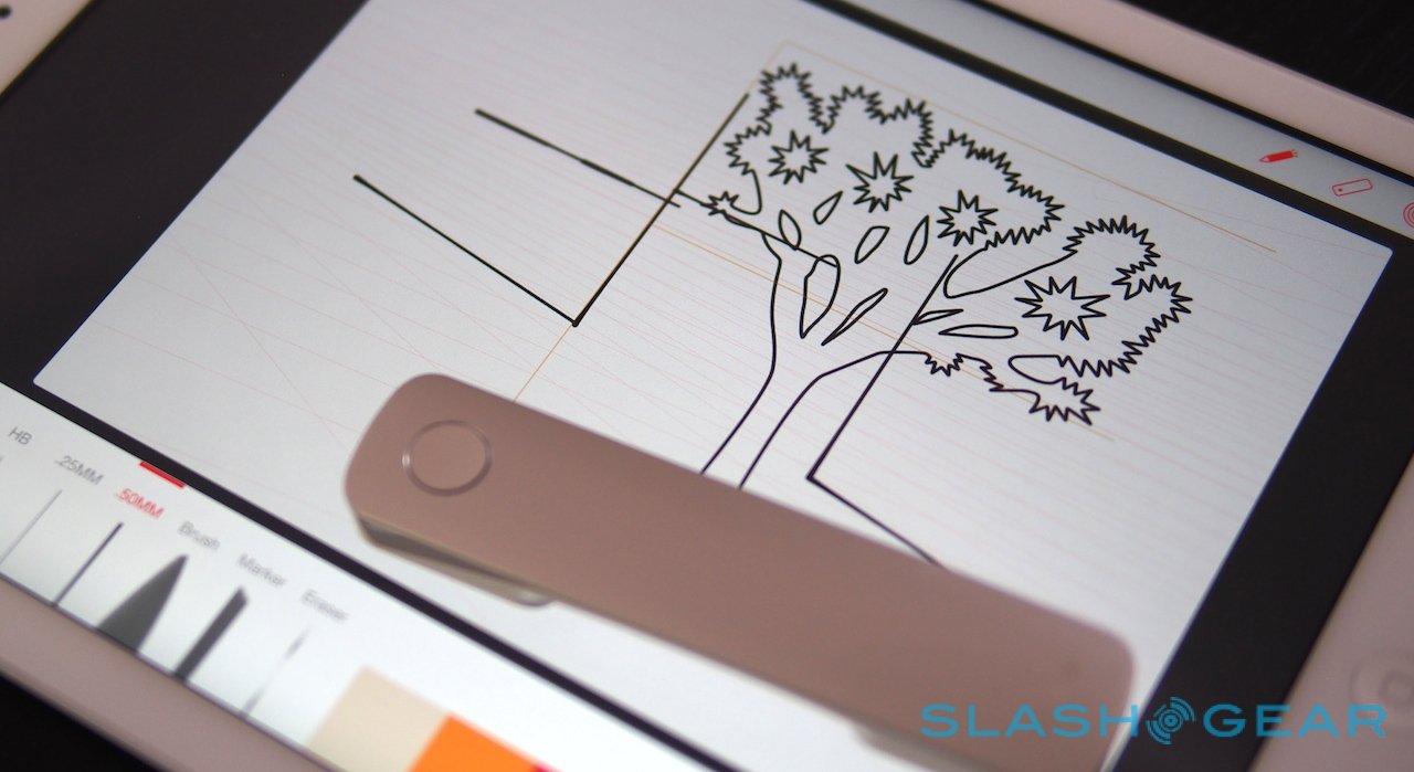
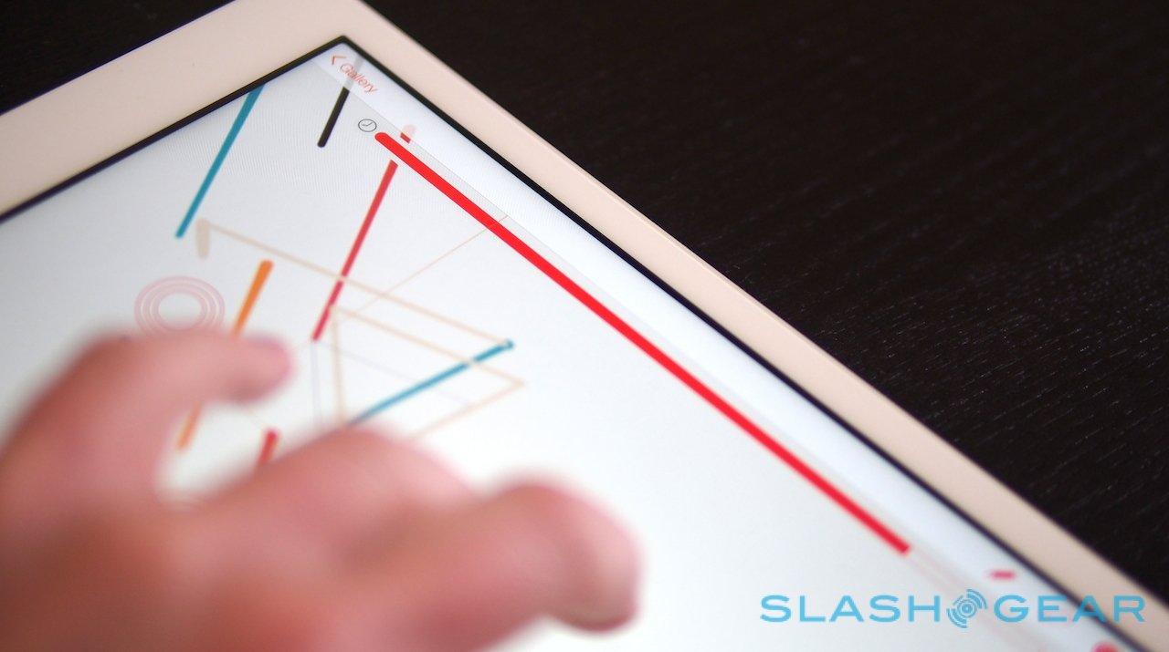
However, the app comes into its own with the ruler. Place Slide down on the display, or tap the button in the top right for the virtual ruler – controlled by a pair of fingers – and you can quickly sketch out perfectly straight lines.

It takes a little getting used to at first, particularly in understanding that the line you draw follows Slide's guideline rather than where the nib itself is. On an iPad Air there's a little parallax to contend with, too, the offset between the nib and the digital ink, but adjusting between the various hand settings and toggling the palm rejection can help.
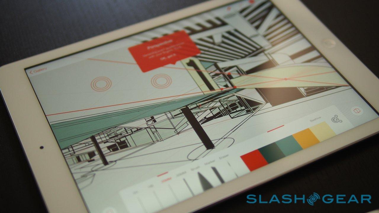
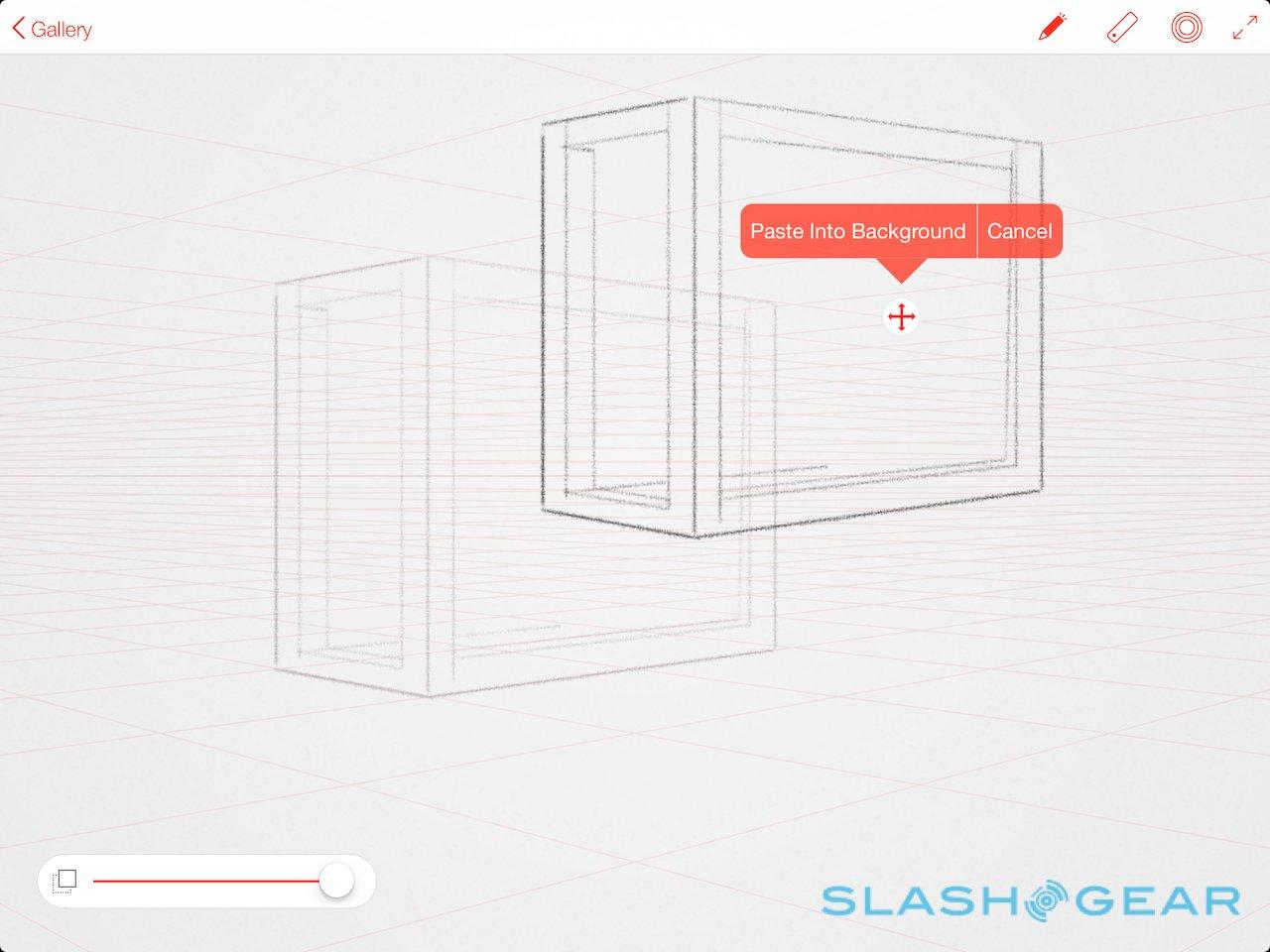
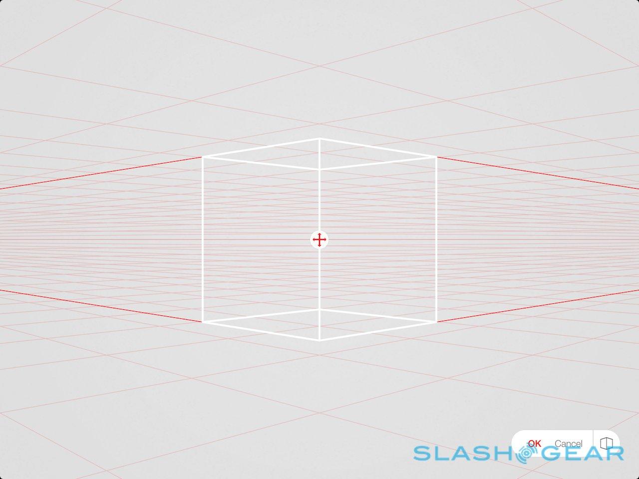
Even deeper, Perspective Mode turns on horizon lines for 3D drawings. You can adjust the angle of the lines beforehand, or change it mid-drawing, while Slide's guidelines adhere automatically to the vanishing points. Small on-screen arrows flip between the different perspectives.

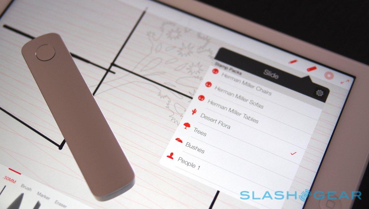
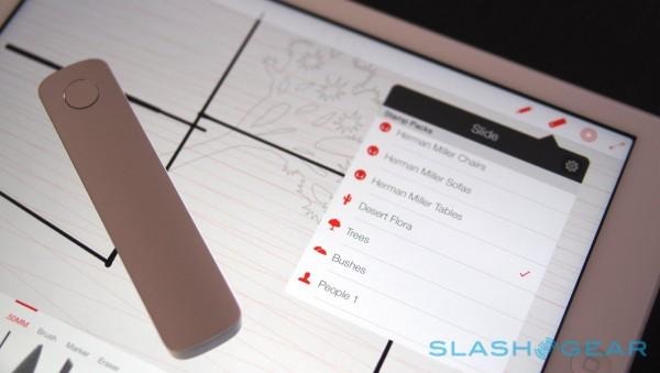
Slide is also used to control Trace Packs, sets of shapes ranging from simple geometric figures, through to Herman Miller furniture, outlines of people, and user interface components. A selection of French curves are there for things like car design. With them you can quickly populate a scene without having to fuss over the details.
Clicking Slide's button cycles through each set – you might have a choice of family members, for instance – and graphics can be resized and rotated, as well as only partially drawn in. It's easy to see how Line might be adopted by app designers, for instance, looking for a simple way to mockup interfaces.
Adobe also provides a cloud-based clipboard which can be used to collect and reuse your favorite shapes or even your signature, and because it's associated with the pen they're available at a click on any device you pair with, as are your custom color sets.
Holding down the button and long-pressing on an image saves it to the clipboard, where it can be starred for even quicker recall later on. Similarly, you can paste in a saved graphic and then resize and reorient it in a new image. Unfortunately there's no way to snap just a section of the screen.
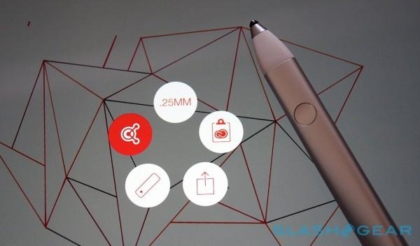
The clipboard is one of a small number of options accessed using the Ink UI, accessed by pressing the side button. That's where saved color themes, sharing options, pen settings, and the template menus are accessed. It sounds fairly complex initially, but after a while I quickly got used to jumping between menus and copying & pasting components to quickly build up more detailed images.
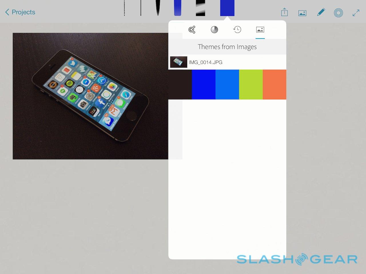
As for Adobe Sketch, that's a more freeform art app, allowing for creation from scratch or by importing a photo and working from that. I struggle drawing things like hands and faces, so it was useful to be able to open up a photo and work from that.

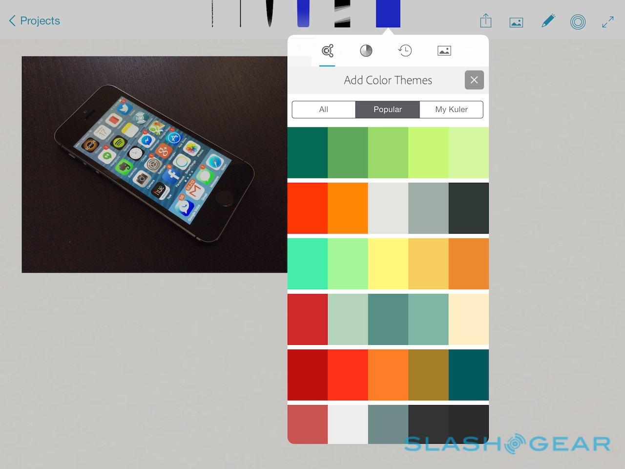
Sketch also creates custom color sets on the fly from imported images, picking out the five key colors and grouping them into a new collection. Images from both Line and Sketch can easily be shared using either Creative Cloud's Behance community – Sketch also has a menu of recent publicly-shared images to look through, or even edit yourself (though the original is unmodified, and only a copy saved to your own collection) – or the typical iOS sharing options.

Wrap-Up
Retrofitting a stylus to a tablet that was never intended to support one is no small task, and that Adobe has delivered on it with the sort of precision that we've seen from integrated-from-the-start slates is admirable. Ink is user-friendly, slickly designed, and so comfortable to wield that I found myself navigating through apps in general with it, not wanting to put it down in-between sketching.

It's worth noting that neither Line nor Sketch actually requires Ink & Slide to work: you can use them with a fingertip, or a different kind of stylus, and they're each a free download from the App Store. To get the best from them, mind, you'll need to cough up $199.99 for the Adobe pen set.
At the end of the day, like a traditional pencil or paintbrush, it's a set of tools. Expect to have to persevere if you want to produce decent results, and the jury is still out on how many third-party developers will adopt the company's APIs once they're available. Still, while Adobe Ink & Slide won't make you a great artist automatically, it's already shaping up to be the best iPad stylus we've seen.
