The iPhone 14 Pro Is Not What We Expected: First Look
It's Apple's biggest day of the year, and while the leaks and rumors about the new iPhone 14 Pro may have been flowing thick and fast for months now, that doesn't make its official debut any less exciting. The smartphone that millions will be upgrading to in the next few months — and, Apple hopes, buoying its profits in the all-important holiday shopping season — features a new design, new cameras, and new controversies.
iPhone has long been Apple's money-maker, but it doesn't operate in isolation. The Android smartphone world has been expanding, not least with the introduction of foldable phones, and while rumors persist about Apple's experimentation with flexible displays, we're not at the point where it's ready to show that off yet. That makes the iPhone 14 Pro and iPhone 14 Pro Max all the more important, then, because Apple can't coast on gimmicks.
Something old, something new
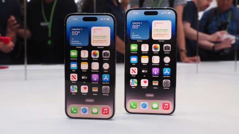
As always, there's a blend of the familiar and the new. By the time you get to the iPhone 14 generation, after all, Apple's formula is pretty solid. Nonetheless, for 2022, what stands out is how broad the iPhone 14 family is getting — by design.
That's key because, if there's a criticism of Apple's smartphone strategy in recent years, it could be that the phones have overlapped considerably. Apple attempted to address that last year with the iPhone 13 mini, but clearly over-estimated the market's appetite for a smaller model. Instead, we ended up with the tricky decision of iPhone 13 or iPhone 13 Pro, where justifying several hundred dollars difference in price came down to a small handful of features. For the iPhone 14 Pro, the argument is a lot easier to make.
The Dynamic Island will divide opinion
The big differentiator — and the way, almost as importantly, that people will be able to see you coughed up for the more expensive iPhone when they glance at your screen — is the new screen cut-out. It's fair to say Apple's decision to add a notch to the iPhone X was a controversial one: people are still talking about it, on today's iPhones, several years later.
It was a design decision with obvious justification. A bigger screen, with thinner bezels, was the trajectory of the smartphone industry generally. Apple, though, had more front-facing sensors than its predominantly Android-powered rivals. They might have a single front-facing camera for selfies; iPhone, in contrast, had the TrueDepth camera array with multiple sensors to power Face ID, among other things.
Apple's miniaturization talents are well known, but physics can't be argued with completely. The result was a compromise, with the infamous notch stealing a little screen space in return for iPhone's biometric security and the rest.
Lean in
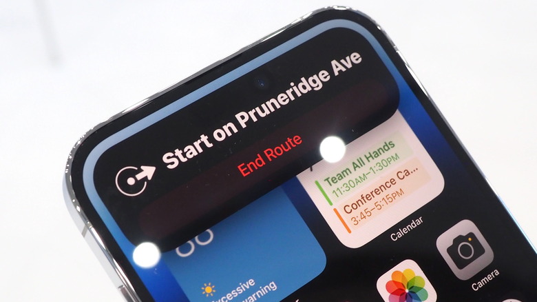
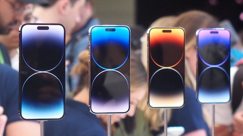
Now, things are changing again. The iPhone 14 and iPhone 14 Plus stick with the familiar notch. The iPhone 14 Pro and iPhone 14 Pro Max switch to a pill-shaped cutout called the Dynamic Island, and even in the rumor mill, it has proved to be almost as divisive as the notch was.
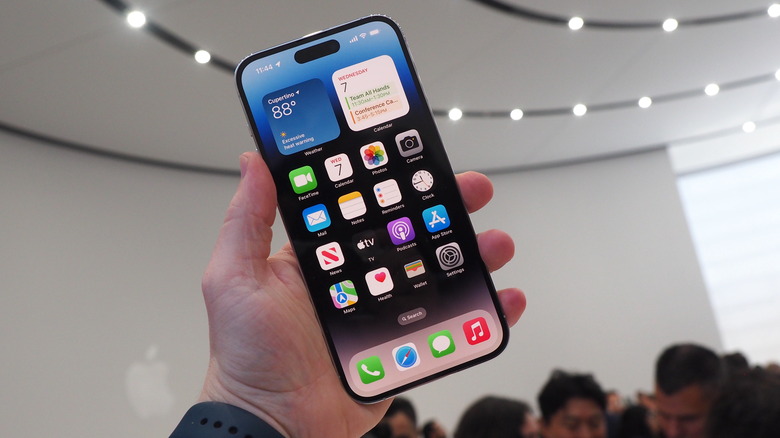
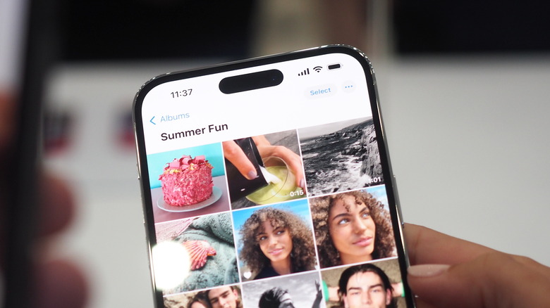
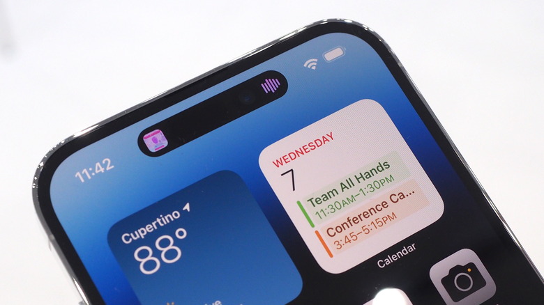
Apple has punched a couple of holes through the iPhone 14 Pro's display, with the front-facing camera and other sensors getting their own openings. However, iOS effectively blends them together into a single lozenge, one of the advantages of OLED panels. I confess I've never really taken all that much issue with the iPhone notch. While I obviously noticed it at first, after a while I find my eyes just gloss over the cut-out.
It's a cheat, but it works
I suspect I'm not alone, there, but the iPhone 14 Pro actually gives you a good reason — beyond just taking a selfie — to look at that cut-out. Apple isn't just hoping you ignore the Dynamic Island, it wants you to see it. Although the new, smaller TrueDepth camera is in the middle, it's surrounded by dynamically adjusting graphics used for alerts, controls, and more.
What's cunning is how those animations and shape-changing graphics flow around the portion of the display that Apple can't show UI on; not quite as we thought it would but arguably even better. You'd never guess, in fact, that there was a section of the Dynamic Island that lacks an OLED portion if you didn't know that to begin with. Apple will be offering developers a way to tap into those same animations, too, so that third-party apps don't spoil the illusion.
If it works, it's because Apple finally embraces the realities of needing to accommodate front-facing sensors, while keeping bezels skinny. The notch felt like an apology; the Dynamic Island actually makes something useable out of it. Is it still going to be madly controversial online regardless? Yes, I don't doubt it, but I think more people will just get on with life and enjoy the new notifications, alerts, and shortcuts.
A broad camera upgrade
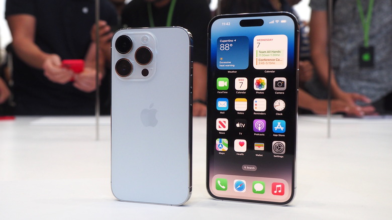
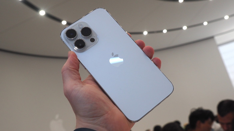
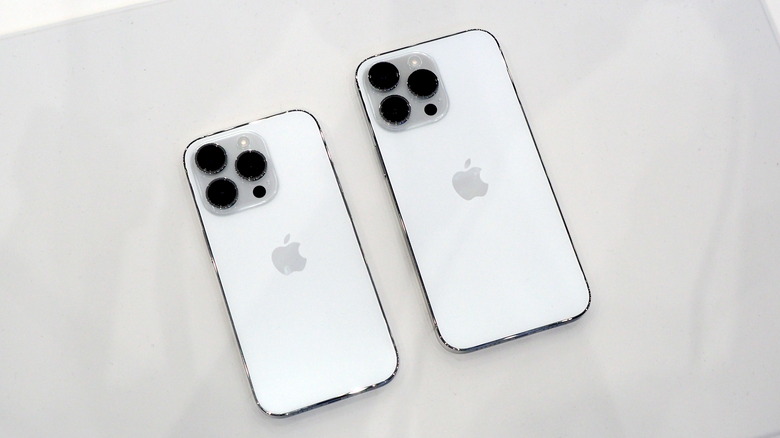
The big reason most people upgrade their smartphone, though, is the cameras, and there Apple has also added distance between the regular iPhone 14 and the new iPhone 14 Pro. As before, there are three sensors on the rear: wide, ultra-wide, and telephoto. However, they're getting a combination of hardware and software updates.
It's a reflection of the fact that good photography isn't just down to physical sensors these days: computational photography is just as key. That said, a new 48-megapixel wide sensor is a good place to start. We'll need to actually try all of the improvements out to see if they're useful in practice — or, if like Cinematic mode, it can feel a little gimmicky — but more raw data and Apple's proven processing smarts hold a lot of promise.
Goodbye SIM tray
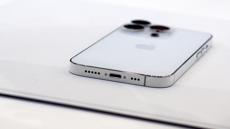
It's all wrapped up in a familiar design. Aluminum, glass, crisp edges, and the same cluster of camera lenses on the rear. What you won't find, though, is a SIM card tray, at least on U.S.-spec iPhone 14 Pro and 14 Pro Max. All four of Apple's 2022 smartphones will be pushing eSIM-only, a bold decision which, with typical brash confidence, the Cupertino firm is pushing as being better news for consumers, not a reduction of flexibility.
With eSIM, so the argument goes, you'll be able to rapidly switch active lines — or add new ones — to an iPhone 14 Pro, without having to worry about physically changing a SIM card. You'll also be able to store multiple eSIMs to the same phone, such as for roaming. The downside, of course, is that the usual advantage of an unlocked phone, being able to put in any SIM regardless of carrier, is lost. If the carriers decide they don't want to support your iPhone 14 Pro, you probably won't be able to add your eSIM to it.
Is iPhone 14 Pro worth the upgrade?
It's a side of Apple we know all too well — one which takes aggressive decisions with features and specifications and leaves the market to decide whether it's willing to stomach them or not. Sometimes, that strategy works. Other times — like the decision to junk all the ports bar USB-C from the MacBook Pro with Touch Bar — Apple later gracefully backtracks. With carriers so eager to push eSIM, though, it's hard to imagine, like the headphone jack, a physical SIM slot ever returning to Apple's smartphones.
The big question anybody looking at the iPhone 14 Pro will be asking is, of course, whether it's worth the upgrade. After all, we're still in the midst of a global pandemic, and plenty of people are facing an uncertain winter of high fuel bills and worse. You'd be forgiven for wondering whether it's the right time to pick up a $999+ smartphone.
I can't speak to everyone's financial status, but I can say that 2022's Pro-badged iPhone lineup feels a lot more worthy of the name than they have before. Up to $1,000 of trade-in credit in the U.S. will take some pain off the sticker, at least. For a final decision either way, stay tuned for the full SlashGear review.
