Samsung Galaxy Z Flip 4 Review: No More Excuses
- Affordable foldable
- Flagship in every way
- Powerful
- Smart use of the folding concept
- Battery life is not great
- Camera lacks telephoto lens
We may receive a commission on purchases made from links.
Typically, a full analysis of a product notes the highs and lows and then wraps it all up with whether or not you should buy it. I'm not going to do that here, for several reasons. First and foremost, and the only thing most people on the fence about this phone need to know is that this is an excellent Samsung flagship phone. There are a lot of qualifiers there, so bear with me.
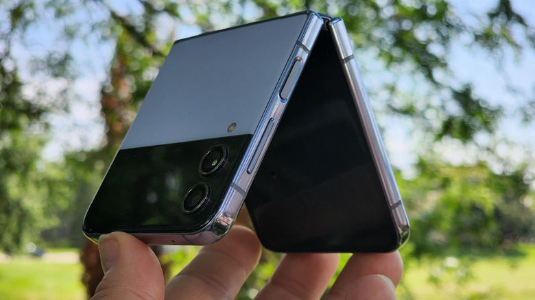
If you like Samsung flagship phones, like the S22 and the Note, you will like this phone. On top of that, it folds in half to form a tiny pocket square you can tuck into your breast pocket. When you put those two things together for a flagship that costs a flagship price, this must be a no-brainer, right? Well, not so fast.
That folding mechanism compromises two parts of the phone and ratchets it down a notch, but a small notch, so what you end up with is functionally not quite as good as every other flagship out there. Unfortunately, those two compromises are the battery and the camera, which are arguably two of the most important components of a flagship smartphone.
Will that affect your decision to purchase a Galaxy Flip 4? How bad are the compromises? I've spent one week on a Galaxy Z Flip 4 sample provided by Samsung and this is my full review.
The battery hit
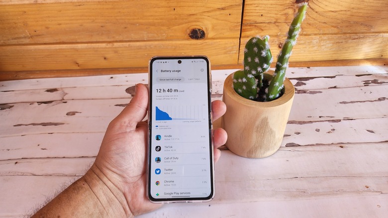
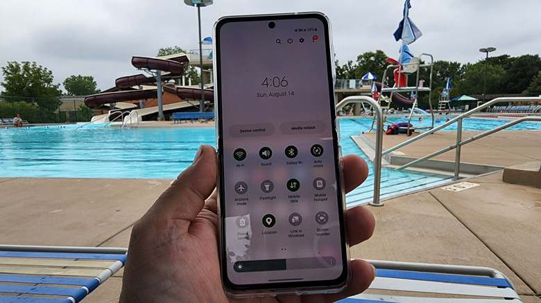
The biggest compromise on this phone is the battery, a 3,700mAh battery that is 400mAh bigger than the Flip 3. That's good because while battery life may be "improved" it's not really approaching good. A normal flagship phone will get me through a day and a half or even two days of light usage. The OnePlus 10T I just reviewed lasted me about a day. The Flip 4 will get me through most of the day, typically, but I often find I have to drop it on a wireless charger here and there throughout the day to get across the finish line.
Anecdotally, you can get through a day, if you take a bit of time during the day to top off. This can be while you're sitting at your desk or eating lunch, or on a drive. If you can find some time to plop it onto a wireless charger, you'll be ok. This is a fairly big compromise; I totally get that, but it's also not the worst thing in the world. Even when I'm carrying those aforementioned flagships, I usually carry a "just in case" battery pack with me. The only difference between those phones and this phone is that I'll definitely end up using the battery with this one.
Charge early, charge often
This isn't the part where I opine as to whether or not that's an acceptable tradeoff for this phone. That will come later. But I will say that adding a Mophie snap adapter ($20 at Amazon as of this writing) to make this phone MagSafe compatible is a soothing balm that I did not expect. It just further proves my long-held belief that everything is better with magnets.
Speaking of wireless charging, the phone can wirelessly charge at 15W and charge wired at 25W, but only if you buy your own wall plug because this is a Samsung phone and Samsung **checks notes** cares about the environment. If Samsung could manage to add OnePlus's 125W charging to this phone so it tops up in 15 minutes, that would make this entire conversation a wash and the battery 100% acceptable. But Samsung set a bunch of its phones on fire a few years back and has taken the cautious approach ever since. That's fair, I think.
Almost a flagship camera
The camera is the other compromise on this phone, but fortunately, it's not that much of a compromise.
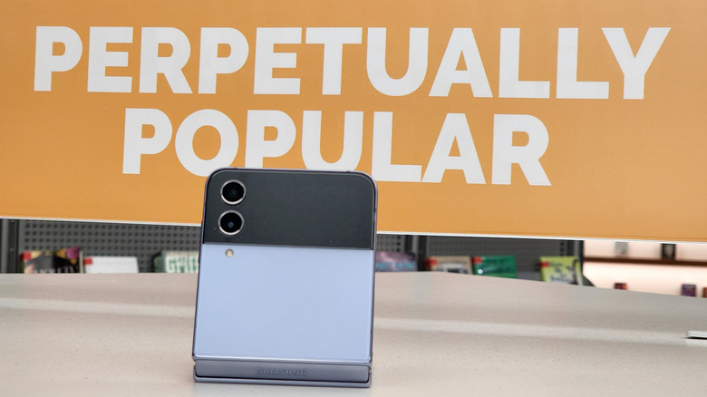
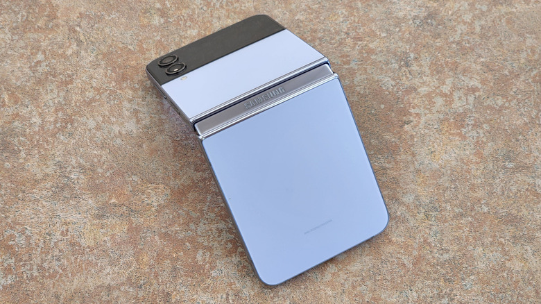
The camera module that sits next to the cover screen takes design cues from the Samsung Galaxy S22 Ultra. Both camera lenses protrude from the back in two distinct islands, rather than one raised portion. I like this better because it looks better than a big bump.
As for the cameras themselves, you have dual 12-megapixel shooters in a wide/ultrawide configuration. Samsung pointed out that the sensors on this generation have larger pixels than the Flip 3 which should (and do) help in low light. The pixel size is now 1.8 microns as opposed to 1.4. The main thing you're missing on this phone is a telephoto lens, which is unfortunate. In this reviewer's opinion, a telephoto lens is more important than an ultrawide lens, but at least one of them is present here.
Keeping the colors
During the day and in good light, there is virtually no difference in color between the two sensors. This means you can capture a photo with whatever lens you need to take in the scene without worrying about colors being off. The main difference I noticed between the two sensors is that the ultrawide seemed to be confused about where to focus, resulting in photos that were just a bit off-kilter. Still usable, and certainly good enough for social media, however.
In low light, the camera performs very well. As with most cameras, you'll want to stick with the main sensor and its larger pixels to capture the most detail and the least amount of grain. As is typically the case, moving subjects (read: people) are tougher to capture, so focus will be a little soft. But if you're capturing landscapes or statues, the Auto mode does a good job, and Night mode cleans it up a bit further.
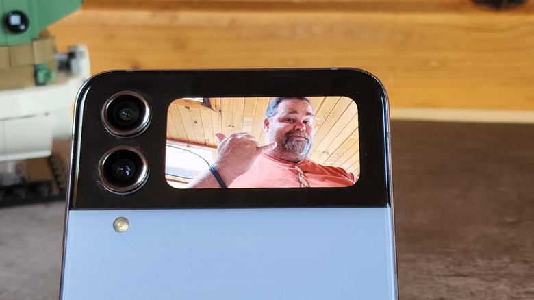
The Z Flip 4 allows you to use the cover screen as a camera display, so it's very easy to simply take selfies with the main camera. The selfie camera is perfectly fine, with only a slightly lower 10-megapixel resolution. Portrait mode on both sets of cameras is about the best I've seen on a phone camera yet. In the photo above, the left side is a photo taken with the main camera and the right is taken with the selfie camera.
Old-school camcorder mode
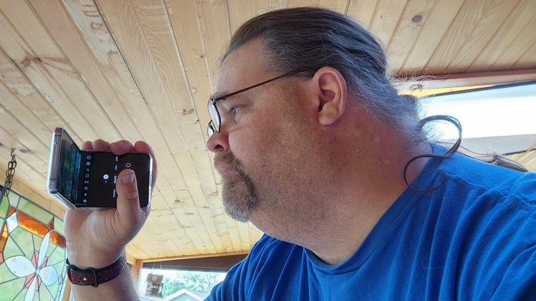
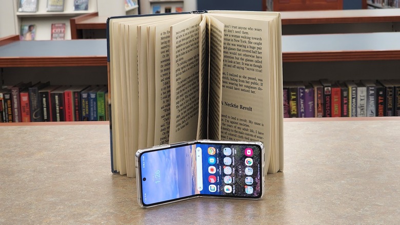
Video is one area where Samsung does a particularly good job. On the technical side, stabilization is really solid (though not as good as what you'll get from an iPhone) and from a usability standpoint, using the video camera with the phone half closed is delightful. It's a much more natural way to hold your hand while shooting video. Plus, you can use Flex mode to set the phone on its own tripod and even do some pans and zooms sliding the phone on its base much more smoothly than what's possible with a normal smartphone. There's a lot to like here.
Also returning are some of my favorite modes like Hyperlapse, Super Slo-Mo, Single Take, and Director's view. Single take grabs up to 15 seconds of stills and videos and lets you take the best shot of everything it took. That's great for capturing stills of the family, kids, or pets. Director's view gives you the ability to capture from all three cameras at the same time and switch between them as your shot dictates. Sure, it's niche, but creators should get a kick out of it.
Overall, I have few complaints about the camera, except that it's missing a telephoto lens. If not for that lack, I wouldn't even ding the camera as a compromise, but if you thought space was at a premium inside of a slab phone, try finding space inside a phone that folds. Sacrifices have to be made.
The more things change, the more they stay the same
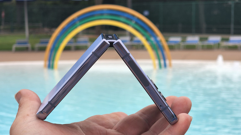
The Samsung Galaxy Z Flip 4 has basically the same design as the Flip 3. Every specification is within a few millimeters from its predecessor. Samsung seems to think, if it ain't broke, don't fix it. I'd counter that by asking whether a 1.9" cover screen is big enough/not broken? It's ok, but I can't help but look at the other four square inches of real estate below that cover screen and wonder if it's a missed opportunity. In reality, it's probably not, unless you want another compromise. But the back seat engineer in us all just has to wonder if there was any way to wedge in a bigger screen.
That same engineer will wonder if there is a way to eliminate the hinge gap or the crease in the 6.7-inch FHD display. The answer again is probably "no." Using the phone for a few days gets you used to both. The screen itself is gorgeous, typical of a Samsung display, but I noted early on that the screen is also a bit of a dust magnet. I suspect that has to do with the pre-installed screen protector, but I was constantly wiping dust and grit off of it, more so than any other phone I've used before.
You still notice the crease and the gap and that's a little annoying. Both of my children (ages 11 and 15) noted to me on separate occasions that the crease is annoying and wondered why anyone would want that on their phone. Out of the mouths of babes, as the saying goes, but it's just where we are with technology. My response to both was, "But...it...folds in half."
Nitpicking the design
As I mentioned in my hands-on with the phone, the side-mounted fingerprint sensor is very high up on the side of the phone when it's opened, and the phone itself is very tall with a 9:22 aspect ratio. There's definitely no lack of real estate on the screen, but it's hard to reach the top with one hand.
One nitpick is the pre-installed screen protector. It feels fine, but the one on my review unit was just slightly off-center. It doesn't block the sensor itself, but for a thousand-dollar premium phone, a bit more QA would be nice.
Another design note — the side rails of the Flip 4 are very slippery, which can at times make it hard to open the phone one-handed. I'm sure the durability engineers at Samsung would prefer you don't do that anyway, but when you're walking through a grocery store pushing a cart, sometimes durability has to take a back seat. Of course, I had a Ringke case ($22 on Amazon) on my review unit starting on day three, so that was no longer an issue.
Hardware and perrformance
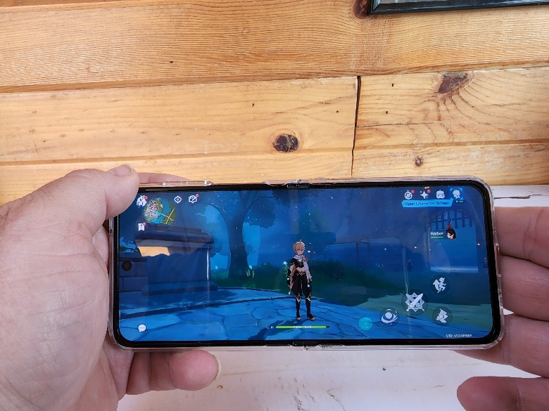
This is in every way a flagship phone. It has a Snapdragon 8+ Gen 1 under the hood, along with 8GB of RAM and up to 512GB of storage. My review unit has 128GB of storage and I was surprised to realize that after only a week, I was using 83GB of it. Of course, Call of Duty: Mobile and Genshin Impact take up over 23 GB by themselves. Speaking of which, on the performance end, this phone is a champion, as we've come to expect from the Snapdragon 8+ Gen 1.
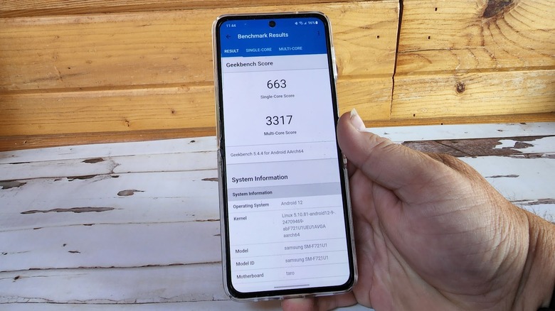
I loaded up the aforementioned games and both performed admirably, even on the highest graphic settings, though the latter did make the phone heat up a bit. Geekbench returned 663/3317 single/multi-core scores, which is what we'd expect from the platform. Put simply, this phone flies with power to spare. If I wanted to nitpick, maybe I'd like to see 12GB of RAM in there for future-proofing, but that's a reach.
Same old OneUI
As for software, this is a typical Samsung phone, which means you either like OneUI, or you don't. You can read any number of Samsung device reviews to get a full sense of the software, which is extensive on a phone like the Galaxy Z Fold 4. For a flip phone, the only software that is different from what you'll find on a slab phone is the cover screen, and some of the gimmicks Flex mode brings.
Some apps, the camera app, in particular, are optimized for flex mode, putting the viewfinder on one half of the screen and controls on the other. This can make it easier to snap photos and shoot videos but since the vast majority of my photos and video are shot in landscape, the value add is lessened considerably.
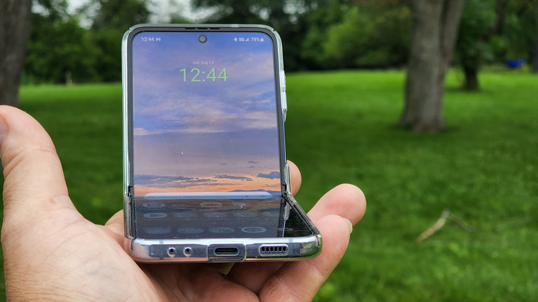
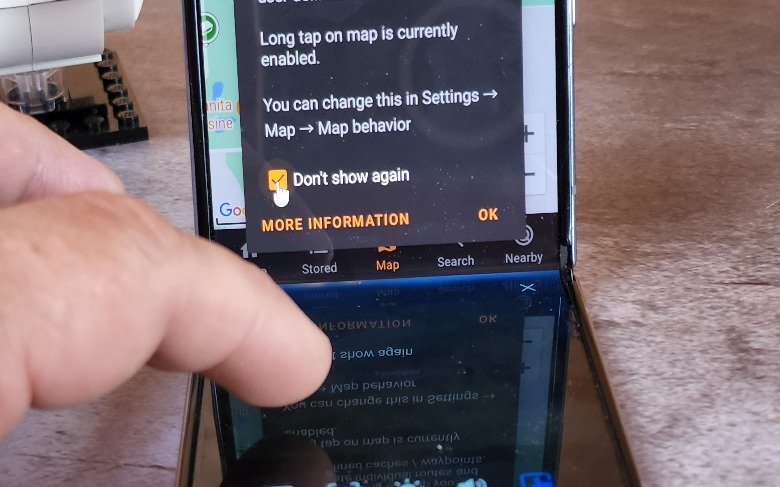
When using other apps not specifically optimized for Flex mode, Samsung will push the app into the upper half while the lower half is reserved for five functions — using the bottom half as a trackpad, adjusting the brightness or volume, grabbing a screenshot, or pulling down the notification shade. I didn't find any of these to be terribly useful. I suppose if you wanted to watch a Paramount+ video and adjust volume and brightness on the fly, an argument could be made. I briefly entertained the notion of using the Kindle app in flex mode with the cursor positioned so that all I had to do was tap the trackpad to advance the page, but that was short-lived.
Features like this are fun to show off at parties, but their actual usefulness varies by user. Samsung still needs to figure out why Flex mode is useful beyond video calls.
Cover screen needs to be moar biggerer!
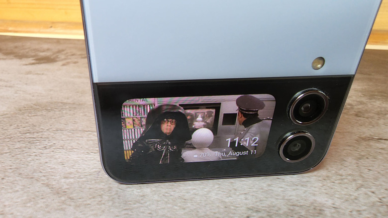
The cover screen is a nice addition to the Flip and absolutely indispensable. I already touched on the cover screen above, but there's software that makes it work. First and most notably, is the cover screen clock, which is amazingly customizable. You can use a photo, gif, or video clip for your cover screen and scroll sideways between clock formats. Beyond that, the cover screen is a notification/widget engine where you can add widgets like weather and calendar, but you can't add widgets from third-party developers. If there was ever a use-case for a cover screen, it's checking sports scores. This is a big miss in my book.
Also, the lack of ability to interact with notifications is a smaller miss. I can see I got an email, open it, and read it, but I can't archive it. I'll give Samsung some leeway because making notifications actionable is a slippery slope. Let people archive emails, and suddenly they'll want quick replies. Then they'll want a microphone for voice dictation. It would be a massively complex scenario, so I can see why Samsung passed on them, but now that I've written it out, hey, why can't we reply, Samsung? My point is that the cover screen is nice, but it could be so much more useful.
The existence of a hacky, side-load app way to run any app in the cover screen makes this even worse because it means it's possible, but Samsung didn't want to do it.
Switching is smart
Finally, I need to tip my cap to Samsung for its Smart Switch software, the best thing to come to Android since Android. As a reviewer, I use a dozen or more phones per year, and switching between Android phones ranges from headache to nightmare depending on your setup. Smart Switch leapfrogs all of that by copying over all of your apps and data and even organizing your apps into folders for you. If you are hearing a hallelujah chorus as you read this, yes, it's that remarkable.
Unfortunately, this only works between Samsung phones, so you're only good to go if you're coming from another Samsung phone. To be fair I should also mention that switching from one Pixel to another works similarly. So, if you're staying with a single manufacturer, this is gold. Honestly, though, Google needs to work on this because moving from Android phone to Android phone is a major pain.
No more excuses
Overall, this phone feels like a moonshot until you put certain things into perspective. First of all, it's not crazy to ask for $999 for a flagship phone in 2022. Second, the tradeoffs necessary are relatively minor if you don't mind keeping a battery pack on you. Of course, the biggest question is, do you want a foldable phone? If you do, this is a great phone to pick up. If you don't or you're not sure, you might find the compromises too much to ignore. At the end of the day this is a compromised flagship, but whether the benefits outweigh the compromises is a question you need to answer for yourself.
That sounds like a cop out. What I can tell you definitively is that I'm all out of excuses for not buying one of my own. I used to worry about durability and the compromises. Samsung has developed a concept that makes acceptable compromises in light of its folding nature. In short, if you are prepared to drop $1,000 on a smartphone, there's no reason why you shouldn't consider the Galaxy Flip 4.
The biggest question
Then there's the question of longevity. A simple Reddit search will reveal a host of problems. Most commonly, you'll see screen protectors peeling. Sometimes the screen will crack in the middle of the phone. There's no shortage of these stories, but that's because there is no shortage of foldable phones in the wild now. I can't tell you if the Flip 4 will last you a year because I've only used mine for a week. Michael Fisher, a.k.a. MrMobile, has a great video about living with foldables for the past year, so give that a look. In the meantime, we'll be sure to update this review if we come across any durability concerns with our own units.
Putting that aside, I don't think there's any reason why you should not get the Galaxy Z Flip 4. It's a flagship phone in every way and one designed to stay in your pocket more than most other phones, which is a nice change of pace. If you have concerns about durability, that's understandable, though I think we're at the point where that's the exception, not the rule.
