Amazon Prime Video Gears Up For A Big Redesign: Here's What's Changing
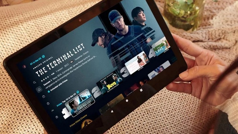
Amazon is bringing a UI design overhaul to the Prime Video platform that will start appearing in the Android app and on Fire TV screens this week, followed by its iOS app and the desktop view. The company says the redesign focuses on simplifying the user experience, helping subscribers find relevant content quickly and more efficiently.
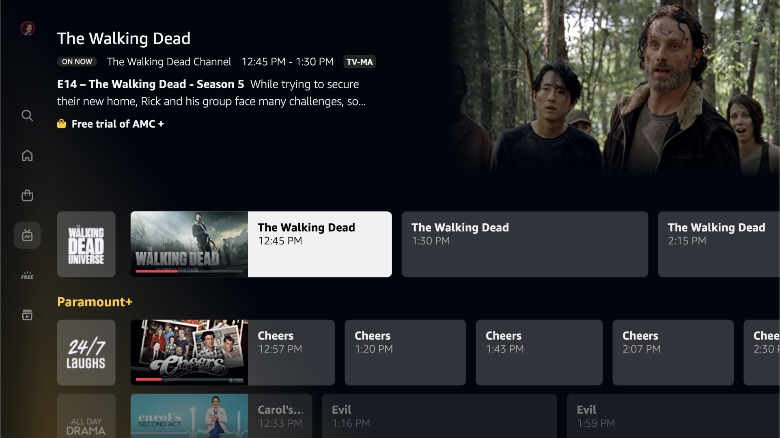
Leading the pack for larger screens is a six-page format for the landing page divided across Home, Store, Find, Live TV, Free With Ads, and My Stuff. Users will also find sections like Movies, TV Shows, Sports, Channels, and Rent or Buy on the relevant pages. For example, all of the live sports content will be served in the Sports dashboard on the Home page complete with carousels of content from teams that users might find interesting. Aside from the live content, it will also host replays, short videos, and documentaries.
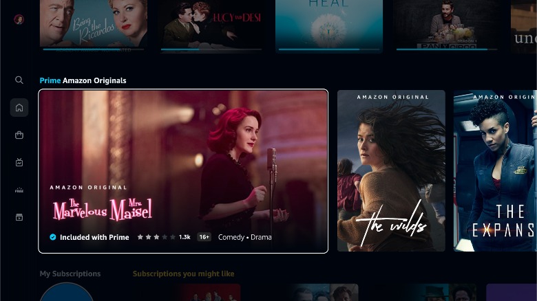
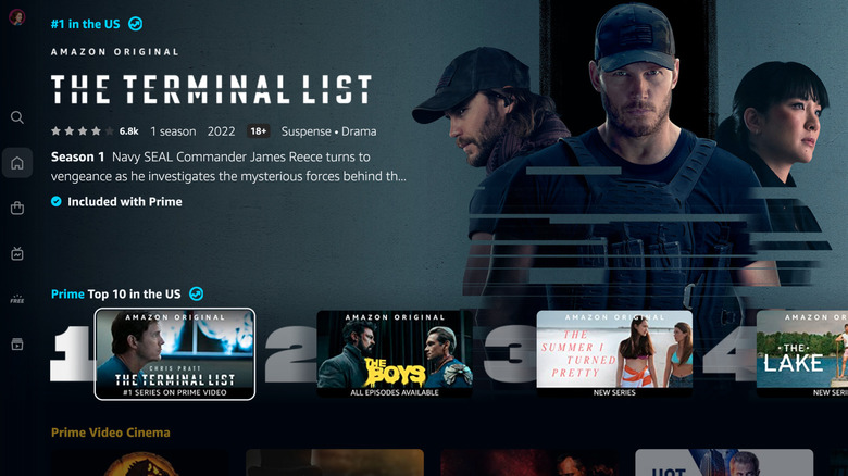
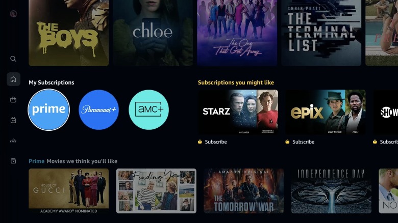
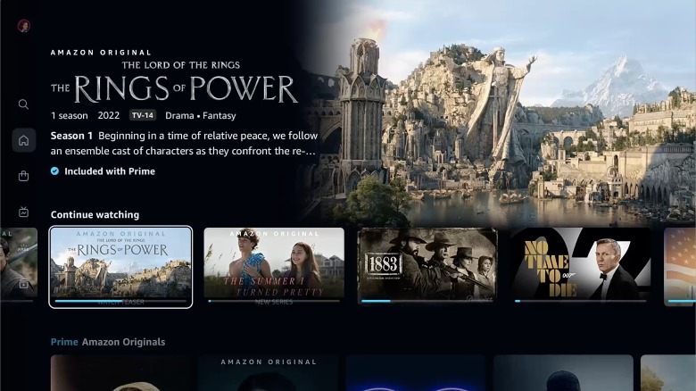
Just like with sports, the platform is also getting custom carousels like the Top 10 Chart to show the most popular content on Prime Video. Of course, Amazon would want its home productions and exclusives to stand out. For that, there is a new Super Carousel for Prime Video Cinema and Amazon Originals and Exclusives, with niceties like poster-style expansive artwork to help the content stand out.
Small changes, big ambitions
Amazon says it will also employ visual cues that can be spotted easily to help distinguish between content that is bundled with Prime membership and titles that require a separate purchase, such as rentals. The former will have a blue checkmark on the card, while the latter category will have a shopping bag icon plastered at the bottom. The redesign also adds a My Subscriptions row at the top of the Home page that shows all of the content available with Prime membership in one place.
Some tweaks have also been made to the Find page, which is now going to show content suggestions as users type their query, complete with visual cues for free and paid content. There's also an option to filter content based on genre and even based on resolution figures like 4K UHD support.
The company says "carousels also showcase titles in a way that makes the experience less busy and overwhelming for our customers," but from the press assets that Amazon has shared, those UI tweaks don't appear to have changed anything dramatically. It is also worth noting here that the user experience might vary slightly based on the device you are using and the region you are accessing the service from.
