Gmail On The Web Is Getting A Facelift That Lets You Hide Apps
As a web-centric company, it's sometimes perplexing when Google's own web-based apps are some of the last to receive new features or designs. That might be fine for less frequently used services like Keep, Notes, or Tasks, but Gmail is Google's bread and butter next to Search and Ads. Granted, it may also be more difficult to change things in Gmail's web form because it could disrupt millions of users, including businesses, so late is still better than never. More than a year after it was first unveiled and first debuted on Android, Google's new Material You language is finally coming to Gmail on the web. Even better, it will allow users to ignore it if they don't want to make the switch yet.
Google doesn't always provide an option for users to revert to a classic theme, and probably for a good reason. Doing so would create a maintenance burden on Google's developers and also create divergent and potentially confusing experiences for different users. In the case of Gmail's new look, however, the switch between Material You and Classic is not only warranted, but it's also necessary because some Gmail users don't even have access to Google Meet or Google Chat.
Back in January, Google made the unpopular move to integrate its meeting and chat services right inside Gmail. It makes sense on some level because enterprise users and teams might want to jump directly to a video call while they're still reading an email, but not everyone does that. You could remove those shortcuts from the UI, but you'd have to dig through Gmail's settings to find the right options.
Material You arrives, but there's still a Gmail-only option
That has become easier with the upcoming makeover for Gmail on the web, now with the Material You design language. Users who only have access to Gmail or want to use only Gmail will have a Gmail-only layout that removes any trace of Meet and Chat from the screen (via Google Blog). By default, however, those apps are available in a new navigation bar to the left that contains Mail, Chat, Meet, and Spaces. You can collapse this panel to free up some space, but that also hides the entire list of folders and labels as well.
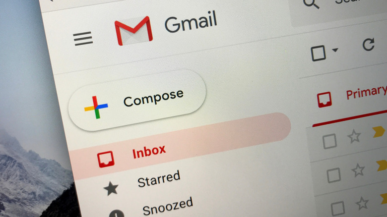
Aside from the layout changes, the Material You makeover also changes the color scheme and shapes a bit. The compose button is now a rectangle with rounded corners rather than a pill, while the email list view is also sharper and more pronounced. Some might appreciate that Gmail on the web will look more like the Gmail Android app, but those who don't still have the option to change themes.
The new Gmail with a Material You refresh has started to roll out globally and is available to almost all classes of Google account holders, including those with free personal accounts. The only exceptions, it seems, are Google Workplace Essentials customers, for whatever reason Google has. Now that Gmail on Android and the web have both been updated, Google might finally have some time to make sure that iOS users won't be left out, though it hasn't given a hint on when that will happen.

