Nothing Phone (1) Display Might Be Nothing To Talk About
Apple events, especially when they introduced new products, remind the world of the company's passion for design. It's a trait that many tech companies try to emulate to varying degrees of success, and it is the standard that many startups try to measure themselves against, whether explicitly or otherwise. One such newcomer is Nothing, though its fabled smartphone still has to make an actual appearance. The company seems to have at least mastered the art of drumming up hype for the Phone (1), but it will need to tread very carefully to avoid ending up as a disappointment, which is what some leaks and rumors seem to be painting it as.
To be fair, there has been very little official information about the Nothing Phone (1) that wasn't a teaser that came directly from founder and CEO Carl Pei, formerly of OnePlus fame. Nothing itself was established as a sort of counter-culture to the current industry trends in smartphone design. The company's first product, the Nothing Ear (1), is representative of that vision with its partially transparent body and minimalist design. Unfortunately, it might also be representative of what to expect from the company's next product, which may be nothing much.
According to a tip from TechDroider, the Nothing Phone (1) will have a 6.55-inch OLED screen with a resolution of 2400x1080. In terms of design, it will reportedly be completely flat, going against the trend of curved phone screens, and will have a very thin chin. Nothing here is new and that fact puts the Phone (1) on the same level as some "mid-premium" flagship phones, namely the Galaxy S22 base model.
Minimalism mission
With very little officially known about the phone, other than its transparent back and wireless charging support, every little tidbit that comes out about the Nothing Phone (1) sparks interest and, in some cases, disappointment. But that might be the entire point of Nothing's products as anti-thesis to the complexity of today's smartphones. It might be made and designed to be simple and basic, which doesn't sound exciting compared to the mainstream handsets.
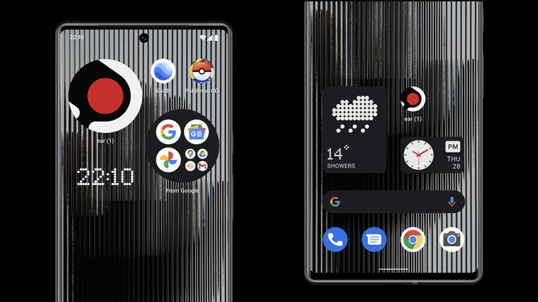
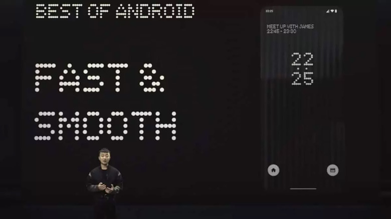
Nothing is banking on the current minimalism trend to attract users who are tired of the complicated ways smartphones work and look these days. The beta preview of the Nothing OS launcher it released in April was not only barebones but also restricted. Of course, it was still in beta, but it already suggests how Nothing will put its vision into practice.
It remains to be seen how Carl Pei and his fledgling company will try to balance matters and avoid going to the opposite extreme of offering nothing. It will probably avoid focusing too much on the actual specs but on the design and experience of the phone, mirroring the strategy that Apple has been using for years. How that will sit with Android users is a very big question mark, especially when one can create their own minimalist experience on any phone anyway.

