Instagram Logo Change Has The Internet Divided
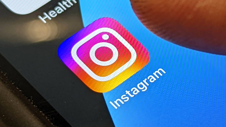
Instagram's new logo is winning the hearts of some, hurting the eyes of others, while the rest simply aren't sure how it's changed — if it's changed at all. The popular social media platform recently spruced things up by introducing some colorful, new design aesthetics. In an announcement, Instagram revealed its icon's new design, which was comprised of its new "reimagined gradient" and a new, ever-so-slightly-modified set of lines. This so-called "Instagram gradient" is said to represent the company's official colors, serving as a foundation for its "complete color system."
For some, the new Instagram logo change might look familiar, unchanged even, until they notice its stark color saturation. In fact, this was by design as it was meant to make it "feel illuminated and alive." Despite the new icon's demure transformation, its vibrant new hue was actually created utilizing "an innovative 3D modeling process," according to the official Instagram release on the design. Rose Pilkington, the digital artist who worked on Instagram's new gradient, described it as something that's "made of light," and also holds a "sense of depth to it."
Instagram didn't exactly please everyone the last time it revealed a significant change in the design of its logo mark, typography, and app icon system. This time around, the opinions don't seem quite so abundant, but they do seem — in some cases — to be just as wildly divided.
Mixed colors and mixed reactions
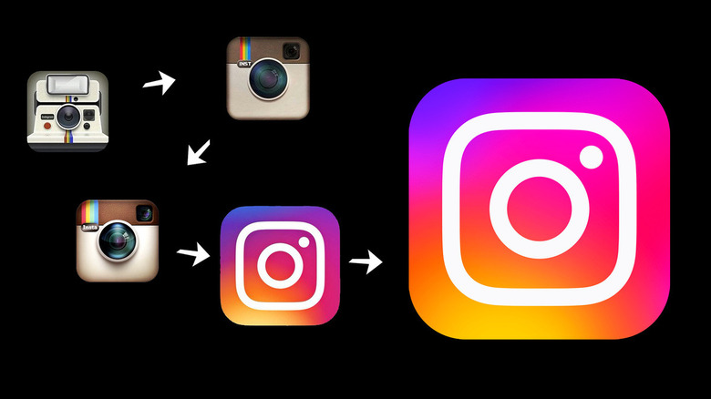
The Instagram icon is certainly far from its monochromatic yet detailed vintage design origins. Its modern iterations might appear more basic, but now, it's simply brimming with colors that are brighter than ever before. The designers behind Instagram's logo change aimed to "bring more vibrancy" and make it feel "illuminated rather than one-dimensional." The new colorful gradient doesn't just apply to Instagram's icon either, it's also incorporated into the app's overall theme, including Instagram Stories and Create Mode. It seems like this also translated to Twitter user reactions which were anything but one-dimensional.
One user posted a tweet comparing the refreshed icon to a blurry YouTube thumbnail from 2013, while another user's tweet mocked the redesign for being too saturated. The tirade on Instagram's new look continued with more tweets claiming the bright colors hurt their eyes, while others are saying they just outright hate it. On the other hand, some actually appreciated the change, with a Twitter user even lauding it for being "fresh and modern." Of course, the rest remained pretty clueless about the changes saying Instagram's new icon pretty much looks the same, and others just don't see any difference at all.
The new Instagram update isn't just about colors
The highlight of Instagram's update might have revolved around its ebullient new color scheme, but the redesign changes included text display and typographic logo as well. Its new "Instagram Sans" font style now makes characters appear angular yet circular at the same time, a look it describes as a "squircle." As odd as that sounds, this supposedly represents Instagram's identity and promotes freedom of expression among its users. Just like the new Instagram logo, however, this change also led to a mixed reception from users.
Instagram head Adam Mosseri announced the design changes in a tweet, which was naturally met with various contradicting reactions. Some users tweeted calling the redesign ugly when compared to the old one, while another Twitter user claims the changes made them stop using the app altogether. On the flip side, there are also those who had some nice things to say about it, including users who actually liked its "swirly" aesthetics, and others even heaped on praise generally exclusively used as a human descriptor. It would appear that graphic designers might be the key audience for the font, in any case.
Meanwhile, there are tweets imploring the company to focus on refining its app experience instead of making things look prettier, with some going as far as threatening the CEO with a boycott if improvements aren't made.


