iPhone 14 Pro Max Dummy Unit Reveals One Big Design Change
In early May, Google revealed what its next big smartphone will look like when it launches later this year. The Pixel 7 will, thankfully, remain mostly the same as its predecessor, save for subtle design differences with the cameras on its back. In the fast-changing world of smartphones, sticking to the same design for one generation is considered unwise by some, trading brand recognition and familiarity for sensationalism and attention. Of course, Apple has always bucked the trend and stayed with its standard design for three or four generations before making big changes, and it seems it's about time for that to happen.
That said, the iPhone 14 Pro Max will most likely continue to look and feel like the iPhone 13 Pro Max, even if it finally ditches the old notch for something else. Leaks about the iPhone 14 series naturally abound by this time — all of them unofficial, of course. While the internal specs still seem to fluctuate, the most telling changes seem to be on the outside, particularly on the front of the iPhone 14 Pro Max. It seems that Apple is finally ready to say goodbye to the notch it launched half a decade ago, but it's still uncertain whether this new design is better or not.
The YouTube channel Unbox Therapy acquired a dummy iPhone 14 Pro Max unit that was created based on the specifications and CAD renders that were leaked over the past weeks and months. These schematics are supposed to be used by accessory makers to ensure that their cases and other products will fit the upcoming iPhone 14 series. Unlike most dummy models, however, this one is supposedly really built to spec, which also means it would weigh the same as the real thing.
Dummy unit shows a familiar design
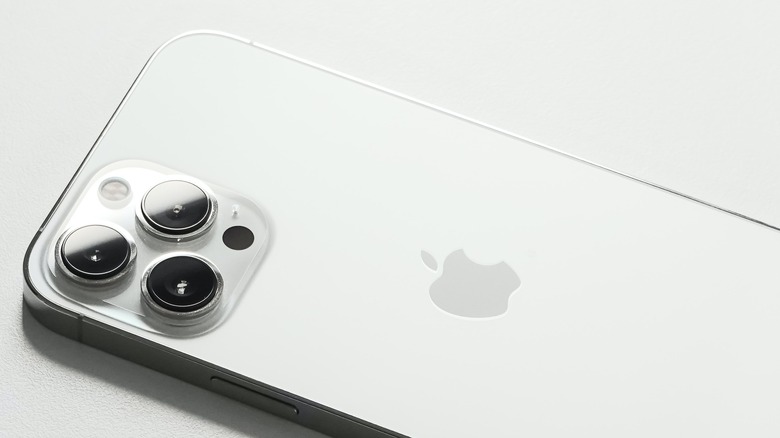
In terms of the overall design, the iPhone 14 Pro Max looks exactly like the iPhone 13 Pro Max from last year. It is reported to even feel the same in both weight and width. A digital caliper, however, reveals that the upcoming giant could actually be wider and fatter, though that might not matter much in the hands of users. The camera bump is noticeably larger, though, and the cameras themselves jut out from the surface more. The entire layout of buttons, SIM card tray, speakers holes, and charging port is completely the same, though with slightly fatter buttons — and, yes, it still uses a Lightning port.
Although it's difficult to see on a non-functional unit, the biggest visible change will, of course, be the switch to a pill-shaped cutout side-by-side with a more standard punch-hole, assuming the leaks are accurate. This replaces the notch, which was already significantly reduced in size in last year's models. The bezels around the screen of the iPhone 14 Pro Max are supposed to be thinner, too, though that may have nothing to do with the move away from a notch. The decision was allegedly made due to how the front camera needed to be a bit bigger, which would have made the notch bigger, too.
This "pill and hole" design will reportedly be exclusive to the iPhone 14 Pro line, leaving the base iPhone 14 model with an old notch. It's also curious that Apple is rumored to be cutting back on the number of iPhone models it will launch, ditching the "mini" this year. All-in-all, the iPhone 14 Pro Max doesn't seem to offer anything significant for users to upgrade, at least based on design alone. It might be a very different story on the inside, though, which is typical of Apple's strategy.
