IKEA And Sonos' Picture Frame Speaker Has One Big Problem
Sonos and IKEA have returned with another surprisingly affordable speaker, but the SYMFONISK Picture Frame hides its music in plain sight. In the process it has added a new element of design to the partnership though, as excited as I am for more attainable connected speakers, I can't help but feel that neither company has quite closed the loop on this third product.
I'm a big fan of Sonos and IKEA's original SYMFONISK range, particularly the bookshelf speaker. At $99 it's the most affordable speaker you can buy which will integrate with Sonos, and that opens up the door to expanding a Sonos system into rooms and spaces you might not otherwise have been able to justify. Home offices and kids bedrooms are good examples, but the affordable speaker also serves well as components for a rear surround sound system too.
Even when it launched the bookshelf and table lamp speakers, IKEA and Sonos weren't coy in promising more from the SYMFONISK series. It was to be a long-term collaboration, the two companies insisted, leveraging the mass-market design chops of one with the tech-savvy of the other. We had to wait, of course, almost two years to see the third product arrive.
I'll confess, I'm left scratching my head a little at the new SYMFONISK Picture Frame. Announced yesterday, it takes Sonos into a whole new form-factor compared to what the company is familiar with.
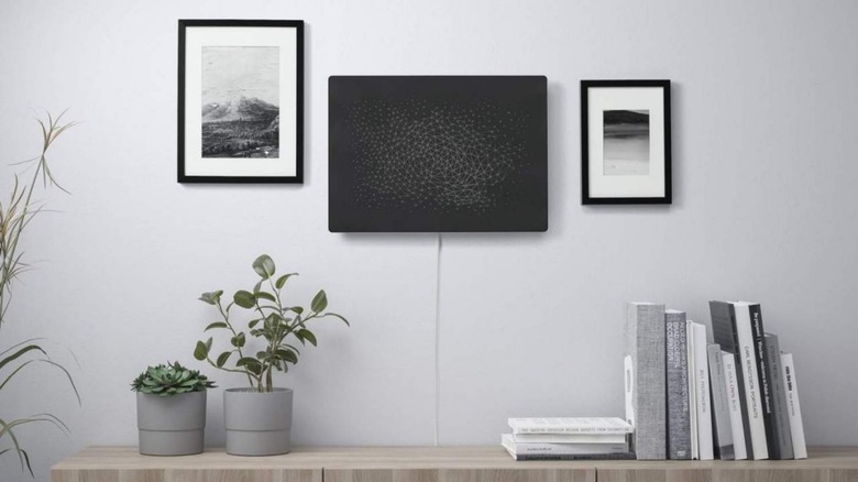
Sonos speakers aren't exactly attention-grabbing, and Sonos Architectural installations can be positively surreptitious. However the new speaker for IKEA goes one step further, effectively hiding the audio side of things even as the SYMFONISK sits on the wall. Only the power cable really gives things away.
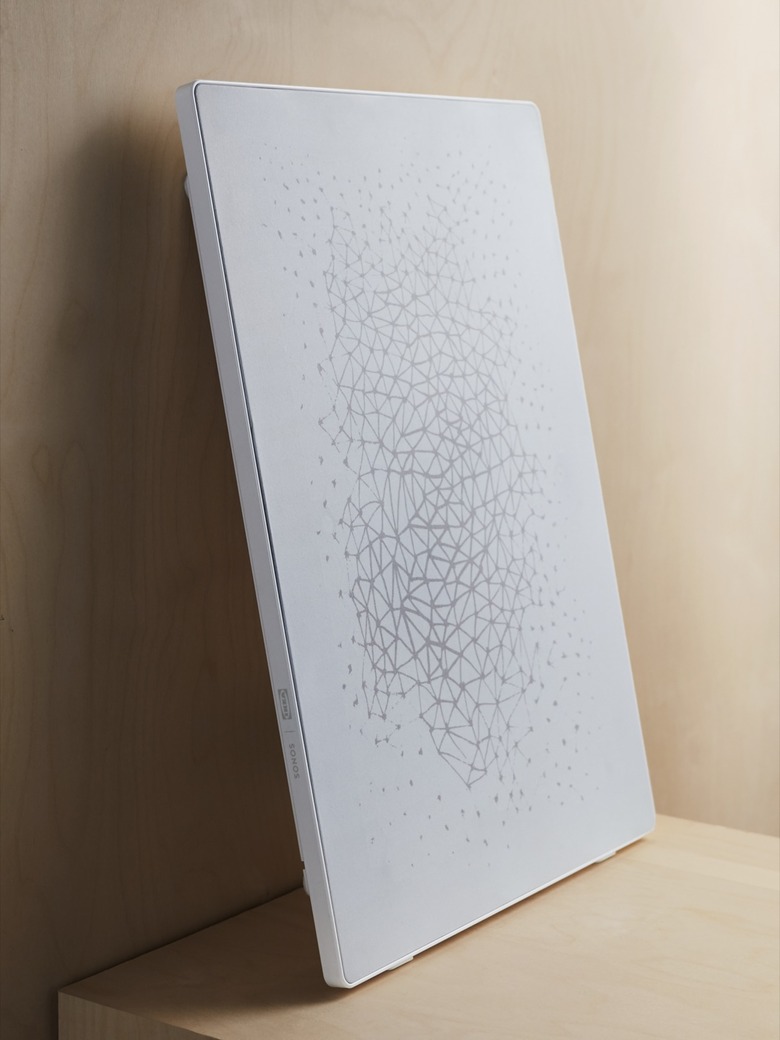
Speaker companies have tried flat speakers before, but never quite like this. IKEA's contribution is, in no small part, the price tag. Yes, at $199 the picture frame is the most expensive of the SYMFONISK line-up so far, but it's a far, far cry from the super-premium flat speakers we've seen attempted in the past. At 2.36-inches deep it's not quite as slender as them, either, but I suspect the cost/thickness balance will be far more acceptable in terms of people opening their wallets.
What I struggle with, though, is the idea of it being a picture frame at all. More specifically, the fact that right now there's no way to actually use your own art in there.
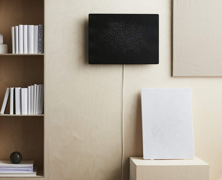
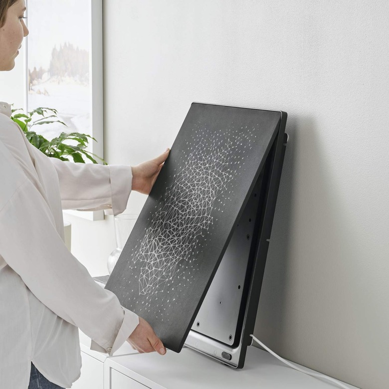
IKEA has designed it so that the picture pops out and can be replaced. The frame – in either black or white – is super-slim, to the point that you don't really see it around the edge of the picture insert, but it means that you'll be able to swap the default image for something new. That is, assuming IKEA has a design you like.
The two standard art pieces are the handiwork of European artist Jennifer Idrizi. They're apparently inspired by visualizations of music and inter-connections, the result being an abstract interplay of lines that are more like a topographical network map than anything else. Neither is unpleasant, and you could easily picture them on the wall of a fancy apartment building's show-suite.
At the same time, though, they're hardly striking in an art sense. IKEA will have a couple of other designs, following on in August, and the retailer says that more versions will follow – and vary by geographic location – in due course. Much like the furniture company's regular range evolves with the seasons, so too will SYMFONISK art, it seems.
What I'd really like, though, is the ability to put my own pictures in there instead. I doubt I'm alone in that. I suspect the challenge is that IKEA isn't using paper or canvas for its art, instead relying on some sort of mesh that's still acoustically transparent despite also showing Idrizi's handiwork.
For now, Sonos tells me, there's no provision for custom art for the SYMFONISK Picture Frame. That could change in the future, of course, and I really hope it does. The ability to upload a picture and have it reproduced on a speaker-compatible mesh seems like the sort of home decor idea people would love, and the Sonos audio side of that would be the gravy on top.
Honestly, I'm not sure SYMFONISK is going in the direction I – and others – expected it to. Sonos and IKEA's plan to democratize music and design looked, initially, like a value play: the value that IKEA is already known for with so much of its range. However instead we've seen the attainable design side be emphasized, a reminder that part of IKEA's charm has long been that it works with individual designers on products that are not only distinctive to look at but can be cost-effective to manufacture and ship at scale.
That's arguably a far more exciting approach to the home audio category, and one I hope we don't have to wait another two years to see the next installment in. More immediately, though, my fingers are crossed that Sonos and IKEA join up the dots on this new SYMFONISK offering, because while art is nice, art with personal meaning can be truly uplifting.


