3 iPhone X Facts That Made Me #TeamNotch
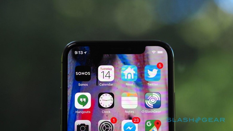
Not since Apple ditched the headphone jack has a Cupertino design decision been so controversial as the iPhone X's notch. The unusually-shaped OLED screen on the flagship smartphone is still dividing opinion, months after we saw it for the first time. After living with the iPhone X for a few weeks, however, I've been swayed over to #TeamNotch for a few key reasons.
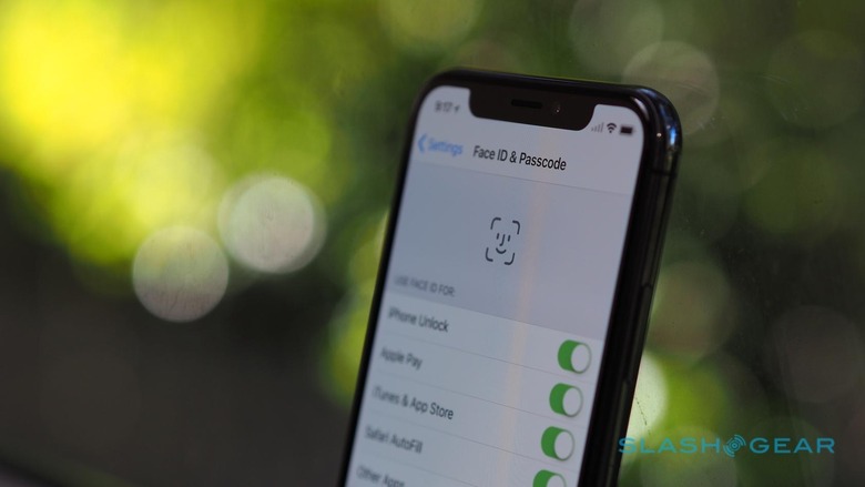
Face ID is super-slick
I hadn't realized how annoying the Touch ID sensor was, until I lived with Face ID. Apple's facial recognition system is currently making headlines for its apparent ability to be fooled with a complicated, 3D printed mask, but I suspect I lack the sort of arch-enemies who would go to the time and effort of producing such a thing. Instead, I'm just left marveling at how slick Face ID makes using the iPhone X securely.

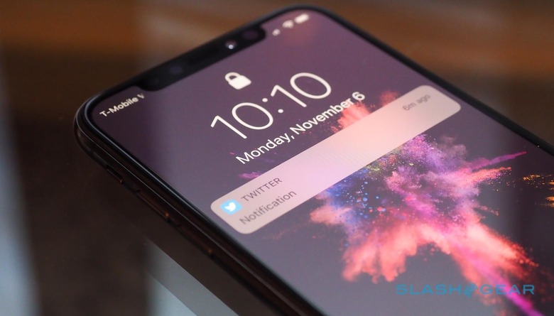
I've already talked about how much lock screen notifications are improved with Face ID masking them. Apple cleverly decided to bake its new biometric security into the same developer APIs that apps relied on for Touch ID support. That means plenty of existing software I was using "just works" with my face to unlock it instead. Invariably that process happens before I've even stopped to think about the fact that a secure log-in is required.
It's the perfect tweener
People generally like big-screen phones, but until the iPhone 7 I refused to be swayed. It took the iPhone 7 Plus' dual cameras – which you just couldn't get on the smaller, 4.7-inch model – to coax me into carrying the bigger handset. I wasn't a fan of the overall size, but I didn't want to give up on the optical zoom.

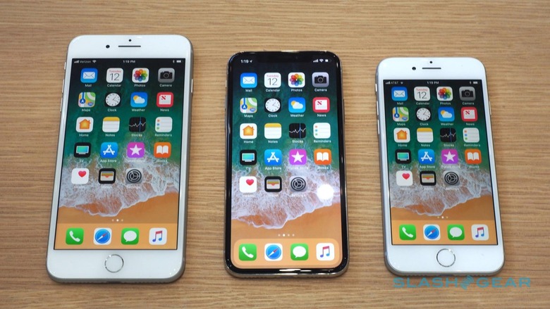
Fast forward to today, and the iPhone X slots neatly in-between what we've come to expect from regular and "Plus" sized iPhones. In my hand, it's more akin to the iPhone 8. In terms of screen size, however, it's more like the iPhone 8 Plus. Meanwhile, I don't have to sacrifice the dual cameras on the back.
I wouldn't be able to get all that without the notch. Had Apple stuck with a normal screen shape, it would've had to accommodate the TrueDepth camera, speaker, and other components above the display. That would've meant either a longer phone – which would've skewed the proportions oddly – or, more likely, Apple opting for a smaller screen.
Attention is the next qualifier
The iPhone X knows what you're looking at, courtesy of the TrueDepth camera, and that's a surprisingly rich seam of data to mine. Right now, it means the iPhone X won't dim its screen if it knows I'm looking at it still, even if I'm not touching the display. If an alarm goes off while I'm using the phone, it will do so at a much lower volume since it knows I'm already paying attention.

I'm very curious about where Apple – and third-party developers – could take this. I can envisage a time when attention is the new multitouch: notifications that open or vanish depending on how you look at them; text-selection that's controlled by your gaze. Not to mention the accessibility opportunities that are opened up, such as screen magnification that follows where you're looking, or text-to-speech based on attention. That all relies on the TrueDepth camera living in the notch.
Wrap-up
MORE iPhone X Review
Design is invariably about compromise. On the screen, it was easy for me to dismiss the iPhone X's notch as a cop-out by Jony Ive and his team: a weirdly inelegant glitch in what was meant to be a "bezel-less phone." After having lived with the iPhone X, however, how I judge the balance of that compromise has shifted.
The notch is still there, and no smaller than it was physically, but how much it annoys me is much reduced because I've come to value the features it enables. Without it, I'd have to sacrifice either form-factor or the TrueDepth camera. Turns out, after some time with both, I'm unwilling to do that.
