Apple Packaging: What Makes Unboxing The White Boxes So Special
Apple makes well-received products, but something that sets it apart from other brands is its attention to detail. From tight corner radius rules and iconography to the familiar look of Apple Store interiors across the world, the company's aesthetic language stands apart. That standout appeal even extends to its packaging. In fact, the famed "unboxing experience" has become part of the techno-cultural identity of Apple products (and users).
Now, the boxes aren't extraordinarily premium, nor do they embrace a fancy look that would put origami artwork to shame. Instead, it's the simplicity of the design, the fuss-free organization, and the material quality that sets the boxes apart. However, it's not just a matter of making the boxes look clean and slapping an Apple logo on the top. From careful color choice to the amazingly snug fit to the font styling, everything has been rigorously thought over to leave a lasting impression.
Apple dedicates no small amount of resources to the design and testing of the boxes its devices come in, and as its product portfolio has evolved, so too have its packaging choices. However, something that's never changed over the years is the company's focus on the fundamental appeal of its boxes. Let's dig into what makes them so special.
The famed design lab for boxes
In his book, "Inside Apple," author Adam Lashinsky reveals that there is a dedicated room in Apple's offices devoted to designing the packaging for Apple hardware. Apple takes the packaging aesthetics so seriously that this room is apparently off the limits for most staff. Only a handful of employees can access it, and only with a special badge card.
Lashinsky describes a time during the design process of a new iPod model, when the room is filled with hundreds of prototype boxes, simply to put designers in the buyer's seat and let them really fine-tune the whole unboxing experience.
"One after another, the designer created and tested an endless series of arrows, colors, and tapes for a tiny tab designed to show the consumer where to pull back the invisible, full-bleed sticker adhered to the top of the clear iPod box. Getting it just right was this particular designer's obsession," he writes.
The tab in question was precisely cut and required just the right magnitude of pulling force to pry apart and open the box, but its design served another important purpose. When boxes of Apple gear were stacked together after leaving the factory, it created a negative space between them that kept it from getting damaged during transit. This ensured the experience of opening the box would be exactly as intended for each individual customer.
Knocking at the government's patent office doors
Mike Markkula, one of Apple's lesser-known first employees who spent 20 years at the company, was also obsessed with making a solid first impression of a product. In his biography of former Apple CEO Steve Jobs, Walter Isaacson writes that Markkula had printed a document titled "The Apple Marketing Philosophy."
"We may have the best product, the highest quality, the most useful software etc.; if we present them in a slipshod manner, they will be perceived as slipshod," Markkula wrote. "If we present them in a creative, professional manner, we will impute the desired qualities."
Setting up a dedicated design lab for product packaging already shows Apple's obsessive focus on serving a refined experience. However, knocking at the doors of the United States Patent and Trademark Office (USPTO) with the packaging sketches of a non-flagship product is a whole new level of obsession.
Yet, Apple did just that with the iconic see-through box of the iPod music player. "The iPod media player is also known for its elegant, yet simple design. It may diminish from the aura of such a well designed product to present it to consumers in a standard cardboard box. A package that is more fitting of the high-tech design of the product is what consumers have come to expect," Apple wrote in the patent application.
The psychology of leaving no buyer behind
One might assume that designing a box should be a straightforward process, given the relatively low stakes. That's not how things work at Apple. "The inexpensive box merits as much attention as the high-margin electronic device inside," writes Lashinsky. At Apple, every element of its product is an experience in itself and must tell a meaningful story. Another astounding yet often-ignored aspect of unboxing an Apple device, is the uniformity of it all.
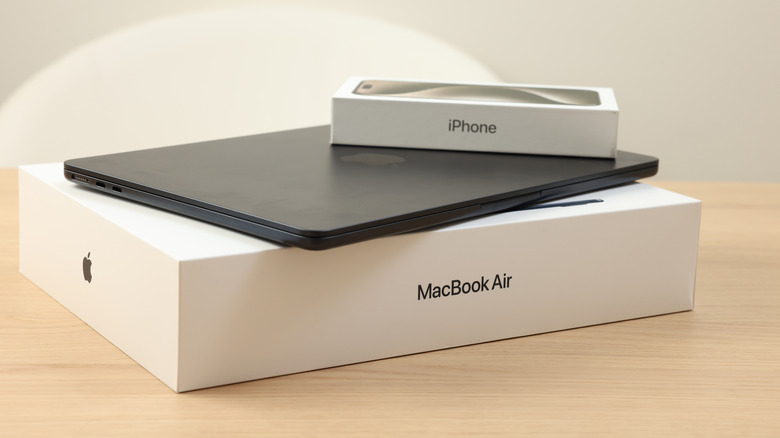
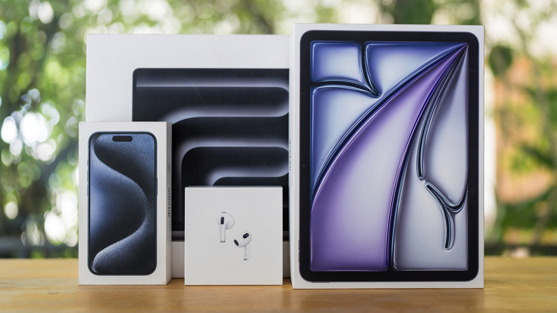
A familiar unboxing experience cultivates a unique brand experience of its own, but there's more to it than meets the eye. It's a subtle message from the brand that there's no quality compromise, irrespective of how deep your bill runs. Take for example the retail boxes of Apple's latest iPhones and its Mac computing gear. It doesn't matter whether you are buying a maxed-out MacBook Pro with the latest silicon or an iPhone that costs as little as $599.
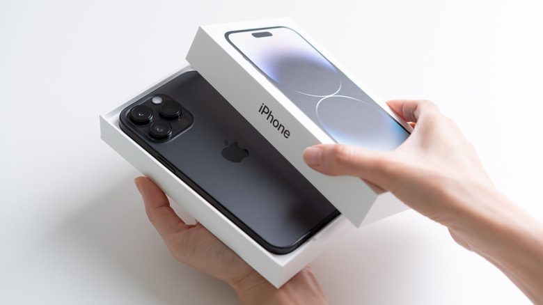
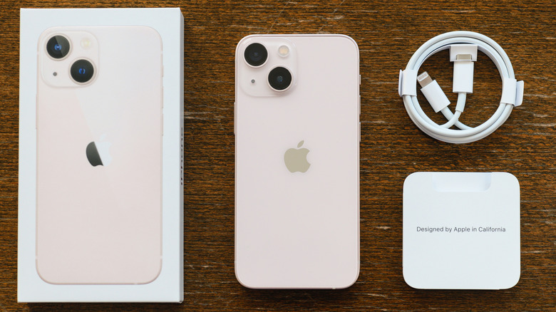
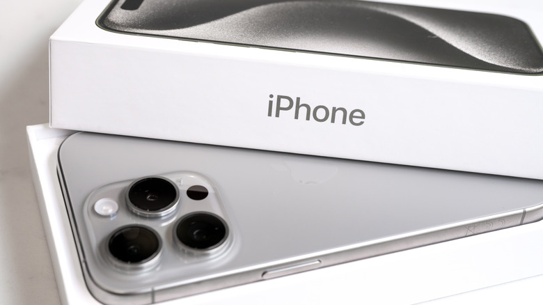
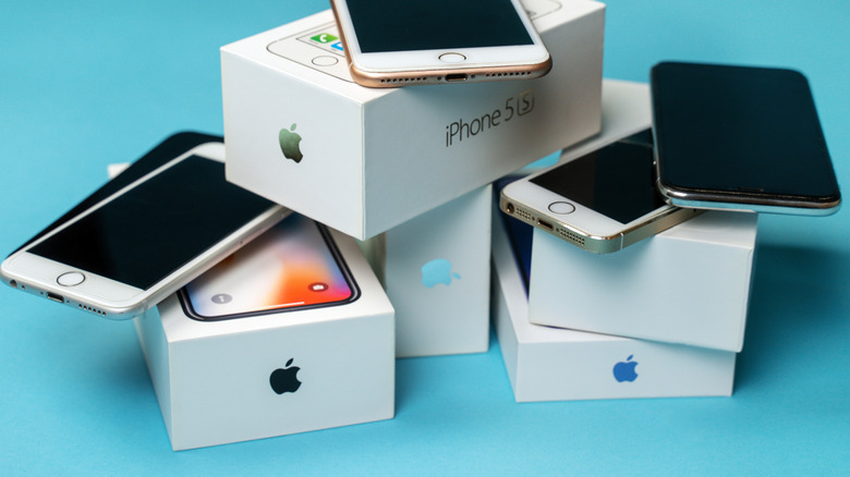
Each product comes in a familiar white box. You pull a familiar tab on the underside. There's a familiar resistance between the cover and the base as the two halves slowly part away. It's Apple's way of telling users that no matter the amount they spend, they won't be served a watered-down experience. The paper cover is a shared trait, and so is the straight adhesive line. Everything comes off and reveals the underlying gear neatly placed in its own open chambers without any obstruction.
The mental science
In the age of social media, distinctive product packaging has become a form of social currency. According to ad research firm Mountain, 62% of people watch unboxing videos while exploring a product. These videos are the fourth most influential type of social content. People often post pictures of their latest electronic gear purchase and share short unboxing clips as story updates.
That social currency — inherently tied to a brand's unique appeal — can be conveyed best with familiarity and nostalgia. For example, Coca-Cola's preference for a certain shade of red, font styling, and signature glass bottle has stood the test of time. Apple isn't doing anything differently to that.
The all-white box with sharp corners, minimal branding, and large imagery depicting the product inside have become hallmarks of Apple aesthetics. Just like how you can recognize a cylindrical Pringles tube from afar, you can identify the box of an iPhone or Mac with similar ease.
According to a blog post on Packaging News by Group Marketing Manager of Graphic Packaging International Nicki Clark, the more colors one adds to packaging, the less sophisticated it feels. White, in her expert opinion, is a sign of purity and simplicity. And that second value is particularly vital. Citing research published in the Journal of Marketing, Australian branding agency Brandwell released a blog post discussing how low visual complexity, minimalism, and sustainability are all more appealing to a buyer.
Apple's product packaging exemplifies all these principles. Its boxes are aesthetically clean, visually straightforward, high quality, and display strong messaging.
A message that hits the deep tones
A recurring theme within Apple's press releases detailing new products is their environmental focus. Take for example the iPhone 16e's blog post on Apple's website. It clearly mentions that the box is made entirely out of fiber-based material, bringing Apple closer to its goal of removing plastic from its product packages by the end of 2025. Does that revelation matter to an average customer?
According to research published in Advances in Economics Management and Political Sciences, promotional work tied to a product's packaging plays an important role in purchasing decisions for buyers. The paper found that "many consumers are more concerned about the brand story, emotions, and values conveyed by the packaging," and that emotionally resonating with these things made them more likely to buy a product.
The environmental factors tied related to the concepts of good packaging highlighted how it should be tied to minimal resource wastage and not add to the pollution burden. Another paper published in the peer-reviewed Biological Forum journal details a study conducted among college-going students, noting that 33% of the participants prioritized eco-friendliness within a product's packaging.
The usage of plastic could theoretically allow designers to make an avante-garde package to grab eyeballs. However, ditching a notoriously persistent polluting material sends a strong message that Apple's priorities side with the planet's well-being rather than standing out with flashy boxes.
Standing the test of time, in style
In 2021, professional photographer Johann Clausen detailed a personal project where he creatively highlighted the inside view of Apple's packaging boxes. "They are well-engineered and well-designed white cardboard objects which are negative shapes of the objects they contain," Clausen told Wallpaper. "They speak the same visual language and give off a familiar, comforting aura." Clausen's findings are not surprising given Apple's history.
From a consumer's perspective, however, there are a few more aspects that come into play beyond the original unboxing. If you got to Reddit, you'll find users discussing how they didn't like throwing away the boxes, even long after opening them. Others mention how safeguarding the boxes comes in handy for keeping the resale value of used predicts a tad higher than the usual market rates.
Users on social media have shared how they use the retail boxes as desk organizers, find a place on kitchen shelves, or even double as gift boxes. One tinkerer turned an iPhone box into an Atari controller with a functional joystick. On eBay, you can even find empty boxes for the original iPhone going for $100 a pop.
Traders are selling entire bundles of product boxes for the recent generation iPhones, too. I've never seen the box of product, especially one that moves millions of units each year, sell like a commodity in itself. That speaks volumes about the everlasting appeal, and the quest to offer the signature Apple unboxing experience, even if it's a used or refurbished gear inside.
The not-so-good side of it all
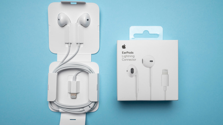
Over the years, Apple has reduced the number of accessories included in the retail package of its devices. In particular, the iPhone has steadily lost key items such as the bundled wired earphones and charging brick. Apple has argued that the move is aimed at reducing the electronic waste burden. In doing so, it also set an industry-wide precedent, and that's why Samsung doesn't offer similar accessories anymore either.
However, by that minimalist strategy, Apple has also burdened the consumer with buying gear that is indispensable, like the charging brick. Considering the premium Apple asks for its gear, that financial pinch can be pretty pronounced. And those peripherals all come dolled up in their own standalone retail packages, further adding to the footprint of boxes that will inevitably end up in the garbage.
Moreover, unlike the packaging box of an iPhone or a Mac, the boxes for its peripherals are neither exceedingly premium, nor can they be repurposed to the same extent. That means they will quickly find their way to the trash can. This strategy somewhat complicates the whole environmental side of the argument, to say the least. Yes, Apple has repeatedly claimed that it uses recycled materials to minimize the impact, but not all of its packaging ends up in the recycling bin.