Hidden Meanings Found In Famous Automotive & Tech Brand Logos
Logos are everywhere — on smartphones, cars, clothing, and almost everything else made by a company with an identity. Logos help with quick identification and mean something to a brand. They tell a story, build trust, signify essential elements of business philosophy, and most importantly, make brands unforgettable. Even if a brand has a simple logo, odds are plenty of thought went into the design. A logo can incorporate hidden meanings, secret symbols, or a reference to the company's history.
Peugeot, one of the oldest car brands in the world, was the first automobile builder to use a logo. It introduced its famous lion symbol in 1850. The symbol was based on the characteristics of Peugeot's flagship product at that time, a saw, and the emblem emphasized speed, flexibility, and bite. In 1858, it became the official brand logo, and by 1907 it began gracing every Peugeot car
IBM was among the early tech companies that used a logo. Several name changes, including International Time Recording Company and Computing-Tabulating-Recording Company, required a new logo for each new name. However, the 8-bar logo design – the three letters of the company name, International Business Machines, rendered in eight horizontal lines created by noted graphic designer Paul Rand — has remained unchanged since 1972.
Today, we examine some of the most famous automotive and tech brand logos to discover the story behind the symbol.
Toyota's ovals
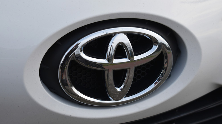
Toyota is not only one of the most reliable car brands in the world, but it is also famous for making some powerful cars. Toyoda — now known as Toyota — was founded in 1937, and the brand has since become one of the biggest car builders in the world, producing around 9 million vehicles every year.
To establish the company's name as a car maker, founder Sakichi Toyoda created a badge with the word Toyoda in the center. The three-oval logo that is used on all current Toyota models debuted in 1989 on the Celsior luxury model, which also happened to be the year the company celebrated its 50th anniversary.
The company invested around five years to develop the Toyota logo, which has meaning and represents the car builder's rising status in foreign markets. The ovals inside the larger oval are arranged to form a T for Toyota while calling to mind the relationship between the customer and the company, with one oval symbolizing the customer's heart and the other representing the heart of Toyota. The outer oval encircling both signifies the world embracing Toyota.
Audi's rings
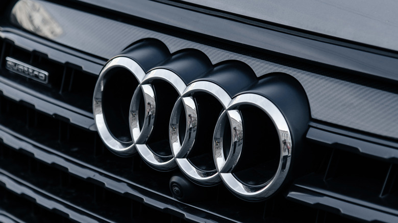
The Volkswagen Group-owned automobile maker Audi has a fascinating logo history. The company is globally popular for luxury and performance cars, but it was not always the corporate entity of modern day.
Before the modern Audi became what we know today, four German car companies — Audi, DKW, Horch, and Wanderer — came together in the 1930s to form Auto Union AG. Each ring signifies one of the contributing companies. Based on the early logo designs, the first ring represents Audi, the second DKW, the third Horch, and the fourth Wanderer. The interconnection between the four rings highlights the company's past achievements, ongoing endeavors, and future aspirations. The logo has been used for nearly a century but remains visually captivating and fitting for the modern era while preserving a sense of evolution and refinement.
The symbol adorning some of the best German cars in history has undergone several changes. Still, it continues to represent the combined endeavors and shared ambitions of the four companies ever since they joined forces.
Mercedes-Benz's three-pointed star

Mercedes-Benz is one of the major luxury brands in the world. The German carmaker has been in business for over 140 years and has a portfolio of vehicles, including some models that demand upwards of $300,000. Mercedes-Benz cars are known for sheer luxury and advanced features, but it is the logo that makes any Mercedes-Benz instantly recognizable anywhere in the world.
The three-pointed star in a circle expresses luxury and innovation, with a history dating back to 1909. The Daimler brothers took inspiration for the logo from a design their father made on a postcard in which a three-pointed star marked his company's home location. The brothers adopted the logo for their own company, then known as Daimler-Motoren-Gesellschaft (DMG). The logo has undergone some subtle changes. In 1926, the three-pronged star was red with a laurel wreath border, but changed to silver in 1934.
Each point in the three-pronged star represents land, sea, and air, where the company aspired to compete. The company also makes a range of high-end performance cars under the AMG banner, in which the A and M stand for the first two letters of the last names of Mercedes founders Hans-Werner Aufrecht and Erhard Melcher, while G stands for Großaspach, where Aufrecht was born.
BMW's propeller
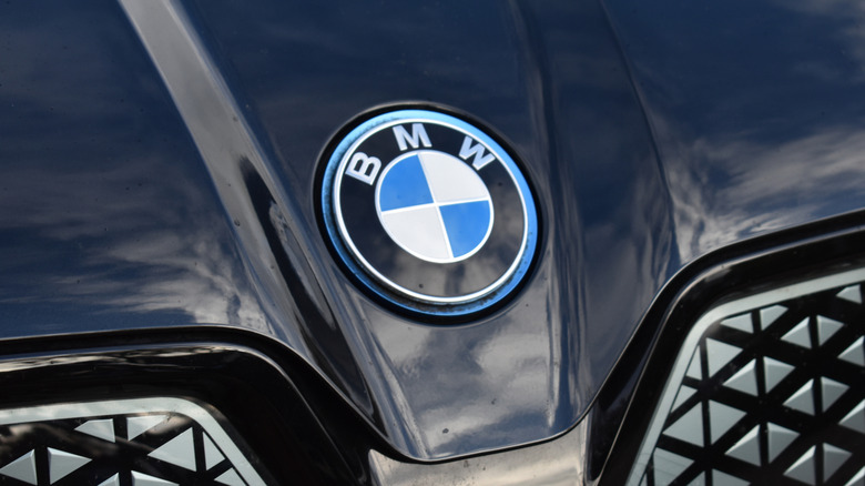
Despite its worldwide recognition, few little-known facts about BMW remain. For example, BMW is an acronym for Bayerische Motoren Werke, translating from German to English as Bavarian Engine Works. The company was established in 1913 in Bavaria and initially manufactured various types of engines used during World War I under the name Rapp. In addition to BMW producing iconic cars, it also manufactures motorcycles.
The company did not have a logo when it was first registered as a commercial entity in July 1917. The first BMW logo featured two gold lines with the letters B, M, and W written in between, but it didn't last long. The initial iteration of the modern BMW logo arrived on October 5, 1917, in the colors of the Bavarian state, not representing a spinning propeller, as some believed.
The meaning behind the BMW logo is often misunderstood. "Many people believe the BMW logo is a stylized propeller, but the truth is a little different," said Fred Jakobs of BMW Group Classic. This misconception originated after a 1929 BMW ad showed the logo within the spinning propellers of an aircraft. Although the logo has evolved, the blue and white colors have remained its centerpiece.
BMW established its high-performance vehicle division, known as BMW M GmbH, in 1972. The current version of its logo was introduced in 2020 and features three colored stripes joined to the letter M, in which blue stands for BMW, red for motorsport, and purple for the combination of the two.
Hyundai's handshake
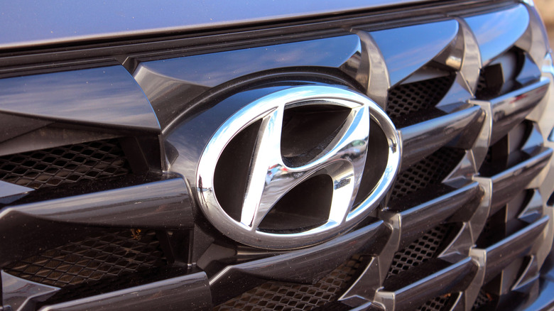
The Korean automotive giant Hyundai was established in 1967. Today, the company sells popular models like the Ioniq 5, Ioniq 6, Kona, Tucson, and more via a global distribution system that includes Amazon. Over the years, various logo iterations appeared, but the most prominent one remains on all Hyundai vehicles today. Understanding the meaning behind the Hyundai logo requires knowing a few key details.
Hyundai's logo resembles two people shaking hands, representing a union between the salesperson and the customer. It also depicts Hyundai's customer-first philosophy, with its angled appearance making it seem to lean forward, symbolizing progress. The oval surrounding the letter represents the brand's global expansion.
Hyundai also has a luxury division called Genesis, which became a separate sister company in 2016. Its logo has a set of two wings surrounding a black shield with the Genesis name inside, symbolizing the premium segment to which the brand caters, similar to brands like Aston Martin or Bentley.
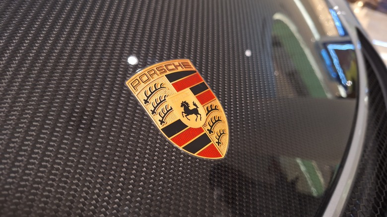
Porsche's crest
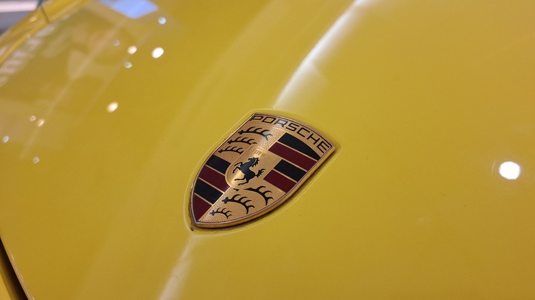
Porsche is a brand famous for its beautiful and luxurious high-performance cars, and its logo is well-recognized as a status symbol worldwide. The brand's first logo debuted in 1952 and is officially known as the Porsche Crest. Designed by Franz Xaver Reimspiess, it features a horse in the center, inspired by Stuttgart's city seal. The horse represents power, agility, and elegance, while the red and black stripes are the traditional colors of Württemberg-Hohenzollern. The antlers represent the coat of arms and the word Stuttgart at the center pays homage to Porsche's home city.
Beginning in 1950, the company featured its name on the car's body in lieu of a logo. An Austrian-born U.S. car importer, Max Hoffman suggested creating a proper symbol to represent the company. In 1951, a design competition among German art academies led to the development of the Porsche crest, with a heavy emphasis on Stuttgart as inspiration.
The most recent version of the Porsche crest was introduced in June 2023 to celebrate 75 years of Porsche sports cars. The latest crest preserves historical elements and retains its meaning, ensuring it remains timeless. Michael Mauer, Vice President of Style Porsche, explains, "With its cleaner and more state-of-the-art execution, the refined crest communicates the character of Porsche."
Volvo's iron
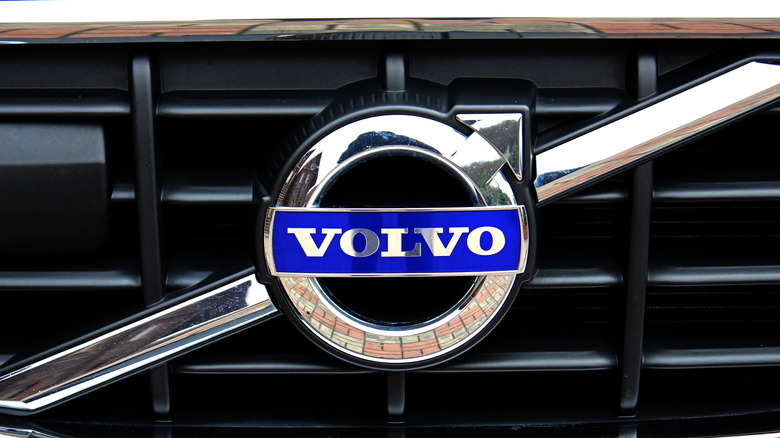
With nearly 100 years of car-making experience, Volvo has cemented its name in the industry as an innovative and reliable brand. The company introduced its first vehicle in 1927. At times, keeping track of who makes Volvo cars and where they are built could be challenging. The brand has changed ownership multiple times, including a stint under the auspices of Ford. Currently, it is owned by Geely, a Fortune 500 company. Despite these changes, Volvo's logo has remained consistent throughout its history.
The word Volvo is derived from the Latin verb volvere, which means to roll. However, the word was conjugated to volvo which means I roll. Volvo became a registered trademark in 1911, producing iron ball bearings under its appropriate new name. While some believe that the design behind the Volvo logo represents a male symbol, that is not true. The design was inspired by Sweden's key Industrial Age product — iron. The symbol in the Volvo logo is an alchemical symbol for iron, a stylized arrow drawn to the upper right, which dates back over 5,000 years.
The current Volvo logo features a blue badge in the middle of the ancient chemical symbol with the word Volvo written boldly in the center. The logo represents the brand's strength and resilience, while the iron symbol, blue color, and chrome finish portray class, stability, and reliability.
Ferrari's prancing horse
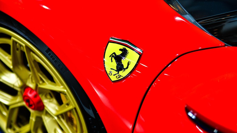
Ferrari was founded in 1929, when Alfa Romeo test driver Enzo Ferrari formed the Scuderia Ferrari racing team. After a disagreement over the direction of Alfa's racing division, Enzo left the company to plow his own pasture. After developing aircraft parts and machine tools for the Italian government during the Second World War, Enzo shifted his focus to making high-performance sports cars. Ferrari launched its first road car, the 125 S, which was based on a modified Fiat chassis, in 1947.
The black horse in Ferrari's logo was originally a symbol used by Count Francesco Baracca, a legendary Italian air force ace during World War I. Baracca painted the black horse logo on his aircraft and became a national hero when he died young in 1918 after being shot down. Enzo Ferrari met Baracca's parents, Count Enrico Baracca and Countess Paolina Baracca, in 1923. During their conversation, the Countess suggested that Enzo use the black horse to brand his vehicles.
The yellow background in the Ferrari logo is a tribute to Modena, Enzo Ferrari's hometown. The letters S and F, found in early versions of the Ferrari logo and still present in the modern shield version, stand for Scuderia Ferrari. Today, Ferrari is synonymous with beautiful high-performance cars for street and track.
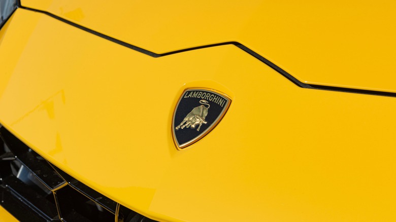
Lamborghini's bull
No list of the world's best sports car brands is complete without mentioning Lamborghini. Founded in 1963 by manufacturing tycoon Ferruccio Lamborghini, the company was rumored to originate from a dispute between him and Enzo Ferrari over the quality of the latter's cars. Formed initially to rival Ferrari, Lamborghini has become one of the world's most renowned automobile brands.
However, just like every other company on this list, Lamborghini's logo has a hidden meaning. The bull logo symbolizes Ferruccio Lamborghini's zodiac sign, which was Taurus. Additionally, Ferruccio was fond of bullfighting and admired the bull's strength and determination, making it the perfect representation of his company.
Interestingly, the bull used in the logo is the Miura bull, a famous breed used in bullfighting. The bull's stance in the emblem also represents forward motion and the relentless spirit of the company, which is also reflected in the company's sports cars. Until 1972, the bull logo was coated with black and white paint and set against a red shield. In 2024, Lamborghini introduced the latest iteration of the bull logo, featuring black and white as primary colors accompanied by yellow and gold accents.
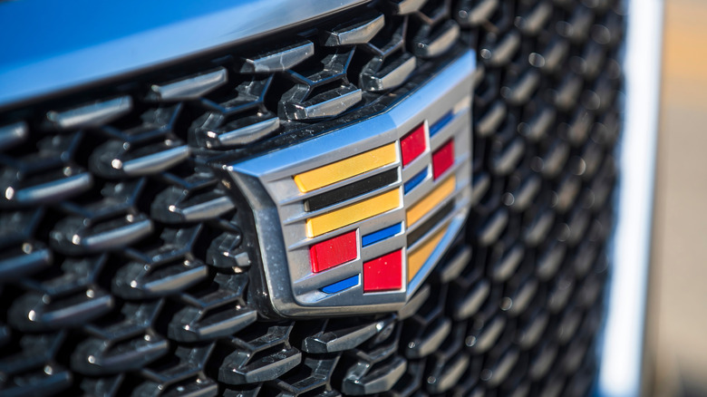
Cadillac's shield
Cadillac earned a reputation for highway cruisers that offer smooth and luxurious rides, but lately some of the highest horsepower Cadillacs ever made have emerged from the automaker's factories. Cadillac was the first in the industry to introduce an electric starter in 1911 and is among the oldest American car brands.
Cadillac is known to have redesigned its famous logo numerous times in its century-long history. While the shield has undergone several changes, its meaning has remained unchanged. The first Cadillac logo, introduced in 1905, featured a coronet with pearls and unique fictional birds called merlettes, symbolizing continuous progress. The shield in the emblem combines symbols of noble families, although the man Cadillac is named after, Antoine de La Mothe, may not have had direct ties to them. Each element in the crest has a distinct meaning representing values such as purity, charity, and honor.
Cadillac initially used a fancy script for its logo instead of a shield. Merlettes were removed in 1999 to simplify the logo, and today, the emblem is sleek, monochromatic, and even lights up in the latest luxury Cadillac EV models.
Apple's apple
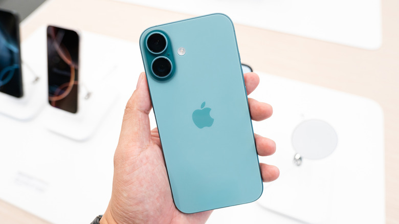
The tech giant Apple, with a market cap of over $3.5 trillion, has a fascinating history behind its logo. Apple's first logo was an illustration containing an intricate design of Isaac Newton sitting under an apple tree. The borders contained the text, "Newton ... a mind forever voyaging through the strange seas of thought ... alone." wrapped in a ribbon that read Apple Computer Co. The meaning of this logo was simple, paying homage to Isaac Newton for his contributions to science.
However, the logo wasn't practical for branding purposes and was short-lived. In 1977, Apple introduced a new iteration that included rainbow colors comprising an apple with a bite removed. You might have heard different theories about the bite mark, but it was primarily added to distinguish the apple from other round fruits. The rainbow colors represented the Apple II's color display.
There were theories that the bite on the Apple logo may play on the word byte, a unit of digital information in computers. The original designer of the Apple logo, Rob Janoff, has debunked these claims. In an interview with Forbes, Janoff stated that the bite metaphorically represented all the knowledge users would gain from using the computer. The current Apple logo retains the iconic silhouette in a dark shade.
Amazon's smile

Amazon is a tech giant that started humbly in Jeff Bezos' garage in 1994. It is now the fourth largest company in the world in terms of market capitalization, behind only Apple, NVIDIA, and Microsoft. Not only does Amazon have an iconic story, but its logo also has a hidden meaning.
Amazon's original logo debuted in 1995 and was designed by an agency called Turner Duckworth, the same company behind the current logo. The first version was in black, featuring a lowercase version of the website's name, amazon.com, at the bottom, accompanied by a symbol depicting the Amazon River. Amazon then made some changes and came up with an awful zebra-striped logo, which lacked meaning and lasted only a year.
The current Amazon logo, introduced in 2000, contains an orange arrow running from the letter a to the letter z. The arrow serves a dual purpose. It resembles a smile brought about by customer satisfaction while symbolizing the endless products the company sells.
Microsoft's window
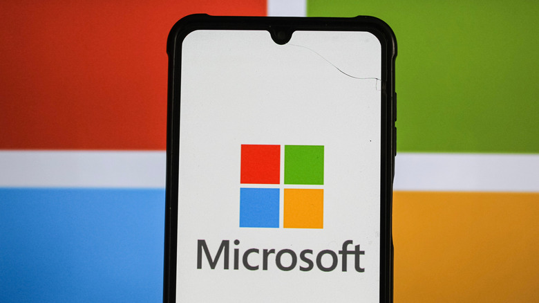
Microsoft is one of the world's top tech giants, known for its vast portfolio of apps, services, and brands. Founded in 1975 by Bill Gates and Paul Allen, the company initially focused on developing a DOS-based operating system for IBM computers — its first major business deal. Today, Microsoft's logo is so recognizable that it has become synonymous with computing.
The first Microsoft logo, introduced in 1975, was designed by Simon Daniels. It featured concentric lines with the word micro stacked above the word soft. Today, it looks like a dated reminder of the 1970s. In 1980, Microsoft updated its logo to look something from the world of heavy metal, using a font similar to that used by bands such as Metallica, Anthrax, Slayer, and Iron Maiden. It was the first time Microsoft merged the company name into a single word.
After undergoing some changes, the current Microsoft logo consists of four red, green, yellow, and blue squares arranged in a pattern resembling a window. The colors represent Microsoft's various products. The red square stands for Microsoft's Office product, the blue represents the company's operating system, the green is for the gaming division, and yellow signifies the Bing search engine.
Google's googol

In the 1990s, Larry Page and Sergey Brin developed a search engine called BackRub. Google officially came into existence in 1998 when its founders registered the google.com domain, which was supposed to be registered as googol — a mathematical term for the number one followed by 100 zeros. To Page and Brin, the term represented the massive library of information the search engine could make available to users.
Google's first logo was simple, using a Baskerville Bold font in green, red, yellow, and blue to spell the company's name. Interestingly, the first official logo, introduced in 1997, had an exclamation mark at the end, similar to Yahoo's logo. The next iteration, created by graphic designer Ruth Kedar, refined the design with a new Catull font and dropped the exclamation mark.
In 2015, Google again introduced a new logo, using a Sans typeface and flattened letters with the same color pattern. According to Looka, the four colors in the Google logo represent the company's bold, playful, and unconventional nature.