7 Of The Weirdest Car Dashboards Ever Designed
Some car dashboards will be remembered for their functionality, clarity, and style. The Jaguar Series 1 E-Type, for example, was a classic car dashboard that looked beautiful and was a pleasure to use. Occasionally, however, dashboard designers throw logic out the window in favor of creativity, grandiose ambitions, or outright absurdity. From spaceship-like control panels to bizarrely placed gauges and inexplicable button layouts, we've taken a look at some of the dashboard layouts that left a lasting impression, often for the wrong reasons.
We've only included cars that have gone into general production, which means that there are a lot of concept cars with extraordinary dashboards that didn't make the list. For example, the Maserati Boomerang, which put its entire dashboard into the center of the steering wheel, and the Chevrolet Blazer XT-1, which had a U-shaped steering wheel and nearly 100 buttons. The Oldsmobile Incas 1986 concept car also deserves a special mention for its wraparound cockpit-style control panel and yoke-style steering. Of course, it's the job of concept cars to be a bit weird. By the time cars are ready for mass production, the more extreme style elements have usually been toned down to ensure that they don't freak people out. Not so the cars on this list, though, which shamelessly unleashed all their dashboard weirdness to the public.
The hodgepodge design of the Fiat Multipla
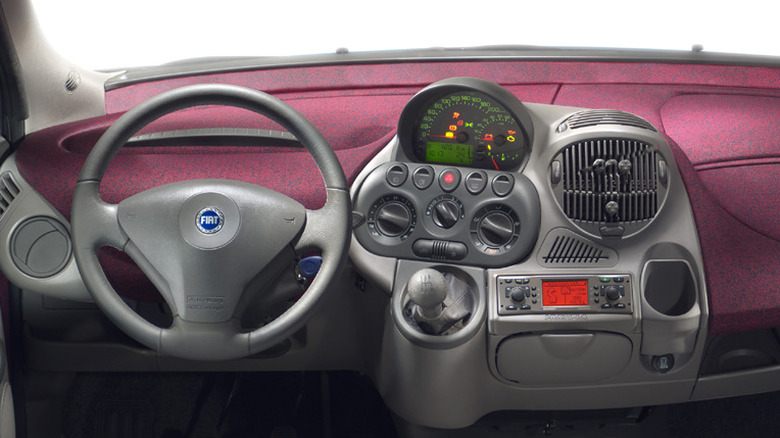
The Fiat Multipla is an automotive oddball that has earned both admiration and ridicule. Fiat never officially sold the Multipla in the U.S., but it became infamous anyway. The first-generation Fiat Multipla (1998-2004) had a bug-eyed face with an extra layer of headlights positioned between the hood and windshield. It almost looked like two different cars had been welded together. However, this six-seater car, with two rows of seats, was much shorter than other people carriers and had ample boot space.
Although the dashboard couldn't manage to be quite as weird as its 'surprised duck' exterior, it was pretty weird nonetheless. A Jalopnik reader described it as "a mass of vents, bulbs knobs, controls and everything else that just sprouted together". The Multipla's instrument cluster was placed in the right in the center of the dashboard to make manufacturing easier since Fiat could use the same dashboard for left- and right-hand drive markets, but it didn't make for ease of reading while driving. Some drivers found that checking their speed or warning lights required shifting their focus away from the road.
The dashboard was loaded with buttons, giving the driver a cockpit-like experience. The bubbly design of the dashboard and instrument panel wasn't to everyone's taste. Some thought it looked futuristic. Autocar called it "part Dyson vacuum cleaner, part R2D2." Jeremy Clarkson described the Multipla as a "mad car designed by a group of people who seemingly never met." That also applies to the dashboard. None of the controls match the other controls and the placement is wonky and asymmetrical and not in a cool way. It looks like they were all jammed on, and nobody took a step back to consider what it would actually look like.
The futuristic stylings of the Aston Martin Lagonda
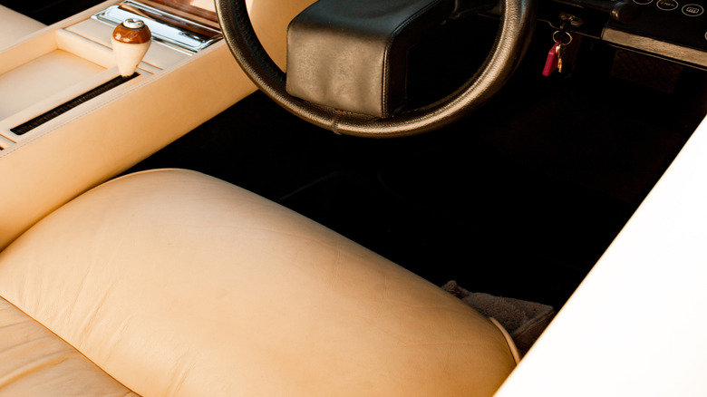
The Aston Martin Lagonda is a fascinating mix of 1970s sci-fi ambition and cutting-edge (for its time) technology, creating an interior that feels more like the cockpit of a spaceship than a classic British sedan. At the heart of the dashboard was a digital instrument cluster featuring multiple LED displays that provided speed, fuel levels, and other vital information in a bold, blocky digital font. The steering wheel sat in front of a sleek, angled dashboard, reinforcing the high-tech, 1980s Bond villain feel. It was a dramatic departure from the traditional wood-and-leather luxury interiors of Aston Martin.
The joystick-like gear handle and the computer screens led one Jalopnik reader to remark that "it looked more like a video arcade game than a car." Sadly, the electronics were notoriously unreliable. And even Aston Martin mechanics and engineers didn't always understand how they worked well enough to be able to repair them. Development of the digital dashboard wasn't cheap — it cost almost four times as much as the rest of the car. In later versions, Aston Martin experimented with vacuum fluorescent displays and even touch-sensitive controls, pushing the limits of 1980s technology past the point where it was probably a good idea. The updates added even more expense and were no more reliable.
Tesla dashboards take minimalism to extremes
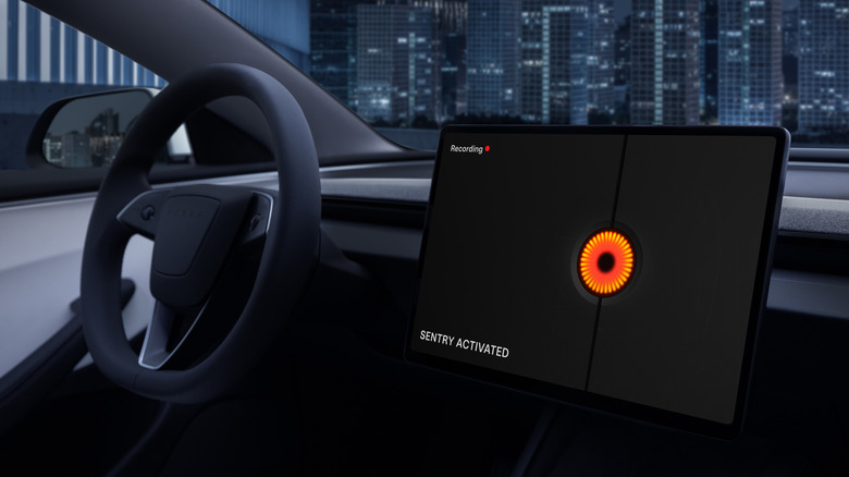
When SlashGear reviewed the Tesla Model 3 back in 2016, it called it a "2001: A Space Odyssey dashboard," and frankly, calling it a dashboard at all feels like a bit of a stretch. Teslas take sparseness to the next level. Behind the steering wheel, there's just a clean, empty dashboard. Nearly all controls are accessed through a 15-inch touchscreen in the center of the dashboard. This includes its speedometer, climate controls, navigation, and driving modes. It does have a hazard button because that's required by law, but Tesla has stripped away as much as possible.
However, Teslas do include left and right scroll wheels on the steering wheel for those who want something that's a bit more like a button and doesn't involve having to tap the touchscreen while driving. You can use the right scroll wheel to activate voice commands, adjust the cruise control, and modify the autopilot settings. The left scroll wheel can be used to adjust audio volume, skip tracks, control side mirror adjustments, and modify the steering wheel position. More recent updates have allowed owners to assign custom actions to the left scroll wheel, like opening the glovebox.
Later models like the Model Y and Cybertruck have exactly the same setup, but the Tesla Model 3 did it first. Earlier Tesla cars like the Model S and Model X originally had more traditional dashboard features behind the wheel, but following the Model 3, these, too, have been updated with the same no-dashboard dashboard design.
Vector W8's digital dash and turbocharge booster
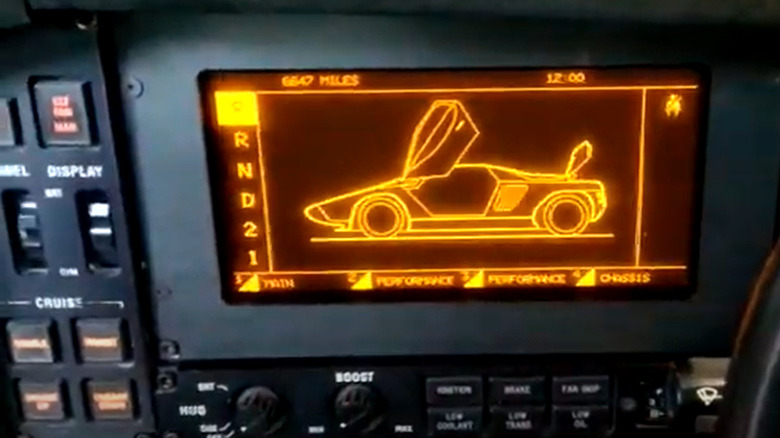
The Vector W8 was based on the concept car, the Vector W2. It was produced from 1989 to 1993, and over thirty years on, it still looks futuristic. However, it was not a huge success. It promised big things and looked amazing, but it was beset with technical issues, and only 17 Vector W8s were ever sold. The futuristic design of the Vector wasn't restricted to its outward appearance. Its digital dashboard was ahead of its time.
The dashboard featured an array of aircraft-inspired digital and analog displays similar to those found in fighter jets. It had a fully digital dashboard that included real-time diagnostics, engine performance data, and aircraft-style warning indicators. The cockpit was cluttered with buttons and switches, many of which were inspired by aircraft controls. It also included a prominently featured dashboard-mounted knob that allowed the driver to manually adjust turbocharger boost pressure so you could dial up boost for maximum acceleration, making it feel like a customizable performance machine.
Because the car was wide and unusually shaped, there was an uncommonly large amount of space between the steering wheel and the door. The car's wedge shape and extreme windshield rake meant the dashboard extended far forward. Instead of a traditional center console, many controls were moved to the left, filling the available space. As one Reddit commenter, "That's pretty strange. I've never seen a vehicle that's left-hand drive and have all the controls still be on the left hand side."
The Cadillac Allanté had buttons galore
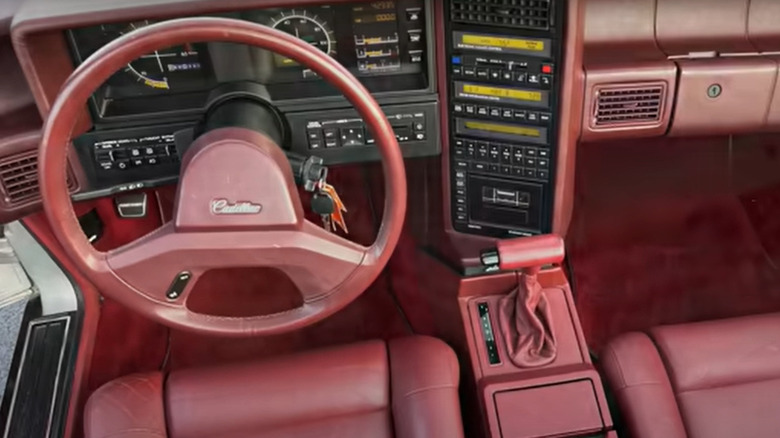
Cadillac produced the Allanté from 1987 until 1993. The Cadillac Allanté's dashboard was designed by Pininfarina, the renowned Italian design house responsible for styling the entire car. Pininfarina not only designed the exterior but also crafted the interior, including the distinctive dashboard. There was a lot going on with the Allanté dashboard. It had a fully digital instrument cluster with a couple of striking analog gauges in the middle. These featured crosshairs-style markings in the center, which gave the dashboard a fighter jet vibe.
There were also a ridiculous number of buttons. The center stack looked like a scientific calculator. There were roughly 50 different buttons on the dashboard, which seems like at least 30 too many. Sure, the Allanté had more features than most, and needed dedicated controls for its electronic climate control, premium sound system, and onboard diagnostics. However, many people found the overabundance of buttons very confusing. And while you could opt for an analog dashboard option if you couldn't handle the digital instrument cluster, there was no getting away from all the buttons which came as standard on both versions. In what seems to be something of a trend with cars with innovative dashboards, the Allanté wasn't a commercial success. In 1987, the industry publication Automotive News declared it to be the "Flop of the Year".
The incredibly wide Hummer H1 dashboard
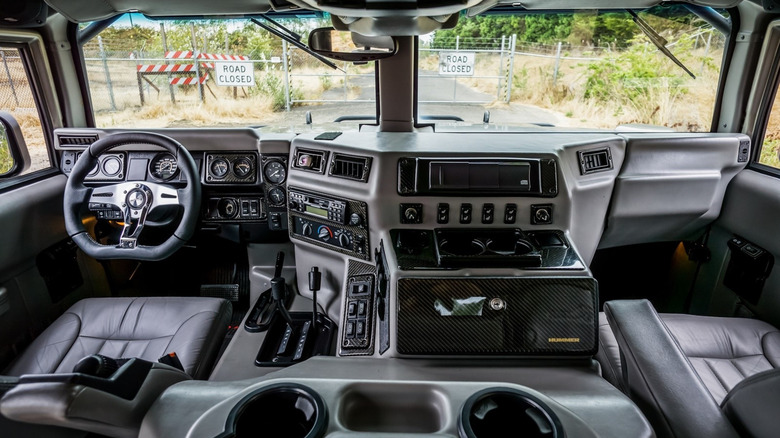
The Hummer H1 was a ridiculously wide vehicle, considering that it only had room for four people. This is because it was adapted from the High Mobility Multipurpose Wheeled Vehicle (HMMWV), also known as a Humvee. Very few adjustments were made to turn it into a civilian car. It was released in 1992 and was in production until 2006. The full-size four-wheel-drive utility had a dashboard that was far wider than seemed practical. There's a large area between the driver and passenger that houses the engine, transmission, and driveshaft inside the passenger compartment of the car to increase ground clearance, which is handy for navigating desert terrains and other military applications. As Reddit users pointed out, you could always use the massive center console between the driver and passenger for playing board games.
Despite its strikingly odd appearance, there's a lot that's good about the H1 dashboard. The straightforward layout is easy to use, and the whole console is angled toward the driver and out of view of the front passenger. Good news for drivers who don't want anyone else touching the radio or climate controls. It does have its drawbacks, though. The unconventional placement of controls and displays could be less intuitive for drivers accustomed to standard vehicle layouts. If someone needs to get in the passenger side, there's no way to reach across and open the door for them without climbing over the center console. Despite its size, people found the inside of the H1 surprisingly cramped. Still, nobody purchasing this vehicle was doing so with comfort in mind. The Hummer H1 proudly prioritizes function over form. At least, they were slightly more comfortable than the military transport vehicle they were based on.
The Subaru XT's dash thought it was a video game
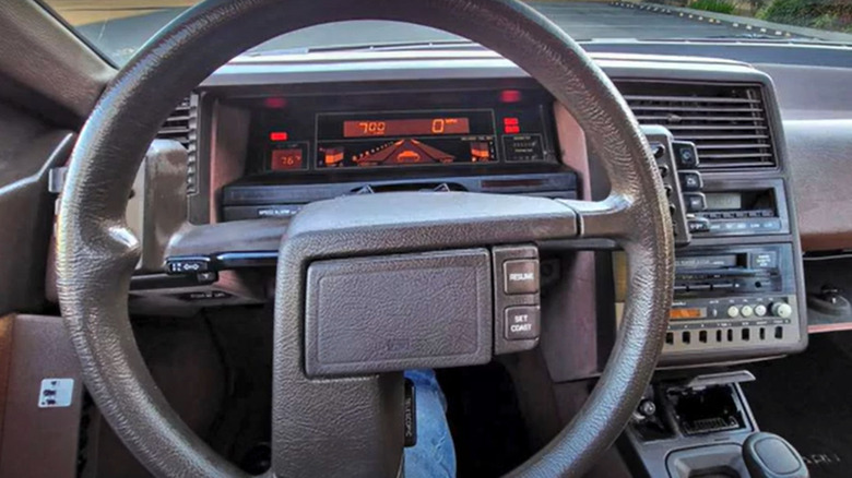
The Subaru XT was only produced for six years, from 1985 to 1991. Its distinctive design was inspired by aviation cockpits, and buttons for functions like climate control and lights were mounted on the steering column pods rather than on the dashboard. This allowed the driver to access controls without taking their hands off the wheel. It also had an ahead-of-its-time tilting and telescoping steering wheel mechanism that moved the entire instrument cluster along with it.
The digital display was an optional extra, and you'd have been crazy not to go for it. It looks like a video game and has been likened to the old Atari 2600 game Night Driver. The screen displayed a pictogram of a car flanked by illuminated sidewalks, which somehow functioned as tachometer and boost gauges. As engine revs and turbo boost increased, the sidewalks lit up, creating the visual effect of the car moving down a road. Additionally, when the XT's air suspension adjusted for extra ground clearance, the pixellated car icon rose up accordingly. Sadly, the digital dashboard was done away with in 1988 and replaced with boring — if admittedly easier-to-read — analog instruments. It was a little glimpse of a sci-fi future that was clearly too much for 1980s drivers.
Lastly, let's not forget about the design of that steering wheel. The XT had an unusual asymmetric two-spoke steering wheel that looks an awful lot like a gun.