The History Behind The McLaren Logo: How Has The Symbol Changed & Which Was The OG?
From its very first model, the McLaren M1A, to one of its latest releases, the McLaren 750S, McLaren has evolved significantly over the course of more than 60 years as a car brand. Over this time, the British car manufacturer has achieved numerous milestones, from winning Formula 1 and Formula E races to claiming victory at Le Mans on its first attempt in 1995. McLaren managed to do so by making changes to its cars, whether it's updating its appearance or completely overhauling the engine to meet the demands of the era.
Another area where McLaren has evolved is its logo design. McLaren has changed its logo eight times to date. The first logo was introduced in 1964 and has been updated every few years since then. The most recent change was made in 2021. That said, here's a quick history of McLaren's ever-evolving logos and what each one symbolizes.
The Kiwi Era
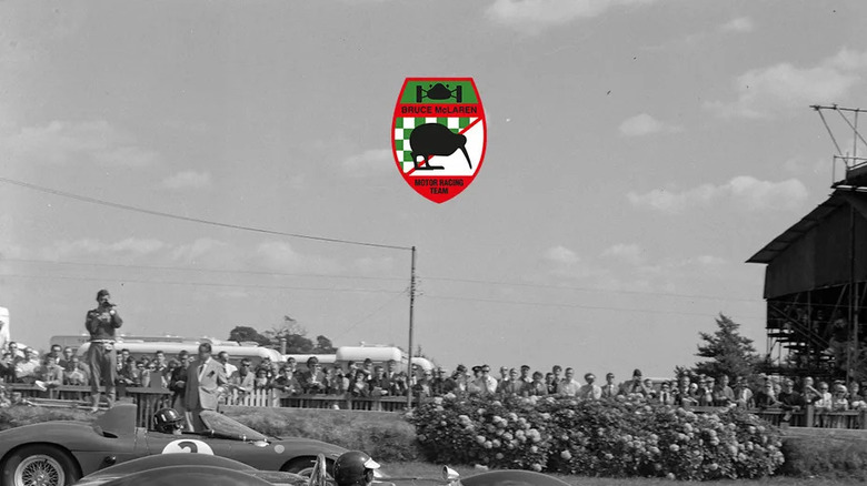
McLaren's first logo featured a combination of multiple text elements and images. It included a green and white checkered flag symbolizing the finish line, a silhouette of a McLaren F1 car, a Kiwi bird, and the name of Bruce McLaren and the "Motor Racing Team" written at the bottom. The logo was designed by renowned motorsport artist Michael Turner, a close friend of Bruce McLaren. The Kiwi bird in the logo, which is New Zealand's national symbol, commemorates Bruce's love for New Zealand, the country he was from. McLaren used this logo from 1963 to 1966.
In 1967, McLaren made major changes to its logo. While Turner retained the Kiwi bird in the new design, the silhouette of the bird was transformed into the "Speedy Kiwi" to symbolize the high speeds McLaren cars could achieve. Also, unlike the previous logo, which featured a mix of black, red, green, and white, the new design combined papaya orange and black. The black was used for the text, which read "McLaren Cars," while the papaya orange was the color of the Kiwi bird.
What's fascinating about this logo is that even after more than five decades since its creation, no one knows what inspired Turner to use papaya orange, a shade that became so iconic it was later named McLaren Orange. Some believe the color represented New Zealand's national racing color, while others speculate it was chosen to honor one of McLaren's sponsors at the time, which used orange in its branding. Whatever the reason, the papaya orange in the McLaren logo helped its cars stand out easily on the racetrack.
Shift from Kiwi heritage to chevrons
The Speedy Kiwi served as McLaren's symbol from 1967 to 1980, during which time the company experienced significant growth and evolved into an international brand. To reflect this expansion in the global market, McLaren updated its logo again in 1981.
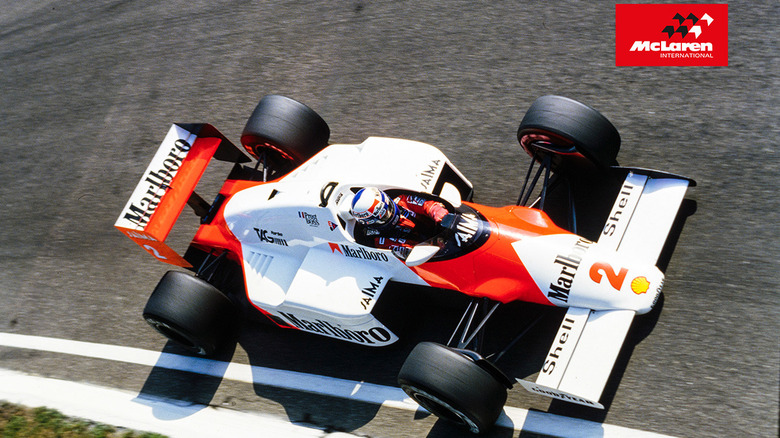
The new logo, designed by Raymond Loewy, featured three chevrons — two black and one white — set against a red background. It also included the phrase "McLaren International" in a font different from the one used in the earlier logo designed by Turner. The updated design and color scheme were a tribute to Marlboro, one of McLaren's sponsors at the time. This logo was featured on McLaren cars until 1990.
From 1991 to 1997, the British automaker introduced a more modern and refined logo than any it had used before. The three chevrons were combined into a single white chevron, and the word "International" was removed from the logo.
Introduction of the McLaren swoosh
In 1997, a major change was made to the McLaren symbol. The chevron was replaced with a red speedmark, symbolizing the vortices, a circular pattern of rotating air, produced around the wings of McLaren cars. These vortices, also known as the McLaren swoosh, were also used on the top of the McLaren car's side pods. Additionally, the new logo didn't have any background color, unlike its predecessors, and "McLaren" was written in black.
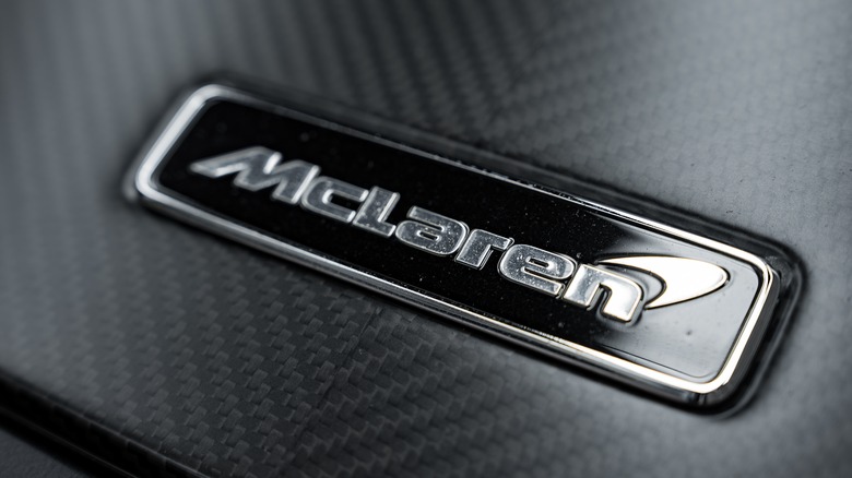
The logo was updated again in 2007 to give it a more modern and futuristic appearance. While the McLaren swoosh remained in the symbol, it was given a slight 3D effect, and a new, stylish font was introduced for McLaren branding.
All the cars McLaren has produced since 2017, such as the McLaren 720 Spider, feature a logo with a monochrome black swoosh. This logo symbolizes all three McLaren divisions — Automotive, Racing, and Applied — unified as one. Aside from this, the logo remains unchanged from its previous design. In 2021, McLaren unveiled a new logo for its F1 cars, featuring the McLaren orange swoosh. This logo was introduced to honor the company's roots in the racing industry. The logo also included a slimmer, more modernized McLaren wordmark, which the company stated reflects its agility and speed as racers.


