The 5 iOS 18 Features We Hate The Most
Each year we see the release of a new version of iOS, and like clockwork, Apple announced the first few developer builds of iOS 18 in June 2024. Despite rumors suggesting that we would be seeing a complete redesign of the user interface — not much ended up changing visually. Still, the plethora of hidden iOS 18 features make it one of the more feature-packed releases in recent years.
You also get fancy new customization features with iOS 18 — including the ability to finally place apps anywhere on your home screen. There's a toggle to turn on dark icons, an edit tool to rework the shortcuts in the Control Center, and a way to change the lock screen shortcuts. The major update also added some extremely useful features, like allowing users to lock and hide apps on an iPhone or iPad.
There is no shortage of content revolving around everything new you can do on iOS 18 — and as someone who has primarily been using an iPhone through the various iterations of beta and stable iOS updates, there are a few features from the latest release that I've come to dislike. Apple is fairly quick in resolving major issues or bugs, so we won't be addressing any of those in this particular read. It's also worth noting that a few features we deem here as gimmicks may be genuinely useful to some — it's all a matter of opinion, after all.
Apple Intelligence isn't very intelligent
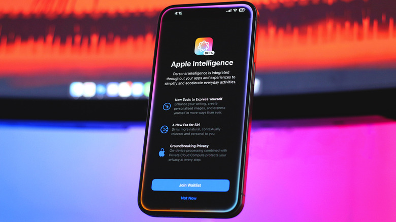
The irony of labelling the iPhone 16 devices as being "built for Apple Intelligence" with none of the features being available on launch didn't go unnoticed. Several updates later, we finally have an assortment of Apple Intelligence tools on the iPhone.
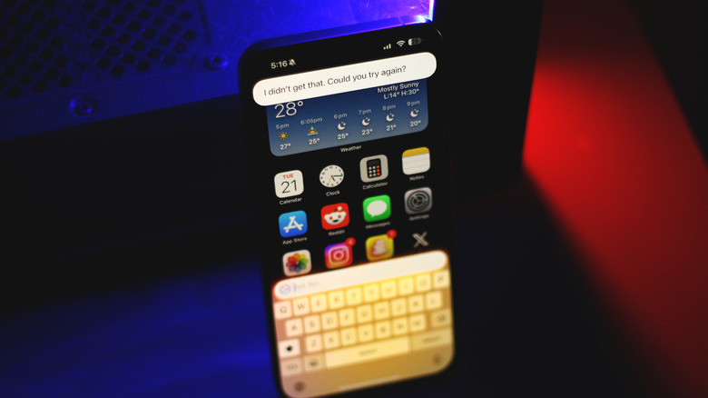
A few of these could come in handy, like Writing Tools when crafting the perfect email excuse to your boss, or the new record and transcribe functionality for calls. Unfortunately, most of the features under the umbrella of Apple Intelligence are still quite buggy. For starters, Siri may have gotten a fresh coat of colors and an impressive new animation, but it still leaves a lot to be desired. There's ChatGPT integration too, but you can also just use the dedicated app for a better experience.
The Genmoji feature on iOS 18 was one I was actually quite excited about. The idea of creating very specific emojis that can be used across any app seemed alluring. Unfortunately, short of the iMessage app, any Genmoji you generate are still sent as stickers — which defeats the purpose of the feature. There's the Image Playground app, too — but it pales in comparison to the dozens of free AI image generators you could use instead. In our experience, Apple Intelligence also takes a toll on your battery life. Unfortunately, the single toggle to disable it also restricts you from using features that aren't half as bad, like the Clean Up tool on the iPhone.
The Photos app redesign was unnecessary
Apple isn't known for overhauling their apps or operating systems too frequently, but when they do, it's often received well by the users. The same cannot be said for the Photos app, that was redesigned into a confusing mess. Being a prominent app on the iPhone, this change sparked heated debates and frustration across many users on social media — and rightfully so.
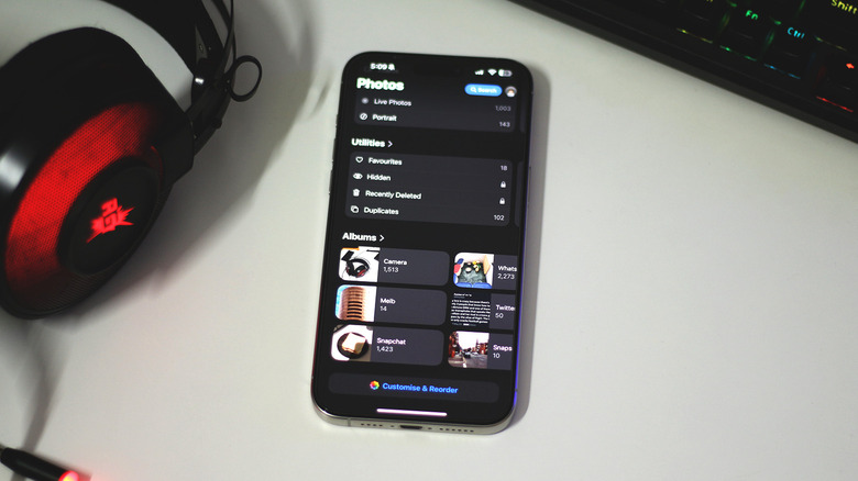
The Photos app on iOS 17 and earlier looked fine, and worked well. The biggest complaint users have with the redesign is how cluttered it is now. There are several sections when you launch the app that might bring little to no value — like the "Recent Days" tab, or the "Wallpaper Suggestions" section. The interface and behavior when viewing a photo was also changed. In the earlier beta builds, the Photos app displayed padding around every image, requiring you to tap again just to fill your screen. This has thankfully been rectified in recent versions of iOS 18 — so make sure you keep your iPhone updated.
As for the clutter, you can actually customize the order of the sections, and even remove them altogether. To make the Photos app on your iPhone a little less ugly, scroll all the way down, and tap on the "Customize & Reorder" option. While the Photos app update isn't the end of the world, it was still largely unnecessary and goes against Apple's usual "if it ain't broke, don't fix it" philosophy.
Tinted app icons are an abomination
Being able to change icon packs has been one of the most recognizable customization features on Android for years. Don't like the default app icons that ship with your Samsung Galaxy smartphone? No worries, just install one of the several free icon packs from the Play Store to switch things up. Starved and deprived of joy, iOS users have time and again come up with creative workarounds — including using custom images as app icons through the Shortcuts app.
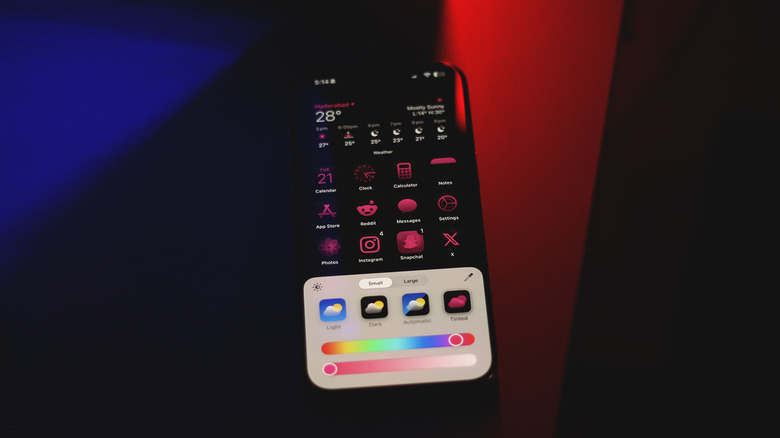
You can finally enable dark and tinted app icons on iOS. While the dark versions of most app icons seem to play well with the aesthetics — try picking a custom tint color. Google had tried this a few years prior with the Material You overhaul, where your app icons match the colors of the applied wallpaper. Android failed in this aspect due to third-party developers not adopting their apps to this new standard — but at least supported app icons didn't look horrible.
When enabled on iOS, all apps are force-tinted with the color you've chosen. Countless customization buffs on the internet have tried to make decent-looking home screens out of this feature — all to no avail. Simply put, this could single-handedly ruin the aesthetic Apple has crafted for the iPhone throughout the years.
The bigger emoji previews are inefficient
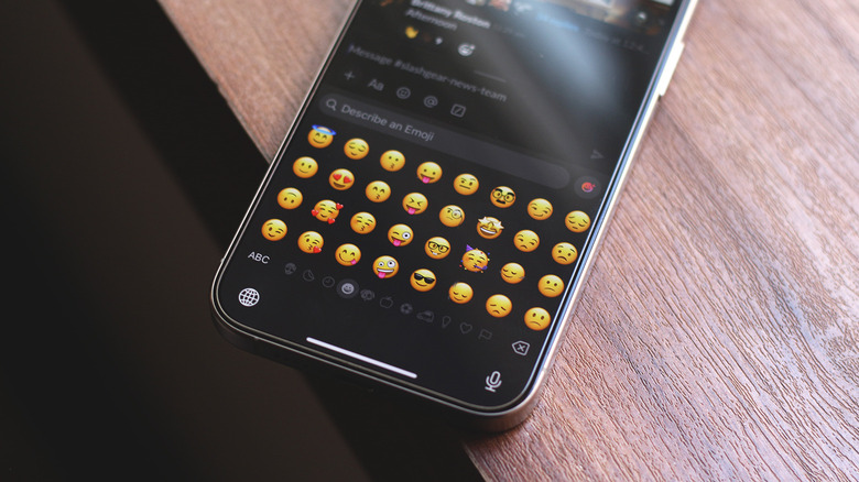
If you have recently found yourself thinking, "Huh, these emojis look weird" while using the keyboard on your iPhone — you're not alone. This is because the emojis on iOS have actually increased in size. On recent versions of iOS 18, if you tap the emoji icon on the keyboard, you will notice bigger previews. Though nothing else has changed in their behavior, this update has also been receiving backlash by users on social media.
Not only does this temporarily ruin your muscle memory by spacing out all the emojis, but the keyboard now displays fewer emojis at once — meaning more swipes. Apple could have made this change for ease of use, or to better accommodate the new Genmojis that also reside in the emoji section.
Unfortunately, unlike the case of the Photos app, there is currently no way to switch back to the smaller emojis on iOS. If this change annoys you a bit too much, your only real option is to switch to a third-party keyboard. I've personally been using SwiftKey on my iPhone since it adds a persistent number row, has a stronger haptic feedback, and generally sports more features than the stock keyboard on iOS.
Control Center customization is painful
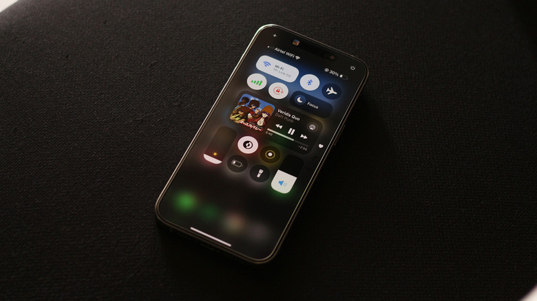
Though you have been able to customize the Control Center on iPhone for years, this only included enabling or disabling certain toggles, with limited flexibility in rearranging them. The iOS 18 update introduced a way to finally move the shortcuts around and resize compatible toggles. You can even create new pages to add additional shortcuts. In the early beta builds of iOS 18, attempting to customize the Control Center was disastrous. Sure, you could add or remove toggles — the issue arose when you wanted to move them around to form a layout of your preference.
This has been improved a lot as we've received newer updates, but is still far from perfect. Trying to move a shortcut in a populated Control Center is sure to send other toggles flying around and ruin the layout. You might also notice shortcuts suddenly disappearing or being misaligned out of the grid.
Another oversight has been the randomness of the Control Center layout when your iPhone is in the landscape orientation. This was a non-issue back when Apple didn't let you move toggles around. A simple fix for this could be the option to create two different presets for when your phone is in the portrait or landscape modes.
