John Deere Green: A Look At The Company's Legendary Logos & Trademarked Colors
John Deere has become the stuff of legend since it was created, and it doesn't take a detective to figure out why. Beyond its iconic tractors, John Deere makes several useful products that aren't tractors, providing all kinds of machinery and equipment to farmers, landscapers, and homeowners simply looking to clean up their yard. But its product assortment isn't all that has made the company so successful. Its branding is very much on point.
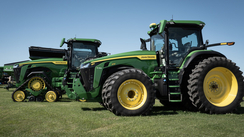
Even if you're not overly familiar with farm and yard equipment, odds are you can spot a John Deere offering. That's because the bulk of the company's catalogue is uniformly designed, with the John Deere logo and its unmistakable green and yellow color scheme at the forefront. This is all a result of the man behind John Deere and its famous tractors, whose name and design sense inspired its now-legendary aesthetic identity.
But John Deere's logo and color scheme didn't become famous overnight. It took time and plenty of twists and turns for them to become the company's key design elements.
John Deere's current logo is over a century in the making
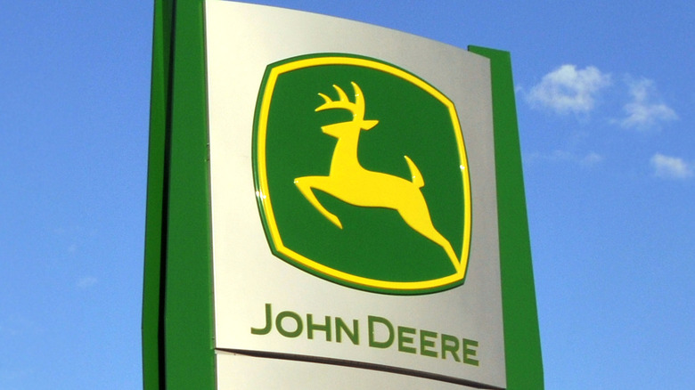
First and foremost is the John Deere logo, featuring a leaping deer. Considering how long the company has been around, it's no surprise that it has gone through a metamorphosis to become the version present on John Deere products today.
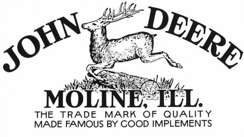
The company was founded in 1837, though it wasn't until 1873 that it used the earliest incarnation of its deer logo, a detailed image of a deer leaping over a log and some greenery — designed John Deere himself, along with a friend. It became official in 1876, sticking around until 1912. This new version was largely the same, only with added detail to the deer and the background. It wasn't until 1936 that the logo began to lose some of its detail, bringing it a step closer to the modern incarnation, with shrunken background detail and a mere deer silhouette.
Through the remainder of the 20th century, John Deere's logo continued to be tweaked. The background elements were removed and the deer remained a silhouette, eventually becoming a much simpler rendering. Come 2000, the logo was once again changed, but not just in terms of detail. Since the beginning, the deer had been depicted as landing after jumping forward. At the start of the new millennium, designer Todd True decided to change the deer to leaping, evoking a sense of John Deere's commitment to moving ahead.
What's the story with John Deere's signature color scheme?
Yellow and green are the premier colors of the John Deere brand. It has used them on some of its products — including some of the most expensive tractors ever made — since between 1870 and 1880, and fully committed to them sometime around 1910. The specific shades of yellow and green used today are recognized as John Deere's signature colors, ands not just in the eyes of the masses. The company has gone to great legal lengths to cement itself as the green and yellow tractor and mower giant.
It took some time for John Deere to take legal ownership of "John Deere Green" and "John Deere Agricultural Yellow," as these tones have become known. Trademarking the colors was difficult, and throughout the 1980s, John Deere struggled to win over the courts, going through litigation multiple times in hope of doing so. Come 1988, John Deere's trademark applications were finally approved, and since then, John Deere has acquired several more trademarks for specific color layouts.
It has taken some alteration, and plenty of trips to the courthouse, but John Deere's logos and colors have settled into modern culture. The company's branding and level of mainstream recognition are second to none in the agricultural world.


