The Worst-Looking Playstation Consoles Ever Made
We may receive a commission on purchases made from links.
Let's face it: PlayStation consoles are really cool-looking devices. Apart from the games, Sony knows how to design machines that look great sitting in your living room, bedroom, or setup. This Japanese manufacturer has designed and produced some of the most iconic consoles that have defined generations of gaming. However, every once in a while, they've missed the mark.
From awkwardly bulky shapes to strange color schemes, a few PlayStation models have committed design sins that still haunt gamers. Sure, they might have played the hottest games of their time, but you wouldn't exactly call them eye candy. Perhaps unsurprisingly, a lot of these awkward designs occur with limited editions and brand partnerships, as they have often struggled. Some of its main releases also make the list, and with good reason. With that in mind, here are the worst-looking PlayStation consoles ever made.
PlayStation Classic (1994)
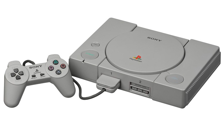
The PlayStation Classic has often been cited as one of the most disappointing entries in PlayStation's lineup, both in terms of performance and design. It was a miniature version of the original PlayStation, maintaining a similar design, but it could only load 20 games.
To make matters worse, compared to its contemporaries like the cool and curvy Nintendo 64 or the colorful Sega Saturn variations, the PlayStation Classic's simple design left a lot to be desired. The giant circular disc tray dominates the console's face, making it look like a glorified CD player.
The gray color is a choice, but not a great one. It's dull and lifeless, doing nothing to make the console feel exciting or inviting. Even the logo, while iconic today, looks more like an afterthought; slapped onto the device without much thought for the overall aesthetic.
Team Jordan PlayStation (1995)
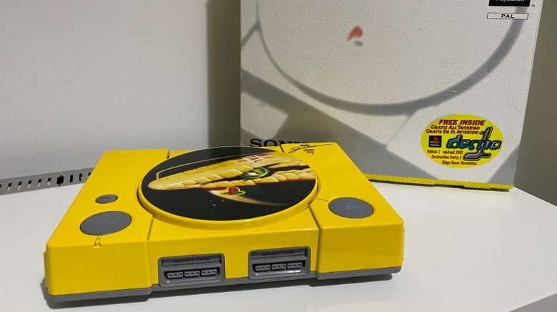
This little-known and peculiar entry in the world of special-edition consoles was released as part of a collaboration between Sony and the Jordan F1 racing team. This console aimed to celebrate Formula 1, not Michael Jordan, as you might have thought. Instead of standing out as a sleek, limited-edition masterpiece, the Team Jordan PlayStation sticks out like a highlighter in a sea of understated consoles, and not for the right reasons.
The Team Jordan Grand Prix PS1 was painted a bright yellow, matching the signature livery of the Jordan F1 team. While bold, this yellow shade clashed with the original gray PlayStation 1 aesthetic. It's not just that the yellow is a blinding, banana-hued explosion that makes you wonder if someone accidentally spilled paint on a perfectly fine PS1 and called it a day. The problem was that for a limited edition brand partnership, it isn't a subtle nod to racing. The Jordan 197-inspired disc lid didn't help either, and the cool autograph-like signature on the top right did little to redeem this.
The crux of the problem is the color, and while some consoles can pull off bright colors with finesse, this one looks cheap and overdone.
PlayStation 3 Fat Launch Model (2006)
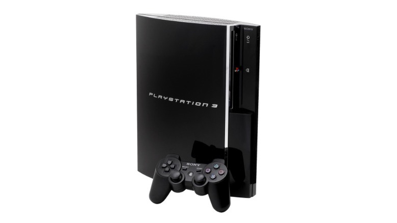
The PlayStation 3 "Fat" Launch Model is one of the most infamous PlayStation designs due to its sheer size and controversial aesthetics. It is a beast, but not in a good way. While it was a technological powerhouse at launch, its physical appearance left much to be desired, delivering a glossy, oversized monstrosity.
The massive console weighs 11 pounds and looks more like a bulky home appliance than a sleek gaming console. It wasn't the kind of system you could casually place on your TV stand without drawing unwanted attention, and its size made you think twice about moving it.
Apart from the size, it has a glossy black finish, and though it seems luxurious at first glance, the second you touch it, it turns into a fingerprint magnet. Dust, smudges, and scratches are also not left out, as the PS3 Fat collected them all like a trophy case. Instead of feeling premium, it looked grimy and worn out way too quickly. However, this overstated look took nothing away from its classic features that holds nostalgic value in the hearts of gamers.
PlayStation 2 Ceramic White SingStar Bundle (2007)
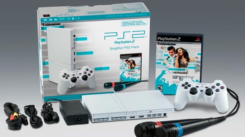
The PlayStation 2 Ceramic White "SingStar Bundle" was a special edition of the iconic PS2 console, bundled with the popular karaoke game "SingStar." The PS2 is renowned for its sleek, timeless design, but this limited edition variant went completely off-key.
First, the ceramic white finish might sound fancy, but in reality, it makes the console look bland compared to the glossy, black original that oozed sophistication. The matte white lacks any character or charm, and feels like an afterthought. It's not bright enough to be bold, and it's not subtle enough to feel elegant.
Then there's the SingStar branding, which is not incorporated anywhere on the console. Perhaps it was for the best. Also, the bundle included two white microphones and a copy of SingStar, but the controllers retained the standard black color. This mismatch made the setup lack a cohesive design appeal.
PSP Go (2009)
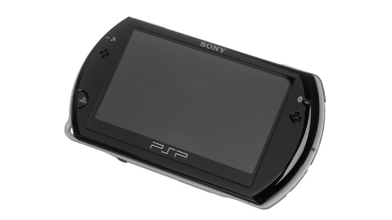
The PSP Go (2009) was Sony's bold attempt to reimagine portable gaming. It tried to take handheld gaming to the next level in that era, but it stumbled out of the gate with a design that was more confusing than compelling. Despite some innovative features, the overall execution left fans divided, with many feeling the design missed the mark.
In prioritizing a pocket-sized design, Sony sacrificed much of what made earlier PSP models so appealing. Paired with underwhelming performance, the PSP Go's struggles didn't surprise most observers.
Starting with the most obvious, the PSP Go's sliding screen design departed from the classic PSP models. It was supposed to be the console's "wow" factor, but the mechanism was a bit out of place for a gaming device. A smaller screen size compounded the issue. The display felt cramped thanks to a reduced screen-to-body ratio compared to the spacious displays of the PSP-2000 and PSP-3000.
PlayStation Portable Hannah Montana Edition (2009)
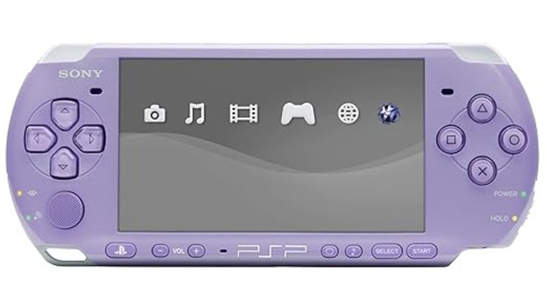
In a partnership with Disney Channel mega star Hannah Montana, the PlayStation Portable Hannah Montana Edition was targeted at younger, predominantly female audiences. Sony rightfully attempted to expand its product's demographic with the Hannah Montana brand. On paper, it was a great idea. A PSP in lilac sounds like a fun, bold choice, particularly for its target market. In reality, it's a pastel-colored trainwreck that came off as a toy not many people wanted to play with.
The branding was especially poorly executed. Plastering the console with Hannah Montana branding made it feel less like a serious gaming product and more like a gimmicky promotional item. The bundled extras only reinforced this opinion. Alongside the console, you also got three episodes from the show's latest season and a PSP-exclusive Hannah Montana: Rock Out The Show video game.
PlayStation 3 Super Slim (2012)
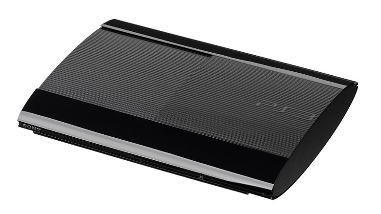
Another PlayStation with a size issue makes our list. The PlayStation 3 Super Slim was the third and final iteration of the PS3 console, and much like the first, it failed to deliver in terms of design. Even after correcting the size problems of the PS3 Fat model with the PS3 Slim, Sony set out to make an even lighter, more compact version of the PS3 that would be more cost-effective than its predecessors. Fair play to them, as they succeeded in reducing the size and price of the system. However, the manufacturers cut many corners in doing so, making some questionable design choices.
The first obvious error was the sliding disc tray, which lacked the smooth, slot-loading drive of the original and Slim models. The ridged matte plastic top and gloss finish on the front and back also don't do it any favors. In short, the Super Slim just looks like a plastic experiment gone wrong. It might have been practical for saving space, but it sacrificed too much in the style department, lacking the bold identity of the original and the understated elegance of the Slim.
Taco Bell Limited Edition PS4 (2015)
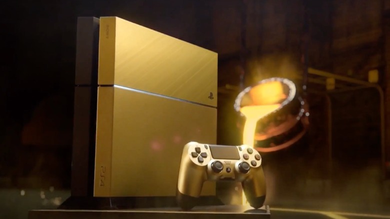
The Taco Bell Limited Edition PS4 from 2015 is a wild example of how a promotional console can go hilariously off the rails. This unexpected duo came together in 2015, and while the collaboration helped promote the console, it didn't sit well design-wise. The console was dubbed the "Gold PS4," but it was really gold and black, which is, nevertheless, a great color scheme if only its execution were better.
The lack of Taco Bell-specific design elements beyond the promotional context made it feel like a missed opportunity to fully embrace the theme. One would expect the Taco Bell logo to be included on the console like it was on the packaging. Then again, the Taco Bell logo is a huge, glowing bell that would look completely out of place and make the console look even worse.
PlayStation 4 Pro 500 Million Limited Edition (2018)
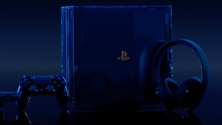
Another limited edition PS4 design that missed the mark is the PlayStation 4 Pro 500 Million Limited Edition. It was released to celebrate the remarkable milestone of over 500 million PlayStation consoles sold since the brand's debut in 1994. Upon release, it was an overly flashy and awkwardly designed console that left many scratching their heads. The console featured a dark translucent blue casing with copper accents that, to its credit, emitted a sleek, aesthetic look.
That sleek, aesthetic look, unfortunately, made this console a dust and fingerprint magnet, so good luck keeping it clean and smudge-free. The design also bordered on gimmicky and didn't align with the typical minimalist elegance of PlayStation hardware. The bronze accents, including the PlayStation logo and the serial number plate, don't really match the midnight blue color.
Then there's the LED lighting; while some fans might enjoy the glowing effect, it can come off as trying too hard to be cool instead of just being cool. Sometimes, simplicity speaks louder than trying to do it all, whereas the latter runs the risk of resulting on some of the strangest special edition consoles ever.

