CAT Yellow: The Story Behind Caterpillar's Iconic Logo & Color Scheme
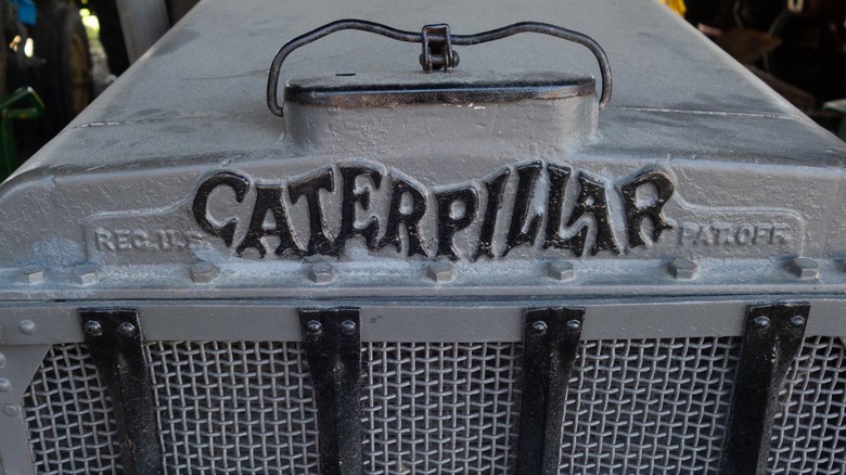
When a company approaches 100 years old, the look and logo of the brand will have undergone a few changes to stay up with the times. That's true of Caterpillar, too, even though it seems like the yellow-and-back color scheme has been around forever. Not too many people alive today remember that back in 1925, when this heavy machinery company came into being through the merger of the Holt Manufacturing Company and C.L. Best Tractor Co., its equipment wore a battleship gray color. That color choice was very utilitarian since many Holt tractors were used in WW1. But on the nose of those tractors, the original logo was a far cry from the tough, heavy-duty-looking, extra-bold logo in use today.
The Caterpillar name was used by the Holt company before the 1925 merger and was inspired by the way Holt's track-type tractors — with tank-like treads instead of rear wheels — moved across uneven terrain. For that reason, the Caterpillar wordmark was a wiggly red version of the word with the serifs of the letters forming the critter's feet. Sometimes, the logo appeared in black instead of red, but when did this battlefield gray machinery with the goofy lettering become the yellow behemoth of heavy equipment we know today?
[Featured image by Thomas Quine via Wikimedia Commons | Cropped and scaled | CC BY 2.0]
1930 to 1949: Caterpillar's metamorphosis
About five years into its existence as a company, Caterpillar straightened out its logo into a line of uniform type, still in red or black. Some of the parts cast by Caterpillar retained the wormy logo for several more years, presumably because the equipment molds were still being used. But the following year, like a sulfur butterfly popping out of a dingy, old chrysalis, the company shifted from gray to bright, beaming yellow for its paint color.
The color shift happened because, by 1931, Caterpillar wasn't just making tractors. It had long since moved into other equipment fields, including road-building machinery, and later even made engines for long-haul trucks. And, large equipment on and near the road really should be easily seen.
Imagine driving around a corner on a foggy road and trying to make out a heavy grey machine in the mist. It wasn't very safe for drivers of either vehicle. The company turned to a higher-visibility color that was pleasant to look at, developing what it called Hi-Way Yellow, which was complemented with only black lettering. It stayed with this borderline neon yellow color for nearly half a century.
1950 to 1978: toughened-up branding
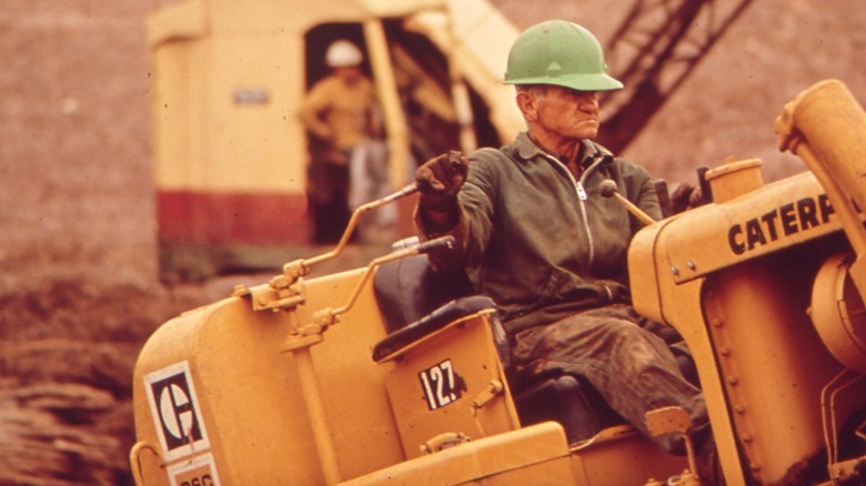
Caterpillar established itself as one tough brand early on, but it maintained its street cred after the Second World War with the help of its newly opened Caterpillar Peoria Proving Grounds in Washington, Illinois, which allowed it to develop equipment through real-world testing. By the 1950s, the company had toughened up the look of the wordmark to match its reputation, losing those flouncy serifs and making a solid statement with all-capital letters in a squared-off, extra-bold type. The company began using the short form CAT on its equipment that same decade. These two design choices laid the groundwork for the brand's look for the next half-century.
Caterpillar went on to introduce a new emblem in 1967 — a stylized "C" that looked almost like a top view of a Phillips head screw. This Block-C logo was coupled with the model name of the equipment that bore it for easier identification of the machinery and more consistent branding to differentiate it from other construction equipment on work sites that had also adopted a high-visibility yellow color.
[Featured image by National Archives and Records Administration via Wikimedia Commons | Cropped and scaled | Public Domain]
1979 to the present: the yellow we all know
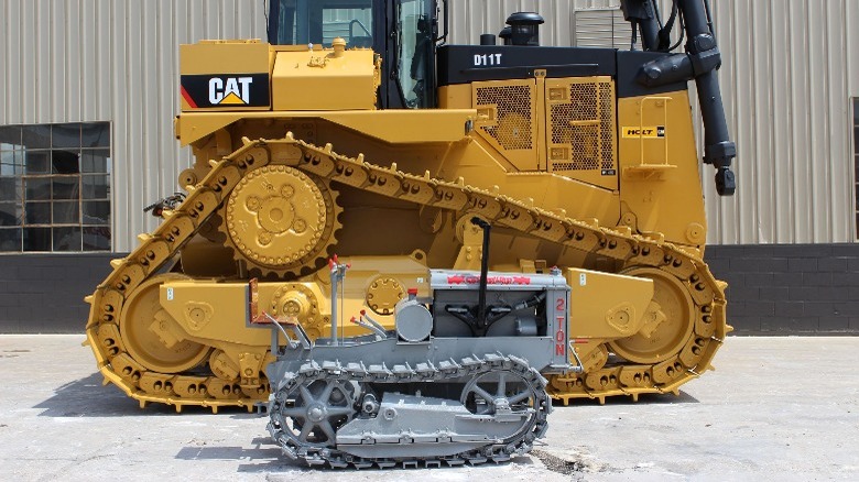
Caterpillar stepped out of this sea of bright yellow competing equipment when, in 1979, it introduced its latest and current color it calls Caterpillar Yellow. This legally protected color is more sedate than screaming, but it is still readily seen by day and night.
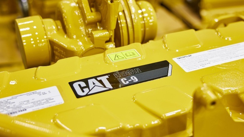
The Caterpillar Yellow color has remained the same for 25 years, but the company still periodically tweaks its logo. In 1989, a triangle was added under the first "a" in the name, with the name appearing in combinations of black, yellow, and white. The type was once again stretched vertically, making it look taller. Additionally, the logo was no longer a lone "C" but the word CAT, with the iconic triangle underneath.
Caterpillar brought the color red back into its branding after decades of hiatus when it added a red Beltline to its logo. The belt then transformed into a Power Edge, an angled red mark on the leading corner of the logo. A few years passed, and the Power Edge became the Cat Modern Hex in 2018, a sort of red hex nut with a black honeycomb pattern inside that is still used on Caterpillar machinery today.


