Apple Watch Series 10 Review: Small Changes Add Up In Unexpected Ways
- Slimmer, lighter design packs a bigger screen
- Comprehensive health tracking
- Faster charging
- Double Tap still feels underutilized
- No blood oxygen tracking in U.S.
There's irony in the fact that, for all the Apple Watch Series 10 has changed over its predecessors, the primary goal of those improvements is to make it less obvious on your arm. There's a focus on size for 2024, rather than speed: the pitch for the new S10 processor, for example, is more about its diminutive scale than its performance. At first glance you'd be forgiven for not seeing much in the way of design changes over the Series 9, and yet this new smartwatch is effectively different in all dimensions, inside and out.
What hasn't changed is the fact that there are umpteen options to choose between. The cheapest Apple Watch Series 10 has a 42mm aluminum case and starts at $399 for GPS only or $499 for GPS + Cellular; the 46mm version is $429 and $499 respectively. Titanium versions start at $699 for 42mm and $749 for 46mm, and get cellular connectivity as standard.
Your pick from Apple's rubber and textile straps are included in the price; you pay more for stainless steel versions. Alternatively, there are Nike bands and Apple's ongoing collaboration with Hermes, where even more expensive straps also come with exclusive watch faces.
Slimmer and easier to see
If conspicuously having the latest and greatest on your wrist is important, you might be better off skipping the Series 10 and grabbing a new, matte black Apple Watch Ultra 2. That's not to say the regular Apple Watch hasn't been redesigned, only that you'd need a keen eye (and maybe some calipers) in order to spot it.
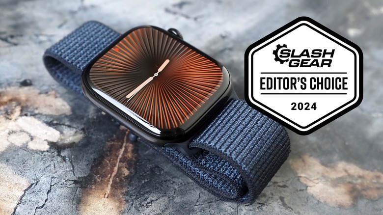
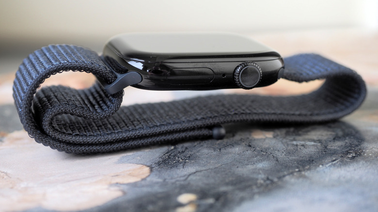
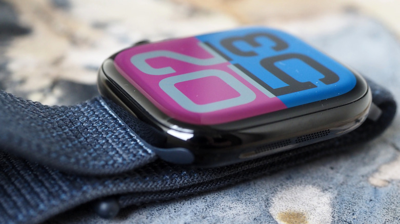
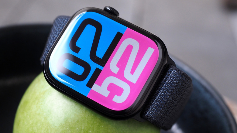
It's 9.7 mm thick, so a millimeter slimmer on your wrist than the Series 9, while the aluminum version is about 10% lighter, too. However the display is slightly bigger — your options for Series 10 are 42mm and 46mm, so the cases are a millimeter larger in height and width, but Apple has also shrunk the display bezels. That means more of the watch looks like screen.
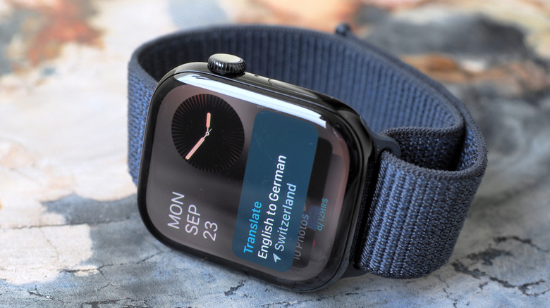
In fact, at the default font size, there's space for an extra line of text in things like email previews. If, like me, you eschew Apple's filtering options and simply allow all your messages to whoosh through to your wrist, relying on the smartwatch as a way to triage what gets attention, that's a convenience that really adds up.
Design evolution, not revolution
Apple supplied an Apple Watch in the new Jet Black aluminum finish for review; other options include Silver and Rose Gold. As is so often the way, there's a whole cavalcade of impressive words to describe the new finish's production process: in this case nano-particle polishing, followed by 30-step anodization. The result is, well, black and shiny.
Alternatively, if you've got a bigger budget, the iPhone 16 Pro donates its titanium to the Series 10. Replacing stainless steel, there are three finishes — Natural, Gold, and Slate Gray — and Apple has matching bracelets and bands.
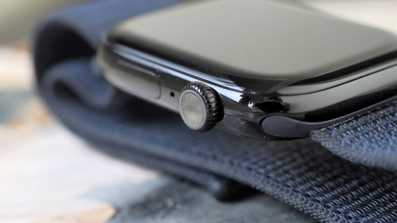
There's a weird duality to the physical changes, here. On the one hand, the numbers in question are so small, comparatively, that — with the exception of fitting more lines of text on-screen at once — you might not notice them day to day. At the same time, for something you wear all the time, small improvements certainly add up. Honestly, what I've noticed most is how the side button and Digital Crown are more clicky on the Series 10 versus its predecessor.
Easier to sneak a glance at
Depending on your watch face preference, you might also end up noticing the new screens more, too. The new, wide-angle OLED panels aren't just slightly bigger than before, but they have greater visibility when looked at askew: such as when you're trying to surreptitiously glance at a notification without making it obvious you've zoned out of a boring conversation.
It's worth noting that, while off-angle brightness is improved, the 2,000 nits of standard brightness remains the same. If you want more, you'll need to step up to the Apple Watch Ultra 2, which has a 3,000 nits panel.
The new Series 10 screens also support a 1Hz refresh ratio, so things like second hands continue their sweep even when the display has gone into low-power Always On mode. You see that in the newly-added faces like Flux, which have more animation, though the improvement won't be so obvious if you're sticking with an older watch face.
Getting a good night's sleep
As before, the Apple Watch can track temperature and generate an electrocardiogram, or ECG, for heart health information. It'll warn you if your heart rate is unusually high, low, or irregular; it'll use its bevy of sensors to try to predict periods of ovulation for those who menstruate. And the various motion sensors allow the smartwatch to summon help via fall detection, crash detection, and an Emergency SOS menu that's brought up by holding down the side button.
Absent, though, are blood oxygen measurements, in the U.S. anyway. That's the victim of an ongoing patent battle, and it means that if you were in the habit of using your Apple Watch to track the levels of oxygen in your blood, for now you should stick with your older model.
What its absence doesn't impact are the new sleep apnea notifications. A condition where your breathing is repeatedly interrupted while you sleep, it can be spotted via the Apple Watch Series 10's accelerometer (and that of the Series 9 and Apple Watch Ultra 2). Though not a diagnosis, it does mean the Apple Health app can flag repeated breathing disturbances that might be a sign of sleep apnea, tracking the average number of incidents over a 30 calendar day period and producing a PDF report that can be shared with a healthcare provider.
Of course, if you don't have above-average breathing disturbances, you won't see the alert; if you do have diagnosed sleep apnea, you're meant to reveal that during setup, since, again, Apple is clear this isn't a diagnostic tool. I didn't see a warning myself, which is probably a good sign for my health, but not much use in my review.
Faster to charge
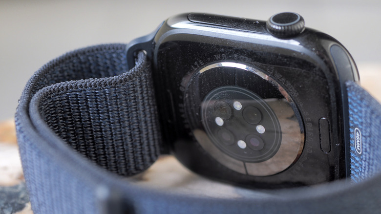
What I did enjoy, though, is the much speedier charging. Apple's redesigned rear panel on the Series 10 not only reworks the biometric sensors but adds a more effective wireless charging coil. The result is a 0-80% charge in about 30 minutes, about 15 minutes less than a Series 9 would demand. If you're needing a top-up before you go to bed, Apple says eight minutes of charging time is good for eight hours of sleep tracking (in Sleep mode, the Apple Watch's display stays dark unless you explicitly wake it).
I typically opt for a daily charge, just out of habit, but on a couple of extended transatlantic travel days I definitely exceeded Apple's official 18 hour battery life estimate.
While you've been able to use the Apple Watch to make and receive calls before, the Series 10 gets a microphone boost with voice isolation; it's good enough that I'll now actually answer calls from my wrist. The new speaker, meanwhile, now supports audio playback beyond just calls. That means music and podcasts from Apple's own apps, along with third-party titles.
Here, Apple and I clearly differ in our assessment of our fellow humans. It envisages the speaker being perfect for finishing the last few minutes of the podcast you were listening to on the commute home. I can only foresee more people playing music out loud in public, rather than through their new AirPods.
Apple Watch Series 10 Verdict
Though Series 9 owners may not feel the need to upgrade — especially since headline features like sleep apnea tracking will be delivered for them in the free watchOS 11 update — wearers of earlier Apple Watch versions will find plenty to like in this slimmer, more practical smartwatch with its bigger display. Being able to see more on-screen at once is a key improvement, and though I wish Double Tap allowed for more granular control in how you react to those notifications, things like improved off-axis brightness deliver a subtle but real boost to daily use.
In fact, a lot of the reasons to consider an Apple Watch Ultra 2 have now been thrown into question by the Apple Watch Series 10. Yes, the bigger (and, from $799, more expensive) watch has better fitness tracking, that useful action button, longer battery life, and a brighter screen. At the same time, it's a hefty thing on the arm; the Series 10's speedy charging offsets its smaller battery; and, unless you're really, really serious about fitness training, the cheaper watch is more than enough for most wearers.
There's a tendency, with new gadget launches, to sneer at anything other than wholesale reinvention. Honestly, though, I'm not sure I want my watch to transform every twelve months. The Apple Watch is arguably about as appliance-like as Apple gets: a workhorse, one you should only ever notice if it gets in the way. Sleep health tracking is nice to have, certainly, but it's the Apple Watch Series 10's cohesive and streamlined design which makes it such a compelling addition to your wrist.
