The History Of Harley-Davidson's Most Iconic Logos
When the Harley-Davidson Model 1 first roared into life in 1905, it began a big, bold, long-lasting legacy. After more than a century, Harley-Davidson has grown from a simple motorcycle-building company in Wisconsin into a global juggernaut and an iconic representation of an entire country. Chevy claims to be as American as apple pie, but one can argue that Harley-Davidson is just as red, white, and blue as Old Glory itself.
When childhood friends William Harley and Arthur Davidson (and later, Arthur's brothers Walter and William) joined forces in 1903 to form the now-legendary company, they were more worried about cranking out motorcycles than marketing concepts or logos. In fact, their bikes were devoid of any branding until 1910. Through the years since then, Harley has had dozens of different logos, but we'll touch on the more iconic ones.
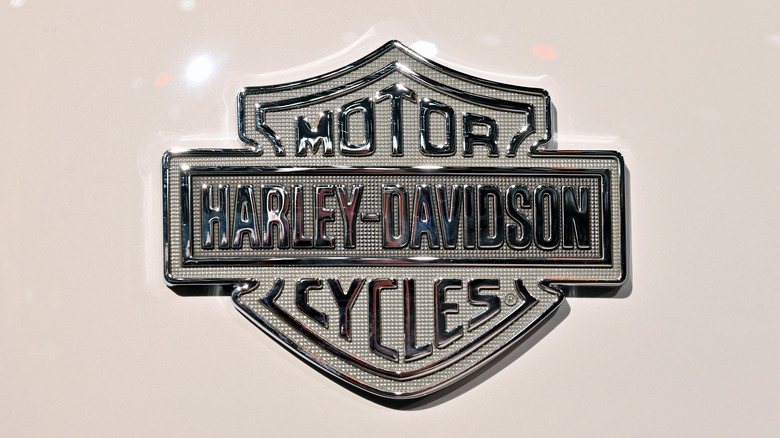
Janet Davidson — aunt of the Davidson brothers — is credited with coming up with the company's first "Bar and Shield" logo, very similar to the one still slapped on bikes rolling off the line. That first iteration used a combination of gray, black, and white with the "Harley-Davidson" name engraved horizontally in tall, tight lettering across a bar (representing stability and strength). This bar sat on top of a shield (signifying safety and protection) bearing the words "Motor" in the upper quadrant and "Cycles" in the bottom. Some form of this first logo has remained in use to this very day.
1930-1953: Patriotism and an anniversary
Starting in 1930, Harley-Davidson tweaked its logo ever so slightly by changing the colors of the letter "O" to red and yellow, where yellow symbolized liveliness and contentment. In 1933, it introduced the now-familiar orange (representing youth and ingenuity) and white lettering on a black background, which has since become the predominant version of the "Bar and Shield" logo.
While the company experienced a dramatic loss of revenue during the Great Depression of the 1930s, it devised a clever marketing idea to remind the country that it was still committed to building finely tuned motorcycles packed with innovation. Harley-Davidson started using the image of an eagle – the iconic symbol of America — to show the company's patriotic passion and fighting spirit. Once World War II started, Harley-Davidson began making motorcycles explicitly for Allied troops, and the new Bald Eagle logo evolved into a tribute to American fighting forces.
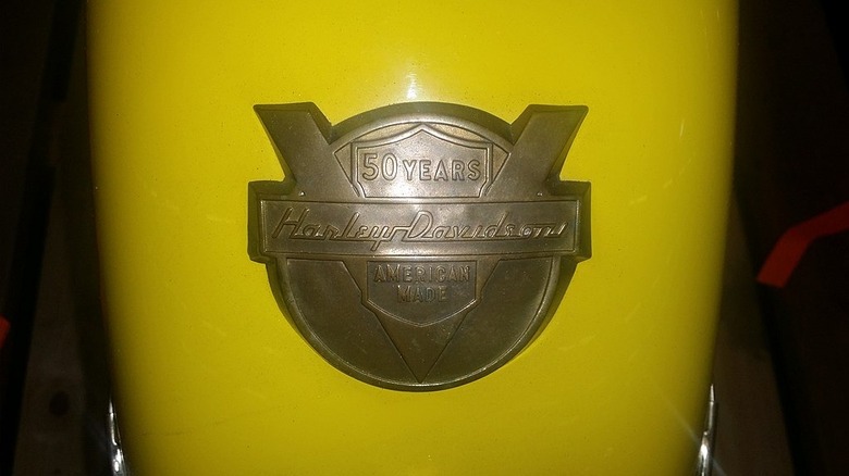
When Harley turned 50 in 1953, it celebrated the historic moment by completely redesigning its long-standing "Bar and Shield" emblem. The new logo was circular, with an engraved V-shaped symbol representing the company's tried-and-true V-twin engine. The horizontal bar remained, but now the Harley-Davidson name was written in cursive. Inside a less obvious shield sat the words "50 Years" (above the bar) and "American Made" (below).
[Featured image by U.S. Customs and Border Protection via Wikimedia Commons | Cropped and scaled | CC BY Public Domain]
1963-1974: A new color scheme and a #1 logo
In 1963, the good old "Bar and Shield" logo reappeared as a modernized version that harkened back to the original, but with a shape that let it be used on the motorcycles' gas tanks for the first time. This new but old "diamond logo" had simple white lettering on a black background. While the orange and black color scheme is arguably the best-known version of the "Bar and Shield," many other color combinations exist, with different dealerships and organizations personalizing it in various ways.
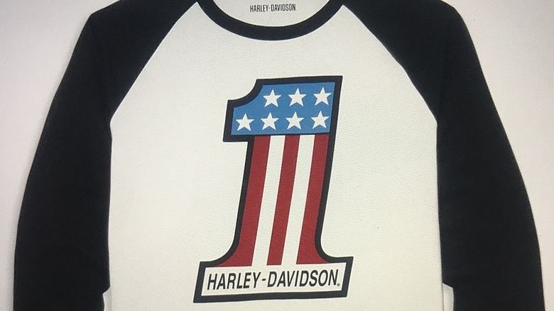
In 1969, the grandson of William Davidson – Willie G. Davidson, aka Willie G — was promoted to be Harley-Davidson's vice president of styling (he later would become a co-owner, one of many important moments in Harley history). Under his leadership, the company released the #1 logo after it won the AMA Grand National Championship title that same year. A later version included graphics incorporating the stars and stripes of the American flag and was stamped onto the dashboard of the 1971 FX Super Glide model.
In 1974, illustrator Paul Smith reinvented the old eagle logo for a new era. The image of an American Bald Eagle (an age-old symbol of power and freedom) with its wings spread and talons grasping the "Bar and Shield" quickly became the go-to logo during the 1980s. This concept was designed to encapsulate America's dreams and values.
[Featured image by Olinone via Wikimedia Commons | Cropped and scaled | CC BY-SA 4.0]
1999-Present: skulls and unusual products
When Harley-Davidson created its Custom Vehicle Operation in 1999, it took the Bald Eagle logo and tweaked it into the Screamin' Eagle logo to represent the company's new performance parts manufacturing and sales program. It's also meant as a nod to the U.S. Army's 101st Airborne Division (aka the Screaming Eagles).
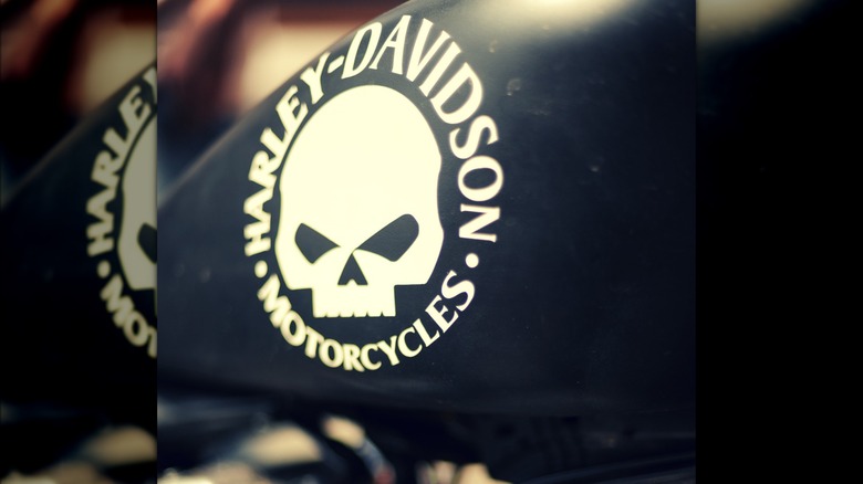
In the run-up to the 2000 Daytona Bike Week, Willie G came up with the image of a skull wrapped by the words "Harley-Davidson" above and "Motorcycles" below, all written in an eerie font. The skull imagery is not new, yet it became trendy during the 2000s, thanks in no small part to Willie G's creativity (oh, and a comic-book character known as The Punisher).
Branding and marketing are the name of any corporation's game. Find the perfect logo, and you almost don't need to do anything else. Today, the "Bar and Shield" has become so ubiquitous with Harley that it's now commonly used without interior verbiage, and adorns things you probably didn't realize Harley-Davidson makes, such as sunglasses, tents, and sneakers. But when you see it, no matter what color scheme is being used, you know it belongs to Harley-Davidson.
[Featured image by André Banyai via Wikimedia Commons | Cropped and scaled | CC BY-SA 2.0]