This Frustrating Android Change Might Hide Important Buttons If Implemented
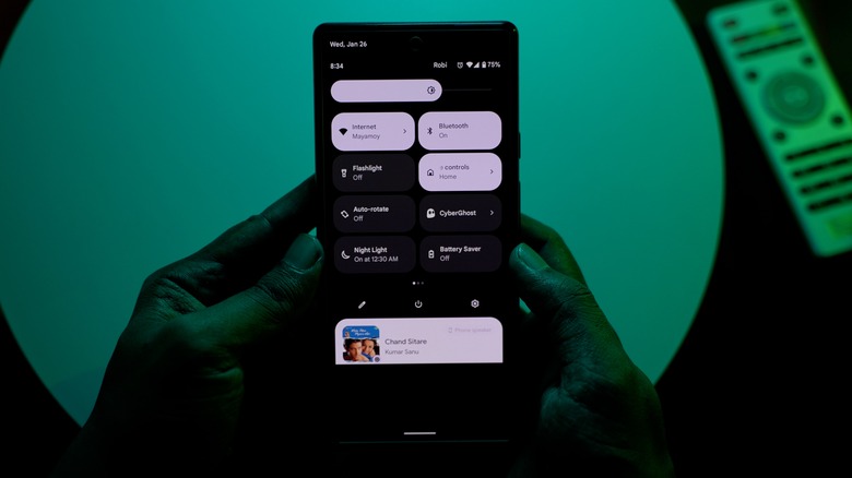
Over the years, Android has undergone some big changes, but from the very beginning, Google's mobile operating system figured out how to smartly implement notifications. From the very first version of Android, a swipe down from the status bar revealed the notification shade, where all your updates are arranged in a list. By 2012, quick settings had been added, which let you quickly toggle your ringer, Wi-Fi, and other commonly adjusted settings. This was refined in Android 12, where Google adopted a large, pill-shaped look for the quick settings panel. Meanwhile, other hardware partners like Samsung have taken to a design that makes individual quick settings buttons smaller but packs more of them onto the screen. But now, as a part of next year's Android 16 update, Google may fundamentally change the way quick settings are accessed.
There are, of course, common Android notification problems, but on the whole, the current paradigm is functional. Moreover, users are accustomed to it. However, it looks as though Google is ready to shake things up, exploring a move that would make the notification and quick settings panels much closer to that of its largest competitor, Apple's iOS. On iPhone, notifications and Control Center (its equivalent of quick settings) are separate panels, and that's what Google may reportedly aim to ape, despite notifications being widely considered one of the features Android does better than iPhones. Many Android fans will undoubtedly be a bit frustrated to learn that these changes could arrive on their phones next year, so let's break down what they are and how they could affect you.
Google is experimenting with an iOS-style change for Android 16
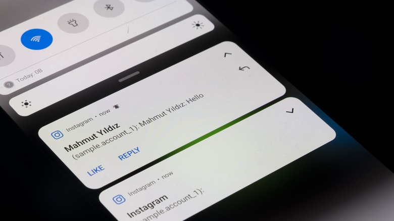
According to Android Authority, journalist Mishaal Rahman was able to trigger a new layout for the notification shade and quick settings panels while tinkering around with the Android 15 QPR beta — one that he believes was intended for Android 16. The change splits quick settings into their own panel, which is accessed by swiping down with two fingers from the status bar. This contrasts with the current way of accessing them, which reveals a partial list of settings on top of notifications with a single swipe down or a full quick settings panel with a double-finger swipe.
There are some benefits to this potential redesign. Currently, the top quarter of the screen is taken up by settings toggles when a user opens the notification shade. If you're playing media, those controls eat up even more space before you finally get to that urgent message from your boss or significant other. Splitting quick settings apart from notifications means more space for both. It also means quicker access to quick settings with a single gesture.
There are frustrating drawbacks, though. Most importantly, swiping down from the top of the screen with two fingers is extremely difficult when holding a large phone one-handed. Users walking with a coffee in one hand and phone in the other will need to set their joe down to silence their phone or turn on NFC. It's also worse for users living with disabilities. Plus, you can already access quick settings this way, which means you'll actually be losing a way of accessing them. If Google does implement this change, or something like it, it would be better if it were optional via a toggle in the Settings app.