8 Hidden macOS Sequoia Changes That Will Leave You Amazed
MacOS Sequoia is well into the public and developer-focused beta testing phases, with a wide rollout planned for the Fall season. The biggest change, of course, is the arrival of Apple Intelligence, which aims to pull off the same kind of AI-OS integration as Windows and it's Copilot-using machines.
Native iPhone mirroring came off as another neat surprise, alongside a seamless drag-and-drop feature for connected devices. Taking a leaf out of the Windows 11 book, Apple finally delivered a version of quick window tiling controls. Personally, I have grown fond of the new Password app, as well, and absolutely love the new reader mode in Safari.
But away from WWDC's big claims and snazzy presentations about the capabilities of macOS Sequoia, a handful of other features have barely gotten a cursory mention. Yet, they have big productivity potential. Let's look at a selection of underrated features that I've grown to appreciate.
Rotating Wi-Fi address
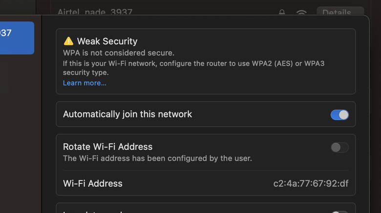
For a while now, Apple has provided a feature called Private Wi-Fi, which assigns a unique MAC address to each device connected to a Wi-Fi network. With the release of macOS Sequoia, Apple is introducing a new Rotate Wi-Fi Address feature to enhance privacy. This feature has also been integrated into iPadOS 18 and iOS 18, and is already live in the latest test builds that are now out for developers.
As the name suggests, enabling this rotation feature randomly changes the Wi-Fi address while the device is connected to the network. Apple asserts that this new feature provides increased protection against tracking since it can occur when the device's address always appears the same to nearby devices and users on the same network. Apple further claims that this will also make it more challenging for entities attempting to create a user profile based on the user's Wi-Fi usage.
It is important to note that this feature differs from the Limit IP Address tracking system already available on Apple devices. The Rotate Wi-Fi Address feature changes MAC addresses, while the Limit IP Address Tracking feature disguises IP addresses. Additionally, it is not comparable to what a VPN tool does.
Highlighter in Notes, at last
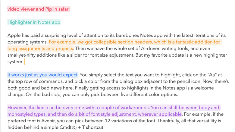
Apple has paid a surprising level of attention to its barebones Notes app with the latest iterations of its operating systems. For example, the new macOS version brings collapsible section headers, which is a fantastic addition for long assignments and projects. Then we have the whole set of AI-driven writing tools, and even small-yet-nifty additions like a slider for font size adjustment. But my favorite update is the new highlighter system.
It works just as you would expect. Simply select the text you want to highlight, click on the "Aa" at the top row of commands, and pick a color from the dialog box adjacent to the pencil icon. Unfortunately, you can only pick between five different color options, but it's still exciting to finally get access to this feature.
The limit can be overcome with a couple of workarounds, too. You can shift between body and monostyled types, and do a bit of font style adjustment, wherever applicable. For example, if the prefered font is Avenir, you can pick between 12 variations of the font. Thankfully, all that versatility is hidden behind a simple Command (⌘) + T shortcut.
Local unit conversions
Following in the footsteps of the iPhone and the oft-delayed iPad version of the calculator app, the macOS app is getting a conversion system. The interface is identical, as well, which is good news as the interactions feel natural already and there is no odd learning curve.
All you need to do is open the calculator app, tap on the calculator icon in the bottom-left corner of the screen, and click on Convert until you see a checkmark besides the text. As soon as the conversion tool is enabled, the input row at the top is split into two halves, one each for the user input and the converted output.
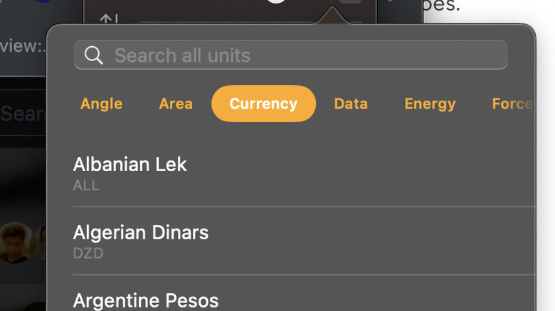
By default, it is set for conversion. However, you can tap on the arrow icon in the top or bottom and pick the conversion units in the drop-down window. At the moment, you get a total of 15 variations across segments like currency, distance, energy, data, and weight, among others.
Apple's approach is all about keeping things simple, even though it misses out on some metrics students or professionals might need as part of their daily workflow. For example, you don't get granular choices for heat, light, pressure, and electricity conversions at various scales. Adding a toggle to enable something like a scientific calculator would've been nice, but it's a solid start nonetheless.
Background replacement for video calls
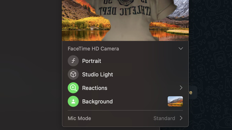
With the arrival of macOS Sequoia, Apple has also paid special attention to the video calling needs of its audience with the addition of two new features — a preview system before you jump into the call and a background replacement feature. In retrospect though, Apple is simply catching up with rivals like Google Meet and Zoom, which have offered such creative conveniences for a while now.
Apple's approach is pretty straightforward. When you start a video call, be it FaceTime or WhatsApp, just tap on the video icon that appears at the top in the status menu shelf. Doing so opens a small window that shows a preview of how what the camera feed will show in the video call, and a new background option underneath.
There are three categories of background options. The first one is a selection of gradients, the second has a handful of artsy work, and the final option lets you pick any image of your choice stored locally on your computer.
Your Mac remembers this choice the next time you hop on a call. The feature works fine, but struggles a bit with subject separation in dim lit. Apple says the tech relies on "industry-leading segmentation technology" to make users look nice in their video calls.
Message scheduling
One of the primary reasons I've stuck with a Mac ever since I first bough my first macOS machine four years ago is the seamless interplay across the entire Apple hardware ecosystem. This seamless cross-device connectivity also dips a bit into the digital well-being side of things, as I can safely keep my phone away and still handle tasks like messaging and calls, without having to touch my phone.
I've quite enjoyed the new message scheduling feature in iOS 18, and was pleased to see that Apple has expanded the functionality to macOS Sequoia, as well. Currently, this feature allows scheduling messages up to 14 days in advance, which is convenient, although not amazingly flexible. Thankfully, you still get the option to adjust the scheduling or even cancel it entirely.
All you need to do is open a chat, compose your message, tap on the "+" icon in the bottom left corner, and select "Send Later." You will now see a blue strip above the message in the composer field, where you can pick the date and time at which the message should be delivered. Once again, the implementation is supremely easy and there's no longer curve here.
Reminders, meet Calendar
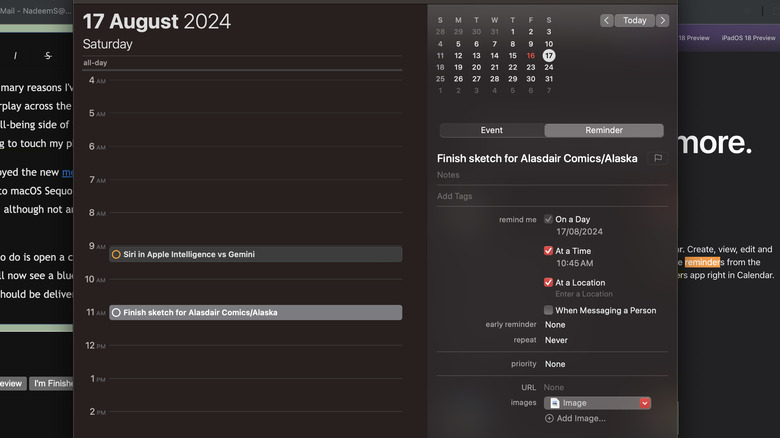
Over the past couple of years, Apple has given some serious functional lift to the Reminders app. In its current iteration, you can add grocery lists, set early reminder alarms, organize them into categories, and even check off tasks directly from the widget. With the upcoming major macOS release, Apple is deeply integrating Reminders inside the Calendar app.
You can now create new Reminder entires right inside the Calendar app. Moreover, you can edit existing entires, and sign them off as complete at your convenience. Right now, there are plenty of things you may not realize your Calendar app can do, but it all mostly focuses on tasks with a set date. Apple has revamped the Calendar's month view, making it easier to tell events apart from tasks, while still using color-coding for both.
As far as controls go, you can adjust the priority of Reminders, modify the repeat behavior, add a URL and media file card, and assign it a location behavior, as well. The interface is familiar across both Reminders and Calendar apps, which is a welcome decision. This integration may not sound like much, but for people working in a packed schedule or workflows that require meticulous task planning, the arrival of core Reminders functionality in Calendar could be one of the more meaningful upgrades.
Quick facts in Apple Maps
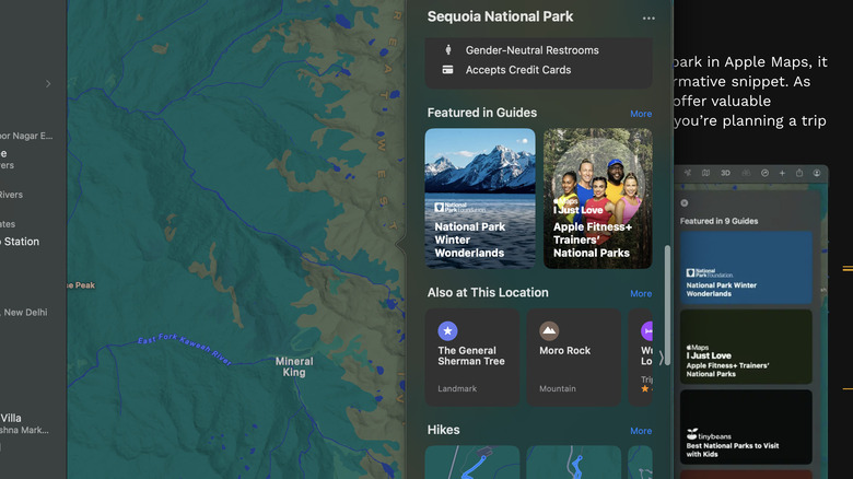
One of the overarching themes of Apple's OS updates this year has been a proactive knowledge-seeking approach that can quickly be turned into an actionable workflow. One of the best examples of this helpful strategy is Quick Facts in Apple Maps. In a nutshell, it provides information about a location that you would otherwise have to search in a web browser or other sources.
When you open Maps and enter a location, a small panel opens up, populated by icons for making a phone call, launching into navigation mode, and opening the share sheet. One-tap direction assistance and the ability to create a custom route sit right underneath. You can see user ratings, open/closed status, popular sights (in the form of pictures), a knowledge card pulled from Wikipedia, and other crucial information such as wheelchair accessibility, restroom facility, Wi-Fi availability, and parking, among others.
You will find a quick snapshot of articles where it is mentioned, whether it has been mentioned by Apple Fitness+ trainers, a selection of popular hike routes, and popular nearby locations. At the moment, this feature works best for well-known locations, especially those in the U.S., but you can expect to see this nifty feature expand to other markets in the coming months as well.
Math calculations in Apple Notes
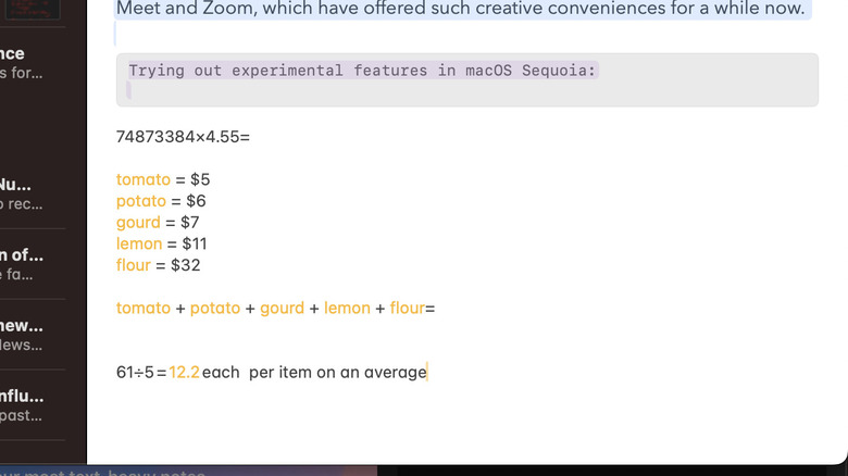
One of the most impressive announcements at WWDC was the arrival of mathematical functions in the Notes app. When it was demoed for iPadOS 18, Apple said you can use a stylus to evaluate expressions, assign variables, and even plot graphs, as if you were doing it all on a paper notebook. Notably, Apple extended some of those niceties to the Notes app on macOS Sequioa, as well.
It's not quite feature parity across both platforms, but in macOS Sequoia, you can still execute basic number crunching, the kind you would expect from a calculator. It can also handle basic variable-based equations and make sense of basic expressions. Just make sure you stick with "Western Arabic numerals and common mathematical symbols" and common mathematical symbols.
As you can see in the image above, the idea here is not turning the Notes app into super-powered do-it-all science lab software. Instead, it's targeted at low-key tasks where a person would otherwise want to launch the calculator app in a separate window. All you need to do is copy the numbers, add the mathematical operators between them, and enter the "=" sign to see the results.
