5 Arc Browser Features That Might Make You Switch
The world of technology is constantly evolving, with new phones and computers being launched left, right, and center. Innovation is even more readily seen in software in the form of apps or services. Despite having over a dozen streaming platforms to choose from and a multitude of social media apps at our fingertips, we all have our favorites. When it comes to surfing the internet, Google Chrome has long been hailed as one of the best browsers, be it on Mac, Windows, or mobile.
Its clean approach to the user interface — paired with countless useful features like a built-in password manager, site-wide translation, and support for third-party extensions — make it a default pick for most people. Backlinko put Google Chrome's global market share at over 63% as of 2024, but the competition is finally catching up — we've been seeing serious improvements in other web browsers. There are even certain features in Microsoft Edge that you won't find in Chrome.
A fresh contender in the race of web browsers is Arc, a solution that has surprisingly become a hot topic in every other tech podcast. We tested Arc to find out if it's actually worth the hype, and spoiler alert — it most definitely does some things that make it an absolute joy to use. So, if you've been unable to push yourself out of your comfort zone, here are five features that might finally convince you to try Arc as your new web browser!
Extremely clean user interface
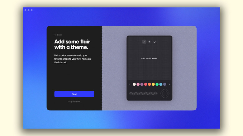
If you thought Google Chrome was minimalistic in style, wait until you use Arc. You'll notice a level of detail and a sense of personalization that is often missing in most other web browsers. This is true right from the very first time you launch the application, where it takes you through a series of customization steps, like picking the theme color. You can even select up to three different shades to create a beautiful gradient and add some texture to the background.
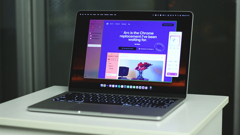
Once you've set everything up and imported your bookmarks, the first thing you'll be surprised to see is the lack of any buttons or options at the top where they're usually located. Arc instead opts for a sidebar approach, which a few other browsers have started to utilize (you can use Google Chrome's side panel feature for similar results). In Arc, everything from the address bar to your bookmarks and tabs are tucked away neatly to the left. You can configure this menu to automatically collapse for a more immersive browsing experience, too.
The new layout will take some getting used to, considering the years worth of muscle memory we've all developed using the familiar user interface of Chrome. Once you do get habituated to the new mechanics, though, you'll definitely enjoy your browsing experience with Arc.
Spaces for better tab management
There are a few features that help you stay organized in Google Chrome, such as using tab groups and customizing the home page shortcuts. Arc takes this to the next level with Spaces. Essentially, this is akin to using tab groups, or profiles. For instance, you can have one Space for personal use and entertainment, and another one with your work-related bookmarks and settings.
To create a dedicated Space on Arc, click on the tiny "+" icon at the bottom of the sidebar, then select "New Space". You can pick a name, associate it with one of the profiles you're logged into, and even create a new theme with different colors. Visuals also change when switching between different Spaces, which helps create a distinct environment. You can quickly navigate between your Spaces by using two fingers to swipe left or right on your trackpad.
If you're using a Mac, you can route certain web pages to open in a dedicated Space by navigating to Arc > Settings > Links > Air Traffic Control. I've configured Arc in such a way that heading to Trello will automatically launch the website in my work Space, while Netflix will always open in my default Space. You can get creative with the number and purpose of Spaces you want to create and route as many addresses to each of your profiles as you see fit.
Peek and Split Views for quick navigation
Peek allows you to open links in a pop-up view, as opposed to switching to a whole different tab — which can get quite annoying if all you're doing is a quick search. For pinned tabs, or websites that you've added to your favorites, all links will be opened in the Peek View by default. For other websites, you can simply right-click on a link and select "Open Link in Little Arc". This does something similar and launches the link in a smaller window that you can close once you're done interacting with the new webpage.
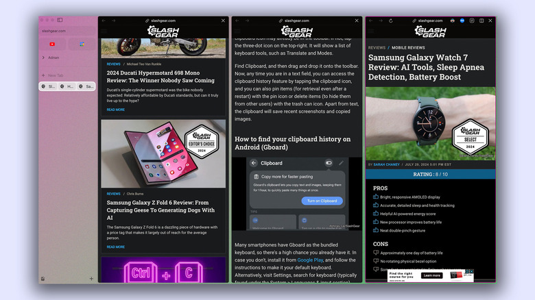
The Split view, on the other hand, divides the screen into two or more segments and allows you to read and interact with multiple tabs without having to switch back and forth between them. This might seem the same as just resizing two different windows side by side. In practice, though, it works much faster and more seamlessly than having to perform mouse acrobatics every time you want to have multiple websites open at the same time. There are shortcuts on both Windows and Mac to quickly enter the Split View on Arc.
You can pick between a horizontal or vertical split, which comes in handy for different types of web pages and content. The groups you've created using Split View will also reflect in your tabs column, allowing you to close individual windows with a single click.
Oh, and there are AI features too
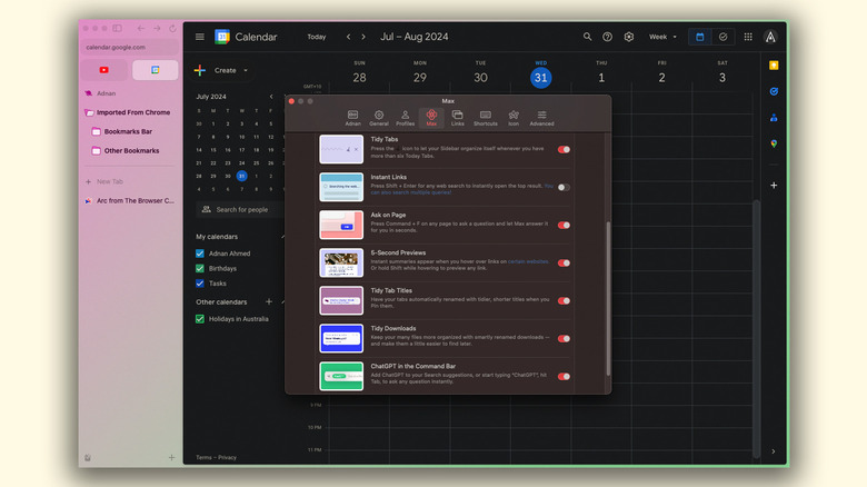
Apparently, launching a product in the modern day without an emphasis on AI is irresistible — and the Arc browser is guilty on all counts. Thankfully, unlike the disastrous launch of the Rabbit R1, the features that Arc has bundled in its browser are actually quite useful and come at no price. All AI-powered features are bundled under the Arc Max mode, that can be found by navigating to Settings > Max.
Some of our favorites include the "Ask on Page" and "ChatGPT" in the "Command Bar" features. The first one lets you press Ctrl + F (or Command + F on Mac) and ask Arc Max any questions related to the contents on the web page. The assistant will then go through relevant information on-screen and provide you with a surprisingly accurate response. The second feature simply acts as a shortcut and lets you start a conversation with ChatGPT directly from the search bar.
"5-Second Previews" displays a summary of any web page when you hover over a link while pressing down the Shift key. This can be a huge time saver when scouring through search results on Google trying to find the right website. Arc Max also has a bunch of AI tools that help you tidy up your downloads and tabs and promote a distraction-free browsing experience. The best part is that Arc doesn't force any of these features — it lets you either toggle them off individually, or disable Max altogether.
Boosts for customization
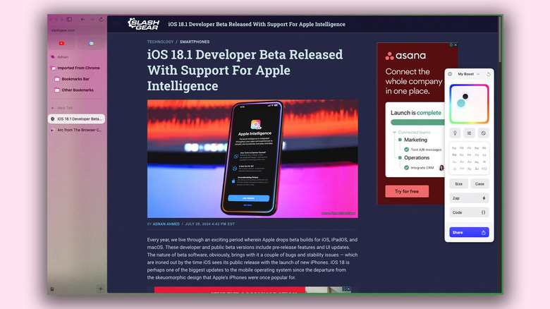
Last, but definitely not the least — and actually one of my favorite features of Arc — is Boosts. This feature opens the door for personalization like never before, allowing you to tweak the colors and fonts for virtually any website. Think of Boosts as a theme engine, but one that can be applied to any of your favorite webpages. You can create a new Boost by first navigating to your website of choice, clicking on the "+" button in the sidebar, and selecting "New Boost".
Depending on the compatibility of the website, you can even pick different font styles and change the size of the text. Like with Spaces, you can use two colors to create gradients for a Boost. There is even a "Zap" tool that lets you get rid of certain elements in a website — such as an icon or button you never use. For those familiar with CSS styling, you can use the built-in code editor to customize even more of your Boost presets. You can have multiple themes for a single webpage, and can enable or disable them with a single click. If you've managed to convince a few of your friends or family to try out Arc, you can share your personalized Boosts with them as well.
