Why Noplace, The New 'Myspace For Gen Z,' Is Taking Over The App Store
It's not every day that a new social media app pops up on the scene and then climbs to the top of the App Store. Noplace has just accomplished that. The app, which has been in an invite-only stage for about a year, is finally opening its arms to the masses, and so far, the reception has been quite buzzy. With a 380K waitlist to download the app — for a short period of time, it was ranked higher than titans like TikTok and Instagram. The feat is remarkable, especially considering what it has to offer. For starters, you can't post photos or videos. There doesn't seem to be any flashy social reactions in place.
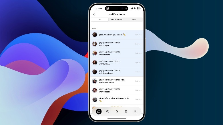
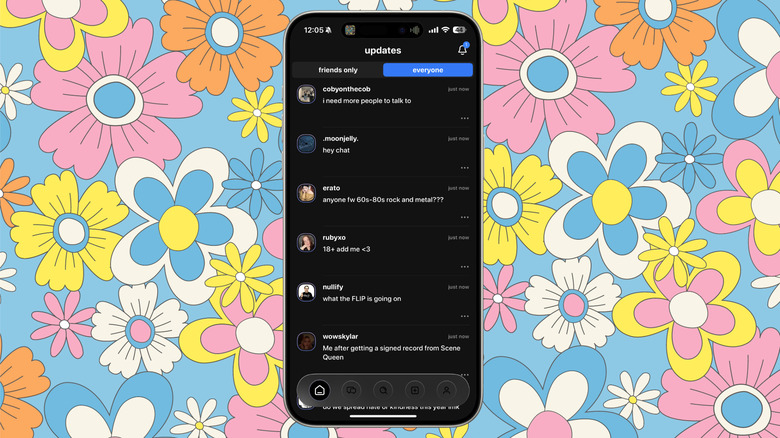
After roughly an hour of usage, I can see why noplace is going viral and the potential it has to become the next trending app like BeReal, or a legitimate social phenomenon among the younger audience. There isn't a conventional popularity metric like reposts or likes here. All you have is a number that displays the amount of organic posts in response to the original one. Another curious miss is an algorithm, which is what keeps users hooked on other platforms like Instagram or TikTok, feeding them an endless barrage of content that they might like.
Instead, noplace — which is being seen as MySpace revived — puts more focus on content moderation and uses AI to curate a feed. The feed of text-based content is divided into two sections — one that sources content solely from your friends, while the other is like a global feed. The latter is like a global message board, in quite the literal sense, where you see an original post with others responding underneath. Needless to say, this is also where you find more people to befriend.
noplace has raw social appeal
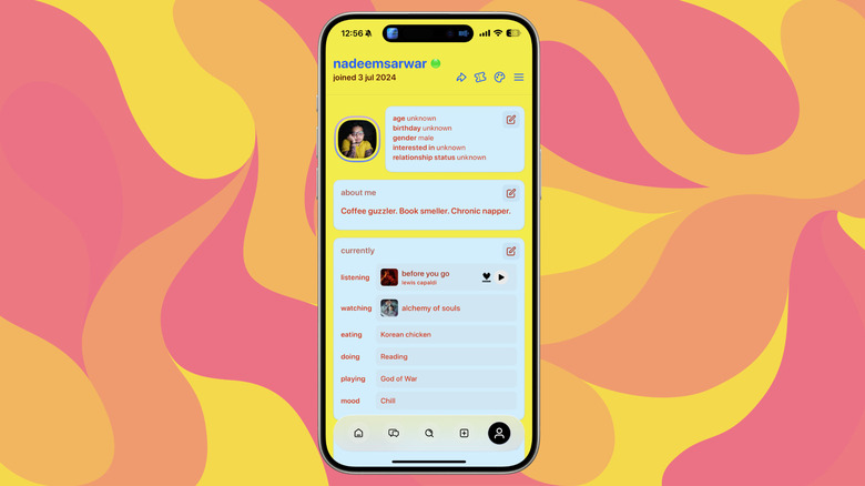
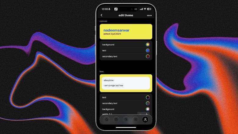
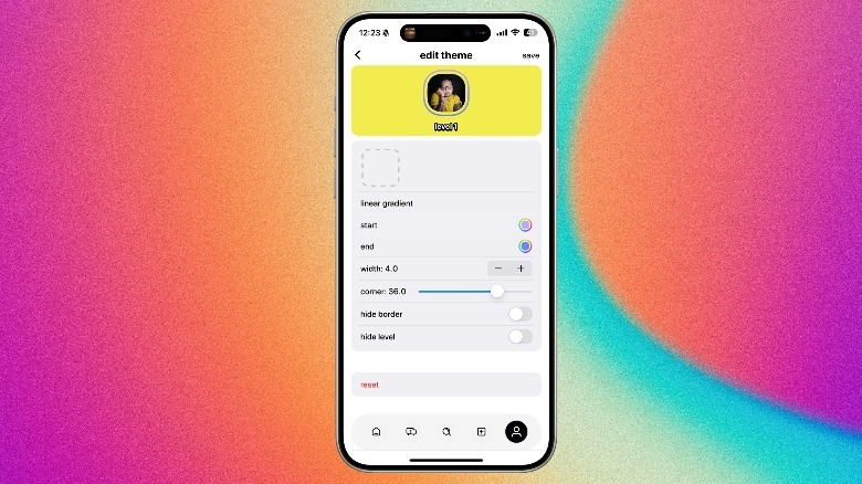
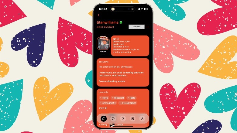
Noplace sets itself apart with a beautiful retro-industrial look that has a playful character to it. The app treats profile pages like a graphics-heavy social media resume, one where you can adjust the font color, background shade, how the outline looks, and more. And there's a lovely "add friend!" on each person's profile page that will instantly take you back to the Windows 98 era.
Instead of tags and interests, noplace has stars. You can add three to begin and add more as you begin your journey. Another striking aspect is that there's no pages-deep settings section or a ton of granular privacy tools. What you put up on your profile page is all there is, including your wall. The wall is the feed, where you write what's on your mind, and others will interact with it. The rest of the profile looks more like a snap book from school days, where you fill your interests (stars), age, gender, relationship status, and brief bio into the "about me" section.
A great conversation starter is the "currently" segment on the profile page, where you can add details like what you're eating, watching, doing, mood, or listening to at the moment. It's one of the prettiest apps out there that truly lets your personality come out with beautiful color-coded blocks and genuine interests. Moreover, based on your engagement, you level up and unlock some exclusive features. Although it has yet to reach the popularity of other Gen Z apps, and some of the initial hype has waned, there's still potential for the app if it can innovate and update. Currently, it seems that a smaller niche community is enjoying the app, unlike the virality of early TikTok.
