12 iPhone Features That Android Still Does Better Than Apple
If you want to reenact the events of Romeo and Juliet (minus the, er, bloodshed and whatnot), then just put a group of Android and iPhone users in the same room and ask them, "Which phone is best?" Grab your popcorn, sit back, and enjoy the fireworks. iPhone users will say Android users are lowlife green bubbles who are too poor to be AirDropped any pictures. Android users will say iPhone users are sheeple who will buy any overpriced, outdated, under-featured device Tim Cook unveils — and ask for seconds. It's a predictable rivalry. If you came here to have your particular bias confirmed, we're sorry to disappoint. But we will admit this much: Both platforms do things better than the other, and to give Android some ammunition, a handful of its winning features are noticeably missing from iPhone.
We're not talking about Android's superior customization in a general sense, or the fact that Apple continues to ship 60 Hz screens and 128 GB storage on $800 phones. We're looking at specific features of iOS, an operating system that drags its feet compared to Google. Here are 12 iPhone features we think Android still does better than Apple.
The notification system
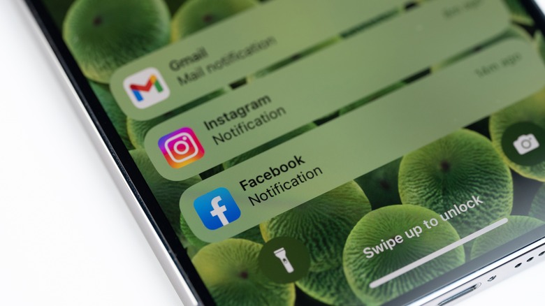
The iOS notification system usually makes the top three in any list of gripes iPhone users have — and the reasons we hate it are many. Take how the Notification Center is annoying to pull down, especially since it's not transparent. It also interrupts what you're doing, like pausing the video you're watching. But you have to open the Notification Center because you can't swipe its banners away when they pop down. And many argue that the non-chronological, per-app stacks of alerts creates a huge mess. There's a lack of built-in granularity for controlling which sort of notifications you get from each app, too — these programs either send notifications or they don't, and you have to hope they give you the option to disable the annoying marketing ones in-app.
Android better summarizes long lists of notifications and makes them easier to digest. It also lets you disable certain types of alerts when you receive them — so you can eliminate marketing notifications as they appear — and has a history log in case you missed something. You can even snooze notifications and easily expand and interact with them, such as replying or archiving an email. The list goes on. It's so much better that for many iPhone users, watching an Android owner manage notifications is like watching another kid lick their ice cream while yours is on the floor.
The iPhone does have some things going for it in the notification department, though. Attention Awareness with Face ID keeps sensitive content hidden. The focus modes work very well to permit only specific notifications during your work hours, and the Scheduled Summary option keeps alerts from ruining your experience by delivering them in bulk at a later hour. Still, these perks don't make up for the simple pleasure of swiping away an alert as it appears.
The keyboard
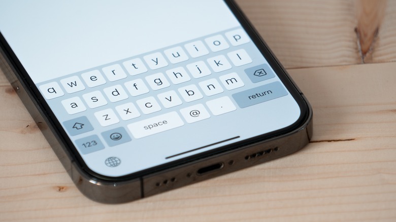
Next up, the keyboard, a particularly sore spot among iPhone users. It starts with the simple things, like how there's no number row or punctuation marks front and center. The autocorrect and text prediction are so bad that it's often better to just turn them off entirely lest you ruin your experience. Otherwise it will correct words to nonsensical ones, or fail to fix basic contractions like "I'll" or "we're." And even with those settings turned off, it seems like the keyboard never learns the way you type things — unhelpful with names like Braidyn and Ashleigh. Many users report a noticeable input lag, which in some cases can only be fixed by removing extra keyboards, which is a nonstarter for bilingual people. Some users even feel their typing is more accurate on Android compared to iPhone.
Gboard, the default on Android (also available on iOS, if you want the suffering to end) blows the iPhone keyboard out of the water. Aside from having that number row and punctuation marks as well as better autocorrect and text prediction, it has productivity boosting hacks like Gesture Delete and the ability to undo auto-correct on backspace. Another bugbear on iOS is the lack of language support — many are not supported or only partially supported, such as not allowing for swipe typing. Gboard, on the other hand, has languages to spare.
Volume and media controls
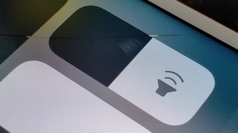
The problem with the volume slider on iPhone exemplifies the problem with its features in general: They're frustratingly limited. The slider controls whatever you're currently listening to, so if it's a call or media, it'll control volume, and if your phone's ringing or blaring the alarm, it'll change those settings. It also displays a Bluetooth icon whenever you're connected to headphones. And ... that's it. The complaints here are twofold: One, a single volume slider for everything quickly leads to confusion, and two, the lack of easy customization for different sound types is woefully insufficient, even if you aren't a power user.
For the former issue, iPhone forces you to dig into settings and change different volume types (say, the ringer rather than media). Otherwise, you'll have to wait until your device is ringing — or media is playing — to adjust the level of that particular sound. Not ideal, to say the least. On Android, the volume mixer is available to you right there beneath the slider. Users can change the settings at any time without opening the app or waiting for a particular sound type to play. Unless you always keep your phone on silent, the lack of simple mixer settings will drive you up the wall — or, y'know, to buy a Galaxy Ultra.
Launcher customization
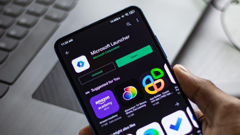
Don't like the look and feel of the user interface (UI) on your Android device? No problem — you can easily replace the launcher for another one. You can change every aspect of it from the icons and notification dots to menu appearances and color schemes. Google doesn't foist the default on you, either. You change the launcher to a third-party option of your choosing in Settings > Apps > Default Apps, without any "Are you sure?" nags.
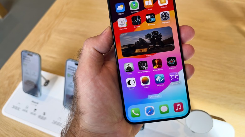
Don't like iOS's default look and want to try something new? That's your problem, bucko. There's no option to swap launchers, and likely never will be. Per Business Insider, Steve Jobs once said, "People don't know what they want until you show it to them." This has been Apple's guiding philosophy for years, and the reason why they often delay — or never deliver — things users beg for. Like launchers.
That said, we may be seeing this paradigm bend ever so slightly. In iOS 18, you'll be able to change the color and tint of home screen icons and make adjustments to the Control Center — two things users haven't been able to customize since the original iPhone in 2007. Are those the winds of change, hinting at ever-increasing customization in iOS 19 and beyond? We can only hope so.
Control Center buttons for Wi-Fi and Bluetooth
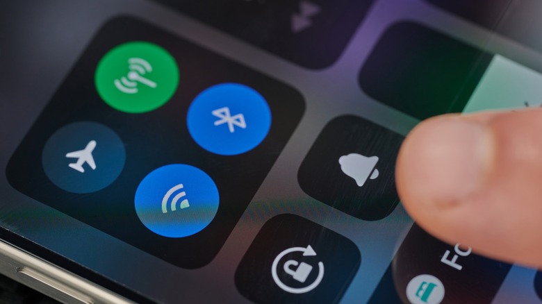
iPhone has a curious way of handling Wi-Fi and Bluetooth in the Control Center. When you turn them off, they gray out rather than disable completely. They aren't turned all the way off, though — only the current network and accessory are disconnected, and both settings automatically re-enable the next day at 5 a.m., or if you restart your device. The reasoning for this, according to Apple Support, is to prevent unwanted disconnection from your Apple Watch, Apple Pencil, Instant Hotspot, and Continuity features like Handoff — and, we presume, so these buttons come back on if you forget to re-enable them later.
The only way to fully disconnect from Wi-Fi and Bluetooth is to do so from the toggles in the Settings app, or to enable Airplane Mode and then hit the Control Center buttons. Besides being a potential security vulnerability, this design is just annoying. When most users turn their Wi-Fi and Bluetooth off, they expect to turn it all the way off, not put their phone in a half-hearted limbo state that's probably draining battery.
Android obviously doesn't have this issue. Disabling the settings from the internet panel turns them all the way off, every time. Better yet, the OS lets you do more without going into the settings panel, such as selecting a new network.
A dedicated back button
Ever since physical back buttons were replaced with extra screen real estate and gesture navigation completely replaced software buttons, Android's back function got its best-ever upgrade: To go back, you swipe in from either side of the screen. That's it. It's fluid, intuitive, and miserable to live without once you get used to it. It works to go back on a browser or app page, or exit an app to the previous one. Apple's back solution leaves a lot to be desired — and in this writer's opinion is the most gaping limitation on iOS.
On iPhone, there is no single, dedicated back button. To go back, you have two options: Give yourself premature carpal tunnel by stretching way up to tap the arrow on the upper left of the screen, or swipe right from the left edge of the screen — a feature that only works on Apple apps and third-party alternatives that support it. You can blame former Apple designer Imran Chaudhri for convincing Steve Jobs that the back button was "untrustworthy" unless pressing it always led to a consistent outcome. Jobs axed the feature from the original iPhone as a result, and it never returned. Chaudhri also made the massive flop that was the Humane AI pin, so it's probably safe to say Jobs would have been justified in getting a second opinion.
Force-closing apps
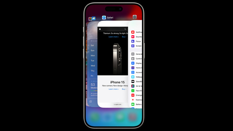
If you're one of those people who regularly opens the app switcher to close some apps at rapid-fire — whether to sate your paranoia or out of a belief you're saving system resources — you need to stop. Force-closing apps this way does nothing except drain your battery when said programs have to be reopened. If you don't believe us, check Apple's support page, where the company dispels the myth. The only real reason to swipe away an app is if you want to restart it because it's not working. With that said, there may be situations where you want to close all your apps to diagnose an issue.
iPhone only lets you close apps one at a time, but on Android, one tap can clear them all. To do this, swipe up and hold down to open the app switcher and press the "Clear all" button.. Simple. But just like iPhone, there's almost no practical benefit to doing this, so yeah — stop doing this (though it could come in handy in rare situations).
VPN split tunneling
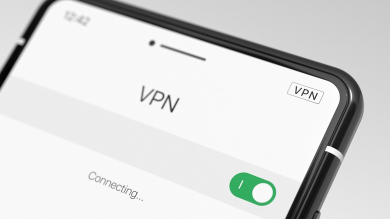
Virtual private networks (VPNs) are a must-have in the internet age for skirting Netflix region blocks and keeping your browsing traffic out of the hands of your internet service provider (ISP) — even if they aren't able to keep you anonymous. Most support a helpful feature known as split tunneling, which lets you route specific internet traffic through your VPN, leaving the rest unaffected. Useful, if you want to use a VPN to see what's hot in Hong Kong's Netflix selection without putting your banking app in a cold sweat thinking you've been hacked. Just one problem: The feature is next to nonexistent on iOS. It does work, technically, but is only functional with enterprise solutions, not for personal use.
As a result, you'll notice that most major VPN apps have split tunneling on Android, but not on iOS. Sadly, the feature used to be possible until November 2020 when Apple began rolling out changes that would make it difficult to implement. It's highly unlikely the company will backpedal and split tunneling will return, so Android users — enjoy the simple pleasure of separating your internet traffic. We'll be over here ... not separating it.
Third-party messaging apps
On iPhone, iMessage is king for sending texts over your cell network. You can't change it to use a different app, despite being able to swap browsers or email clients. This is likely because Apple wants to keep the gentrified blue bubbles separate from the peasant greens. To continue beating a dead horse that we think deserves to be beaten some more, Tim Cook once told a reporter that if people want modern texting features like typing indicators and read receipts, they should just buy $800 iPhones — instead of the company implementing support for Rich Communication Services (RCS). So yeah, love or hate it, iMessage is what you're stuck with.
On Android, Google Messages is the default texting app, but you can easily change it (or uninstall it) from the settings. Luckily, iPhone users aren't stuck entirely with iMessage for getting in contact with friends. Third-party messaging services like Facebook Messenger and WhatsApp are excellent alternatives, with their only big limitations being the inability to text over your mobile carrier. And RCS text support is coming to iOS 18, meaning iPhone-Android text conversations will have all the most important features found in iMessage, anyway.
Third-party phone apps
It's not just iMessage. The Phone app on iPhone is also your only option, and likewise gets a fair bit of flak from users. You can't easily edit numbers that you've typed or pasted in. T9 dialing for finding contacts by typing in their name is nonexistent (though it's coming to iOS 18). There's a lack of recommended or frequent contacts. And more. Being unable to change the default becomes especially painful seeing how Android users are having a party with futuristic AI-enabled calling. Cool Google Assistant features let them screen calls and hold their place in line for customer service — two of many things that haven't yet been announced for iOS, and may not arrive for some time, if they ever do.
Suppose, for whatever reason, you don't like the Google Phone app. You can change that, too, and have a separate app serve as your caller ID and spam filter. This could be useful if you wanted to, say, download a program with better call recording functionality. Or maybe you want one of those phone apps with soundboard sound effects to prank your friends. Or maybe you just want an open-source alternative to be 100% sure Google's not listening in on your calls. Whatever your reasons, none of that freedom is available to iPhone users.
Change the default voice assistant
Apple's Siri makes a bucket of river stones look like Einstein. She's unfit for doing much beyond setting basic reminders and turning on the lights. The Apple Intelligence announcement seemed like a needed IQ-boost for the flagging digital assistant — until we learned she's locked behind the iPhone 15 Pro and up. Awkward. That might not be too troubling if you could change her to the far more capable Google Assistant. Except, you can't. Not from Settings.
While we wouldn't recommend Google Assistant's competition (tech YouTuber Marques Brownlee ranked Bixby and Alexa ranked behind Siri), you at least have the choice of replacing it on Android. Both Bixby and Alexa can answer your summons and manage data on your phone. Even if the alternatives aren't great, it's comforting knowing you have the options.
Now to be fair, you can make Google Assistant your "default" on iPhone with a workaround. Simply download the Google Assistant app, then create a shortcut that triggers the program via Siri with the "Hey Google" wake word. You'll have to summon Siri first to use it, and Google Assistant can't interact with system apps (setting alarms, changing your calendar events, etc.), but it's still the best option for making verbal internet searches.
Files app
The biggest complaint about the new iPad M4 is how the barebones software leaves so much of its impressive hardware horsepower on the table. iPadOS is basically a blown-up version of iOS, and many of its deficiencies originate with the iPhone. The Files app is an excellent case study of this, and user grievances would take a full-length fantasy saga to be properly aired. The search function is dreadfully bad. AirDrop doesn't let you choose a destination. You can't view the file structure, or view files from third-party apps. You can't open files in another app, they open inside Files. You can't transfer files to a connected device like a computer. In the interest of keeping this article brief, we'll stop there, but we've only scratched the surface.
Yeah, you guessed it — you can change the default files app on Android as easily as everything else on this list. No such option exists on iOS. And even if you couldn't change the Android program, at least the default there is subjectively better. Files by Google has 4.5 stars on the Play Store as of this writing, compared to 3.0 for Files on App Store. Case closed.
To be as fair as we can to Apple, there are tons of file manager alternatives on the App Store, even if they don't get the status benefits that come with being a default. Documents is one example, and receives high praise in online forums despite its limitations. Others still serve as excellent, free alternatives that soothe the sting of the pitiful Files experience.
