Moto Razr Plus (2024) Hands On: Doubling Down On The Cover Screen
Disclosure: The writer of this article worked independently with Motorola on pre-production units of the Moto Razr and Razr Plus. This separate SlashGear review is based on production unit hardware and is done solely at the behest of SlashGear.
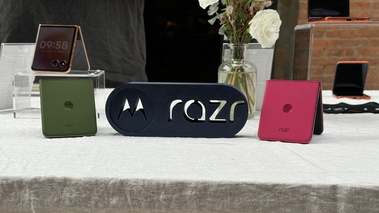
Motorola is launching a pair of new flip-style foldable phones this year, and this time, both the Moto Razr+ and the Moto Razr are launching at the same time. I got to go hands-on with Motorola's flagship foldable in New York, and I'm able to share some initial impressions.
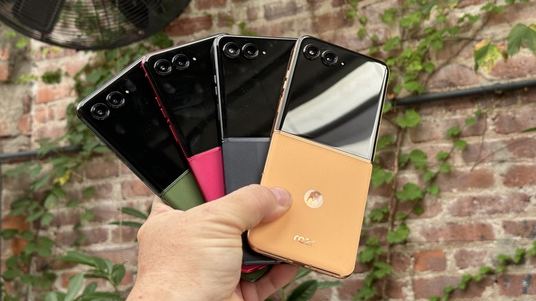
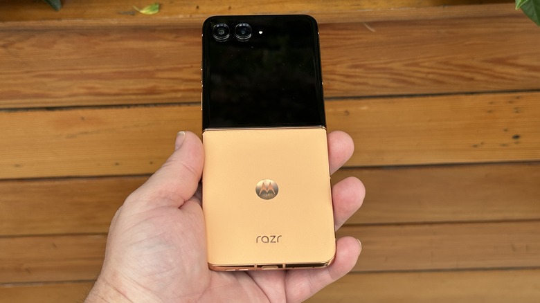
Overall, it's safe to say that both of these phones feel like the version of themselves that they should have been last year. Another way to put that is that these phones are the most refined versions of themselves, and that's truer for the Razr+. Motorola extended the exterior screen so that it takes up the entire top half of the opened phone, or the entire area of the closed phone sitting on a table. That's where it needs to be and will assure that Motorola continues to wear the "largest exterior screen on a flip phone" title for another year.
A step forward; a step back
The most notable improvement in this phone over the Moto Razr Plus (2023) comes in the form of the 50 MP main camera. The sensor is brand new for Motorola, and an upgrade over last year's 12MP sensor. The other camera holds a 2x telephoto lens, and if you can count to two, you'll realize that means there's no room for an ultrawide sensor. That was intentional. Motorola felt that a telephoto sensor will give you better bokeh for portraits and allow you to zoom in. That's all true, and personally, as a guy who rarely uses the ultrawide camera (except for camera testing), Motorola has my vote. But it's still very much a controversial decision.
The size of the sensor also contributes to one of the more annoying aspects about the build. The camera sensors both protrude from the face of the phone by quite a bit — roughly four times as much as the Razr+ (2023). Don't let that scare you; it amounts to about 2 millimeters. But that is a bit of an impediment when trying to swipe on the exterior screen. It's not terrible, and if the cameras are good, then it'll be worth it, but it's still a bit on the annoying side.
Software updates
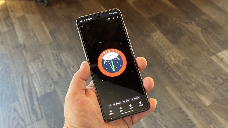
This year's Razr+ comes with four years of operating system upgrades, which is good; Motorola is catching up to the other major players in this regard, which is a good thing. You'll also get five years of security updates. Overall, not too bad.
The cover screen has a whole new user interface which is more user-friendly — I described this in detail in my Razr hands on. The short version is, you can simply pinch to zoom out to select or reorganize your panels. Beyond that, there's a new panel available which gives you the ability to add Android widgets. If you're like me, there are a few widgets that are super helpful on your phone's home screen — they can be on your widgets panel now, too. It seems like low-hanging fruit, but it's there now, so we can all rejoice.
Motorola also worked with Bose to develop a panel specifically for Bose headphones. Any Bose headphones will work. This panel allows you to quickly access your headphones' settings, which is rather niche. All the same, it goes to show that these panels can evolve over time.
Bring on the AI
The Motorola Razr+ sports the Snapdragon 8S Gen 3 processor, which is a less expensive version of Snapdragon's flagship. It should still be quite the performer, and it still has the 8 Gen 3's AI capabilities. Google Gemini is on board, which could be useful everyday, as is the ability to use Gemini on the cover screen. The Razr+ (2023) allowed you to use Google Assistant on the cover screen, but it was never ideal. The Assistant interface appeared and would accept spoken commands, but you never got any additional UI beyond that. The Razr integrates Gemini's UI fully, which is a nice change.
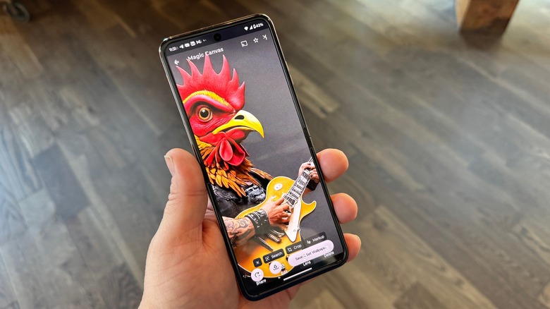
Additionally, there are a number of AI enhancements in everything from photography (which uses AI to clean up your photos) to wallpapers. Magic Canvas and Style Sync both use AI to generate wallpapers for you. Magic Canvas uses prompts like "Heavy metal chicken with tattoos" to generate a wallpaper — with amazing results, by the way. With Style Sync, you can snap a photo (presumably of your clothes) and generate a wallpaper based on that pattern.
Plus, down the line, Motorola teased Moto assistant that can help you organize your life, summarize your notifications, and do all the other AI things that other AI makers claim will make your life oh so much easier. We'll see when that comes out how valuable it is.
Still leading the way
Motorola released a great phone last year, and followed it up with a better phone this year. It made some interesting choices; that's for sure. But overall, I think this was a solid first step. When you take the Razr (not plus) into account, this is a really good lineup of flip-style foldable phones for the U.S. market. It's hard to place where this phone falls in the foldable market, with Samsung lurking around the corner, but the rumors suggest that Samsung doesn't really intend to push the envelope.
That's really good news for Motorola, and it feels like the company intends to pounce on Samsung's seeming complacency (as it rightly should). My verdict will wait for the full review to come next month, but for now it's safe to say that Motorola is positioning itself well to be competitive not only in the U.S. market, but in the world market. This phone has a lot going for it, as does the Razr, and it's hard to see a move that Samsung can make to stall that momentum.
