16-Inch MacBook Pro Leak Reveals Apple's Touch Bar Change
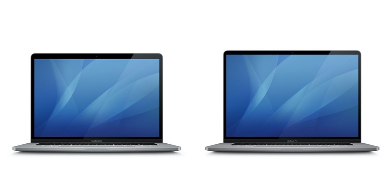
Apple's much-discussed 16-inch MacBook Pro continues to drip details, with the latest leak suggesting the aesthetics of the larger notebook won't stray too far from what's already on the market. The new MacBook Pro is expected to squeeze a slightly larger, potentially higher-resolution Retina display into a similar footprint as the current MacBook Pro 15.
It'll do that by slimming the bezels around the display, so it's believed. Apple's own graphics have apparently confirmed such a strategy, with images buried in a recent beta of macOS pulled out to show how the new 16-inch MacBook Pro's panel gets closer to the edges of the notebook's lid.

Would-be buyers of the new machine are, arguably, more interested by what's in the lower half, however. Apple's decision to switch to its homegrown "Butterfly" keyboard mechanism has been a highly controversial one, not least because of frequent complaints that it breaks too readily and is tricky to repair. Many had hoped that the company would switch back to a more traditional, scissor-switch type in the new MacBook Pro.
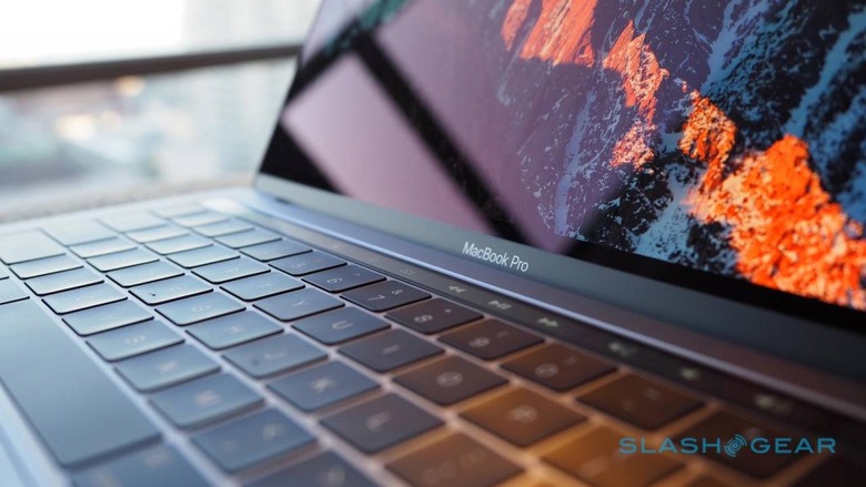
At the same time, the Touch Bar has proved to be less compelling to users than Apple might have hoped. When it launched the slim OLED touch-strip on the MacBook Pro back in 2016, Apple's argument was that the secondary display provided the flexibility of a touchscreen with the ergonomics of a notebook. In reality, it proved underwhelming for owners, not least because of how it made the Escape key a software button rather than a physical one.
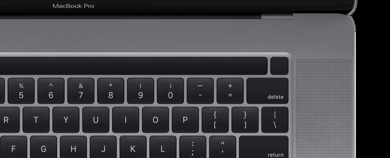
How much of all that Apple might address with the 16-inch MacBook Pro has been a big topic of discussion, therefore. A graphic spotted within macOS 10.15.1 indicates the slimline touchscreen is here to stay, unsurprisingly, 9to5Mac reports, but shows that the power button – which doubles as a Touch ID fingerprint sensor – is now separated from the Touch Bar.

That chimes with previous reports that, at the opposite end of the Touch Bar, the Esc key would now be a separate, physical button. Doing the same for the power button would help keep the new MacBook Pro visually symmetrical.
What's clear is that Apple isn't straying too far from its current design language. Where you stand on that will depend on your appetite for change; the current style of the MacBook Pro was dramatically different to the rest of the market back when it was first revealed, but Windows notebooks have come on in leaps and bounds since then. At the same time, some power users have voiced regret that Apple's prioritizing of slim laptops has had an unwelcome impact on factors like performance, battery life, and connectivity.
The reality seems to be that the 16-inch MacBook Pro isn't going to change all that in any fundamental way. Then again, perhaps it doesn't need to. As long as Apple gives its pro-users a more reliable keyboard, a dedicated Escape key, and a bigger screen, they may well be content.
