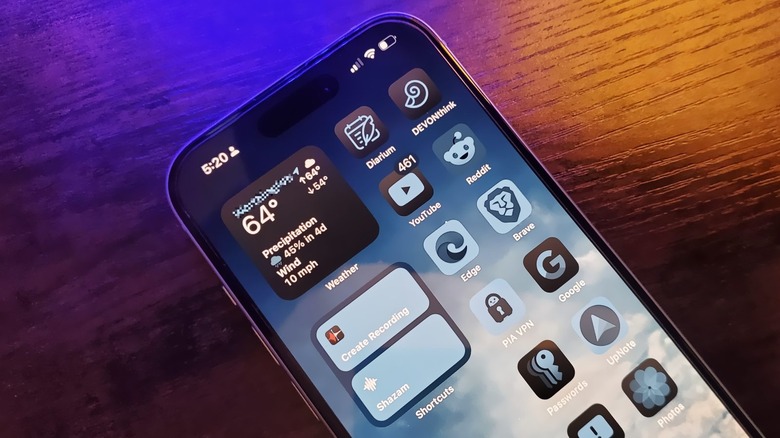
How To Enable Dark And Tinted App Icons In iOS 18
Apple hasn't always been the most generous host when it comes to OS customization — in fact, it was only in 2022 that it opened the doors for something as basic as lock screen customization on iPhone. However, with the introduction of iOS 18 in 2024, Apple gave users an added dash of aesthetic control over app icon coloration and positioning on the home screen.
Yeah, it's something that should've been made a part of the home screen customization toolkit quite some time ago, but at long last, it has finally arrived. Do keep in mind, though, that this isn't the same kind of granular control that you would get on an Android phone. This is neither a match for Android's Material You controls in terms of artistic flexibility, nor is it a match for the combination of a launcher and third-party icon pack that can overhaul your home screen in its entirety.
In iOS 18, you still have to stick with the default icon geometry. You don't get any fancy editing controls like editing shadow depth or giving a line art look to the icons — all you get are controls for adjusting the color tone and intensity, a choice between two icon sizes, and the option to adjust the positioning. But when done right, it does add an element of minimalist joy to your phone's home screen.
How to change your iPhone's icon color
In order to get the dark or tinted look for app icons for the iPhone's home screen, you will need to be running iOS 18, which was released as a developer beta in June 2024. Assuming you have the latest version of iOS 18 installed on your phone, follow these steps to change the icon color from light to dark or to add a tint:
- Long-press an app's icon to open a pop-up window with customization controls.
- In the pop-up window, tap on Edit Home Screen.
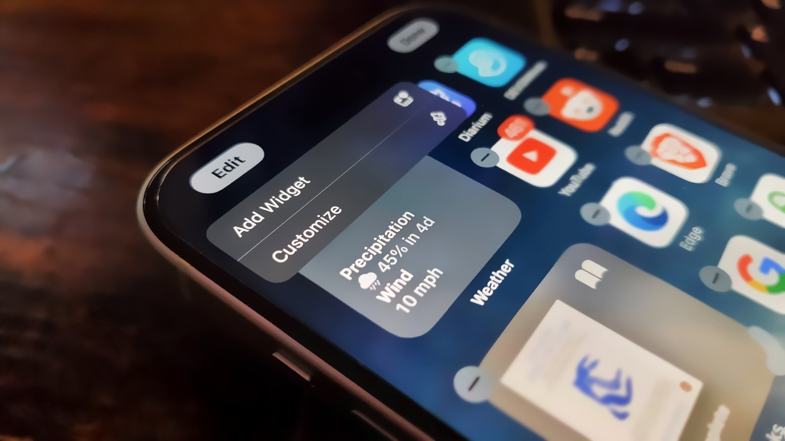
- Tap the Edit button that appears in the top-left corner of the screen.
- Tap the newly added Customize option.
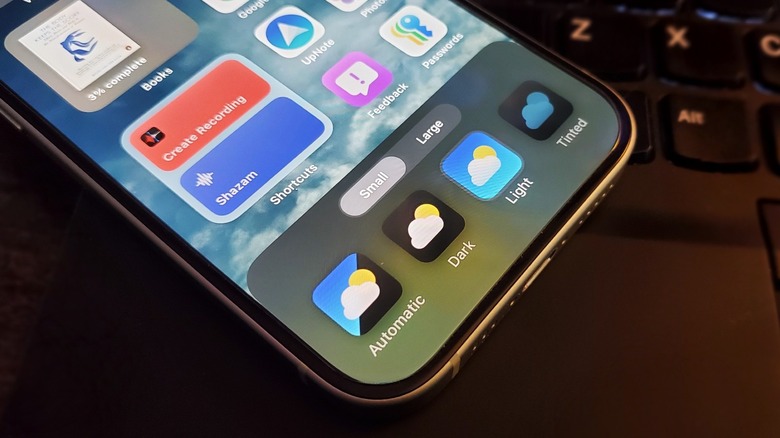
Selecting the Customize tool will give you controls like picking between Light and Dark icon themes. The difference is quite subtle between them, however. The third and final option on the Customize deck is Tinted, which lets you adjust the color shade for the tint and its strength using two sliders. Depending on the background wallpaper, you might need to play around for a bit to find the right balance.


