iPad Pro M4 Review (2024): More Power Than You'll Need, Less Than You Want
- Stunning industrial design
- Solid build
- High-end performance
- Fantastic OLED display
- Surprisingly good battery life
- Great keyboard to go with it
- Considerably expensive
- iPadOS is unapologetically barebones
- Full M4 firepower is price-locked
- Accessories are quite expensive
- M4 potential largely untapped
There are certain machines that need to be experienced firsthand to realize their potential and real-life efficacy. In 2024, no device is more deserving of that honor than the M4 iPad Pro. The hardware is dreamy, the firepower underneath is a notch higher than in its predecessor, and the display is dazzling. This is an altogether splendid piece of hardware, to be sure.
Apple has left no stone unturned to make its latest slate, and then extended the same treatment to the accompanying keyboard accessory as well as the stylus. Every piece feels like a complete reimagination, a kit that is unabashedly aimed at destroying the tablet competition. Or making its user base forget the competition exists.
But this is an Apple machine, and some caveats come with it. The stakes are even higher this year, all thanks to the sweet price hike. Here's my experience of pushing this machine and how it fared on Apple's tall claims.
Excellent hardware
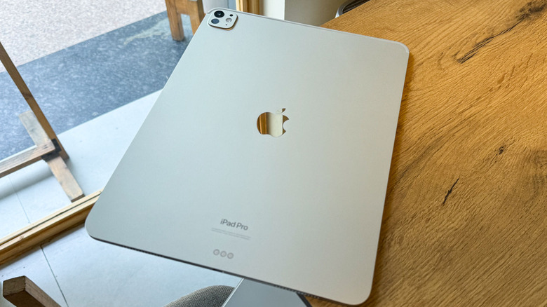
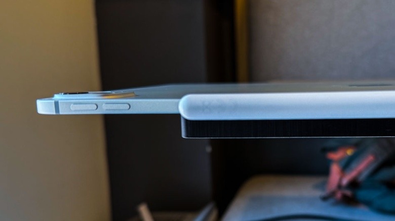
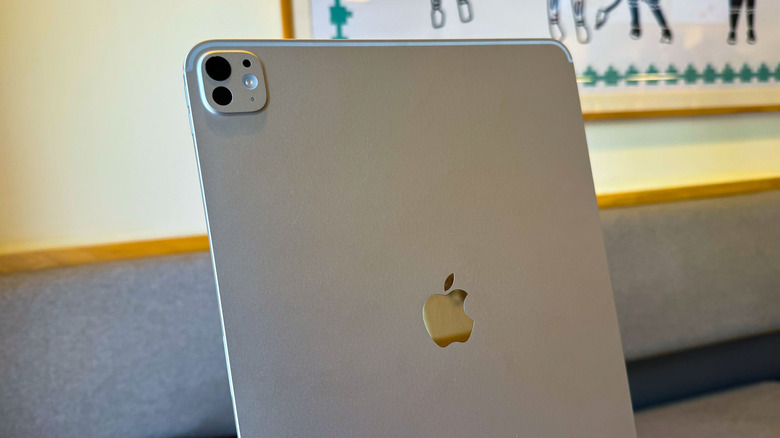
The 2024 iPad Pro is thin, more so than a slate this powerful has any right to be. With a cross-section of just 5.1 millimeters and a weight of 1.27 pounds (579 grams) for the 13-inch version, this is one of the slimmest machines out there. Yes, you won't always be carrying this machine in your hands, but when you do, it won't make your arms regret the decision. Apple has once again used 100% recycled aluminum for the slate's enclosure and offers it in two familiar colors — silver and space black.
The metallic shell does a good job keeping smudges at bay, but I would strongly recommend putting a skin or a protective shell on it. Scuff marks look ugly, especially on the silver version. I have a silver 10th gen iPad that serves as a painful reminder of my wayward ways with protecting gadgets. Moreover, I don't trust Apple gear with metal kits, especially around the corners and edges. My M3 MacBook Air is barely two months old, and already has a healthy few spots on the edges where the paint has scratched, exposing the scarred silvery metal underneath.
To Apple's credit, the iPad Pro's weight balance is great and you can easily carry the slate around in your arms for note-taking or other such chores. Another practical change that Apple has made this time around is a horizontally-aligned front camera. It should've been the obvious choice from the start, especially when Apple is pushing the iPad Pro as a legitimate workhorse that even apes the looks of a laptop. Oh, the ultrawide camera has also gone missing as Apple embarked on a crusade to engineer its "thinnest device ever."
A fantastic display
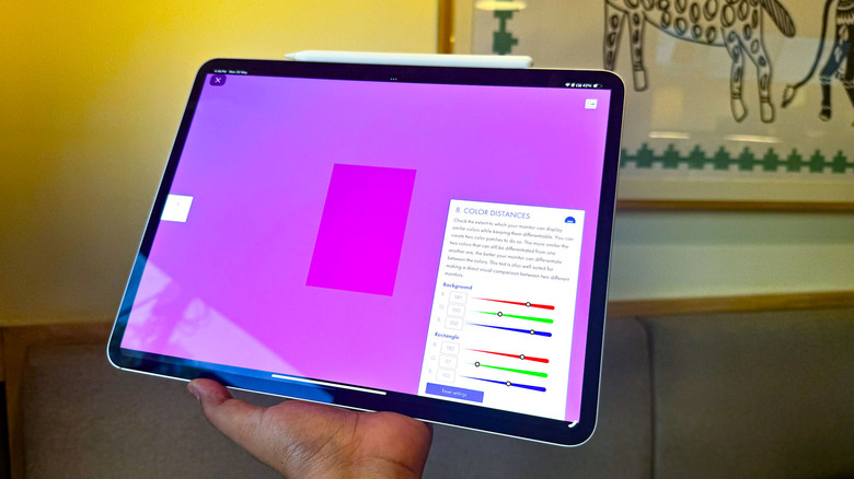
One of the biggest draws is the new Ultra Retina XDR display is the underlying tandem OLED tech. I'll start with the bad part first. It's amazingly glossy and loves to attract smudges. If you can't live that visual woe, Apple would kindly take your $200 for a nano-etched textured glass coat. It solves the reflective glare problem, but seen side by side, this one looks less appealing in terms of color saturation and is therefore arguably not an ideal choice for color-obsessed creative folks.
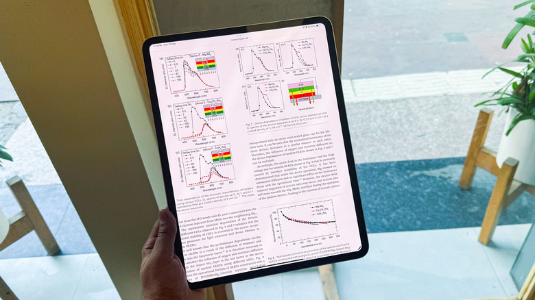
On the bright side, this time around, the OLED love is shared across both sizes, unlike the mini-LED generation, which was exclusive only to the bigger 12.9-inch model. This is one of the nicest screens you will come across, and it's due to a combination of both hardware and OS-level optimizations. The screen delivers excellent colors married to great viewing angles and terrific sharpness.
Shifting my workflow between an M3 MacBook Air, an assembly of two ultrawide monitors on my desk, and the iPad Pro, I actually found myself gravitating towards the new Apple slate more than any other machine. Now, I am not sure if creative folks would really use the iPad Pro as a reference screen, despite Apple's best intentions to market it as such. I asked an award-winning video journalist about it, and they simply laughed off the idea. "Dude, that 13-inch size is too small," they told me.
Tandem OLED tech
Now that we are talking screens, let's get into a bit of science here. Tandem OLED is not another tongue-twisting marketing jargon. Display stacking in a tandem arrangement is an innovative tech that brings more benefits than just boosting the sheer brilliance of a panel. There have been multiple experiments with chemical variations for the inherent charge generation layer, but the benefits are quite diverse. At the fundamental level, a tandem layer is essentially two OLED panels stacked atop each other, while the connection between them is driven by charge generation layers.
But what's wrong with a single OLED layer? Well, the magnitude of current that can be injected into a single OLED stack is limited, and it can't reach high luminance figures. On a tandem OLED stack, depending on the light extraction design at play, the light extraction efficiency can be enhanced by up to three times. Thanks to the unique architecture, when external charge is applied, there is a multi-fold increase in the number of photons. As a result, the net brightness goes up, which is no small advantage.
In simple terms: compared to previous iPad Pros, the OLED panel on this device is brighter, sucks up less power, and will last longer.
Quality tests
The peak brightness of 1,000 nits for SDR content, and 1,600 nits in HDR mode, beats the best smartphone OLEDs on the market today. That's nearly double that of the Asus ZenBook S13 OLED. But thanks to Apple's tight rules around animation and scaling at the OS-level, the 120Hz ProMotion panel on the iPad Pro makes every interaction feel smoother than any other device I've used. Using the EIZO monitor quality test, I analyzed the gray-scale uniformity at three linear gray tone levels and the RGB gradient test. The iPad Pro excelled in these tests and provided excellent results at the monotone gradient and viewing angle stability parameters.
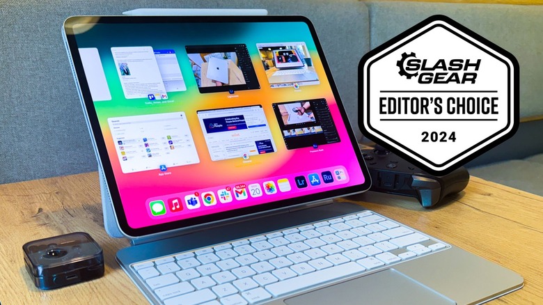
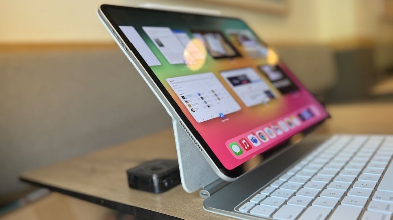
I worked with the iPad Pro as my primary workflow driver for about a week in a variety of scenarios: from a sofa in a pitch-dark room to a well-lit coffee shop and an open-sky college canteen. Save for the reflection issue, especially for eyes that have grown to love the dark mode, I would give the OLED panel a perfect score for visual fidelity and legibility. It is a joy to power it on and prop it atop the Magic Keyboard. The slimmer profile of the slate definitely helps the iPad towards its candidacy as the best portable screen available today, and a feature-packed stylus lends a helping hand, as well.
I have worked for about two years on an 11-inch M1 iPad Pro, pushing it to its limits, and I can confidently say that the 13-inch screen is definitely the saner choice for getting serious work done. Thanks to the tight pixel-level control of an OLED panel, the blacks and contrast are outstanding. Indoors, the black bezels almost merge with the black background in certain apps.
Processing Power
The 2024 iPad Pro marks the introduction of the M4 silicon, which is based on TSMC's updated 3-nanometer process node. This one offers 10 GPU cores and an equal number of CPU cores, two more than the M2-fueled iPad Pro. The gains over the M2 are impressive, with Apple touting a 50% jump at raw CPU firepower, and matching performance at half the power draw. The memory bandwidth has also increased by a healthy 20%, reaching 120 Gbps on the M4 generation.
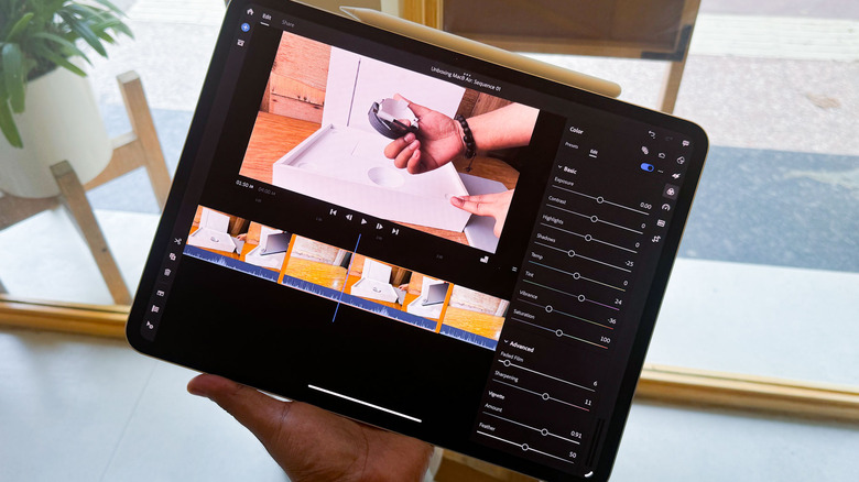
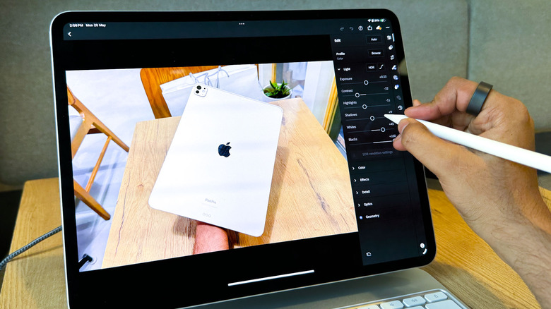
But for an average enthusiast, how much those speed gains matter rests squarely on the machine in their hands. If you have an M1 or M2-powered iPad in your hands, the M4 won't make any day and night difference in your workflow. I definitely feel that the M4 iPad Pro is snappier than the M1, but not enough to warrant a desperate jaunt to the Apple Store. On its own, however, the M4 is an outright beast. Photo and video edits in the Adobe Suite of apps were speedy. Even with about 20 apps in the background with Stage Manager enabled, this machine never stuttered or froze.
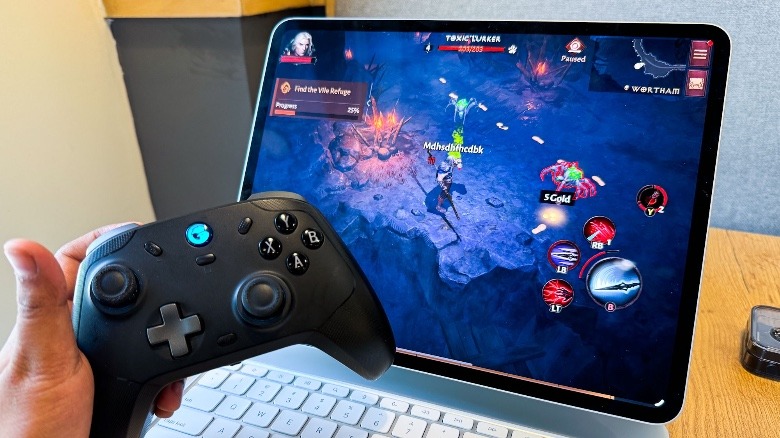
But you will see the difference in demanding apps. I fired up DaVinci Resolve and saw nearly a 3x improvement at the rendering pace of a sample 4K video edit with heavy effects applied. But remember to fork extra (a lot) cash on at least the 1TB storage version to get the 16GB RAM version for such workflows. Both "Diablo Immortal" and "Call of Duty: Warzone" really show how far the tablet's come over the past decade. You can confidently push every single graphics setting to the max, and have a gala gaming time on the M4 iPad Pro.
Locked up silicon
All that talk of a nigh-peerless processor inside the iPad Pro is seriously undermined, as one of the worst parts of configuring a Mac makes the leap over to Apple's tablet. Remember how Apple will give you a less powerful version of its computing M-series silicon with fewer GPU cores if you buy one of the entry-level Mac configurations? Well, that undesirable situation has made its way to the iPad Pro, as well. For the first time in the iPad's history, Apple is offering two versions of the M4 silicon. The entry-tier version serves a 9-core CPU, while the higher-end version gives you 10 processing cores.
That extra (or missing) CPU core matters because it's one of the bigger hardware-accelerated cores that handle demanding workflows and not a low-power efficiency core. If you are looking to push the iPad Pro at demanding workflows, especially pro-grade video editing, that additional performance will definitely make a visible difference, and for reasons more than one.
You see, that extra performance core is not just a question of a few extra bucks. Instead, Apple has tied access to it behind the memory configuration. You will only get it if you pay for the 1TB storage version.
That means if you are eyeing the 256GB storage version, but want those 10 CPU cores, your bill goes up by $400, at the very least. I can't imagine a customer would be happy paying as much as $1,499 on an iPad Pro, only to be told that it contains a less-powerful M4 trim and just 8GB of RAM. Oh, the RAM situation. You will only get 16GB RAM if you pay for the 1TB storage variant of the iPad Pro, as usual.
Magic Keyboard testing
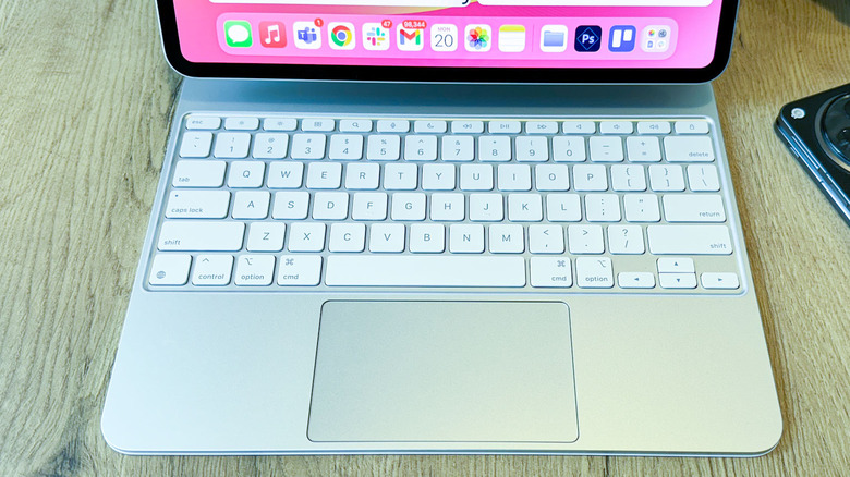
For a couple of years, I have harbored a love-hate relationship with the Magic Keyboard. For a keyboard that pulls roughly $300 from your wallet, the black Magic Keyboard on my M1 iPad Pro blessed me with a peeling skin — and the glue right below the trackpad dried off, leaving an ugly exposed gap alongside the bottom edge. The updated Magic Keyboard wants to fix those critical flaws, and so far, the experience has been great.
The switch to an aluminum deck gives it a premium look, and gets it teasingly close to the MacBook aesthetics. The typing experience is noticeably better, and the addition of a function row key at the top is a meaningful change. The trackpad has also seen its dimensions stretched, and thanks to the arrival of a glass layer, executing swipe gestures or even mundane scrolling on it feels better. Button clicks are also more uniform across the trackpad. But the most notable upgrade is the addition of a haptic engine underneath. As soon as I set the iPad Pro for the first time, I enabled the tap system for the trackpad and got rid of physical clicks without regretting it.
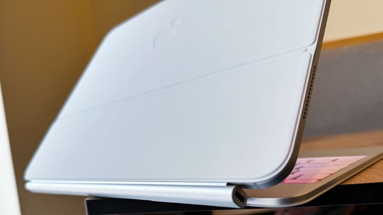
The metallic ridge at the back is exposed now, which now means zero risk of any ugly skin peeling. I am just a tad bit skeptical of how the polish on it will hold in the long run. On the bad side of things, Apple won't let you manually adjust the backlight brightness of the keyboard under ample ambient light. Moreover, if you're using the whole kit on your lap, know that the deck won't rest still like an average laptop, thanks in no part to the top-heavy nature of the whole setup here.
Battery testing
There's something curious going on here. The M4 iPad Pro is 22% thinner and about 16% lighter than its M2 counterpart. And yet, despite fitting in a smaller battery, Apple still touts a 10-hour battery for the latest iPad Pro. Now, those longevity figures are based on web surfing and watching video. But to my surprise, the tablet held pretty well even with far more demanding workflows.
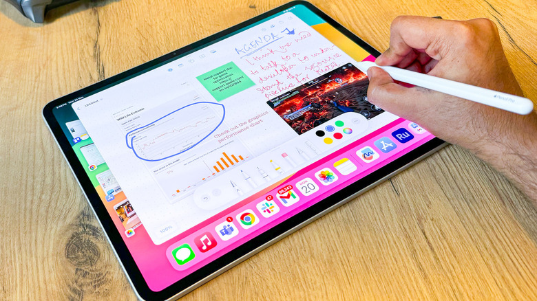
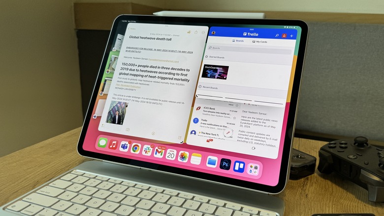
I had Chrome (with 42 tabs) open in split-view mode with Google Docs and Apple Notes, while having 21 apps in the background. There were four other multitasking app clusters in the background with Stage Manager enabled. The slate was connected to a pair of wireless earbuds and the brightness level was set to a comfortable 75% mark. In two hours, the net battery draw was exactly 23%, which is terrific and significantly better than what I usually get on an M1 iPad Pro.
This was when an Apple Pencil was also magnetically drawing some juice from the tablet, and the Magic Keyboard was consistently doing the same. The mileage might vary depending on the app you are running, particularly if they happen to be of the same caliber as Final Cut Pro or Adobe Illustrator. But for anything lighter, you can comfortably get about seven hours of battery juice with a fairly intensive workflow on a single charge.
Overall, if you have the whole iPad Pro setup with a stylus and keyboard, it will very likely deliver the best battery longevity figure you will get on any other slate out there. Compared to my midrange OnePlus Pad and the Samsung Galaxy Tab S8, the M4 iPad Pro is miles ahead in the battery department.
iPadOS isn't Mac OS
What's the best way to justify hurting your wallet for the M4 iPad Pro? If it can run the apps that are central to your workflow. Think Procreate or Logic Pro. Or you need a stop-gap version for getting some work done on the go, like editing on Final Cut Pro or Adobe's Creative Suite. Otherwise, iPadOS will leave you frustrated. It's a stretched-out iOS to date, and that's a truly unfortunate scenario. Apple's improvements in processing power continue to outpace the software it works with.
There is still no native calculator app, nor one for a dictionary. I don't understand why the iPhone's Journal app hasn't yet arrived on iPadOS, either. The file manager continues to be difficult to work with, and you still can't set a default app for certain file types. You can't create app pairs (or triplets) for quickly getting back to your workflows, and Stage Manager would keep you limited to 4 apps. For all its "desktop-tier silicon might," Apple won't give us something like Mission Control. Split-screen multiple-tasking is also fairly basic.
Now, I won't demand Apple to let the iPad Pro dual-boot macOS, but it would be awesome for the experience to get more functionally unique, at long last.
Verdict
The M4 iPad Pro has its merit, and it's undeniably in a league of its own. The looks and feel are a definite standout. The OLED display is a stunner, and so is the Magic Keyboard, both aesthetically as well as functionally. Performance is blistering, as expected, and the battery life is surprisingly good, especially for a slate with a 13-inch OLED panel. From a hardware perspective, there is almost nothing meaningful to complain about Apple's latest flagship slate.
Interestingly, the biggest undoing of this beautiful kit is Apple itself. The iPadOS experience is still frustratingly limiting and the sluggish pace at which it is evolving further shrinks any scope of bright hopes. The iPad's getting closer to a Mac all the time — unfortunate for power users, that also goes for configuration pricing and top-tier M4 action. And unless your workflow doesn't involve stylus-based work, the Magic Keyboard is an expensive must-have to extract any iota of computing needs from this slate.
Is this the best tablet out there? Without a doubt. But you should only buy it if your workflow needs an app that runs in its full-fledged avatar on this tablet. Or, you can live with a limited OS on a machine with power and aesthetics that far outpace its potential. There is no middle ground on this one — but if you happen to fall in that sweet spot of the M4 iPad Pro's target audience, go ahead and splurge.
