Lamborghini Has A New Logo, But Can You Even Spot The Difference?
Lamborghini — arguably one of the world's most popular sports car brands — is also famed for its iconic, immediately recognizable logo. The familiar raging bull that has adorned many of the company's iconic sports cars since 1998 is finally retiring after 26 years of existence, the carmaker confirmed on March 28, 2024.
Alongside this announcement, the company also revealed its brand-new logo, which will be used on future Lamborghini cars. Besides the logo, the company also revealed an updated corporate identity, that entails "freeing" the raging bull from the classic 'shield', and displaying it outside of it across the company's social media channels. This move, according to the company, will give more prominence to the bull.
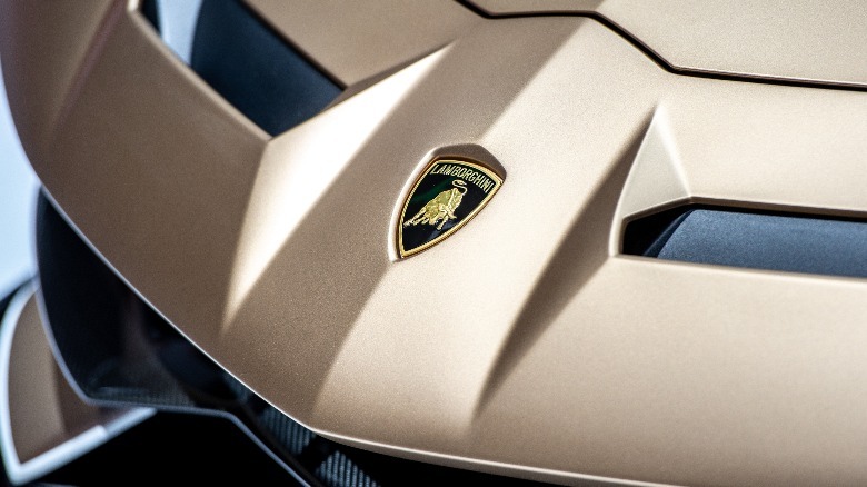
Despite these changes, the first thing you'd notice about the refreshed Lamborghini logo is that it looks near-identical to the outgoing logo. And while this is not necessarily a bad thing, it may for a second make you think whether it was a prudent move to make these changes, especially when they don't seem very significant.
We have renewed our historic logo to adapt the brand's visual expression with the "brave," "unexpected," and "authentic" values of our "Driving Humans Beyond" mission and is part of the ongoing process of evolution, initiated with our Direzione Cor Tauri strategy.#Lamborghini
— Lamborghini (@Lamborghini) March 28, 2024
Nevertheless, the most significant changes to the new logo include a broader typeface for the "Lamborghini" font, and the use of minimal colors. The familiar golden shade from the old logo has been replaced by a less shiny, subtler golden color, still staying within the yellow spectrum. The bull has some added negative space to give it more of a silhouetted look. There are black-and-white versions of the logo as well, and these versions use the same broader font.
The evolution of Lamborghini's iconic logo
Lamborghini's origin dates back to the mid-'50s, when the company's founder Ferruccio Lamborghini set up a tractor company called the Lamborghini Trattori. The tractor company had a simple, triangular logo with three triangles inside of it — each of them featuring the letters F, L, and C inside, which is the abbreviation for Ferruccio Lamborghini Cento. This logo was used on all Lamborghini products made between 1953 and 1963.
When Lamborghini finally entered the world of sports cars, the company felt the need to update its logo. To evolve with the times, Lamborghini commissioned another logo change in 1963. This logo, for the first time, introduced the familiar shield and raging bull combination. The insides of the shield were painted using a red color. Beneath the shield was a prominent Lamborghini text.
 Robert Hradil/Getty
In the next update, which took place a decade later — between 1972 and 1974 — we saw Lamborghini introduce the now-familiar golden yellow palette. In this update, the black space above the bull was filled with text that reads "Lamborghini". In 1974, Lamborghini made other changes to the new logo — which was again in black and white — and continued to be in use for 24 years.
The last time Lamborghini changed their logo was back in 1998 when the company retired the older logo that was used between 1974 and 1998.