Nothing Phone (2a) Review: Premium Midrange Lights Up
- Great processor
- Very solid (midrange) cameras
- Delightful software
- Great battery life
- Glyphs are getting a little gimmicky
- Hoop-jumping to buy in the U.S.
Nothing has taken a tough road and made it look easy so far. Breaking into the mobile landscape is not an easy thing to do, and yet the company has continued to make forward progress with each iteration of its phones. The Nothing Phone (1) was good enough to make people curious about what the Nothing Phone (2) would offer. That phone rose to the challenge.
But now, Nothing is taking a side-step in the Nothing Phone (2a) returning definitively to the midrange. One could argue that the Nothing Phone (2) wasn't necessarily a flagship phone, but it was not midrange either. The Nothing phone (2a) has no such complication; it's a midrange phone, take it or leave it.
That's the big question with this phone. How will Nothing respond when it chooses to not upgrade, and instead decides to supplement its lineup? In some ways, this is more dangerous than trying to introduce a new phone entirely. After all, when you're new to the market, there's nowhere to go but up. Launching a second offering that is designed to be "lesser" means a company has to pick and choose what to cut and what to keep. Now it's time to find out if they made the right calls. This review was written after spending two weeks on a Nothing Phone (2a) Review sample provided by Nothing.
Familiar design
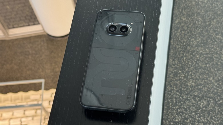
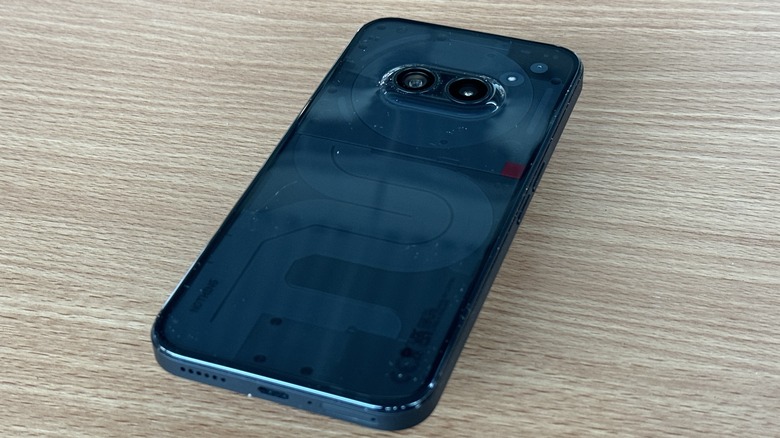
The back of the Nothing PHone (2a) will look familiar if you know the brand. The clear backplate shows off the pseudo-internals of the phone including the NFC coil near the top of the phone. The bottom half of the back of the phone is supposed to resemble New York City's subway map, or so the company claims. You may or may not see it. A distinctive red accent mark sits on the right side of the phone. At least it's not a switch that doesn't do anything.
In the center of the top of the phone rests the dual camera setup that is designed to look like eyes. Once you see it, you'll never un-see it. Those both hide under a dome that seems to intentionally defy the current trend of making giant camera islands, and that's a welcome change indeed. The buttons remain in the same places with the power button and volume buttons on opposite sides of each other.
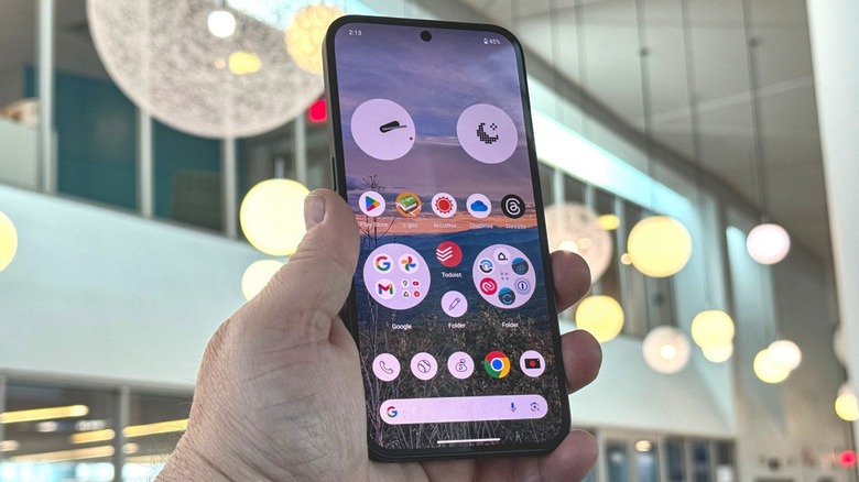
On the front of the phone, you get a 6.7-inch Flexible AMOLED display with a variable refresh rate from 30 Hz up to 120 Hz. The phone comes with a 5000mAh battery, 8 or 12GB of RAM and 128 or 256 GB of storage, and a MediaTek Dimensity 7200 Pro processor.
Keeping the Glyphs
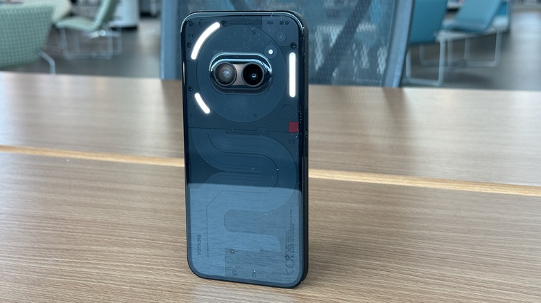
The glyph design on the back of the phone is more simple — there are only three LED strips that light up. You still get the basic functionality of seeing timers tick down on a glyph, but you're still limited to apps that are designed to work with the glyph, like Uber, which is a little annoying. Moreover, if you want to watch a timer tick down, you need to set a "Glyph timer" not a regular timer. Obviously, Nothing can't force app makers to incorporate this solution, but there should be a better way.
Like previous Nothing phones, you can use the Glyph as a flashlight but long-pressing the flashlight button in the quick settings menu. You can also use the glyph as a fill light when taking macro photography at night, which is just as niche as it sounds. You can also program ringtones to flash distinctive patterns of glyphs when your contacts call. All of these are fun party tricks, and it's nice that Nothing has them, but it's time to make these party tricks more actually useful or leave them behind.
Software is still fantastic
One of the great things about launching a midrange phone is you don't necessarily have to change the software, and in the case of Nothing, that is a very, very good thing. Nothing's software is simply delightful. It's a mostly stock build of Android, but where Nothing has made changes, it has made thoughtful changes.
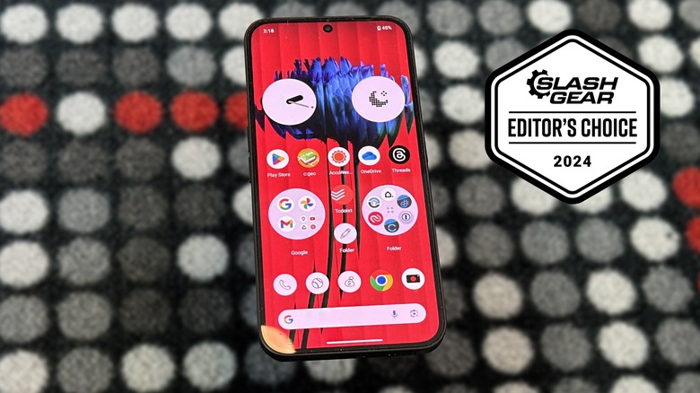
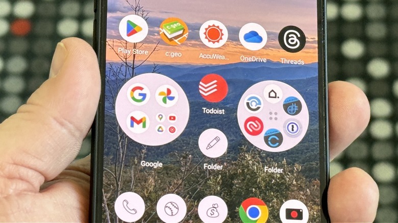
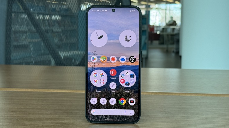
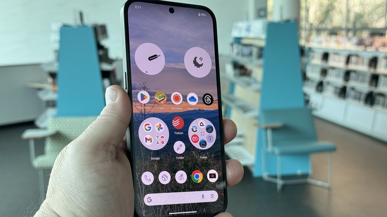
By now you're likely familiar with Nothing's design aesthetic with the dot-matrix style writing, and its color palette of reds, greys, black, and white. To that end, Nothing has built several widgets that all fit that design philosophy. Nothing is also a fan of circles, and that shows up not only in those widgets but in the icons you can have on your screen. Folders can be enlarged so they take up more space but display more apps. Plus they can be enlarged circles to fit the theme.
Nothing also includes an icon pack that can turn virtually all of your icons into monochromatic icons. That's a really cool way to use your phone, but it's also very difficult to get used to. Apps and brands put a lot of thought into their color palette, so when you're hunting for an app, the color will most likely be what draws you to the app first. Take that away, and finding a particular app becomes a lot harder to do at a glance.
If you want to use your phone less, this is a good way to do it. But if you don't necessarily want to curb your phone usage, you'll want to skip this particular feature.
Folder fun
In addition to enlarged folders in different shapes, including circles and rounded squares, you can also cover your folders with single icons, such as a baseball, a game controller, or even a simple smiley face. Nothing provides a few options to choose from that are in the Nothing dot matrix style of art, or you can use any emoji. You lose the dot matrix effect, but you have a much wider array of options to choose from.
It's a little disappointing that Nothing hasn't added more dot-matrix-style icons here since the Nothing phone 2 (almost a year ago). It would be great to see more options so you don't have to resort to using emojis. It would also be nice if emojis were searchable in the selection menu, but for now, it's great to have that option overall, and it would be awesome to see Google pick up (read: steal) a few ideas from the Nothing software team.
Battery and performance
The Nothing Phone (2a) comes with a MediaTek Dimensity 7200 processor which is not the latest and greatest from the company, but it's very not bad. The processor is built on a 4nm process and has a clock speed of up to 2.8 GHz. All that means it's pretty solid. Geekbench returns scores of 1,069/2,515 single/multi-core scores which are very good; they're roughly on par with a Snapdragon 8 Gen 1 processor. In fact, the OnePlus 12 in its default state scores slightly lower on Geekbench 6 than the Nothing Phone (2a), and that's not nothing if you'll forgive the pun.
In terms of battery life, the phone is a champion. If you find yourself homebound with a COVID-19 diagnosis and stuck in a basement for the better part of two weeks, you'll easily get two days out of the phone. Under more normal circumstances, you'll probably achieve a day and a half or two days on a single charge. There is no wireless charging, but the phone can charge at 45 W, though Nothing does not ship a power brick in the box.
Surprising cameras
The Nothing Phone (2a) has a dual camera set, consisting of a 50-megapixel main camera with f/1.88 aperture and a 50-megapixel ultrawide camera with 2/2.2 aperture and 114-degree field of view. On the front is a 32-megapixel shooter with f/2.2 aperture. So, on paper, this is a pretty good camera setup. And overall, in good lighting that holds up. Colors are accurate and consistent between lenses which is always a good thing to see in inexpensive phones.
Portrait mode is very hit or miss when it comes to outlining your subjects accurately. Hair continues to be a challenge that no one has quite figured out to handle. But if the edges of your subject are smooth, portrait mode does a very good job, with only the occasional hiccup of completely missing the outline.
Despite the fact that the phone has no dedicated macro mode, macro photography is still very good. The camera can capture excellent detail with really great natural bokeh in the background behind your subject.
Overall during the day, photos are crisp and have excellent detail, even at full resolution. That is also very rare to see in a midrange phone. Nothing is doing a good job with these sensors.
Good night?
At night, color consistency drops off quite a bit. The ultrawide camera is quite a bit darker than the main sensor. Meanwhile, both lenses have trouble with bright lights in the frame, blowing them out, and not in a subtle way. You'll want to keep light posts out of your shot wherever possible. That also includes subjects that reflect light, like the dog statue in the photo above. The Nothing Phone (2a) does not handle light sources at night well at all.
Night photos are also good for sharing on social media, where they'll be compressed anyway. Blowing up night shots to full resolution should a lot of banding in the shadows and a lack of depth and detail, which is the bad news, but the good news is that as long as you limit your sharing to social media, photos are surprisingly good. That being said, there is certainly room for improvement.
Interestingly, video at night has some of the best stabilization you'll find on a phone camera. Whether you have a subject in your frame or not, video is smooth without the tell-tale judder you'll usually see with footsteps. The footage is still a bit grainy in the dark areas, but whatever Nothing is doing with its stabilization algorithms, it needs to keep doing it. Selfie camera video on the other hand is a grainy mess that you won't want to use for anything.
Nothing Phone (2a) price availability and final verdict
The Nothing Phone (2a) goes on sale right now in Europe, and it is not officially available in the United States. However, if you sign up for Nothing's developer program, you can buy a device and it will work in the U.S. You have to jump through a few hoops in order to be able to order the device, but you don't officially have to develop anything or provide feedback about the device. There are no obligations beyond just signing up to be a developer. Once done, you can order the phone for $350.
That is a very attractive price point for a phone of this caliber, and if you're in the market for a fun, unique phone that absolutely will not break the bank, this is a strong contender. You won't be getting the best phone you can, but you will be getting a very solid offering. On that basis alone, this phone warrants a very positive score. Plus, it answers the question asked at the beginning of this review: How will Nothing build a phone that isn't a straight-up upgrade? The answer is quite well, thank you very much.
