6 Ways To Customize Your Chromebook Just For You
Google's Chromebooks are functional devices perfect for the classroom and the office cubicle. Google fills Chromebooks with useful features that make them highly efficient machines that can accomplish many everyday tasks. They might not be the most powerful machines on the market, but they're great when in need of an affordable device that can connect to the internet. However, sometimes functionality isn't enough.
Users often want to make their computer their own. From the wallpaper to theme, the appearance of a computer acts as an expression of personality. While Chromebooks are more simplistic when compared to Macbooks and Windows laptops with considerably fewer features, they still offer many ways for users to take control and make it their own.
There's no need for a Chromebook to look as basic as the display model in a Best Buy, so here's how you can explore and give your Chromebook some personality.
Use color to sort all apps
By default, computers sort apps alphabetically. This typically makes it easier for users to navigate the sea of applications to find the one they need. However, everyone is different and it's not always about efficiency. When it comes to organization, everyone has their own technique. This is especially true with computers, which is why Google gave users a means to sort their apps vastly different from its competitors.
While Windows lets users sort their desktop items by name, size, type, and date modified, Chromebooks offer a color option. This is great for those who might pick up on patterns faster than the name of an app. Green app icons like Evernote and Google Sheets will be adjacent to each other, while YouTube and Netflix will be found together. Additionally, this will naturally place all of the multi-colored Google apps, such as Drive, Maps, and Gmail, beside each other.
To sort apps by color in the app launcher, right-click on any empty space and select "color" from the menu that appears. It's easy to revert back to its default alphabetical order by right-clicking and selecting "name."
Make it easier to search through apps with folders
For those who enjoy downloading apps on apps on apps, especially since Android apps became available on the Google-manufactured laptop, the Chromebook launcher can get out of control fast. Luckily, just as users can group apps into folders on their phones, they can do the same on a Chromebook. When the launcher starts to get crowded, simply drag an app over another and drop it. This will create a new folder within the launcher.
Grouping similarily-functioning apps into folders together not only provides an easier means to navigate the launcher, eliminating pages of free-floating applications, it also gives it a cleaner look. It's natural for users to pin their most frequently used apps to the shelf, but that can fill up fast and become just as cluttered. A better alternative is to create folders and place them at the top of the first page of the launcher, where they're just as accessible.
Toggle dark mode and more
Dark mode isn't a new feature on Chromebooks, but it's not a new feature on computers. It's one of the most demanded features for apps and computers, mostly because users like the way it looks, but it also offers a few benefits. Dark mode reduces eye strain, extends the charge of a battery on a single charge, and improves accessibility for those who require visual accommodations.
Putting ChromeOS into dark mode is as simple as right-clicking anywhere on the desktop and selecting "set wallpaper and style." From there, users can select their theme. Anyone looking for a more unique personalization option can go the color inversion route.
By going to Settings > Accessibility > Display and Magnification, they can toggle color inversion on and off. Fair warning: Color inversion inverts the colors of images as well as the UI, which might not be ideal when browsing images in their original form.
Fully personalize the wallpaper
A computer's wallpaper is an extension of a user's personality. It's usually the first feature anyone changes whenever they get a new computer because it helps solidify that it is theirs. Plus, the default wallpaper is boring, whether it's a Chromebook, PC, or Apple computer. ChromeOS offers a good selection of preset wallpapers to choose from for those who don't feel like scouring the internet for an image that speaks to them.
However, scouring the internet can be fun when one has the time. Right-clicking anywhere on the Chromebook's desktop brings up the option to set a wallpaper. ChromeOS even took into consideration those who grow bored with their wallpaper easily.
Just as the name implies, the "Change Daily" button replaces the wallpaper every day, giving users something different to look at when they boot up. Clicking the "refresh" button in the wallpaper setting panel will skip to the next image in the queue. Unfortunately, this option only works with the preset Google-approved wallpapers, not any custom images saved on the Chromebook.
Take control of the shelf
The taskbar, or "shelf" as Google calls it, on the Chromebook is completely customizable. It's the ideal location for those applications frequently used. Users can add as many as they like, or keep it to a minimum for a clean look. Apps pinned to the shelf appear in the order that they were pinned, but they don't have to stay that way. Users can rearrange any app on the shelf as they see fit by clicking, holding, and dragging.
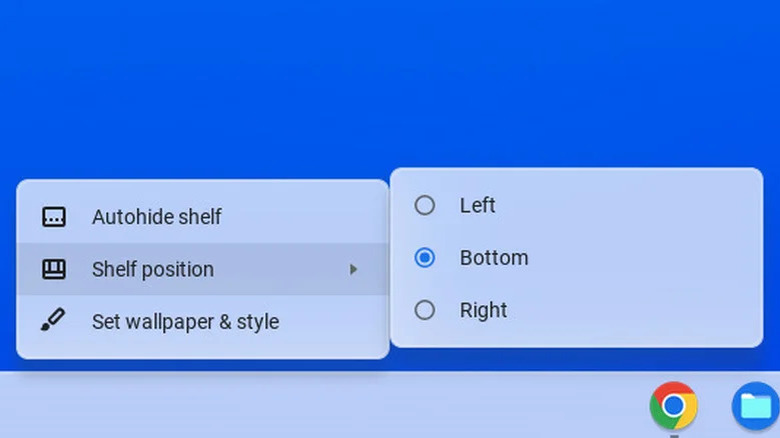
The shelf's default position is at the bottom of the desktop, but if that's too vanilla for anyone, they can move its position. ChromeOS offers the left, right, and bottom of the desktop as its options, so anyone hoping to have it at the top is out of luck.
However, there's always the ability to hide the shelf as well. This option keeps the shelf hidden until the cursor hovers over the area where it's located, giving users more desktop real estate.
All the gifs all the time
One of the more overlooked customization features on most computers is the profile image. That's typically because the only person who sees it is the user, and it doesn't offer much value. However, ChromeOS takes the profile image a step further by broadening its definition of "image." Users don't have to use a still photo on a Chromebook for their profile.
Instead, they can set up a gif if they wish, adding that extra "oomph" of individuality. When changing the profile image, there's a little loop button that will bring up the camera. It lets users record a short, funny clip of themselves that can then be set as their profile image. For those fluent in gif, Google has been making it easier to share gifs for years.
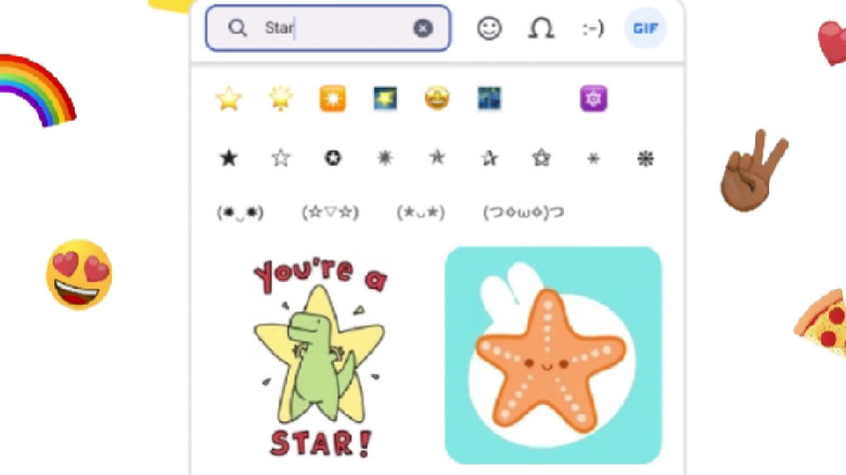
ChromeOS now lets users find gifs faster than ever. By pressing the magnifying glass button + Shift + Spacebar, the icon selection tool appears. Along with emojis and other special characters, users can select the perfect gif for a conversation or any other text field on a Chromebook. There is no shortage of options to personalize a Chromebook these days.
