6 Of The Coolest iPhone Home Screen Layouts And Themes For 2024
iOS isn't exactly known for being customizable. Unlike Android, where you can dive into a sea of options to personalize your display, iOS generally sticks to the very basics. It's all part of Apple's love for simplicity and consistency, which, is awesome for making things easy for users. Still, it greatly limits how expressive users can be with their home screens. This limitation can be disappointing, especially considering how much a fresh display can liven things up. Let's face it — pun intended — staring at the same background gets old fast.
But since iOS 14 and later, Apple has allowed users a bit more freedom. It's not quite Android-level, but now you can play with dynamic wallpapers, widgets, and file folders to give your iPhone home screen a fresh, new look. The possibilities are endless, with a few tweaks in Settings, or some simple third-party apps if you want to step things up. To inspire what you create, we've gathered six of the coolest home screen layouts and themes that will make your iOS experience as smooth and stylish as possible.
How to customize your iPhone home screen
If this is your first go at personalizing your iPhone display, let's get you familiar with the basics. There are several baked-in options for customizing your home screen, no third-party app needed:
-
Change the wallpaper. You'll find several baked-in options in Settings > Wallpaper, but you can turn to stock-free photo websites like Pexels, Pixabay, or Unsplash if you'd prefer something less generic. Make sure to update your iPhone so you can access a nifty feature that lets you create a variety of different wallpapers and change them right from your lock screen. All you'll have to do is touch and hold the screen, then you can scroll sideways to switch up your wallpaper.
Advertisement -
Sort app icons. Tap and hold an app icon till the rest start to wobble, then drag it to any part of the screen you like. On newer versions, tap and hold the slider menu above the dock, or press down on an icon and select Edit Home Screen from the dropdown menu. You can change which page an app icon is on if you drag it to the far edge of the screen. You can also delete entire pages from your home screen if you have too many — with your home screen still in edit mode, tap the slider above the dock and uncheck all the pages you want to hide from the home screen.
-
Add widgets. Widgets provide a nifty at-a-glance view of info from your most important apps, so adding them to your home screen isn't merely an aesthetic plus. It's also a functional one. Press down on any empty space on your home screen, tap the plus sign at the top-left, select the widgets you want, and tap "Add widgets."
Advertisement
Going gray
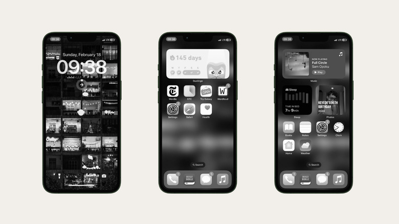
We're starting on a dull note here — things will get more colorful as we progress — but a grayscale home screen could be a great idea for a new look. It's a pretty low-effort route to a uniform, minimalist look, and there might even be an added benefit. For folks trying to reduce screen time, grayscale mode significantly diminishes the allure and stimuli that usually keep us glued to our gadgets. Streaming, gaming, and the general interface don't look so fun in black and white, so if you've been unsuccessfully trying to wean your brain off an iPhone dependency, Grayscale might just be the way to go. It also looks super cool.
To enable Grayscale, open the Settings app, then tap Accessibility. Select Display & Text Size under the Vision section, then toggle on the Color Filters option and select Grayscale. Your iPhone will immediately switch to Black/White mode. If you'd like to alternate with a regular colored interface, you can make a shortcut on your home screen for switching back and forth. Go to Settings > Accessibility > Accessibility Shortcut, then select the Color Filter option. Once that's done, all you'll have to do is triple-click your power button to switch grayscale mode on or off.
Docking around
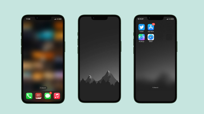
Another minimalist option is to remove the app icons from your home screen, save for a few favorites in the dock. This is especially appealing on larger iPhones — those who use the Pro Max models will appreciate not having to awkwardly reach for the top of their screens to access essential apps, although this is a UX issue that's also easily resolved by turning on Reachability in Settings > Accessibility. One-handed mode is another handy setting for when your hands are full, and you'll find several such nifty features on your iPhone that will seriously improve your experience.
To switch things up, you can also go dockless, i.e hide the dock away from view. There's no built-in setting for this, but the trick is to download a wallpaper, usually one with a gradient effect, that cancels out the dock area. Run a Google search for "wallpapers that hide iPhone dock" or "wallpaper that makes dock invisible," and you'll be greeted with a gradient sea of options. If your choice wallpaper is too light at the bottom in a way that makes the dock visible, you can go to Settings > Accessibility > Display & Text Size > Reduce Transparency and toggle off the switch. Remove the apps from the dock once that's done to have a dockless home screen. Spice things up even further with iEmpty, a tool that lets you create empty or invisible app icons so that you have more flexibility with your home screen layout.
Split personalities
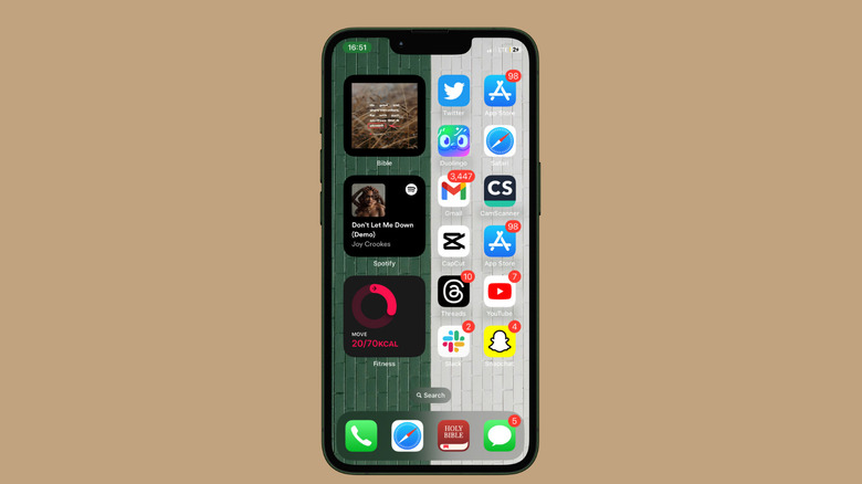
A split wallpaper is the buy-one-get-one-free of wallpapers. It's two separate images integrated into a single display, and it's a great way to achieve both an aesthetic and a functional upgrade. You'll find loads of cool split wallpapers on stock websites like Unsplash and Pexel, and a Google Search will reveal even more sources for these kinds of backgrounds.
To maximize a split wallpaper, you can sort your apps into two categories — one on each side of the divide. The distinction is yours to create, and you can play with different groupings and categories: work and play, health and social, productivity and creativity, and so on. Once you decide which side of your home screen will be for what, rearrange your apps accordingly. It's a fantastic method to reduce clutter and use your iPhone more skillfully to encourage focus and deep work. That, and they look seriously cool.
Really retro
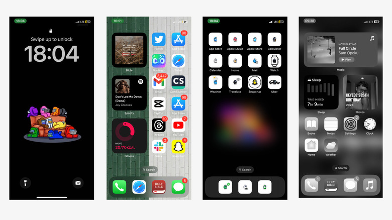
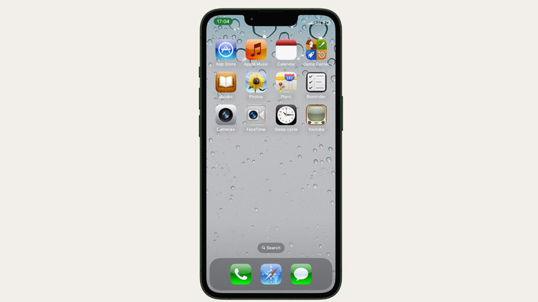
Pay homage to the evolution of tech by keeping a piece of the past alive on your home screen. You could use a vintage wallpaper to achieve this effect, try out this iPhone 4 icon pack, or switch things up with this nod to Windows 95. This should bring back wistful memories of a period when iPhones were smaller and everyone still had custom ringtones. You can also find a variety of themed custom icons on sites like Icons8 and Flaticon.
When you download the icons, it'll take a bit of tweaking to replace the default icons with them. Go to the Shortcuts app, then tap the plus icon to create a new shortcut. Next, tap Add Action, then use the search bar to find the Open App option and select it. After that, tap the faint "App" button to bring up the app whose icon you want to change. Now, hit the dropdown icon beside the shortcut name and select Add to Home Screen. On the next page, rename the Shortcut, and tap the placeholder icon to replace it with the custom image from your Photo Library or Files. Drag or zoom the photo till you're satisfied with its proportions, then tap Add to finish.
You should remove the original app icon from your home screen so that it doesn't further clutter your screen. Long-press anywhere on the screen until the apps start to do the Wobble, then tap the minus above an icon to remove it.
Hue harmony
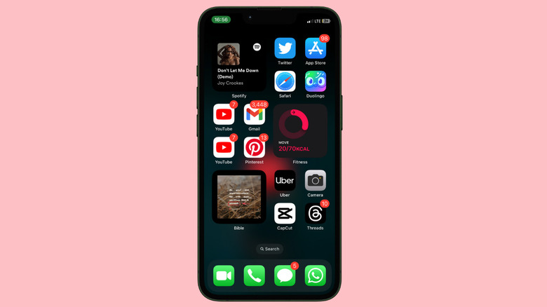
Another simple way to reorder your home screen is to put apps in color categories — all red apps on the same row/page, and the same for green, blue, yellow apps, and so on. You could also group apps by function and assign a different color to entertainment, social media, or productivity and utility apps.
If you don't have enough same-colored apps to make a group, you can create custom app icons using the same Shortcuts process explained above. You'll find many great options on Flaticon, and there's even a native tool that allows you to change an icon's colors and other properties. Widgetsmith is also a great option for changing your iPhone's app icons, although it will take more tinkering than the Flaticon option. The effort is worth it in the end. You could do even more with this layout if you have decent design skills — one of Canva's lesser-known features is a suite of color palette tools that allows you to create and manage custom colors for your projects.
Feeling franchise-y
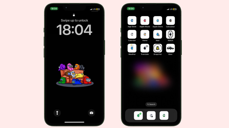
There are a few ways to show that you're a fervent fan of a franchise. You could deck yourself out in graphic tee-shirts, decorate space with stickers and posters, or you could plaster the franchise art on your iPhone home screen. You'll find wallpapers, themes, and app icons for your favorite movies and characters on Icons8 and WallpapersClan, whether you're an MCU, a DC fan, or an anime fan. Once you've secured the assets, you'll have to follow the Shortcuts process we've explained earlier to replace default icons.
You'll get the best effect with full commitment, so try a wallpaper and matching or complementary app icons of the same theme. If that feels like too much, you could change only your wallpaper or the app icons. Either way, it's easy to make your device a reminder of the worlds and stories that inspire you, and you have a ton of options to switch things up your theme whenever you feel like it.
