5 Big Mistakes To Avoid When Using Adobe Illustrator
When it comes to crafting logos, vectors, and other graphic design-related artwork, Adobe Illustrator sits at the top with its feature-rich toolbox and reputation for being reliable. It is not only used by professionals but is also a very sought-after program by beginners seeking to step foot into the world of lines and shapes.
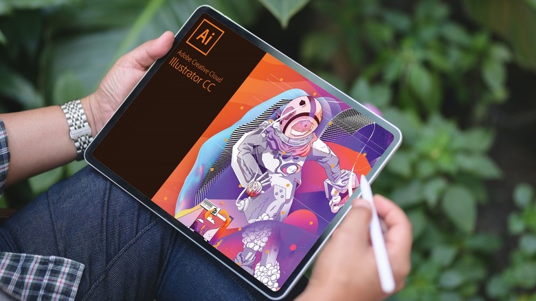
Released in 1987, Illustrator is available on Windows, macOS, and now even on iPadOS following the launch of Apple's desktop-level M-series of chips in the iPad Pro. Students and employees can usually find cheaper or completely free subscriptions to the Adobe suite of creative apps, making Illustrator an even more alluring option for vector-based editing.
There are ways to yield the most use out of a piece of software when used correctly, but certain mishaps result in more facepalms than one would like. From using improper settings to not utilizing the abundant list of tools to their fullest potential, here are a few ways you are using Adobe's vector-editing tool the wrong way.
Not utilizing tools the right way
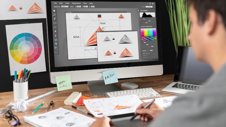
The pen, indeed, is mightier than the sword, and its tool in Illustrator is as powerful as you need it to be. When used precisely, it can create any shape you require and is also the fastest way of designing logos once you're habituated to using it. The pen tool has a steep learning curve, which can be quite intimidating, especially to new artists, but as enigmatic as it may be, it is something you can't avoid forever.
Editing in Illustrator requires a deep understanding of shapes and overlays, which will eventually lead you to use the Pathfinder tool. In essence, this tool allows you to manipulate shapes by adding, subtracting, or merging different overlapping elements.
Beyond these two key elements, Adobe Illustrator has a plethora of other tools at its disposal. Options and variations within tools also exist, making your work simpler when used effectively. From the vast library of brush strokes to the built-in color swatches, mastering different tools should be of high priority to every designer.
Restricting yourself to a single input device

The modus operandi of using the two buttons and the scroll wheel on your mouse is functional but far from being the only way to design using complex software like Illustrator. Mastering keyboard shortcuts will save you a gracious amount of time, which is all you need sometimes when deadlines keep crawling up. Certain mice have additional buttons that can be programmed to perform quick actions within the editing tool. Perhaps you can bind two of your most commonly used tools to these extra toggles.
Drawing tablets are another popular add-on you can find on the desks of professional designers. The addition of pressure-sensitive styluses that offer a more dynamic drawing experience also allows for varied stroke styles without having to adjust the thickness of your lines using the painstakingly old ways. A few premium graphics tablets, like the Wacom Cintiq 22, have built-in color screens, making drawing feel one-to-one. Illustrator is also available on iPads, making editing extremely simple and efficient on-the-go.
Using a combination of input devices is sure to improve not just your ability to experiment with different styles but also, eventually, the quality of your work. Embracing something as simple as a few keyboard shortcuts to begin with can go a long way.
Practicing destructive editing

Compared to traditional pen and paper, the amount of flexibility that digital software like Illustrator and Photoshop provide now is unparalleled, allowing for undoing and making changes to edits without leaving a trace. However, even these multi-faceted design tools usually used for complex projects aren't immune to setbacks caused by poor workflow practices. The entire notion of making irreversible edits that do not account for the future-proofness of your work is termed destructive editing.
On the other end of the spectrum, there is non-destructive editing, which is something you should be practicing instead. There are no set instructions for following this editing method — something as simple as designing in different layers and naming them appropriately also counts.
Using the mask tool is yet another cornerstone of non-destructive editing, making it possible to hide parts of your artwork without needing to delete them for good. Think of masks as invisibility cloaks that can be lifted when the situation calls for it. Other good practices include converting layers to smart objects before applying filters to avoid losing quality.
Using inefficient import and export options
Having the flexibility of the various import and export options that Illustrator provides can sometimes get overwhelming. Knowing which format to use for what kind of work is crucial. Adobe Illustrator is mostly used to output in PDF and SVG formats, both of which retain the high-quality nature of vectors. However, when exporting for the web or something casual, PNG and JPEG are popular file formats that you should turn to since they offer a much wider range of compatibility across devices and platforms and are often smaller in size.
If you're importing third-party assets to your file, it is good to look for SVG files or, better yet, Illustrator's proprietary AI files that maintain 100% of the original quality and scalability. Choosing the right color mode is also imperative. While you will mostly be exporting in RGB for digital use, perhaps for websites or your portfolio, CMYK is the standard when it comes to printing. You also need to keep in mind your final export settings throughout your editing process since swapping color modes may cause drastic visual changes.
Overusing Illustrator for other kinds of work
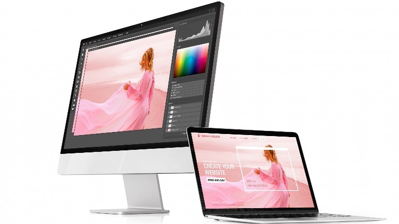
Despite being a titan in the vector-editing landscape of apps, Illustrator is simply a poor choice to be used for small touchups, painting, or photo manipulation. Understandably, sticking to a single solution for all your needs saves time and energy, but this can end up being a clunky experience — especially when Adobe's creative suite has other apps that may tailor your needs far more precisely.
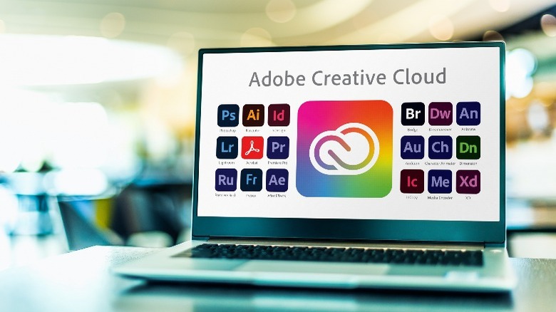
Despite the fundamental differences between Photoshop and Illustrator, the former does the job of an all-around photo editing and graphic design app much better. Perhaps you only need a quick way to change the colors in your photos; then Adobe Lightroom is going to be a more apt program to go with. While Illustrator is also widely used for designing documents and brochures, InDesign excels in this sphere with its streamlined typography tools.
Illustrator also isn't a very cheap option, with a monthly subscription fee of $22.99. Being a student brings the cost down, or if you find yourself using multiple Adobe apps, grabbing their Creative Cloud suite might prove to be more effective. If you're on a budget or simply don't want to shell out any money, free alternatives include Inkscape, Vecteezy, and Vectr. Understanding the set of tools you need for your specific projects by choosing the right software will help you achieve the task at hand more effectively.