Ford's Kinetic Design Explained: What You Need To Know
When you think of a car, conceptually speaking, what comes to mind? A big box with four wheels and some windows? Certainly, that's the simplest way to think of an automobile, and indeed, that's been the dominating template for automotive design for about as long as it has been a thing. In the last couple of decades, however, automotive manufacturers have been looking for new and interesting ways to iterate on and evolve the simple concept of "a box on wheels."
In the mid to late-2000s, automotive giant Ford came up with a concept for its vehicles that was intended to be the next big evolution in the silhouette of a car. This concept was known as "kinetic design." The idea of kinetic design has been around in general since as far back as the middle ages, but this was the first time it was being implemented on automobiles. But what exactly is kinetic design, and as far as Ford cars go, did it pan out?
Kinetic design in general
Kinetic design, also known as kinetic architecture in regards to stationary installations like buildings, is a design philosophy that seeks to either emulate the idea of movement in the stationary, or apply the concept of movement to subtly shift the shape of the stationary. Examples of this notion include a lamp with a twisting fabric shade, or building walls with wavy, swooping patterns. Whether it actually moves or not, the point is to make you look at it and think, "Wow, look at that thing move."
This is a nifty concept from both a design and marketing perspective, and for similar reasons. Applying kinetic design to things makes them look sleek and futuristic, and, as it so happens, people like buying slick and futuristic things. If you make your product look like a flowing surface, onlookers will be naturally entranced by it, and thereby willing to slap down money to keep looking at it.
Kinetic design in Ford vehicles
Kinetic design was first introduced into Ford's overall design philosophy back in 2004 by prominent British automotive designer Martin Smith, who was commissioned by Ford's European arm to create a car with a more expressive, attractive design. Smith's answer was kinetic design.
"Kinetic design is something we can actually describe," Smith said in a 2010 interview with Dexigner. "The key elements are confident stance, dynamic lines, expressive form language, taut surfacing, bold graphics and great detailing. Together they convey movement and athleticism, and they telegraph the dynamic capabilities of our cars with that fun-to-drive spirit. It looks like the car is moving when it's standing still."
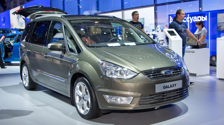
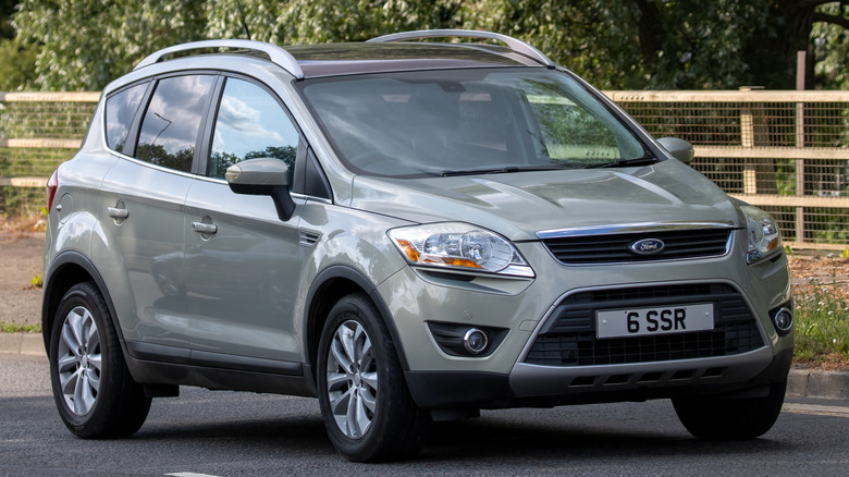
The first Ford vehicle to exemplify this ideal was the SAV concept car, which appeared in 2005. Following that, multiple Ford vehicles followed suit to varying degrees, including the Galaxy, Mondeo, Kuga, Focus, Fiesta and Ka. Each of these cars employed the same or similar hallmarks, from sloping hoods to striking side ridges, all to make onlookers think, "wow, that thing looks fast, I want one."
Is kinetic design still Ford's primary philosophy?
The original kinetic design concept was Ford's dominant paradigm up to and including the unveiling of the Iosis-MAX at the 2009 Geneva Motor Show. In that same year, though, following the reveal of the Ford C-MAX, the company began to transition to what became known as "Kinetic 2.0" as its design language. The overall idea was more or less the same, attempting to convey "energy in motion," but with some overall tweaks and simplifications.
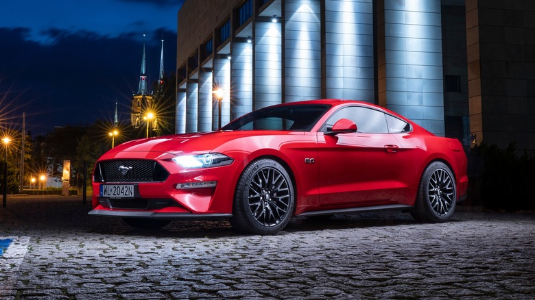
Kinetic 2.0 was Ford's primary philosophy until the early 2020s, when the company switched over to its new design language, "progressive energy in strength," a concept whose primary principles were "commanding, agile, and responsive." An example of this was shown off in the form of a wheel-less Mustang sculpture at the 2020 Beijing Auto Show, featuring striking angles and a windswept profile. It's not dissimilar to kinetic design, just a bit more ... swoopy.


