The 10 Worst Android Devices Ever Made By A Major Brand
While many Android smartphones and tablets have earned acclaim for their innovation, performance, and design, not every venture into the realm of Android has been a success. Manufacturers, often racing to stay ahead in a fiercely competitive market, occasionally stumble when pushing the boundaries of creativity and functionality. The result is a graveyard of ill-fated Android devices that failed to resonate with consumers and, in some cases, left a stain on the reputation of even the most reputable brands.
Whether it be sluggish performance, glaring design flaws, or a lackluster user experience, some Android products have felt half-baked at best. It becomes apparent that factors such as rushed development cycles, inadequate market research, and a failure to address crucial user needs have played pivotal roles in the downfall of these devices.
As the successes and innovations that have shaped the digital landscape are celebrated, it is equally crucial to acknowledge the failures that have propelled manufacturers toward refinement and improvement. There are some truly puzzling failures and plenty of questionable Android devices made by major brands, including some of the worst smartphones of all time. From misguided attempts to revolutionize form factors to ill-fated experiments with cutting-edge features, these devices serve as cautionary tales in a realm where progress and pitfalls often walk hand in hand.
Samsung Galaxy Note 7
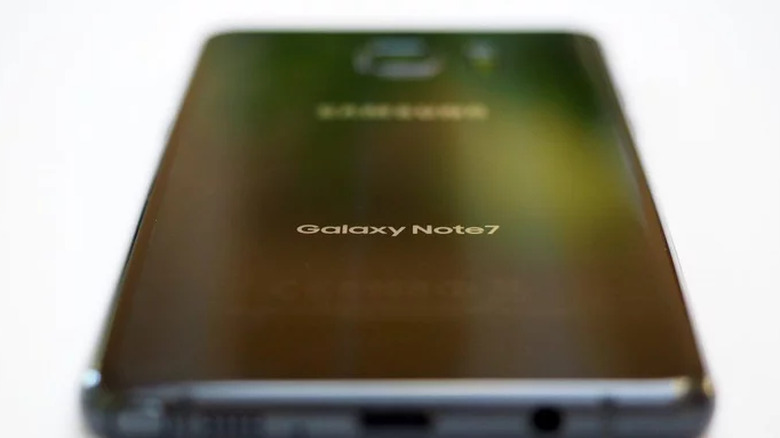
The journey through the worst Android devices must begin with a bang, or more accurately, a series of explosive incidents. The Samsung Galaxy Note 7, released in 2016, was meant to be a flagship phablet that showcased innovation in both design and features. Unfortunately, it quickly became synonymous with a catastrophic failure that reverberated throughout the tech industry.
The Galaxy Note 7 was plagued by a severe battery issue, causing units to overheat and, in some cases, catch fire. The scale of the problem was so immense that Samsung had to issue a global recall on the Galaxy Note 7, resulting in a massive financial hit and irreparable damage to its reputation. The recall process itself was marred by logistical challenges, and the replacement devices were not immune to the same hazardous defects, leading to the eventual discontinuation of the Galaxy Note 7.
What feels worse in the case of the Galaxy Note 7 is that it was a perfectly fine flagship when divorced from the battery issue. You wouldn't have been blamed for calling it a great phone before becoming aware of the issue. While the Galaxy Note 7 could very well have been a fond memory for Samsung, it is instead their most infamous device to date.
LG DoublePlay
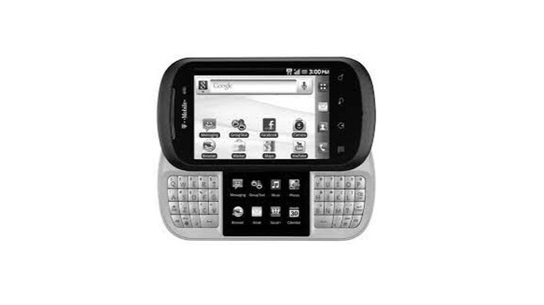
Released in 2011, the LG DoublePlay boasted an innovative secondary display nestled between its split physical QWERTY keyboard. While the concept of dual screens aimed to enhance productivity and multitasking capabilities, the execution left much to be desired.
The primary flaw of the LG DoublePlay lay in its divisive design, which sacrificed both ergonomics and aesthetics. The additional screen, sandwiched awkwardly between the keyboard halves, led to a clunky and unbalanced form factor. Users found the physical separation of the main display and the secondary screen cumbersome, disrupting the seamless user experience that smartphones are meant to provide.
Beyond its design woes, the functionality of the dual screens failed to resonate with consumers. The secondary display struggled to justify its existence, offering limited app compatibility and often serving as a mere extension of the main screen rather than as a distinct, useful feature. This lack of compelling use cases rendered the innovative concept more of a gimmick than a practical enhancement.
The LG DoublePlay's technical specifications further exacerbated its downfall. With outdated hardware, sluggish performance, and an underwhelming camera, the device fell far behind its competitors, such as the iPhone 4. The compromises made in both design and performance left users questioning the device's purpose and value proposition.
While ambitious attempts to innovate should be applauded, the LG DoublePlay illustrates the importance of striking a balance between innovation and practicality. In the pursuit of uniqueness, LG sacrificed essential elements that users prioritize in a smartphone — a sleek design, seamless functionality, and up-to-date software. The DoublePlay serves as a stark reminder that novel ideas must align with actual user needs and preferences, and that cutting-edge features should enhance, not hinder, the overall user experience.
HTC Flyer
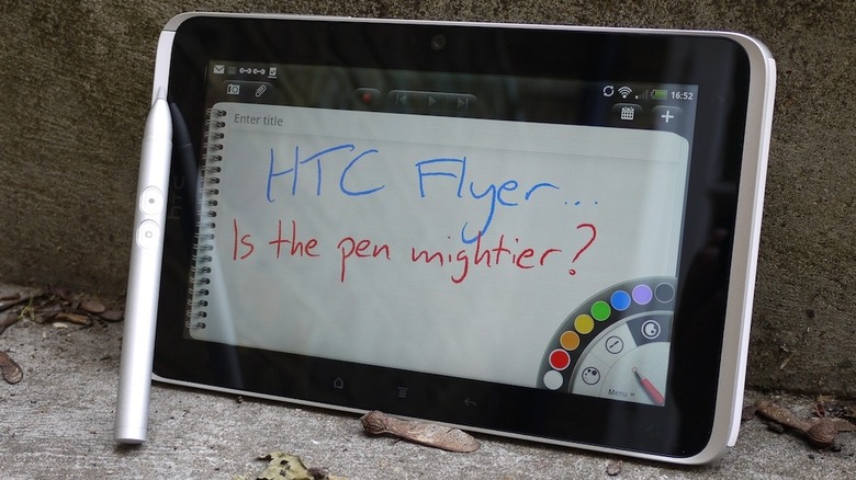
The HTC Flyer was a tablet released in 2011 that aimed to carve a niche in the increasingly competitive tablet market that had been rocked by the introduction of the iPad the previous year. HTC, known for its innovative smartphones, ventured into the tablet realm with high hopes, but the Flyer's journey proved a tale of unmet expectations and missed opportunities.
At first glance, the HTC Flyer presented itself as a sleek and compact tablet with a unique seven-inch form factor. However, its downfall can be traced back to HTC's decision to embrace an outdated version of Android — version 2.3 Gingerbread — at a time when rival tablets were adopting more advanced iterations of the operating system. This choice severely limited the Flyer's capabilities and left users yearning for the features and optimizations found in newer Android releases.
One of the Flyer's standout features was its inclusion of a stylus, a seemingly forward-thinking move at a time when touch-based interfaces dominated the market. However, the execution of this feature fell short of expectations. The stylus, dubbed the "Magic Pen," lacked the precision and functionality offered by competing devices, and its integration into the user experience felt more like an afterthought than a compelling reason to choose the Flyer over other tablets.
However, the HTC Flyer wasn't exactly unique in the realm of subpar Android tablets. Before 2018, many Android tablets were far below par in terms of user expectations. Another great example of a substandard Android tablet from the same year as the HTC Flyer is the Motorola XOOM. While the XOOM did make the step up to Android 3.0 Honeycomb, its steep price and close proximity to the launch of the iPad 2 made it a non-starter in terms of shaking the tablet market.
Amazon Fire Phone
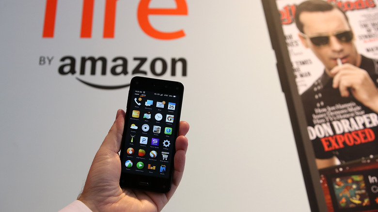
The Amazon Fire Phone, an attempt by the e-commerce giant to extend its reach into the competitive smartphone market, launched in 2014 with much fanfare. The Fire Phone, however, turned out to be a flame that burned out far quicker than anticipated.
Amazon's foray into the smartphone arena was fueled by a desire to integrate its ecosystem seamlessly into users' daily lives. The Fire Phone's hallmark feature was its dynamic perspective display, employing four front-facing cameras to create a 3D-like effect that responded to the user's movements. While this innovation held promise, it failed to resonate with consumers who found the 3D elements more gimmicky than anything else.
One of the Fire Phone's most significant missteps was its pricing strategy. Amazon opted for an exclusive partnership with AT&T and initially priced the device on par with flagship smartphones from established competitors, despite lacking comparable hardware and features. This pricing misjudgment resulted in a lukewarm reception, deterring potential buyers who expected more value for their investment.
Moreover, the Fire Phone ran on Amazon's heavily customized version of Android, dubbed Fire OS. While this operating system was tailored to seamlessly integrate with Amazon's services, it lacked the familiar Android experience users had grown accustomed to. The absence of popular Google apps and services further alienated potential buyers, limiting the device's appeal in a market dominated by Android enthusiasts.
Amazon's attempt to leverage the Fire Phone as a shopping-centric device also fell flat. While the integration of Firefly, a feature allowing users to scan objects and purchase them on Amazon, sounded promising, its real-world application proved impractical and failed to justify the device's existence beyond being a conduit for e-commerce.
Motorola CLIQ
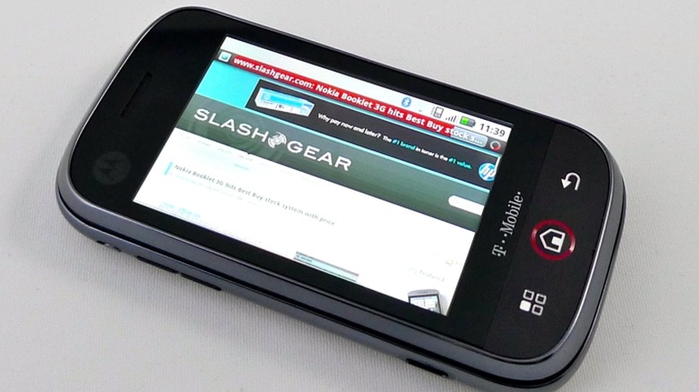
Released in 2009, the Motorola CLIQ aimed to strike a chord with consumers in the burgeoning Android landscape. The CLIQ's primary ambition was to introduce the masses to the potential of Android, but its execution left much to be desired. One of the device's prominent features was Motorola's custom user interface, MOTOBLUR, which aimed to enhance the social networking experience by aggregating updates from various platforms. While the idea was innovative, the implementation proved to be more cumbersome than convenient, often resulting in sluggish performance and a disjointed user interface.
The CLIQ's camera capabilities, a crucial aspect for many users, were notably lackluster. The 5-megapixel camera failed to deliver impressive results, especially in low light conditions, putting the device at a disadvantage in a market where imaging capabilities were becoming increasingly important.
While Motorola's vision with the CLIQ was to appeal to a broad audience, the device faced stiff competition from other Android offerings that presented a more polished and cohesive user experience. The missteps with MOTOBLUR, coupled with aging hardware and uninspiring design choices, relegated the CLIQ to the sidelines of an Android market that was evolving at breakneck speed.
Samsung Galaxy Fold
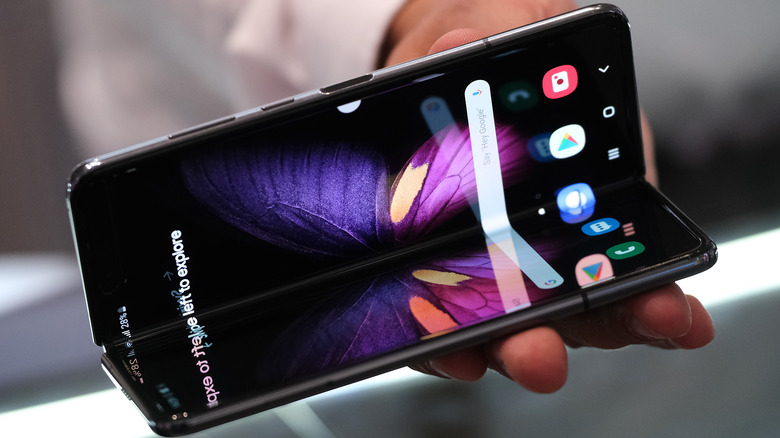
The Samsung Galaxy Fold aimed to redefine user expectations by introducing a foldable display, promising a seamless transition between a compact smartphone and a larger, tablet-like experience. However, this pioneering endeavor faced a wide variety of challenges, casting a shadow on the device's initial foray into the market.
Undoubtedly, the original Galaxy Fold represented a technological marvel with its foldable display. The ability to unfold a smartphone into a tablet-sized screen captured the imaginations of consumers. Yet the first iteration of the Galaxy Fold encountered significant teething problems, most notably with the durability of its foldable display.
Reports of screen malfunctions, including instances of flickering, creasing, and even outright failure, marred the device's debut. One of the more infamous pieces of the debacle at the device's launch was the screen protector that was not to be removed under any circumstances. The issue with said screen protector was that there was no warning that its removal would kill the phone.
Samsung's rush to enter the foldable smartphone arena led to insufficient testing, revealing the fragility of the initial design. Users who had eagerly anticipated the Galaxy Fold were met with disappointment as concerns about the device's long-term durability overshadowed its groundbreaking features. The hinge mechanism, a critical component in the foldable design, became another point of contention. Some users reported foreign particles infiltrating the hinge, causing further damage to the delicate display.
Beyond the hardware woes, the Galaxy Fold faced challenges in terms of software optimization for the foldable form factor. Some apps struggled to adapt seamlessly to the changing screen sizes, leading to a disjointed user experience. The crease in the middle of the unfolded display, while inevitable in a foldable design, also drew attention and raised questions about the device's overall aesthetics.
Motorola Backflip and Motorola Flipout
Motorola's attempts to redefine smartphone design are perhaps most underwhelmingly represented by the Motorola Backflip and Motorola Flipout, both released in 2010. While they sought to break away from conventional form factors, their unorthodox designs proved to be missteps that left users scratching their heads rather than embracing innovation.
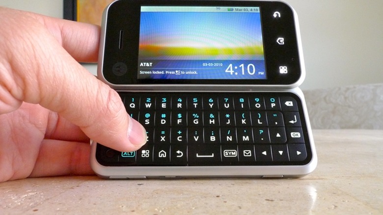
The Motorola Backflip presented an unusual backward-flipping keyboard that introduced an ergonomic nightmare. The location of the keyboard on the back of the device meant users had to flip the phone open to access the physical keys, resulting in an awkward and cumbersome experience. This unconventional design choice not only defied user expectations, but also introduced a practical hurdle that undermined the device's usability.
Beyond its unorthodox form factor, the Backflip struggled with outdated hardware and software. With a modest processor running an older version of Android, the device failed to keep pace with its contemporaries. The lackluster specifications, coupled with the unconventional design, positioned the Backflip as a niche device that failed to capture broader interest.
Hot on the heels of the Backflip, the Motorola Flipout took a different approach to unconventional design. Released later in 2010, the Flipout featured a square form factor that could be flipped open to reveal a small QWERTY keyboard. While the square design aimed to offer a compact and pocket-friendly option, it posed its own set of challenges.
The square form factor, though unique, raised questions about the practicality of the device. The display's limited size compromised the user experience, especially when compared to more traditional rectangular designs. The square shape, while undeniably interesting, was swimming directly against the current of smartphone evolution. Additionally, the Flipout faced criticism for its build quality. The hinge mechanism, crucial for the device's flipping action, raised concerns about durability over time.
HTC First
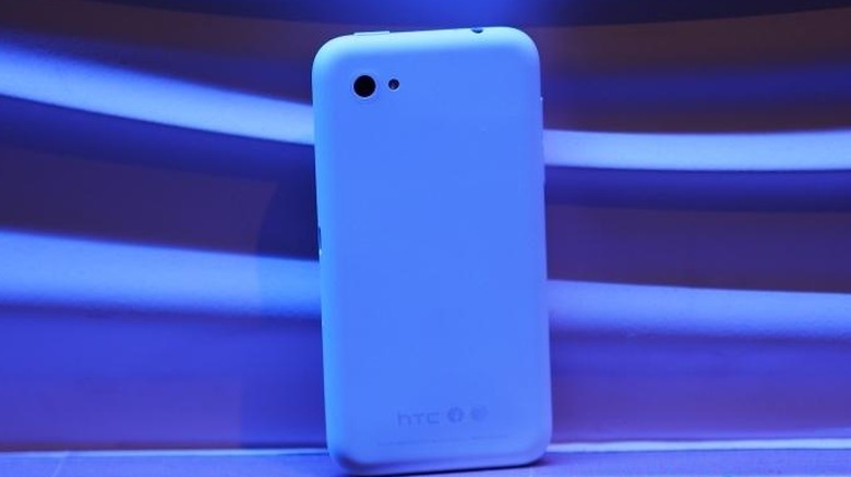
The HTC First, a smartphone released in 2013, carried the weight of a distinctive partnership with social media giant Facebook. Touted as the "Facebook Phone," the HTC First aimed to offer users a deeply integrated social experience but ultimately faltered due to misjudgments in both design and user priorities.
At its core, the HTC First was an attempt to prioritize social connectivity by incorporating Facebook Home, a launcher that transformed the device's home screen into a constant stream of Facebook updates and content. While the idea of a phone centered around a social media platform seemed appealing to some, the execution fell short of expectations.
Contrary to what the name might imply, this wasn't HTC's first attempt at making a Facebook phone. The company had previously released the HTC Salsa and the HTC ChaCha. While neither handset stood significantly above the HTC First in terms of features, they were both more affordable.
One of the primary issues with the HTC First was the integration of Facebook Home. Users found themselves with a Facebook-centric interface that left little room for personalization. The device essentially turned into a conduit for Facebook content, sidelining other important functionalities.
The device's hardware specifications, while decent, failed to stand out in a market where users were demanding more powerful and versatile smartphones. The mid-range specifications of the HTC First, coupled with its limited appeal due to the Facebook-centric interface, hindered its competitiveness against other Android devices in the same price range.
Ultimately, the HTC First was struggling to sell and AT&T, the exclusive carrier for the device, quickly dropped its price shortly after launch, signaling the struggles the HTC First encountered in the market. The device's failure prompted HTC and Facebook to reevaluate their approach to integrating social experiences into smartphones.
Google Nexus 6
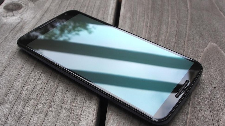
Even a collaboration between Google and Motorola can result in a misstep. Released in 2014, the Nexus 6 represented a departure from its predecessors, but its oversized form factor and compromised design left users questioning the balance between innovation and practicality.
Before the Google Pixel came around, the Nexus line had earned a reputation for delivering a pure Android experience on devices with competitive specifications. However, with the Nexus 6, Google and Motorola aimed for a bolder approach. The device featured a massive 5.96-inch display, a significant departure from the more modest screen sizes of previous Nexus iterations. While the industry was gradually moving toward larger screens, the Nexus 6's size pushed the boundaries to an extent that raised eyebrows among consumers.
Moreover, the design of the Nexus 6 lacked the refinement that users had come to expect from Google's Nexus lineup. The device's build materials, including a plastic back, failed to exude the premium feel associated with flagship smartphones. The absence of certain features, such as expandable storage and a removable battery, left users longing for the customization options found in other devices within the same price range.
While the Nexus line had traditionally been associated with competitive pricing, the Nexus 6 entered the market with a higher price tag. This departure from the Nexus legacy raised expectations regarding the device's capabilities and design, making its shortcomings more pronounced in the eyes of users.
Despite these criticisms, the Nexus 6 did offer many positives. It introduced wireless charging, a feature that gained popularity in subsequent smartphone releases. The inclusion of a stock Android experience, free from bloatware and manufacturer-specific customizations, appealed to users who valued a clean and efficient user interface.
HTC EVO 3D
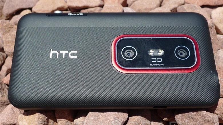
The HTC EVO 3D, released in 2011, aimed to capitalize on the burgeoning fascination with 3D technology. While the idea of a glasses-free 3D display sounded innovative, the EVO 3D's execution left users questioning the practicality of such a feature and underscored the risks associated with gimmicky trends in smartphone design.
At the heart of the HTC EVO 3D's pitch was its glasses-free 3D display, an ambitious feature that promised to bring an extra dimension to the smartphone experience. The device incorporated dual rear cameras to capture stereoscopic images and videos, allowing users to view content in 3D without the need for specialized glasses.
However, the reality of the EVO 3D's 3D display fell short of expectations. Users found the 3D effect to be more of a novelty than a substantial enhancement to the overall user experience. The viewing angles for the 3D content were limited, and the quality of the effect varied, leading to an inconsistent, lackluster performance that failed to justify the added complexity and cost.
The EVO 3D wasn't the only mobile device seeking to capitalize on the 3D craze. There was also the likes of the LG Optimus 3D Max, which couldn't boast much better 3D than HTC's device. Or, in the world of gaming, there was the Nintendo 3DS which has aged far better than LG or HTC's 3D smartphone offerings.
As the novelty of 3D technology wore off, the HTC EVO 3D faced a swift decline in popularity. The device struggled to compete with more conventional and user-friendly smartphones that prioritized aspects such as build quality, overall performance, and camera capabilities.
