Hands-On With Samsung's DeX Update For Tablets: Major Frustrations And Improvements
Samsung has finally rolled out its long-awaited One UI 6.0 update based on Android 14. Devices in the Galaxy Tab S9 lineup, the company's flagship tablet range, are among the first to have received the update, which includes a massive overhaul to Samsung DeX. I've spent a little over a day testing the new interface, and while it brings some impressive improvements, some drawbacks quickly became apparent as well.
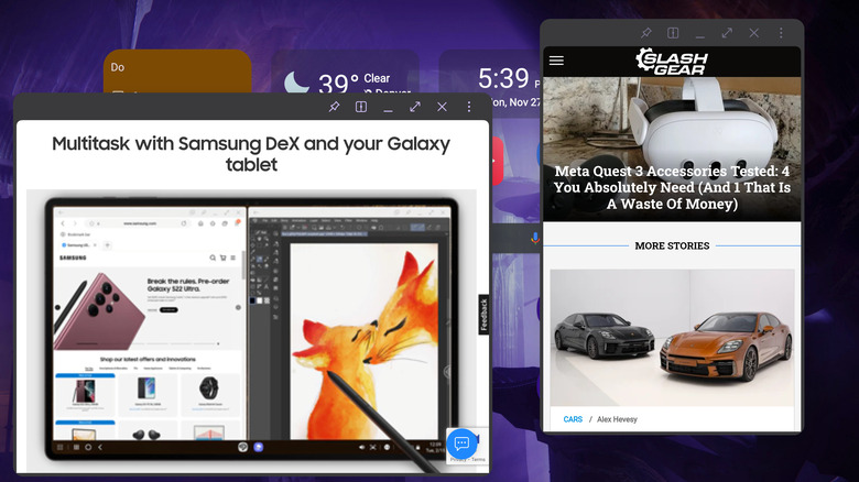
DeX is one of Samsung's most unique and highly praised features, and One UI 6 brings the biggest changes we've seen to it in quite some time. For those out of the loop, DeX is a somewhat hidden Galaxy feature that transforms Android into a desktop-like operating environment optimized for a mouse and keyboard, where apps can be launched in resizable windows. On smartphones, DeX requires an external display to activate, whereas on tablets, it can be launched directly on the main screen of the device.
With the new DeX for tablets, Samsung is focused on making the transition between standard tablet and DeX modes more seamless while making the DeX interface more versatile. When using the tablet as a standalone device, the update brings some welcome changes, but frustrations quickly mount when a second display is added. Still, it's a worthwhile upgrade overall.
Improvement: New DeX is a pleasure to use directly on tablets
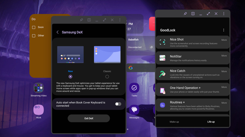
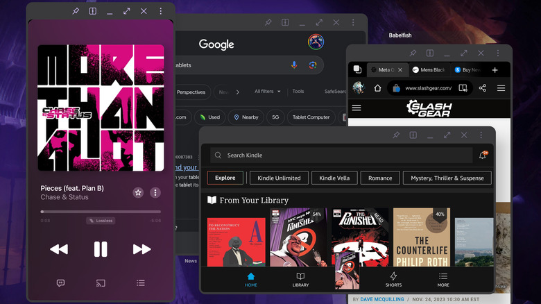
The biggest change you'll find when you upgrade your Samsung tablet to One UI 6.0 is what the company calls "the new DeX for tablets." While activating the previous version of DeX — which Samsung now calls Classic DeX — completely changes the user interface, "New DeX" instead changes very little at all. Rather than a Windows-like desktop enabled by Classic DeX, the new version retains your tablet's normal home screen layout, widgets and all. Instead of notifications and quick settings moving to the taskbar, they'll stay in the standard Android notification shade. However, all apps will open in DeX mode, and the tablet taskbar will persist on the home screen.
Initially, this new paradigm felt like a step backward, but after using the New DeX for a few hours on my Galaxy Tab S9 Ultra, I began to reevaluate. Classic DeX has always been difficult to use without a mouse. I've got Samsung's Book Cover Keyboard Slim, which doesn't have a trackpad, and the inability to take advantage of a cursor has pushed me away from using DeX in the past. The New DeX bridges that gap, letting me use a combination of windowed apps and traditional Android navigation without having to dig my mouse out of a bag. Being able to use my widgets is also delightful.
Even so, I'm left a bit skeptical. One UI already lets me open apps in windowed mode with or without DeX, and apps opened in DeX permanently have chunky title bars slapped across the top, taking up valuable screen real estate. There's very little incentive for me to use New DeX directly on my tablet rather than the standard One UI tablet interface.
Frustration: New DeX is less useful on external displays
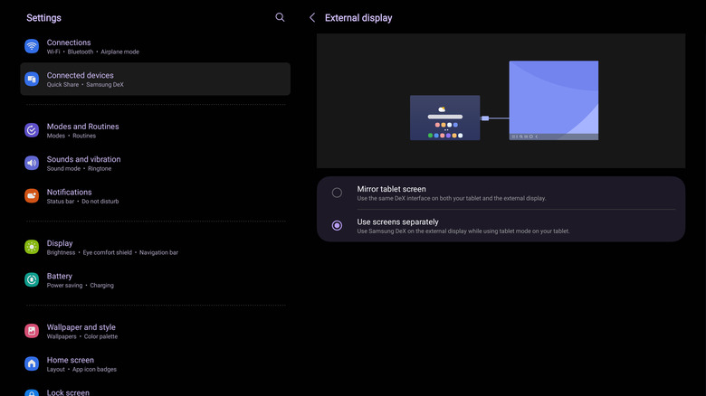
The new DeX for tablets on Samsung One UI 6.0 is useful when the tablet is standalone, but DeX has always been best when paired with an external display, and that's where the new version falls short. Classic DeX runs on a second display when connected wirelessly or via HDMI while letting you either use the tablet's screen like normal or as a comically large trackpad.
But plug in a display with New DeX activated, and you'll quickly find that it only allows you to mirror the screen, meaning you can't take advantage of the extra display. Even more frustratingly, New DeX won't take advantage of your display's native aspect ratio, meaning you're left with chunky black bars on either side of the screen.
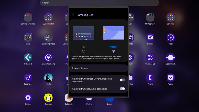
Mercifully, you can dive into Settings and switch between New and Classic DeX. However, you'll have to turn DeX off, switch modes, and then turn it back on again each time you make the jump. I find myself using New DeX while working at my local coffee shop, then having to fiddle with settings when I get home before being able to hook up to my monitor. All that fiddling makes using New DeX significantly less convenient, and I'm inclined to stick with Classic DeX until Samsung fixes the way New DeX works with external displays. As of now, there's no word on any such update.
The best way to put it is that New DeX lets you use your tablet with a keyboard and mouse, whereas Classic DeX turns your tablet into a PC. The two modes are totally different paradigms, but they're bundled into the same feature.
Improvement: Buttery smooth performance and portrait mode
Before the One UI 6.0 update, another big gripe I had with tablet-based DeX was how jarring it was to switch between it and the standard Android interface. Apps would have to be relaunched, wallpaper would change, and there was a lot of stuttering as the UI rearranged itself. But with One UI 6.0, DeX is now a much more seamless transition, not only on New mode but Classic as well.
Apps that were already in windowed mode now carry over into both New and Classic mode when DeX is launched, which means you'll find yourself relaunching apps far less often than before. Another pleasant addition is the ability to use New DeX in portrait orientation. Classic DeX, however, remains locked to landscape.
Once DeX is launched, the performance improvements remain clear. I found no lag when dragging or resizing apps, nor when launching them from the app drawer or minimizing them to the taskbar. Additionally, there were no app crashes during my day of testing. This level of performance is delivered in both New and Classic DeX.
On One UI 5, DeX always felt a bit like trying out beta software, so these performance improvements are a massive step forward. No longer do apps feel like they're being pushed to their breaking point, plagued by flickering and stuttering. Instead, everything feels fluid and deliberate.
Conclusion: New DeX leaves me perplexed and vexed, but still impressed
DeX has always been a strong selling point for Samsung's Android devices since it first launched in 2017, and this tablet-based update proves the company doesn't intend to leave it by the wayside. Samsung has always taken a kitchen-sink approach to features, and plenty of its best ideas get lost in the shuffle. However, consumer enthusiasm for DeX has remained high, and Samsung knows the feature is a way to differentiate itself from the competition.
Moreover, New DeX shows that Samsung is actively searching for ways to make the feature more useful, bridging the gap between tablets and laptops in a way other tablet manufacturers seem uninterested in. While there are still some kinks in New DeX that absolutely need to be ironed out, the ability to keep using Classic mode makes the update a pure value-add. Moreover, the improved performance and addition of portrait mode support make the DeX experience feel like a far more complete package than it has in the past.
Still, it's hard to get past the quirks of this New DeX system, and I'm left with more questions than answers after my time testing it. Jumping between New and Classic modes whenever I want to use a second display is a pain point, and while I'm glad the new mode exists, it often feels like a solution in search of a problem.
But having more ways to interact with a device is rarely a bad thing, and New DeX is another tool in Samsung's Swiss army knife approach to Android. In a world where other tablet manufacturers seem afraid to push boundaries, Samsung's attempts to innovate in the space, however clumsy, are a welcome dose of novelty.
