Spotify's Big TV App Redesign Serves Up Dark Mode And Account Switching
Spotify seems to be on a feature-addition roll of late. Days after adding 200K audiobooks for Premium users, and almost five months after Spotify revamped the desktop version of its app with a refreshed look, it's now the turn of the TV-focused versions of the app to get a similar treatment. The new version of Spotify's TV-focused app has just begun rolling out to users across the globe. According to Spotify, the refreshed UI takes familiar elements from the mobile and desktop versions of the app in a bid to offer users a consistent experience across platforms.
The changes to the app start right from the redesigned home page, which now claims to offer an improved big-screen experience and better discovery options. Spotify also adds that the revamped UI offers users greater control over the overall listening experience. Besides the redesigned homepage, the refreshed app also gets an easily accessible "Up Next" listening queue. Other new additions include the option to switch to "dark mode" and a simplified method of quickly switching between multiple profiles.
It is evident from this update that Spotify's aim with this latest update is to minimize the learning curve for new Spotify TV users who are already familiar with the service on other devices.
Easier navigation, consistent cross-platform experience
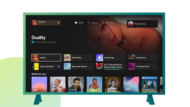
At the center of the changes is the completely revamped home page which now offers easy access to personalized recommendations, shortcuts to favorites, and recently played audio. The home page also offers users quick access to Spotify's search tool. There is also a quick access option to access the entire Spotify library at the click of a button. At the top left corner, users also have the option to access the track that is currently being played back.
In addition to these, Spotify has also added a new option called the "Up next" listening queue. This is a major feature addition that lets Spotify TV app users get a glimpse of all the songs that are part of the playlist, while also letting them easily manage them. This wasn't possible in the older version of the app which only allowed users to see the next song that was lined up for playback.
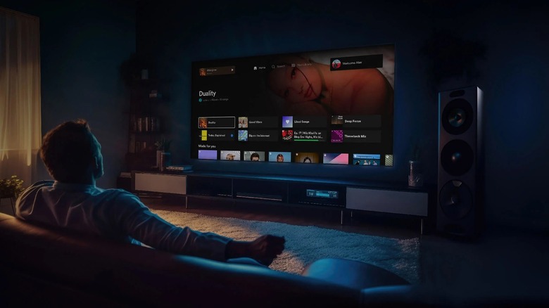
The third major feature — the dark mode — does exactly what it says. Turning it on will dim the screen and display only the most important relevant song-related information that appears on the screen. This mode is designed to be as less intrusive as possible but doesn't prevent users from accessing important information.
The refreshed Spotify app for TVs also simplifies the process of switching between multiple profiles. The currently active profile is shown in the top-right corner of the screen. Any user wanting to switch to another profile needs to click on the active profile icon and select the other logged-in profile. The refreshed Spotify experience for TVs is currently being rolled out to Spotify Free and Premium customers globally and should reach your TV soon.

