Android Over The Years: All The Biggest Changes From 1.0 To Update 14
Android is the dominant smartphone OS on the global market, and over the years it has become essentially the only competitor to Apple's iOS. But the platform had humble beginnings before it erased the competition (like Windows Phone, Symbian, and RIM) from the map, and it's evolved considerably from the first version that was released in 2008. Fifteen years after its initial launch, it's time to take a look at how much Android has changed over the years, starting with version 1 and running through to version 14, Google's latest and greatest.
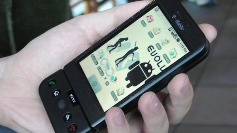
Founded by Andy Rubin, Rich Miner, Nick Sears, and Chris White in 2003, it would be five years before Android was acquired by Google. Interestingly, Rubin thought Android would be a smart camera OS, but a few months after Google bought the company in 2005, he realized his product had much greater potential. From there, there were a series of early versions called Milestones by the Android team. Finally, in September 2008, Android 1.0 launched alongside the HTC Dream, ushering in a new era of mobile computing.
We have broken down the major changes across every major release of the Android platform, highlighting the progress made since that first device launched. The most surprising thing is that, for all the upgrades, fresh coats of paint, and new form factors Android has adapted to, it has, in many ways, always remained itself.
1.0 - 1.6 Cupcake and Donut
Looking back at the first version of Android a decade and a half after it launched in the fall of 2008, we can already see the bones of a great OS. The best example of this is the notification shade, that bar you pull down from the top of the screen. Those notifications have become more interactive over the years, but the core concept is so good, it was never abandoned. The Android Market (later rebranded to the Play Store) introduced in the early days of the OS was also ahead of its time. When Android launched, it was mere months after Apple finally added the App Store to its own mobile operating system. And with version 1.5, codenamed Cupcake as Android began its dessert-themed naming scheme, static widgets were added along with copy and paste and a virtual keyboard. But the real ace in the hole was that Android supported the full suite of Google apps, making it the clear choice for anyone already invested in that ecosystem.
Android officially launched alongside the HTC Dream, where the home and back buttons showed up for the first time as physical buttons, along with the long-forgotten menu and search buttons. Looking at a modern phone running Android 14, it's clear the OS has progressed by leaps and bounds since its birth. For example, there was no multitouch support at first. But there are still some striking similarities, like that notification panel and the ability to pin apps or widgets to the homescreen.
2.0 - 2.1 Eclair
Of all Android's major updates, Éclair wasn't the splashiest, but given the pace of updates Google was shipping, that was to be expected. The 2.0 update shipped in October 2009, less than two months after version 1.6, mainly fixing bugs and improving performance. Although it refined what was already there and had a fresh set of icons, it was sandwiched between more significant updates. Still, better enterprise features were added for business users, including exchange email support and multiple account sync, making it possible for those still on the Blackberry train to switch over to the burgeoning OS.
The onscreen keyboard was improved, as it became clear physical keyboards were going the way of the dinosaur. This was also when the big Google search bar made its appearance as the default widget on home screens, providing instant access to information. Notably, Google Maps Navigation launched with Éclair, allowing people to ditch their standalone GPS units. It's remarkable to consider how much that single addition changed the way most people interact with the world around them, no longer relying on memory or road signs to travel the roads. Android 2.0 also had a car mode that we could consider an early precursor to Android Auto.
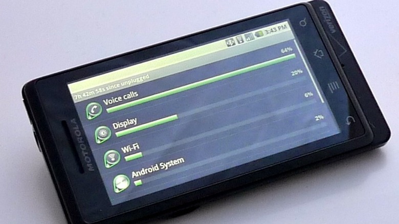
The Motorola Droid launched alongside Éclair and, given how much hype and marketing was centered on it, you'd be mistaken for thinking it was the first Android phone. Even today, the sharp, industrial angles of the device look slick and modern, but it had an anachronistic slide-out keyboard and D-pad that made it look dated.
2.2 Froyo
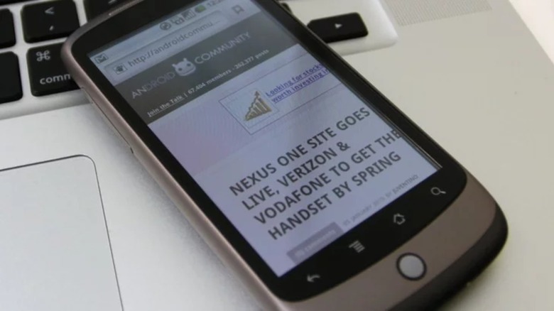
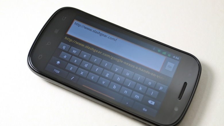
One of the most significant updates in Android history, Froyo, shipped in May 2010. It was the point at which the OS began to see mainstream adoption with phones like the HTC Desire, the Nexus One, and LG Optimus. It featured the arrival of push notifications, Wi-Fi hotspotting, and plenty of other future-proofing features. UI improvements, like an updated launcher and the addition of PIN and password locks, were nice, but the real meat of Android 2.2 was its performance boost thanks to a new compiler. SlashGear's hands-on with the Nexus One while it was running Éclair didn't find a ton of lag on the phone, but when Android Police tested speeds after the Froyo update, it found a jaw-dropping 450% increase in performance.
With Froyo, Android added Flash support, but it was doomed from the start, and eventually dropped in Android 4.1. More long lasting was the Twitter app, which the microblogging platform developed in collaboration with Google. And the search giant continued its foray into voice-to-text by adding Voice Actions to the OS, letting users command their phone vocally. This functionality would be greatly improved years down the line with the introduction of Google Assistant.
2.3 Gingerbread
Gingerbread was another notable upgrade to Android, showing just how quickly the OS was maturing when it was released in December 2010. One of the most significant additions was NFC support, opening the door to a world of smart interactions with the physical world. The iPhone wouldn't receive NFC until 2014, so it's remarkable to think Android had it back in 2010. But the biggest improvement was a UI overhaul that darkened UI elements, added an app manager, and revamped the Android Market to be more inviting for customers.
At this point, fragmentation was beginning to become a problem for Android. Gingerbread had low system requirements, but later versions required more processing power. Lots of users with lower-end hardware wouldn't be able to upgrade any further, and it took many years for both manufacturers and customers to catch up. The problem persists even today, as the latest version of Android has never been the one being used by the majority of devices.
One notable device to release with Gingerbread was the original Galaxy Note, which at the time was considered a massive device with its 5.3-inch AMOLED display. It kicked off the trend of ballooning screen sizes, but by today's standards, that's a small phone.
3.0 Honeycomb
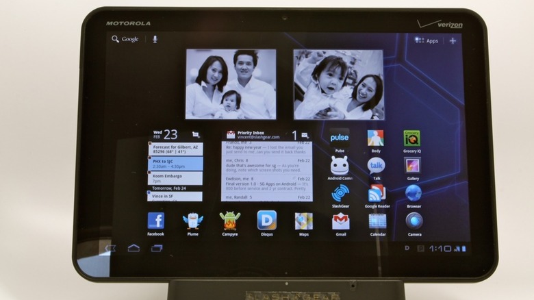
Honeycomb, the Android version only for tablets released in February 2011, is often considered a failure for its inability to make the tablet experience better. But many of its ideas were ahead of their time and became standard on later versions of Android. Among those ideas were the now ubiquitous on-screen navigation keys and interactive widgets. It was also the first version to feature screenshot-style app previews in the task switcher, letting users visualize where they left off in apps. As consumer demand drove the production of large-screen phones in years to come, many of the ideas Google had for tablets would become equally useful on all Android devices. One reason for the massive step up in design: Google had recently hired Matias Duarte, the lead designer of the now defunct PalmOS. Palm had sold its gorgeous operating system to HP, but Duarte didn't stay there.
Honeycomb may have been a strange blip on the Android timeline, and it never even had an open-source version, but it drove important innovations in the evolution of the world's most popular mobile operating system. On the hardware side, Honeycomb's flagship device was the Motorola XOOM. While its specs are laughable by today's standards (a quaint 1Ghz of processing power and 1GB of RAM), it received plenty of praise from reviewers at the time.
4.0 Ice Cream Sandwich
Ice Cream Sandwich was a step back to the drawing board after the curious misfire of Honeycomb, incorporating much of the tablet-only OS's design language into its UI. The update, which shipped in October 2011, was a much-needed modernization for Android that marked the introduction of on-screen navigation buttons for smaller devices, ditched the menu button (to the chagrin of enthusiasts), and added resizable, interactive widgets. It's safe to say this was the dawn of modern Android.
Also of note, Visual Voicemail was integrated, as were text responses to calls. Face Unlock was introduced, though the first iteration could be fooled by pictures and was not reliably secure. Native screenshot support was a great addition, as was real-time speech-to-text input and HDR photography. Another big change was the favorites bar or "dock" that got added to the home screen. One more useful feature that later got removed was Android Beam, which used NFC to share content from one phone to another when they were pressed back-to-back. Now that Apple has introduced a similar feature in iOS, here's hoping Beam makes a return.
Toward the end of 2012's first quarter, Google debuted the Google Play Store, finally doing away with Android Market and launching a suite of Play apps — Movies, Books, and Music. Strangely, only Play Books survives today, with Play Music killed off (and user libraries migrated to YouTube Music), and Play Movies having become Google TV.
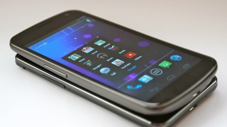
Ice Cream Sandwich debuted on the Galaxy Nexus from Samsung which, with its signature hump on the bottom and soft but angular design, still stands apart from other handsets. It was well reviewed, even raved about by owners, and to this day, you can find former owners of the device who talk about it with nostalgia.
4.1 - 4.3 Jelly Bean
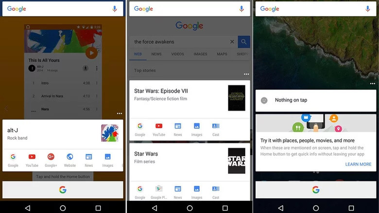
Jelly Bean, which was released in July of 2012, seemed like a minor iteration compared to Ice Cream Sandwich's sweeping changes, but under the hood, it modernized the OS. Google's "Project Butter" aimed to improve performance at a time when Android had a reputation for lagging and being generally janky. Another core feature added with this update was the Quick Settings panel, allowing users to toggle things like wi-fi and Bluetooth without leaving the current app. Meanwhile, updates to HDR photography and external display support added future-proofing. Google Now also debuted, marking the start of Google's focus on predictive search. It was designed to serve up useful information before you asked for it in a card style interface, including notifications for package deliveries, flight times, and more. Notifications, already Android's strong suite, were also improved.
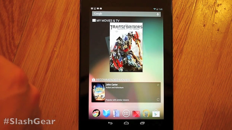
Google released a slew of Nexus devices alongside Jelly Bean, most notably the Nexus 7, built by Asus. The 7" tablet looks a bit impractical today, as flagship smartphone screens nearly match its size and foldables dwarf it. Its massive top and bottom bezels seem comical, too. But its design was inviting, with a stippled, soft-touch backplate and an even friendlier $200 price tag. The Nexus 7 sold well enough to kick off a new product category, and Apple responded with its own iPad Mini.
4.4 KitKat
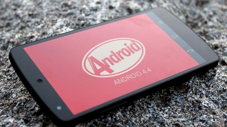
The first Android version to feature a tie-in with a major candy brand, KitKat was internally called Key Lime Pie before Nestle broke them off a piece of that branding. Released in October of 2013, it came with a minor visual overhaul that brightened things up, but more importantly, it optimized the system for midrange and budget devices by reducing memory usage with a program called "Project Svelte," helping to alleviate growing problems with version fragmentation. KitKat expanded NFC payment support along with other near-field capabilities, and at the time, Google was trying to make Google+ a thing, so there were also some integrations with the now defunct social media platform that feel obviously misguided in hindsight.
In the hardware space, the Nexus 5 and HTC One M8 were the hot phones of the year. While the former ran stock Android and the latter ran HTC's Sense skin, both received high praise from the tech press.
5.0 - 5.1 Lollipop
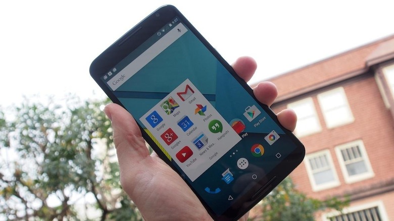
Lollipop refreshed Android's design language for the first time since Ice Cream Sandwich's Holo interface with its November 2014 launch, introducing a new design language called Material Design. Apps were now to be thought of as layers of cloth or paper, with animations and interactions reflecting that paradigm. Important elements were designed to be colorful in comparison to the rest of an app's interface, drawing the user's attention to the most important functions. This reimagining was once again the work of Matias Duarte and his team. Thanks to betas released through the Developer Preview program, far more apps were immediately updated with Material Design at launch than might have been otherwise. It's hard to overstate how positive an impact this had on the experience of using an Android device. Apps finally felt cohesive; no matter where they came from, they shared a basic design language that made them immediately intuitive.
The Lollipop update also brought a brand-new app engine, Android RunTime, or ART. It was a massive update that allowed Android to take full advantage of newer chipsets. Additionally, heads-up notifications were added, as well as lock screen notifications — two things it's hard to believe we lived without for so long. Also added: battery life improvements and 64-bit support. Not everything was great, though. Most annoyingly, Chrome tabs and Gmail threads were now integrated into the app switcher and appeared as recent apps, making it frustrating to navigate around if you had a few open.
The Nexus 6 was the most interesting device to immediately support Lollipop. Codenamed "Shamu" internally at Google, it lived up to its namesake by being absolutely massive, showing that giant phones were here to stay.
6.0 Marshmallow
While the previous year's upgrades had focused on UI, Marshmallow focused on refreshing support for newer hardware with its October 2015 launch. USB-C was starting to see wide adoption as a universal standard, so Google added support for it. Native API support for fingerprint biometrics, 4K app rendering, and even MIDI support for musical instruments were also introduced with Marshmallow. Security was vastly improved with more granular permissions controls, letting users revoke apps that got too greedy with their device data, though those systems were still far from perfect and have been improved upon in more recent versions. But Marshmallow's most important feature was one most users would never notice, a deep sleep state called Doze that detected when your phone wasn't being used — for example, leaving it on the table overnight — and turn off all unnecessary functions, saving idle users a ton of battery juice.
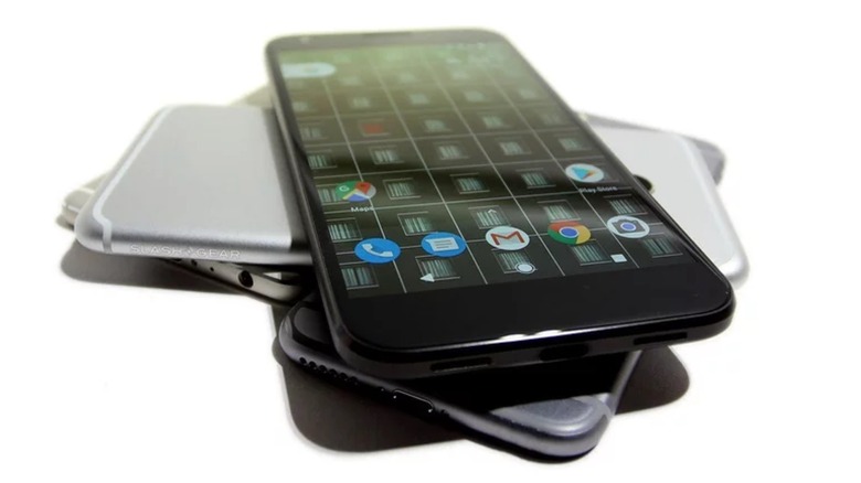
The Nexus 6P was the main launch device for Marshmallow, with a "visor" camera design that would resurface years later on the Pixel 6 line. Ironically, the 6P was made by Huawei, which is no longer allowed to sell phones in the US market.
7.0 Nougat
While Nougat came with under-the-hood performance and security improvements when it dropped in August 2016, the biggest changes were to multitasking. Split-screen mode finally made its way to the OS, and the notification shade was redesigned to organize and fit more information and added the ability to reply to messages from a notification. Battery life was also made better in Nougat with improvements to Android's deep sleep state called Doze, activated when a device is unused with the screen off for extended periods of time. If you left your phone off the charger overnight, your battery would drain slower, for example.
But the big headline was the launch of the Pixel lineup, ditching the Nexus moniker Google had licensed out to its manufacturing partners in favor of custom in-house designs. The original Pixel was also the first device to support Google Assistant, which replaced Google Now as the phone's smart assistant.
The original Pixel and Pixel XL received positive reviews, with SlashGear's Chris Burns noting that Google's camera was the best on the market at the time due to its computational approach to smartphone photography. It was the phone that kicked off an arms race in smartphone camera software. The Pixel also marked the point at which Google's own phones shipped with a different fork of Android than the AOSP, one that contained Pixel Exclusives.
8.0 Oreo
The second — and last — Android version to feature a popular snack brand tie-in, Oreo was launched in August of 2017 at an event held outside the trendy Chelsea Market in New York City, the location of the Oreo cookie's invention (via CNET). Among the headlining changes, notifications got another set of improvements, including dots on app icons to indicate unread alerts, as well as the ability to snooze notifications, and the notification shade now automatically sorted by priority and category to manage the increasing flood of app alerts people were experiencing. Bluetooth devices were now able to show battery life device-side, a welcome change as wireless buds grew in popularity. Picture-in-picture was added, allowing users to watch video while using other apps. Perhaps the best change most users didn't notice was Project Treble, a play on the phrase, "All bass, no treble," that allowed apps to only download parts of an app that needed updating, instead of redownloading the whole app. This significantly cut down update sizes.
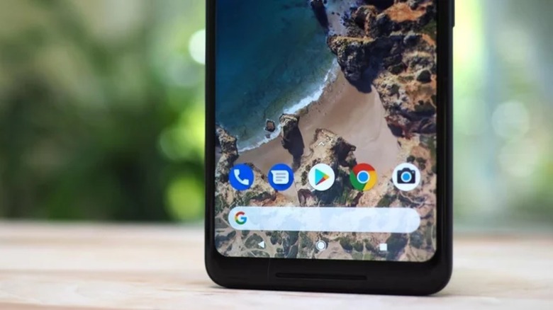
On the hardware side of the equation, Google's Pixel 2 XL was beset by problems with its screen, but otherwise received lots of praise. Displays would continue to be the weak point of the Pixel lineup when compared to those from competitors like Samsung or Apple.
9.0 Pie
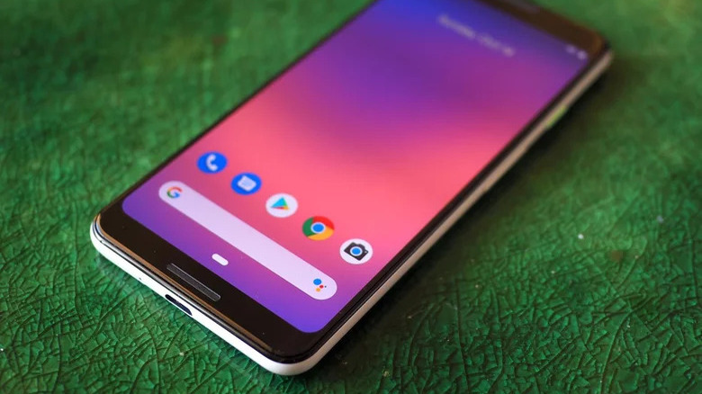
By August of 2018, competition for Android was really heating up, and Apple had completely revamped its aging smartphone lineup with the iPhone X. For the first time since KitKat had ditched physical navigation buttons, Android's UI was feeling dated, so for the OS's 10th anniversary, Android Pie finally added gesture-based navigation. Unfortunately, Google didn't knock gestures out of the park on its first swing, and Pie implemented a so-called "pill" interface which was extremely unintuitive and required swiping in different directions on a small button at the bottom of the screen. It also wreaked havoc on third-party launchers. To be fair, the pill button offered more functionality, like opening the app drawer with a full swipe up. Support for display "notches" was also added with Pie, since they were in vogue at the time. Cue flashbacks to those ugly intrusions into your screen, another consequence of the iPhone X's popularity.
Other, smaller improvements that arrived with Android Pie included Lockdown Mode and smart linking to apps like Maps from text. Another great addition was Digital Wellbeing, a suite of features to manage healthy smartphone use. But let's be honest, very few of us actually abide by the app timers we impose on ourselves.
10.0
With Android 10, released in September of 2019, Google finally dropped their dessert naming scheme with 10 letters left to go (a fact that still makes completionist brains itch), but it was internally known as Quince Tart, so maybe that's for the best. It was a pretty big update, revamping gesture navigations to be more like the iPhone's. Unlike the iPhone, it had back gestures, although they conflicted with apps that had navigation drawers accessed by swiping in from the side of the screen and it took some time before developers updated their apps to remove those once-ubiquitous UI elements. Swiping from the bottom corner of the screen now activated Assistant. Other nice-to-haves included a system-wide dark mode to save users' eyes and batteries, as well as a major location permissions overhaul.
Android 10 launched in 2019, just as Samsung released its first ever foldable phone, the Galaxy Z Fold, and Google accordingly added foldable support with this update. Although that original Fold was plagued with issues and had to be re-released, foldable devices have only proliferated on the market in subsequent years. Google clearly saw that trend coming.
11.0
Internally called Red Velvet Cake, Android 11 dropped in September of 2020. Its biggest feature, while not a splashy UI refresh, was an overhaul for app permissions that included one-time allowances, thus allowing users to take advantage of an app's location-based features without granting that permission to the app in perpetuity. This much-appreciated privacy enhancement also rolled out to older devices from Android 6 upward through a Google Play update, proving that the company's years-old initiative to decouple many of Android's features from system updates was paying off.
Other useful additions to Android 11 included fine-tuning for the back gestures, notification history, and better 5G support. A native screen recorder also finally arrived far too late. For years, stock Android users had relied on permissions-hungry third-party apps for that essential function. A new sorting system for app notifications debuted that prioritized notifications from messaging apps. Lastly, chat bubbles arrived. The less said about them, the better.
12.0
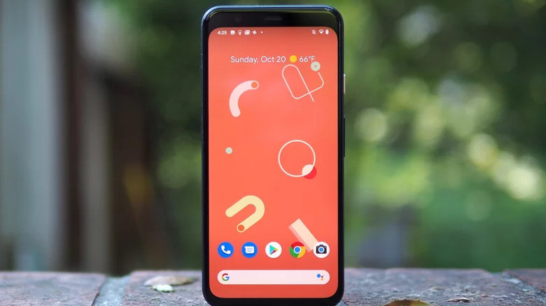
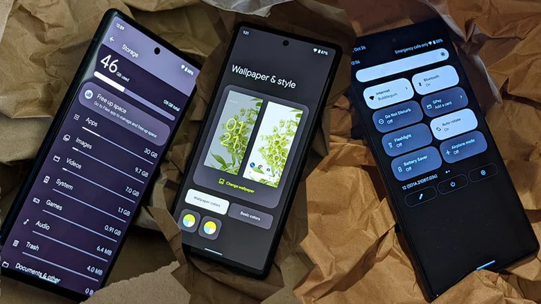
Internally codenamed Snow Cone, Android 12 was introduced in October of 2021, bringing the biggest design changes since Material was introduced. The new system, Material You, allowed system elements, app icons, and widgets to take on colors complementing the selected home screen wallpaper. Once again, this enticing visual refresh was the work of lead Google designer Matías Duarte.
More significant privacy features were introduced with Android 12, including indicators when the camera or microphones are accessed, the ability to only show apps an approximate location, and a new Privacy Dashboard. The next year, in 2022, Android 12L was released, a minor update focused on improving support for foldables, tablets, and other devices with larger screens. This was likely due to the development of the Pixel Fold, which Google would release two years later in 2023.
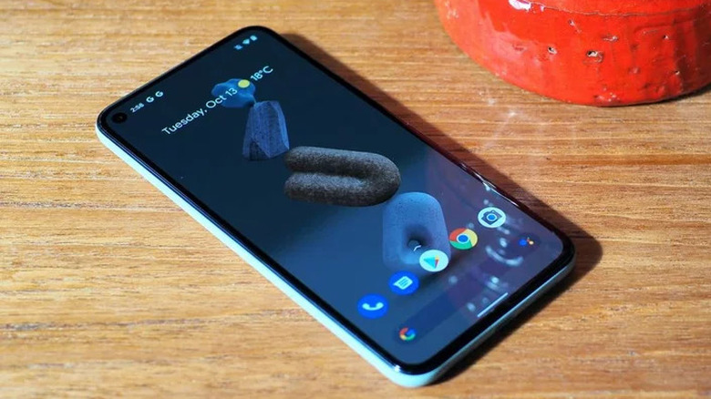
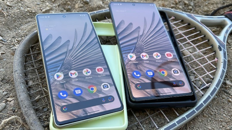
Google launched the Pixel 6 alongside Android 12, which brought the first major hardware design change to the company's phone lineup. It sported a "visor" camera bump that echoed the design of the years-old Nexus 6, and also marked the first time Google deployed custom silicon with the Tensor processor.
13.0
Known inside Google HQ as Tiramisu and released in August of 2022, Android 13 was a relatively minor update compared to a lot of other point-oh releases, a fact signaling how much the OS had matured. The biggest addition was that it made apps request permission to send notifications — a welcome change, given all the notification spam that piles up for most users. (However, Android still won't let you flag spam notifications from apps that beg you to open them, and apps continue to bundle those into vaguely defined notification categories like "general." Please, Google, it's out of control.)
Allowing multiple devices to receive audio with LC3 became supported, a welcome addition to anyone who wants to share music with a friend without giving up an earbud to them. One feature that many users may not be aware was added is a multitasking shortcut that opens split screen when you drag and drop icons from the notification shade. Accessibility for polyglots was also added at last, allowing users to set per-app languages. Third-party apps were also given the ability to take advantage of themed icons with Material You, though many popular ones still haven't done so as of this writing.
14.0
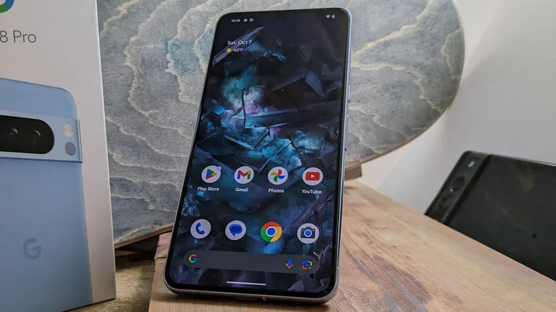
Codenamed Upside-Down Cake internally at Google, Android 14 is the latest version of Android, and it recently started rolling out at the beginning of October 2023. Its development was delayed by a month to ensure stability, although betas have been available for quite a while. The biggest ease-of-use improvement is a preview when back gestures are used that indicates whether the gesture will return to a previous screen or exit the app entirely, and also shows a preview of that page on some versions. It's a welcome update, since horizontal swipes in apps have been a minefield ever since the side-swipe back gesture was introduced, as you'll inevitably end up going to a previous page by accident if you're not precise.
Support for using phones as webcams is also here, so you can use your beefy flagship camera instead of your laptop's dinky built-in webcam in video meetings. Meanwhile, new accessibility features let you make text bigger while using smart scaling so those with poor eyesight can still see more than one thing onscreen.
Fifteen years after Android took its first steps, it has grown up into a remarkably mature operating system, capable of powering devices in an array of form factors and dominating the global market. Yet even while being adaptable enough to be forked and reskinned by major manufacturers, even as the world around it changed dramatically, it retains a core identity. Whatever the next fifteen years may hold, Android will sit in the pockets of billions of people around the globe.
