YouTube Is Rolling Out Dozens Of New Features Including An Audio Stabilizer
YouTube is getting a meaty feature overhaul across mobile and the web, making changes that focus more on user convenience than a dramatic UI makeover. To avoid the menace of accidental swipes or button presses, YouTube is rolling out a Lock Screen feature that avoids nasty interruptions. This convenience has been available on a lot of local video player apps out there, and it's great to see it finally arrive on the world's largest video-watching platform.
Next, long-pressing at any spot on the video increases the playback speed to the 2x preset instead of asking users to do so from within the playback controls section. Similarly, if you are scrubbing across the seek bar and want to land on a specific chapter or segment in the video, YouTube is easing the chore by serving bigger thumbnail previews.
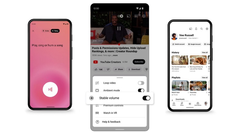
In case you wish to return back to the same time stamp where you started, you can simply lift the finger to cancel the seeking progress and resume from the same point in the video where you left. There's also a new "stable volume" toggle that can be enabled to smoothen out unpleasant volume shifts while watching a video. YouTube is adding some dynamism to the UI, as well, such as a new light-up animation for the subscribe button, live counts on the likes and view counts in the first 24 hours of uploads, and automatic highlighting of the buttons when creators mention "subscribe" and "like" in their videos.
Cleaner looks and easier navigation
YouTube is also borrowing one of Google Assistant's most underrated tricks. You can now sing or simply hum the tune of a song, and YouTube will identify it for you. You will need to hum for at least three seconds for the trick to do its magic. This feature will be rolling out in the coming weeks, starting with Android. Until then, you can summon Google Assistant to do the job. After all, the results it pulls up usually default to YouTube's own music and video platforms, so there's that.
Here's the feature in action:
Google's new hum to search feature is really good. Works well with Hindi, English, and Urdu classics as well. Even worked flawlessly for two Persian songs I hummed.
Here it is, perfectly detecting "Aaj Jaane Ki Zid Na Karo" pic.twitter.com/0qHcZmWcBN— Nadeemonics (@nsnadeemsarwar) October 16, 2020
YouTube is also overhauling the "You" page that can be accessed on the profile icon in the bottom right corner of the screen. Instead of text-based controls, you will now see carousels of video thumbnails neatly separated in rows labeled history, playlist, etc. It looks much cleaner and makes it easier to find videos you may have liked, saved, added to playlists, or watched (assuming watch history is enabled in the first place) in the past.
YouTube is making it easier for creators to highlight their social links using a dedicated tab for it. The company is also paying attention to YouTube's TV interface. Details such as action buttons, video descriptions, chapters, and comments now appear in a separate window slotted neatly alongside the right edge of the screen. These changes will eventually make their way to the mobile and web clients.
