5 Features Introduced In Windows 95 That You're Still Using Today
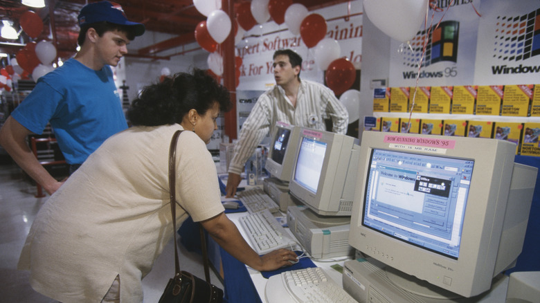
In 1995, Microsoft released the first iteration of what would become the Windows 9x series of home operating systems, the aptly named Windows 95. Windows had already been a prominent player in the home computing scene for a good few years prior to this with its release of Windows 3.0 and its subsequent updates, but Windows 95 was when the brand really started to hit its stride, cementing itself as the definitive face of personal computers (or at least, non-Apple personal computers).
Windows 95 introduced various features into the Windows paradigm, and while many of those features have either been pruned or overhauled in the nearly three decades since, some still endure into modern Windows versions. While they may not exist in exactly the same forms as they first arrived, it's a fact that many of the Windows staples we take for granted these days can be traced back to that fateful release in the summer of '95.
Start button
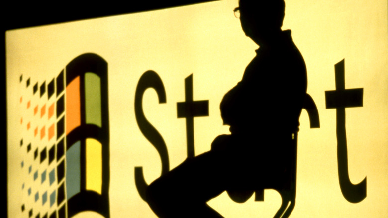
One of the most iconic features of the Windows design is the Start button, that little button on the bottom of your PC screen. While current iterations of the Start button only feature the Windows logo, in the olden days, starting with Windows 95, it was a large, steel-colored button with the word "Start" proudly emblazoned in bold black. Not only was the Start menu a convenient one-stop-shop for users, but it was also a great jumping-off point for newcomers to personal computing. Not sure where to start? Just start at the Start!
The original Start menu was slightly more condensed than the current version, sorting files and functions into six categories. You had your programs list, quick access to your documents folder, your settings menu, a Find function for searching for files, a help menu for learning about your computer's functions, and a Run function for the file path-minded who already knew what they were doing.
Taskbar
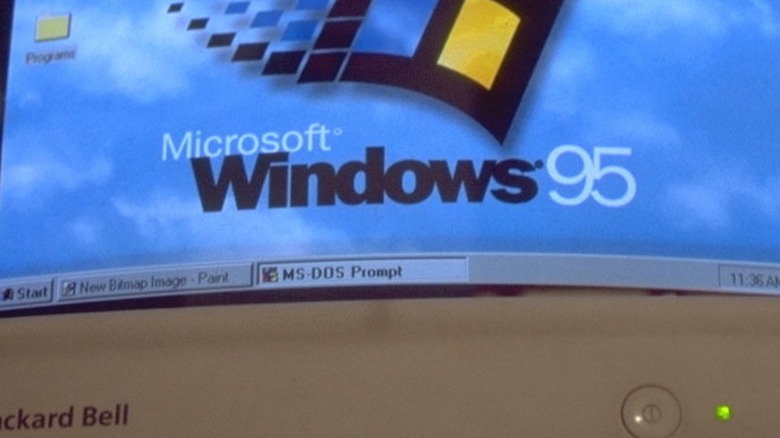
Older versions of Windows would leave all of your open programs and file windows floating around in space. If you lost track of something, you'd have to manually move or close your windows until you managed to track it down again. This was thankfully remedied in Windows 95 with the addition of the Taskbar, the gray bar at the bottom of the screen that housed both your Start button and your system clock.
Whenever you opened a program or file in Windows 95, a rectangular Taskbar icon would appear, which you could click on to immediately call that window to the front. Later updates to Windows 95 also added a quick-launch sub-bar, which you could link programs to and quickly launch them. This quick-launch icon format has gone on to become the default setup for the Taskbar in current versions of Windows, integrating with the existing window format to help condense your running programs.
Plug and play
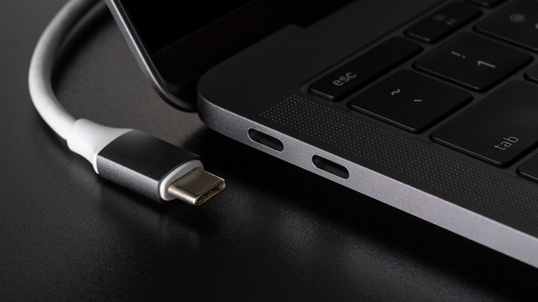
Before Windows 95, if you wanted to plug some kind of peripheral device into your home computer (besides a keyboard, which was often built into the system), you'd have to manually configure internal settings and even activate physical dip switches to properly accommodate whatever you were hooking up. It was unwieldy, to say the least, which is what makes the introduction of Plug and Play functionality in Windows 95 such a godsend.
In Windows 95, and every Windows version since, you can simply plug a device right into an open port on your PC, and Windows will immediately detect it and configure it for your use, or at least attempt to. The feature wasn't quite perfect when it was first introduced, as a lot of universal hardware and software standards hadn't yet been established in the industry to facilitate quick connections. Still, the groundwork was laid, and nowadays, adding a new device to your system couldn't be simpler.
Recycling Bin
In the 1980s, Apple was looking to race to the front of the visual user interface scene with distinctive icons and functions. One of those functions was its Trash folder, which would automatically wipe any deleted files when a computer was restarted. In '88, Apple actually sued both Microsoft and Hewlett-Packard for developing visual systems with icons that it deemed too similar. Microsoft won this case, but with one caveat: the design for its Trash function was too close to Apple's, and needed to be changed. Thus, with the release of Windows 95, the Recycling Bin was born.
Unlike the deletion functions on Mac or MS-DOS, the Recycling Bin acts more as a temporary folder, allowing users to double-check what they've deleted before they clear out the space. That's been the mainstay format for the Recycling Bin in all Windows versions since, serving as a last line of defense for the absent-minded in preserving important, accidentally deleted files.
Long file names
In both MS-DOS and the earliest versions of Windows, a file name could be a maximum of eight characters, plus a three-character file extension. If you were saving important documents, for example, you'd need to give everything heavily-abbreviated codenames in order to meet the file name limit. Thankfully, this changed with the release of Windows 95, which swapped out the existing file allocation table framework with the updated virtual file allocation table system.
With this increase in file variability, your file names could be a whopping 255 characters long, plus a longer file extension. It may seem like a small feature, comparatively, but if it weren't for this change, you wouldn't be able to give your school and work files descriptive names, nor would you be able to use some of the file formats we take for granted like JPEG or HTML. Computing would be a lot more abstract without this humble tweak.
