5 Tips And Tricks To Make Your Notion Page Look Incredible
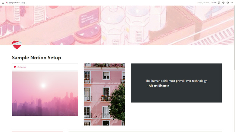
If you spend most of your time on Notion, you already know how unmotivating it can be to look at your setup and see a boring, cluttered layout. Your content blocks are everywhere, the colors don't follow a theme, and there isn't anything remotely fun to look at on your page. You just wish your page could magically turn into one of those aesthetically pleasing ones you see on YouTube and Pinterest.
You can always go the easy route and just duplicate an already organized and stylized Notion template. There's a host of websites where you can buy such templates, and some YouTubers and Redditors also offer ready-made ones for free. However, if you're looking to design an already existing page or want to create an eye-catching setup on your own, we've got five Notion tips and tricks you can try to enhance the look and feel of your workspace.
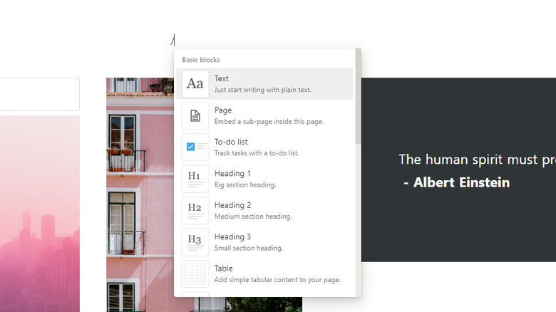
Take advantage of the different content block types
If one type of content is a staple of your Notion pages, it's the database block. This is easily among the most commonly used Notion features as it can serve multiple purposes, from an inventory tracker to a travel planner. But while databases are nothing short of handy, a Notion page with nothing but columns and boxes isn't really a pretty sight. To make your setup more pleasing to the eyes, throw in a couple of other content block types on your page.
If you don't already know, Notion comes with a variety of content you can use. Here are a few:
- Quote: A plain text block but with a bold vertical line at the beginning to separate the content from the rest.
- Callout: A text block contained within a box for emphasis. It also includes an icon inside the box for added flair. You can change the background of the box and switch the icon to reflect the content of the callout.
- Headings: Bigger text for titles, subtitles, and the like. You can choose from three heading types.
- Table: A simple table without the fancy features of a database. This is the perfect block type if you're just looking to display your content and are too overwhelmed with how to use a database.
- List: For anything you want to be arranged vertically. List content types include the to-do list, bulleted list, and numbered list.
Embed widgets
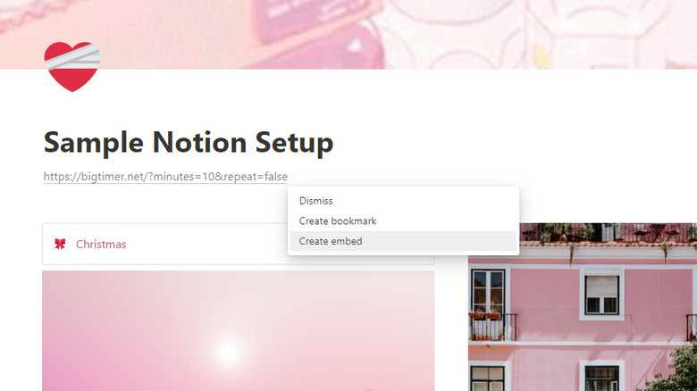
Notion widgets are essentially embeddable third-party tools that elevate your page with pizzazz and functionality. You can add them to your setup just like you would embed an image: simply paste the link on the page and click "Create embed" from the floating menu that automatically appears. To find a widget you want, just hop on a widget collection website like Indify, Kairo, Apption, and WidgetBox. Some widgets there are free, while others require a paid subscription. There are also other stand-alone Notion widgets you can find around the internet. We've compiled a list below for your convenience:
- Life Calendar: Shows you a grid of small boxes representing the weeks of an entire 90-year lifespan. The black boxes are weeks you've already lived, and the white ones are weeks in the future. This is a minimalist and easy way to see all the remaining time you can look forward to.
- Big Timer: A huge timer, perfect for when you want to study or work on a project.
- Walking Pandas: Displays a crowd of pandas walking on a purple background. It's a fun way to spice up your page.
- Quotes: Generates a random quote from a certain theme (wisdom, technology, friendship, inspirational, famous quotes). You can choose the theme, background color, and font size before embedding the widget in Notion.
- Combo Clock: Adds an analog with a digital clock and the current day of the week on your page.
Use photos and GIFs
Photos and GIFs inject a pop of color and life into your Notion setup, so if you want to break the monotony of your page, they are excellent fillers. Photos of the right size (2,000 px by 50 px) can also serve as dividers, just like what Reddit user u/No-Violinist-838 showcased in their divider template. These photo dividers are a more attractive alternative to the default gray divider that Notion has. To add a photo or GIF (or cat meme) in an empty space on your Notion page, type the command /image and choose how to attach your file (upload the file to Notion or embed a publicly accessible link). You can also look for a picture in the integrated Unsplash and GIPHY search bars.
Aside from breaking up the content of your Notion page, photos and GIFs can also make your page icons and cover photos more personalized. Yes, Notion does feature a collection of emojis, icons, and photos, but you can use only so many. Some don't even fit the vibe of your page, so you're better off uploading a custom picture and GIF. This is where sites like GIFDB, GIFER, and Pinterest come in handy. For icons, you can also browse through Simple Ink, Notion Icons, and Icones. They offer an extensive library of free icons. All you need to do is copy the link of your preferred icon and paste it on your Notion page.
Organize your content blocks
A single block occupying the entire width of your Notion page can look suitable for large content like databases, simple tables, and plain text. However, if you only have minimal elements, such as bulleted lists with one-word items and an embedded portrait photo, this kind of layout may not be optimal — you'll end up with a lot of white space next to the content. Too much blank space can make your page dull and unbalanced, so you want to arrange your blocks to maximize the page and create better visuals.
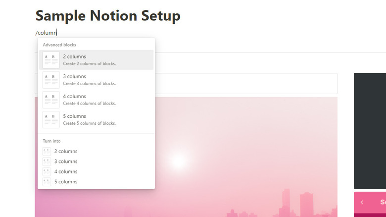
Fortunately, that's easy to do with Notion's column feature. If starting with a blank page, type /column and pick how many columns you want to generate (two to five). If, however, you already have existing blocks on your page, just drag the block you want and drop it on the rightmost side of another block. This will create two columns. Rinse and repeat until you have your preferred number of columns.
To organize your page even further, utilize Notion's divider block. It's a thin horizontal line that visually separates two content blocks. You can add it to your page to divide your notes by chapter or place it at the top and bottom of a specific block (like a quote or callout block) to give it more emphasis. There's also a nifty Javascript code you can use — $$color{gray}rule{1px}{250px}$$ — to make a vertical line, as Notion doesn't offer a built-in one yet.
Leverage the color features but do it cohesively
You can never go wrong with a minimalist black-and-white look for your Notion setup. It's significantly cleaner, helping you focus on what matters most. However, if that scheme doesn't suit your tastebuds, you'll be glad to know that Notion offers many color styles you can integrate into your page. First, there's the light and dark mode that changes the overall vibe of the platform. This applies not only to the pages but also to the settings and sidebar. To change to a new mode, press Ctrl/Cmd + Shift + L.
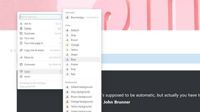
You can also change the colors of the text in the block and the block's background. Open the block configuration menu (the six-dot icon to the leftmost of a block) and go to the Color option to do so. However, it's important to note that this feature only applies to specific block types, including text, quotes, callouts, lists, and headings. You can't, unfortunately, change the color of a database and table.
When making use of Notion's color features, be thoughtful about it. You don't want to crowd your setup with a myriad of colors. Instead, make sure to have a color palette in mind before designing your page. Then, check if this palette goes well with the mode (light or dark) you choose. Another useful tip is to minimize the colors on the page itself if your cover photo is already bursting with hues.
