Google Chrome Gets Material You Redesign And New Features As It Turns 15
Google Chrome on desktop is finally getting the kind of aesthetic attention that Google introduced on smartphones with Android 12. To mark the 15th anniversary of its bread-and-butter web browser, Google announced in a blog post that it is bringing the Material You design language to Chrome. That means Chrome's desktop version will no longer look like a hodge-podge of cool colors and rounded corners married with boxy black/white UI elements against bland fonts.
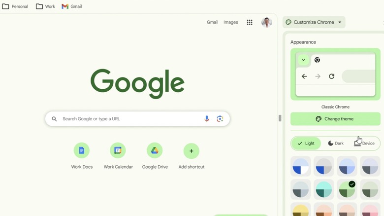
Right now, if you apply a theme from Chrome's own web store, it beautifully changes the color scheme of the status, URL, and bookmark bars at the top. But the rest of the UI elements, such as the menu box, the customization dashboard, and the entire settings page are an aging grayscale mess. That is finally changing soon with the advent of Material You styling on Chrome's desktop version.
The customization dashboard will soon have color palette wheels, and more importantly, dedicated buttons for quickly switching between light and dark modes. Of course, there's also an auto-mode that plays with system-level color theme preferences. Google says it has "refreshed Chrome's icons with a focus on legibility and created new color palettes that better complement your tabs and toolbar."
To combat the rising menace of short-lived malicious websites, Google will now perform a real-time vetting of all new websites popping up on the internet against its database of bad URLs. The company says it will offer "25% improved protection from malware and phishing threats."
Safety gets priority
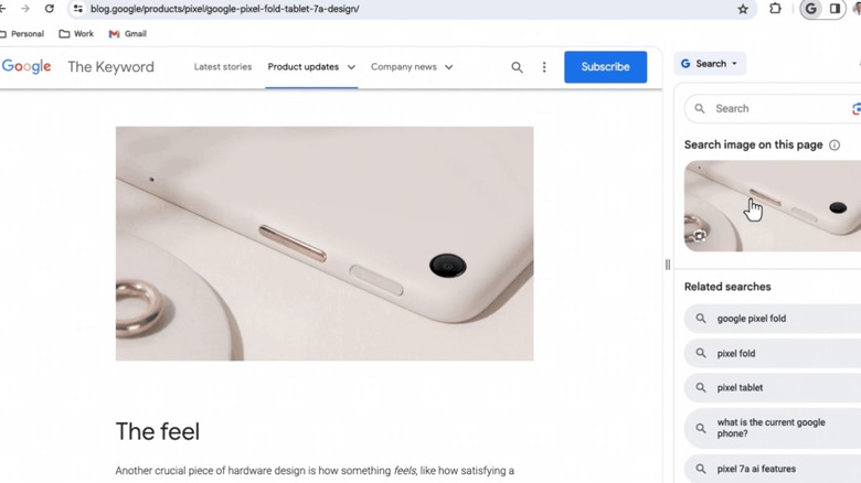
The Material You design makeover also comes with an overhaul of the menu dashboard. It adds a handful of new controls for quick access, such as profile switching, one-click deletion of browsing date, Google Translate, and Save & Share. There's also a new "Search this page with Google" option that opens a dedicated side panel with web search controls, Google Lens for image information, keyword hotlinks, and webpage source information at the bottom. It's somewhat like the Bing Chat side panel in Microsoft's Edge browser.
The Material You overhaul for Chrome will arrive in the coming weeks, but if you want to get a taste of what it looks like, you check out the preview version of Chrome's web store. Aside from a design overhaul, it gets some neat categorization controls, too. Additionally, the store also gets some new sections such as extensions that leverage generative AI tools, and an Editor's Spotlight segment that highlights the best of what Chrome extensions have to offer.
On the security side, Google is making a big leap. The in-house safety check system is finally expanding to browser extensions. Experts over at Avast, IBM Security, and McAfee have repeatedly highlighted the issue of malicious Chrome extensions over the past few years, and even though Google removes them, they continue to pose serious risks such as arbitrary code injection. It's unclear how effective the safety check move is going to be, but it's at least a step in the right direction.

