12 Cars With The Most Futuristic Dashboards We've Ever Seen
Nobody knows what the future will look like, but car designers often try to predict it. Ever since the creation of the first concept car, the Buick Y-Job in 1938, designers have used this platform to develop ideas of how automotive styles will be shaped in upcoming years. This has led to some extremely imaginative designs showing up at auto shows, wowing the public with forward-thinking concepts and ideas. Often, those designs incorporate technology thought to be the next big thing in automotive engineering, such as the 1958 Ford Nucleon, foretelling of a future of nuclear-powered cars that can go 100,000 miles before refueling. Obviously, it never made it into production.
Not all futuristic concepts make it into production cars, but some do. Furthermore, while styling can be very avant-garde and progressive, the dashboards are often where you will find the most potential glimpses of the future. The interfaces allowing us to manipulate cars are the most tangible connection to them, and the tech that we interact with is constantly evolving with increasingly advanced hardware. Furthermore, modern dashboards already look like something of the future and the proliferation of touchscreens makes them endlessly versatile. This often makes dashboards of older cars more interesting in some ways. Considering the context of the time in which they were created, these are the most futuristic we've seen.
Lamborghini Athon
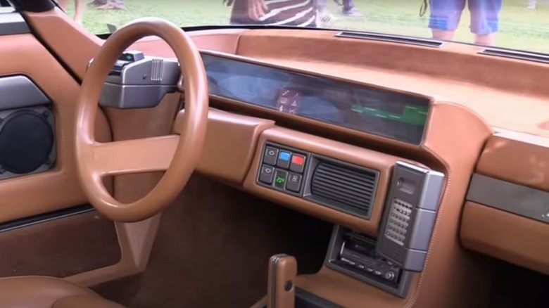
Lamborghini's history is already full of modern and cutting-edge designs. However, the company also has a long history of releasing concept cars and prototypes showcasing the potential of its designers and new technologies coming down the pike. Coachbuilder and design house Bertone is responsible for many of these, including the Athon, an open-top car that exudes the design of the '80s from every sharply creased angle.
The Athon was created in the early '80s as a concept, and it features the clearly defined geometric shapes for which '80s design is known paired with muted browns and golds synonymous with the more conservative Regan and Thatcher era. Yet its dashboard is a conglomeration of beautiful LEDs and rectangular push buttons that signify a shift from the levers and switches common on cars of the decade prior. But the pièce de résistance of futuristic design is the inclusion of a digital calculator mounted on a pod hanging off the right side of the dash. It clearly denotes the intention of this car to be used by Wall Street traders and high-ranking bank managers obsessed with crunching numbers while driving their Lamborghini.
Honda EV-STER
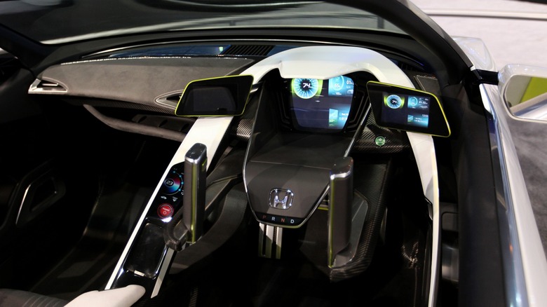
Back in 2011, Honda revealed a concept car that looks like a replacement for its retired S2000 model. This concept would differ from the S2000 by having an electric drivetrain and never being put on sale. It was a small open-air two-seater built to show what a future electric Honda may look like. It showed a potential future that was extremely attractive but also forecasted the future of dashboards with a degree of accuracy.
The interior of this is created similarly to a cockpit, and the dashboard looks a bit like the controls of a jet plane. The steering is accomplished by a set of parallel joysticks that operate in a manner similar to zero-turn lawn mower controls. It never made it into production, but the gauge cluster did. It is made up of a central dynamic LCD screen flanked by two smaller screens with auxiliary information that represent a couple of side-view mirrors. In videos, the screens show different setups displaying tachometer, speedometer, maps, and more. While screens were taking hold in the auto world in 2011, they were not yet commonplace. This futuristic design element was an accurate glimpse into the future.
Mercedes-Benz Vision EQXX
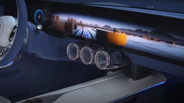
As a modern automotive concept car, it doesn't get much more technologically advanced than the Mercedes-Benz Vision EQXX. Not only is it packed with high-tech equipment, it also sports futuristic styling inside and out. While this car is wild in its design and features some cutting-edge technology, it's a rolling test bed for what we will see in future electric vehicles from Mercedes-Benz rather than an exercise in design with little practicality.
The dashboard in the EQXX is massive. While many cars are now incorporating ever-larger screens in the binnacle and over in the center of the dash, this one extends from door to door. In addition to being large, it displays graphics in brilliant color and high resolution. The pertinent driving information including speed and vehicle warnings remains in front of the driver while the rest of the screen is dynamic and can be used for standard functions like HVAC controls or can be changed to provide entertainment options to passengers. The integration of multiple functions in the increasingly large dashboard screen may be a bit futuristic, but only marginally as this sort of design will be on roads very soon.
Peugeot Quasar
French cars have long been known for being quirky, often incorporating mechanical elements in an unorthodox fashion, but many French cars are utterly impressive for both looks and performance. Peugeot has been making cars as long as any company and has roots in making bicycles before automobiles existed. Peugeot has also raced its cars throughout its history, often creating exquisite machines for this purpose. Its 1984 Quasar concept, built for Group B rally racing, is one of those exquisite cars.
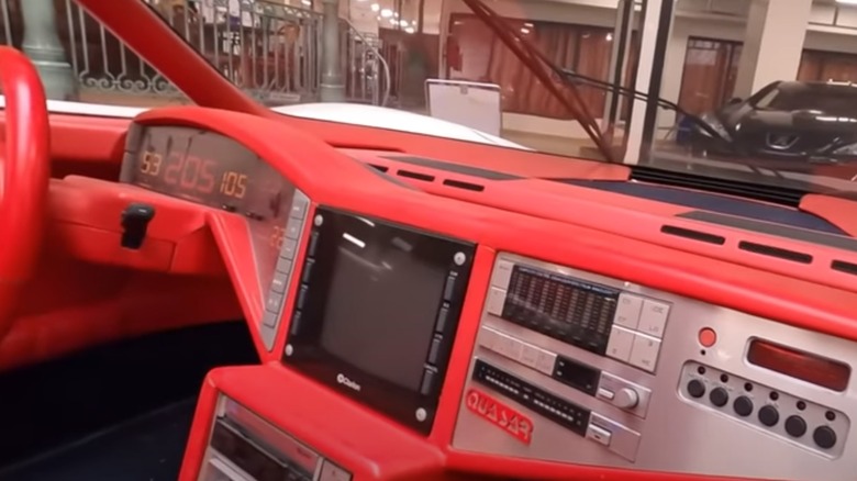
As a 600-horsepower AWD racer built with carbon fiber and Kevlar, the Quasar is quite a runner. But it also stuns in sophistication and beauty with its styling, which includes a bright and forward-thinking dashboard. Paul Bracq, designer of the "Pagoda" Mercedes SL, penned this concept, incorporating bright red colors throughout and even brighter LED lighting on its instrumentation and gauges. The all-digital dashboard was the way of the future for '80s designers as well as the elimination of all switches in favor of rectangular buttons, which the Quasar possesses in spades. Furthermore, Clarion provided a CRT video screen in the center of the dash as the holy grail of all things future for a car in 1984. The Clarion screen is part of the component entertainment system and also offers navigation, very futuristic for 1984. Furthermore, this is all located on a floating binnacle running across the passenger compartment. It's a shame this was only ever a concept.
Citroën Karin
While French carmakers are known for making unique automobiles, Citroën reigns supreme in oddball cars that could only ever come from France. While the groundbreaking Citroën DS is among the quirkiest cars ever put into production, the 1980 Citroën Karin concept takes this to an extreme.
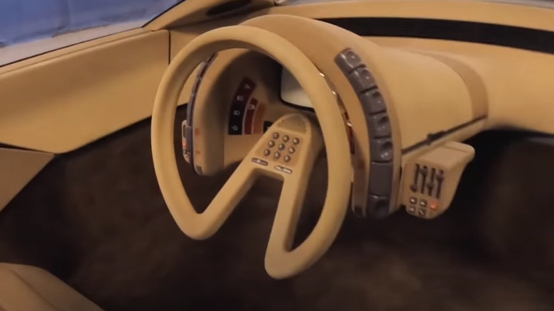
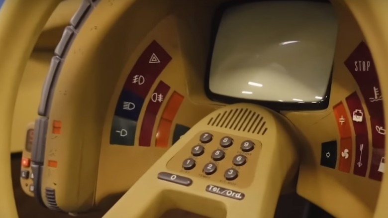
While the exterior footprint dimensions of this car make an almost perfect rectangle, everything becomes a pyramid as it goes up, taking the wedge shape popular in the '70s to its absurd conclusion. The shape forces the driver to sit in the center flanked by two passengers, McLaren F1-style. Driver controls are housed in a pod extending from the dashboard to the centrally located driver and include all controls and instrumentation in a circular binnacle. Like any good future car of the period, a CRT screen is mounted right in the middle. The central screen displays operational information, but it does dual duty. In the rear of the car is a small camera lens, which means this car comes with a backup camera a full 28 years before it became mandatory in the U.S. Furthermore, the steering wheel includes a dial pad for a phone years before mobile phones became commonplace. For 1980, this looked about as close to a space-traveling car as anything else and would have looked right at home in The Empire Strikes Back released the same year. It looks wonderfully dated and archaic today, but no less desirable.
Ford 24.7
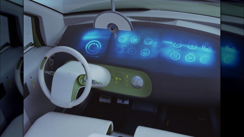
Ford showed its 24.7 concept at the North American Auto Show in 2000, introducing many technologically advanced features that seemed impractical, if not implausible, at the time. The entire dashboard is free from buttons, switches, dials, or much else. The dashboard surface itself was a single full-color screen with dynamic interactive displays. It could display a wealth of information and be used to control climate controls and the radio. Perhaps the most futuristic concepts were its wireless internet connection and prodigious use of voice commands. It also had the ability to browse web pages and send an email. The display could be configured with custom backgrounds and differing arrangements and could be set up for up to four users, each with unique login settings.
All of this tech may have seemed a bit over the top and silly at the time, but most, if not all, of its connected and digital features are now becoming standard on new cars, including having different user profiles. The email idea may not have caught on, but it foreshadowed the current ability of cars to announce incoming text messages through the audio system. The 24.7 may not have been a highly exciting concept, but it predicted the future of automobile dashboards better than any concept before or since.
Buick Riviera
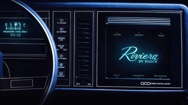
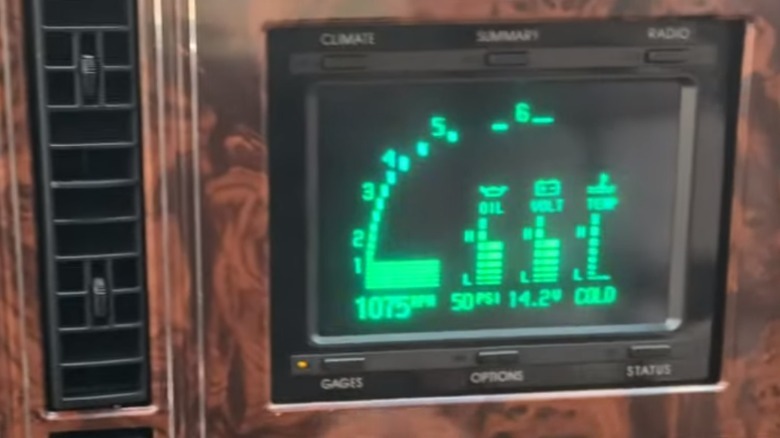
The personal luxury car was a hot segment for decades, and Buick's longtime entry into the segment was the Riviera. For years, it offered buyers an upscale coupe with plenty of room for passengers at a price below the luxury marques. It also served as a test bed for Buick's most promising technologies. In 1986, the Riviera became the first production car to come with touchscreen controls mounted in the dashboard.
While the styling of the dashboard itself is conservative for the '80s and bog standard for a Buick of the era, the screen in the center of some models was akin to something from "Star Trek: The Next Generation." Built at a time long before flat screens ruled our world, this touchscreen used a Cathode Ray Tube (CRT) similar to those of all the old boxy TV sets commonplace until the 2000s. It worked as a multi-function device much like modern touchscreens but with less sophisticated graphics. It controlled the audio system and climate controls, and could display readings from the rudimentary engine electronics of the day as well as trip computer, diagnostics, and economy readings. This was paired with a digital gauge cluster that numerically displayed speed and engine monitors. Today, it looks decidedly old and slim on available functions, but in 1986, it was the future.
Maserati Boomerang
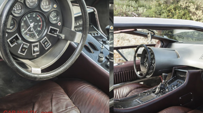
The ideas that designers of the '70s had of what the future would look like often diverged wildly from what became. The most futuristic car designs of the '70s often just look silly in the current day. In 1971, Maserati commissioned Italdesign and its premier designer, Giorgetto Giugiaro, to create a one-off concept car for upcoming car shows. A mockup debuted in Turin in 1971 with a fully functional car appearing in 1972 at the Geneva auto show. This car, called the Boomerang, pushed Maserati's design well out of the box in a way that foretold the future direction of car design, inside and out.
The sleek wedge-shaped car is the epitome of early '70s supercars with its abundance of impractical windows and low-to-the-ground silhouette. Inside, the driver is treated to the most unusual dashboard, too. Since electronic and automated functions were still a few years off, the only way to make a futuristic dashboard design was to create something wholly unorthodox. Giugiaro accomplished this by cramming everything inside the steering wheel. Thus, the wheel featured all the gauges, switches, and buttons within the circumference of it in a weird cluster of interior functions. This also included the turn signal and wiper stalks jutting forward within the wheel. It's a bizarre arrangement, but to the world of 1972, it was the look of things to come, even if they never did. However, the Boomerang survived well into the future, last selling at Bonhams for $3.5 million in 2015.
Imagine by Kia
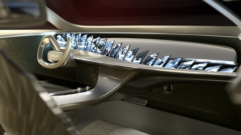
Concept vehicles tend to give a glimpse into the future. But with modern cars being already advanced and full of technology, you may wonder just how the envelope can continue to be pushed. In 2019, Kia gave us what looks a bit like the future of cars, albeit probably a more fanciful version.
Few concept cars today are powered by gasoline, and the Imagine by Kia is no exception. It's an all-electric car that looks to show the future of Kia design. Hopefully, the naming convention does not stick as it already harkens back to the failure that was the Chrysler TC by Maserati. The shape and the scale of the car are both predictably crossover-like, but the interior is something out of the post-Space Age era. Sitting in front of the driver is an array of 21 screens fanned out in an arc that goes from end to end on the dashboard. It almost looks like the car has 21 charge ports and someone is charging all 21 of their iPhones with the screens linked in the car. It is a cool effect, making them look like they are floating all with a seamless image slayed across all the screens, but it is also decidedly a gimmick. It is a cool look that does appear futuristic, but hopefully, it won't be the future that we actually get to experience.
Aston Martin Lagonda
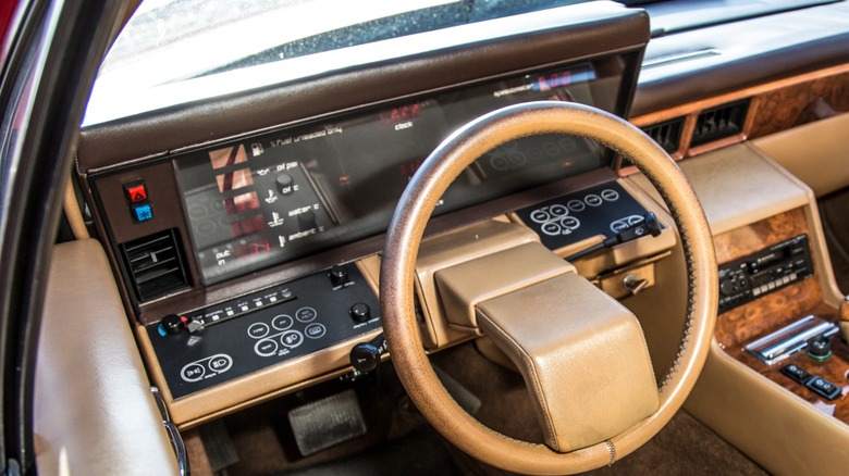
Of futuristic cars that actually made it into production, the Aston Martin Lagonda wears the crown. By the mid-'70s, Aston had a solid reputation for building luxury grand touring cars with good power and great handling. Despite having cars featured in the James Bond franchise, finances continued to struggle. Creating a new luxury car with an unusual design featuring advanced electronic features wasn't the best idea for a struggling boutique automaker. It built it anyway.
Aston released its new four-door luxury sedan in 1976 — a Series I Lagonda was released in 1974, but only seven were built — to mixed reactions from the public and press. Its wedge shape was polarizing and bold, and the bold choices continued inside. The Series II dashboard received an excessive technology touch with analog gauges replaced by digital LED displays showing speed and rpm like portable calculators of the era. Below the gauge cluster was a flat panel of membrane touch buttons for other functions.
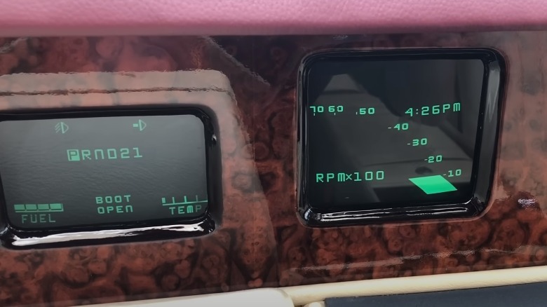
The Series II in 1985 received the full CRT screen treatment. Gauges were replaced by three screens showing vital information in full monochrome splendor. The technology was supplied by Clinton Electronics in Texas and had originally been designed for use in the F-15 Eagle fighter jet. As these systems were overly complicated, they were not reliable and owners of Lagondas today must be very particular about maintenance. Complexity aside, both of these dashboards were far ahead of their time.
Nissan Round Box
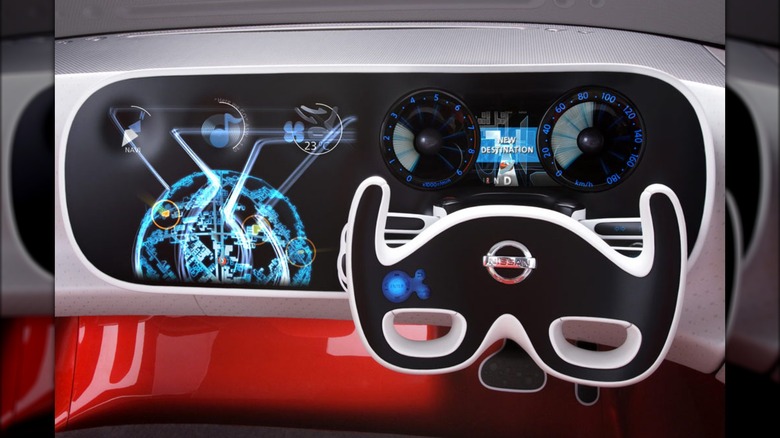
Several years after the establishment of a partnership between Renault and Nissan, a concept car came from the latter that suggested some of the French quirkiness of the former had bled through its designs. This little roadster concept was called the Nissan Round Box. Although the car was more square, the interior took on a more circular shape and the round theme continued through the cabin space. While the dashboard was not round, it was the most dazzling feature of this car and it showed off some advanced designs for 2007.
The dashboard of the Round Box is completely devoid of buttons, leaving an instrument and control panel to a singular flat touch screen accented by a steering yoke. The display is in full color and appears as though it would be a touch screen, but the graphics are vague as to any purpose. The yoke also shows a glowing symbol, suggesting it is also a small touch panel as well. According to Nissan, it also features an interactive "Play Catch" entertainment system that encourages drivers and passengers to exchange information from the large display up front to an additional display in the rear seating area. Aside from the inclusion of navigation in the system, few other details are offered about capabilities. This was obviously a concept car created as a design exercise, but the integration of touchscreens in modern cars seems to prove that Nissan was headed down this path many years before.
Canoo Lifestyle Vehicle
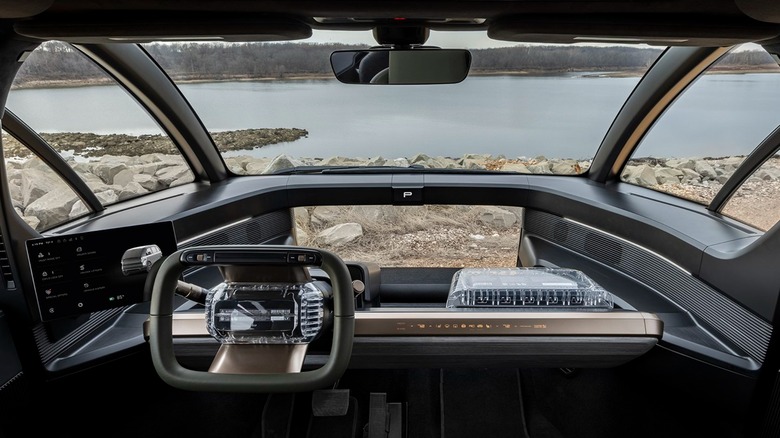
Startup electric vehicle maker Canoo has a different outlook on how automobiles will look. Its upcoming vehicles, which can be configured into a pickup or van layout, are well past the prototype stage and are readying for serial production in its facilities in Oklahoma. The design of these vehicles gives them an odd egg-like appearance, but that is linked to Canoo's philosophy of modularity in construction. That modularity and the design flexibility it offers continue into the dashboard.
Sitting in a Canoo driver's seat, you will see a squared-off steering wheel that looks as if it is attached to a crossbar and little else. A screen mounted on a pod at the side displays all the pertinent information for operation and a small screen far in front with the speed displayed. Just below the speed display, the Canoo has a unique additional window that offers a view directly down to the ground. The design is meant to be able to adapt the vehicle for nearly any application and add additional features or accessories as needed. Furthermore, it makes the process of making a Canoo right-hand drive exceptionally easy, especially with its drive-by-wire electric drivetrain. Whether this will take off is yet to be seen, but Canoo is moving forward at speed. Its upcoming vehicles also look more like the electric and automated vehicle pods that the movies will have you expect to be commonplace in the next 20 years. Perhaps Canoo is just ahead of the curve.
