5 Hidden Notion Features You Need To Know About
When it comes to productivity tools, Notion comes out at the top. It's packed with a plethora of features that make it an organized person's dream app. There's the database block that you can use for all sorts of things like budget planners, employee databases, and project management. You also have the basic lists (to-do, bulleted, and numbered) for your notes and tasks and the recently added Notion AI that adds generative AI capabilities to your page (e.g., writing and editing content, summarizing pages, translating content).
But apart from all the fancy bells and whistles you can see upon opening a Notion page, there are a handful of other nifty features this platform has hidden away. These gems make working with Notion a lot less overwhelming and a lot more fun. We've curated five of these features in this article and will walk you through how to use each one.
Slash commands
Slash commands aren't exactly hidden, as you probably already use them to add new content blocks to your Notion page. When you type "/" on an empty space on the page and follow it with the name of the block (e.g., table, to-do list, table of contents), the command automatically inserts the particular content into that space.
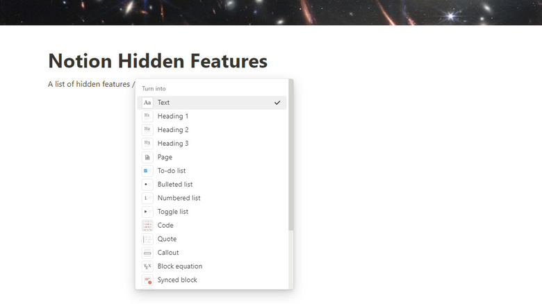
However, what you don't know is that you can also type slash commands right on an existing content block, not just on an empty space. There are three main uses of slash commands written next to current content: turning the block into something else, changing the block's text and background color, and pulling up the actions menu for that block. To use slash commands on existing blocks, here's what you need to do:
- Click on the existing content block.
- Type any of the following:
- /turn – converts the block into a different type of block.
- /color – changes the text and background color of the block. Alternatively, you can type out the name of the color you want to change into (/red, /pink, /blue) as long as it's available on the menu (gray, brown, orange, yellow, green, blue, purple, pink, red).
- /actions – shows you the actions menu for that block (e.g., delete, duplicate, comment). As an alternative, just input the action you want to do. Available actions include ask (ask Notion AI), delete, duplicate, copy (copy link to block), moveto, and comment.
- Choose from the options in the floating menu.
Third-party embeds
There are a bunch of embeds you can add to make things a whole lot easier. You can embed a Google Drive file, Figma design, Excalidraw whiteboard, Hex project, Trello card, Asana task, and even a Zoom meeting link, to name a few. Just type "/embed" on an empty block to see a list of embeddable Notion-supported apps.
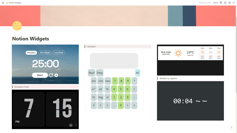
However, the power of embeds doesn't end with this list. Thanks to widgets, you can add a host of other things to your page. Notion widgets are third-party tools that increase productivity and add flair to your page. Here are a few widgets you might want to try out:
- Flocus Pomodoro Timer – a minimalist Pomodoro timer.
- Flocus Quotes – simple motivational and inspiring quotes with aesthetic background photos.
- A Soft Murmur – ambient sounds for relaxing or studying.
- Calculator – a basic scientific calculator.
- Stopwatch – gray minimalist stopwatch.
- FlipClock – a digital flip clock with a dark and light theme.
To add these widgets to your Notion page, simply paste the link on an empty space and select "Create embed" from the floating menu. Aside from these stand-alone widgets, there are also certain websites that offer a collection of customizable Notion widgets for free, such as WidgetBox, Indify, and Apption. You'd typically need to create an account to use widgets from these websites, but once you have the link to your widget, just paste it on your page and create an embed.
Custom icons for your database properties
Custom icons come in handy when you want to label your Notion pages visually. For instance, you can use a shopping cart icon for your grocery list, a calendar icon for your monthly schedule, and a cash icon for your budget planner. Icons are an excellent alternative to page emojis, especially since the emoji collection is currently pretty limited. However, if you think that you can only use icons in the page header, think again. Icons can be a game-changer in your databases, too.
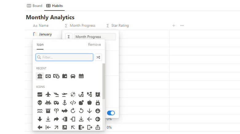
If you frequently use a table database, you already know that the properties (the names of the columns making up your table) come with default icons. Unfortunately, they're typically not related to the names you assign to the properties. Take the Number property, for example. Its icon is a hashtag, but if you rename it to "Amount purchased," the hashtag icon doesn't seem to go well with that name. To change the icon, you only need to click on the property name, select the icon next to the name, and pick your preferred icon from the library.
Similarly, you can change the icon of the database view itself. To do so, click on the name of the database view and choose Edit view from the drop-down menu. On the View Options, click on the icon box to the left of the database view name and select the icon you want to change it to.
Custom dividers
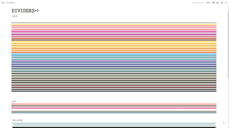
Dividers add organization and style to your Notion page. They separate sections and keep your space looking tidier and easier to navigate. The downside of Notion's default dividers is that they're too simple, with only a thin gray line. If you want to make your page more aesthetically pleasing, there are two ways. The first is using the divider-generator code by Productive Dude. Follow these steps:
- Click on the space you want to add your divider.
- Copy and paste one of these codes:
- $$color{gray}rule{705px}{1px}$$ – creates a customizable horizontal divider
- $$color{gray}rule{1px}{250px}$$ – creates a customizable vertical divider
- To edit the divider, click on it and change the following values:
- Color – change "gray" to your preferred color
- Rule – the first figure changes the divider's length (for horizontal) or thickness (for vertical), while the second figure changes the divider's thickness (for horizontal) or length (for vertical)
- Click on Done to save your adjustments.
The second way to add fancy dividers to your page is with embedded images. You can find some from Red Gregory and Reddit user u/No-Violinist-838. Just download the divider image of your choice and embed it to your page. You can adjust the divider length by dragging it horizontally. Note that this also enlarges the image, making the divider look thicker. If you can't find what you need here, feel free to create your own divider image (suggested dimension: 2,000 px by 50 px).
Word count
While you often see others using Notion's advanced database feature for personal and office use, Notion is best known for taking notes. It's a great alternative to popular note-taking apps like Microsoft OneNote and Evernote. Like what you'd expect from a note-taking app, Notion has basic word processor features like typographical emphases (bold, italics, underline, strikethrough), text color, text background color, font style, and font size. But another useful word processor feature that's pretty hidden in sight: the word counter.
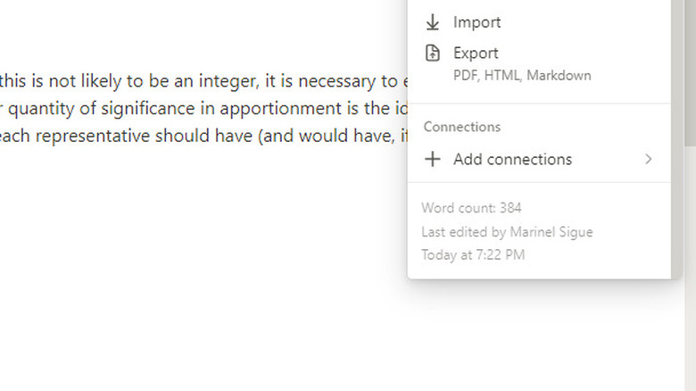
Yes, Notion has a word counter, so you won't need to rely on third-party apps or sites to count the words in your essay or wiki page. This feature, however, isn't as plainly displayed as the other word processor features. To check the word count on any Notion page, click on the three horizontal dots in the upper right corner of the screen and scroll to the bottom of the floating menu. There, you can see the word count and the timestamp for when you last edited the page. It's important to remember that the word count includes not only the plain text but also the words in your page title and embeds.
