Apple macOS Sonoma First Look: 5 Features Worth Installing The Public Beta For
Apple's macOS Sonoma public beta has arrived, and rather than bringing a single "must have" reason to upgrade, the latest Mac release has a series of improvements and productivity tweaks that long-time users could find greatly improve their everyday experience. As you'd expect, Apple is leaning into its cross-platform smarts in many places, with tighter connections between Mac, iPhone, and iPad. However, some of the most obvious benefits come in the shape of relatively minor enhancements that, cumulatively, make a Mac easier to live with.
While much of the Apple update attention will be on the release of the iOS 17 public beta and the iPadOS 17 public beta, Mac fans will find plenty of reasons to consider installing pre-release software on their laptop or desktop. Though the changes are spread out across the platform, Apple's updates have a tangible impact on how user-friendly — and how attractive — macOS is. Considering how much time we spend in front of our computers every day, that adds up to a big deal.
As always, it's worth bearing in mind that this is work-in-progress software, not Apple's final release. Though macOS Sonoma has been pretty stable in my testing so far, some bugs will undoubtedly remain: after all, the public beta (and the developer beta before it) is intended to help flush out any final glitches. Now's the time to consider booting up a spare Mac, if you're lucky enough to have one; if you're going to install the macOS Sonoma public beta on your primary machine, make sure to do a full backup of your data first, just in case.
Widgets break loose
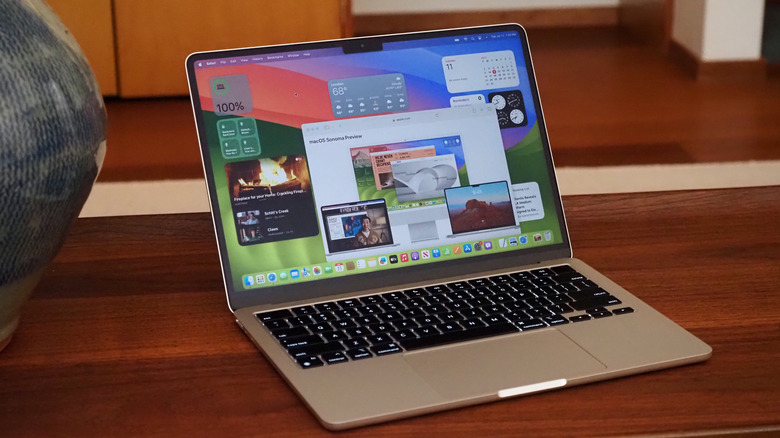
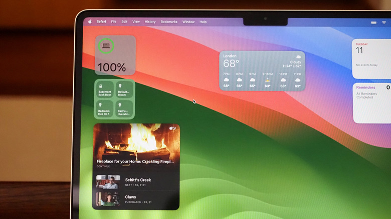
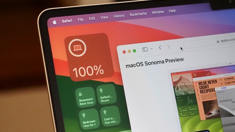
Widgets are breaking free of the macOS Notification Center, which is welcome since I usually forget they're there in the first place. Apple has seemed reluctant in the past to allow widgets to coexist with apps, preferring instead to corral them away, but now you can fill your desktop to your heart's desire. There's a redesign to the widget gallery, and new extra-large widgets invited over from iPadOS.
What I particularly like about widgets in macOS Sonoma is how intelligently they coexist with everything else you're using your Mac for. If you drag a window on top, for example, the widgets underneath will fade into a dimmed transparency that takes on the color of the underlying wallpaper. You can still see them, and the information they contain, but they're far less distracting.
I try — and often fail — to keep my desktop relatively clear of files and icons. Still, the way macOS Sonoma's widgets see files flow around them is welcome, too, and the ease of alignment satisfies the neat freak in me.
Continuity keeps showing its worth
The cohesive interactions between multiple Apple devices have long been an advantage to going all-in on the Mac, iPhone, Apple Watch, and iPad ecosystem. AirDrop, Continuity Camera, Instant Hotspot, and the Universal Clipboard are features I use every day, and macOS Sonoma adds a couple more things that are likely to go into my daily rotation.
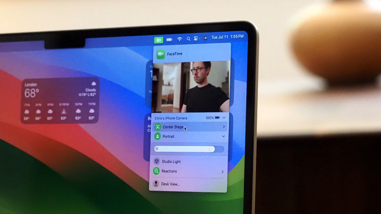
Continuity Camera is now controlled with a simple drop-down menu that lives in the taskbar, rather than in the Control Center. It means adjusting camera settings — whether you're using your iPhone camera or your Mac's built-in FaceTime camera — is easier, and you get a video preview that helps line up your iPhone. It'll support third-party apps, too, such as Zoom, as long as they're using Apple's API.
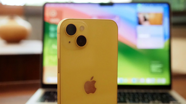
One thing I'm curious to see develop is Continuity widgets: effectively seeing the widgets from your iPhone on your Mac desktop. That'll work without having the app installed on your Mac, just as long as your iPhone is nearby (or even just on the same Wi-Fi network). I usually have my iPhone clinging to a MagSafe charging stand alongside my laptop, but not having to reach for it for frequently-used widgets is a neat enhancement.
Video calls look more professional
If — like a lot of us — you now seem to spend half your work day on video calls, macOS Sonoma's improvements to how cameras work with your Mac could make it time to upgrade to Apple Silicon (if you haven't already). While Intel-based Macs do get some of the improvements, the real computational photography magic is reserved for those released in the past few years with Apple's own chipsets inside.
I don't really do presentations, which means the clever new overlay features in macOS Sonoma are somewhat wasted on me. Being able to snip yourself out of the frame and move your face around the screen, or have a large overlay kept centered while the presentation floats next to you, look much more professional than the usual little window in the corner. I'm also probably not going to make much use of gesture-triggered reactions (at least, not intentionally) since I prefer my dour facial expressions to communicate my displeasure during video calls.
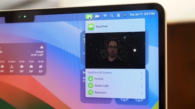
Far more useful, though, are macOS Sonoma's improvements to the video feed itself. Some of the features will be familiar if you've used a recent iPhone, like Studio Light to simultaneously brighten your face and darken the background. Adjustable background blurring in Portrait mode is a welcome addition, too. And, as someone who has been interrupted multiple times by a cat in the background, being able to manually adjust the zoom, framing, and whether Center Stage uses the main or Ultra Wide iPhone camera is not only a neat trick but — equally important — straightforward to tweak even when you're in the middle of a call.
Safari adds smarter sandboxes
I'm guilty of browser disloyalty, but for good reason. I normally use both Chrome and Safari simultaneously, as it helps me keep my work and personal browsing separate (plus a crash in one app doesn't take down every single tab I have open). macOS Sonoma, though, is doing a good job of luring me back.
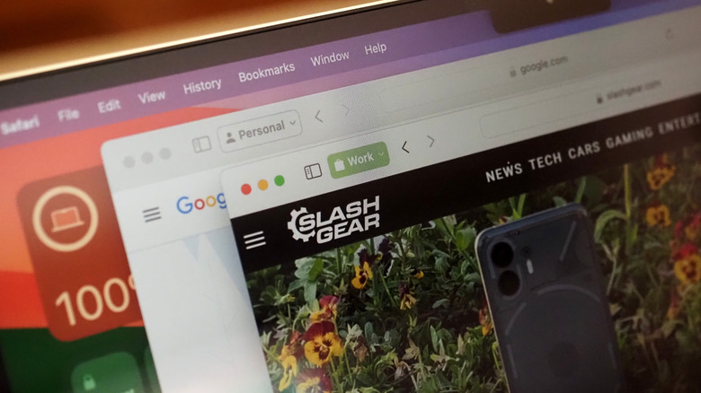
That's thanks to the introduction of Safari Profiles: basically ways to ring-fence different windows. With a Work and a Personal profile, for example, you can sign into the same sites — like Gmail or Facebook — with different accounts. History is kept separate, too, along with any cookies, favorites, and extensions. Better still, Profiles you set up on one Apple device sync with your others — a Work profile will also be available on an iPhone or iPad, for instance — and if you're making use of Focus, you can have certain Safari Profiles linked to certain individual Focus modes, too.
The other welcome improvement to Safari is around privacy. You can lock a Private Browsing session with your Mac password or Touch ID, for example, while links opened will automatically have any tracking code ousted.
Time-savers galore
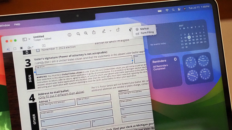
Some of my favorite Mac features have been there for years, though I suspect a lot of people still don't know about them. Being able to save a signature in Preview, for instance, and use that to sign documents like contracts and letters without needing to print and scan them is something I do multiple times every week. In macOS Sonoma, that form-filling process gets even easier.
Likely forms can now be automatically identified — in Preview, but also system-wide, such as in Mail or even in documents you've scanned in yourself — and the text entry boxes added intelligently. AutoFill can start making contributions there, too, pulling out details from Contacts as appropriate.
Is that world-changing? No, but it's definitely time-saving, and that feels like the unofficial motto of macOS Sonoma. Just like inline predictive text for typing, the ability to simultaneously use voice dictation and the keyboard, and Notes supporting viewing presentations and PDFs within individual notes rather than demanding they be individually opened, it's a steady paring-back of things that would've taken extra steps in previous versions. If, like me and plenty of other people, you spend hours a day in front of your computer screen, that's an efficiency promise which will have you looking forward to macOS Sonoma's full release this fall.
