How To Enable Google Chrome's New Design Refresh
For over a decade, Google Chrome has dominated other web browsers by a large margin on both mobile and desktop. The reasons for this popularity include ease of use, high responsiveness, and frequent updates with minor but useful features. While Chrome also has a reputation for hogging your PC's RAM, Google attempted to fix the issue by adding a "memory saver" feature that puts unused tabs to sleep to free up some RAM.
From a visual perspective, however, Chrome has not gained any significant features since 2018. This is set to change soon as Google has been working on a design "refresh" for Chrome for Windows, macOS, ChromeOS, Linux, and other desktop platforms.
This isn't a full-fledged redesign, which is why Google is calling it a "refresh." However, we can see curvier elements, new icons in line with Chrome for Android, and a splash of colors. The list of changes may get longer as we approach a final announcement from Google. If you want to try out how the world's most popular browser feels with these enhanced elements, this guide will walk you through the simple steps required to enable Google Chrome's new design "refresh."
What is Chrome Refresh 2023?
The recent changes in Google Chrome mark the first major visual upgrade since Chrome 69, delivered to users in 2018. The previous update introduced rounder and more symmetric attributes, distinguishing them from the previous trapezoidal tabs and solid blue color. Much hasn't changed in Chrome visually since the 2018 update, except for adding rounded corners and shadows to menus. These round menus were added to Chrome in a 2021 update, which also brought more uniform accent colors and better sorting of bookmarks.
The new changes are part of what is referred to as "Chrome Refresh 2023." The refreshed elements are in line with Google's Material You design philosophy for Android and ChromeOS. This means it brings a uniform and consistent set of colors throughout the different parts of the Chrome browser, which can be customized by the user instead of a standard color for all users.
The new design has been available on Chrome Canary — a special version of Chrome meant for testing experimental features before they make it to the stable version — since November 2022. Following Canary, the elements are now available in Chrome's stable channel, and you can test them without hampering the browser's performance.
If that interests you, here are the simple steps to activating Chrome's new design.
How to enable Google Chrome's new design 'Refresh 2023'
While the latest redesign is available to test on the stable version of Google Chrome on Windows, macOS, and other desktop operating systems, it is not automatically implemented for all users. It is currently available as an experimental feature, also known as "a Chrome flag," and one must activate it manually to experience it. Thankfully, the process is swift and straightforward, and the steps are identical, irrespective of the desktop's operating system.
Start by opening Google Chrome on your desktop. If the browser is already open, make sure to save everything you were working on to ensure no data is lost. Now, follow these steps:
- Type
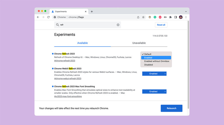
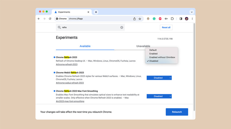
chrome://flagsin Chrome's address bar and press Enter (on Windows) or Return (on Mac). - Type "chrome refresh" or just "refresh" in the search bar at the top of the page. As you type the keyword, the list will shorten, and you will see two flags —
Chrome Refresh 2023,Chrome WebUI Refresh 2023, and a third one —Chrome Refresh 2023 Mac Font Smoothing— if you are using macOS. - Using the drop-down menu next to each tag, choose "Enabled" instead of "Default."
- Close and relaunch Chrome, and you will see the refreshed UI.
What's new in Chrome Refresh 2023?
Since Chrome Refresh 2023 is not a complete redesign, you will not encounter extreme changes that make it feel like an entirely new browser. However, a few noticeable changes will automatically grab your attention.
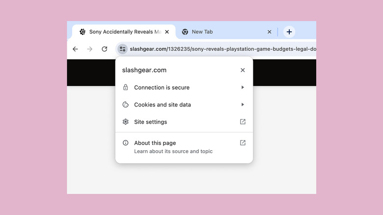
First of them is the new address bar, which Google refers to as "Omnibox." The bar is now thicker, while the text inside it appears smaller. The address bar's lock icon, which represents that the website you are browsing supports a secure HTTPS connection, has been swapped out for a toggle icon. The contents of the menu that appears when you click this icon remain unchanged, but the menu itself has rounder corners. Talking of rounded elements, the corners of tabs are also curvier than earlier.
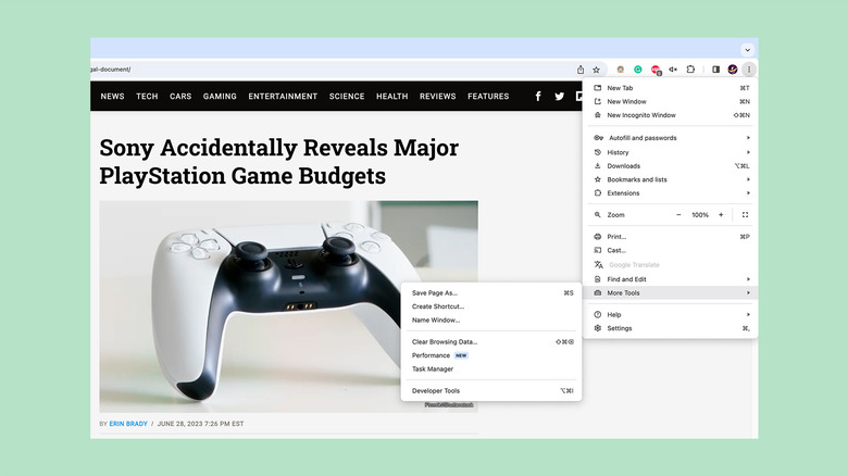
The options menu, accessible through the three-dot button on the top-right corner, has been revamped and now includes icons next to each menu item, making them easier to choose. Next to the three-dot button, we see a new icon to access the currently active Chrome flags.
As I said before, Chrome Refresh 2023 is aligned with Google's Material You philosophy. Unlike Android, however, Google Chrome does not pick up color from your desktop's wallpaper but will match colors to the background you use inside Chrome. Colors from the same family are also used for tabs, bookmark menus, new tab shortcuts, and the new toggle button. Unfortunately, Material You-based coloring is currently limited to Chrome Canary and is not available on the stable version.
How to disable Chrome's new design 'Refresh'
Google Chrome's refresh design brings some new elements, but it does not necessarily imply that you must like it. Since the design is not final or enforced for all users, you can opt out of using it if it doesn't please your eyes.
The steps to turn off the new design are similar to those we used above. Here's how to go about the process:
- Enter
chrome://flagsin Chrome's address bar and press Enter (on Windows) or Return (on Mac). - Type "refresh" in the search bar. For the previously enabled flags, including
Chrome Refresh 2023andChrome WebUI Refresh 2023, choose "Default" or "Disable" from the drop-down menus next to them. - Restart the browser, and Chrome will revert to the previous interface.
If you want to compare the "Refresh" with the existing interface, you may download and install Chrome Canary or Chrome Beta on your computer and apply the same flags we listed in the above section for a side-by-side comparison.
