Motorola Razr Plus Review: Judge This Foldable Phone By Its Cover
- Excellent build quality
- Cover screen implementation is great
- Surprisingly good battery life
- Fun to use and eye-catching
- Camera is just ok
- Network connectivity issues
We may receive a commission on purchases made from links.
One of the benefits of the annual cycle of phone releases is you can start to get a sense of a company's focus. When a first-generation product comes out, you have no idea what Gen 2 will look like. But as a portfolio develops, you get to know the company and see whether the company "gets it" or not. Motorola gets it.
That's not surprising, as Motorola has been at this for a long time. The first cellular call was made on Motorola hardware over 50 years ago. But it the foldable space, that wasn't necessarily going to be the case. It's taken four generations of Razr to get where we are today, but where we are is in a very good place.
That's not to say that this is a perfect phone — far from it. But an argument can be made that this is one of the most versatile and fun phones available on the market today, as long as you're willing to play by Motorola's rules. You have to genuinely embrace what Motorola wants to do here in order to get the most out of this product. This review is written based on those merits, so this isn't so much a product review, but a full review of both the idea and the execution.
Motorola provided a Razr Plus for the purposes of this review. Over the course of our review, this review unit functioned on T-Mobile's network in the Chicagoland and western Illinois area.
Say so long to the gap
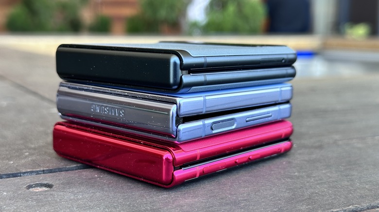
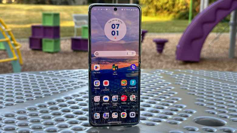
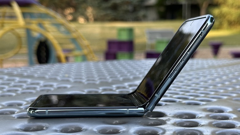
The Moto Razr Plus is not the first foldable, nor even the first flip phone to get rid of the gap in between screens. But is it the first one commercially available in the United States — and that's worth mentioning. The gap just frankly makes a foldable look ... unfinished somehow. So the fact that this phone folds flat is definitely a win. The phone isn't as stiff in the spine when compared to the Samsung Galaxy Z Flip 4 — the top screen has a tiny amount of noticeable lateral movement to it, evoking a certain cheap feel to the quality, so Motorola needs to take the loss with the win in this case.
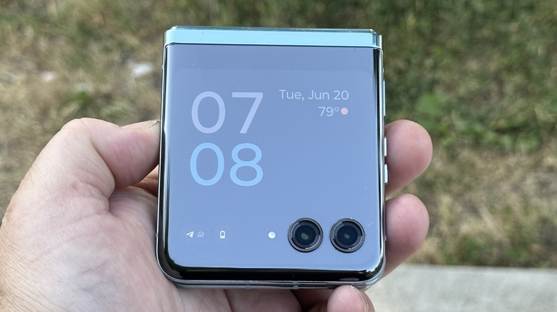
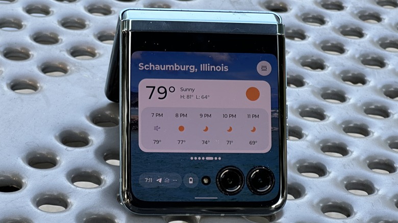
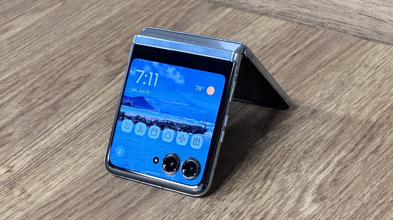
The cover screen is a massive 3.6-inch screen with three punch holes for the main cameras and the flash. It's the largest cover screen of a flip-style foldable to date and judging by the Samsung Galaxy Z Flip 5 rumors we've seen thus far, that looks to continue for a while. This is the crux of Motorola's selling point — this screen is large enough to do anything on it. Actually, it's not, but that's still what Motorola is selling here. You'll quickly find out what is and isn't possible before too long.
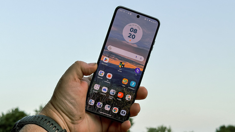
On the inside, this phone is a pretty typical 6.9-inch Android smartphone, so the majority of this review will focus on Motorola's sales proposition a.k.a. the cover screen. You can just use this phone as a normal large-screened Android device, but to do so misses the entire point of the device (and that will put a strain on the phone's microscopic 3,700 mAh battery).
It's all about that cover screen
Put simply, if Motorola had its way, you would do most of everything on the cover screen. Got a notification? Check the cover screen. Want to IMDB that actor in that movie you're watching that you swear you've seen somewhere else? Cover screen. Got an incoming text? Cover screen. Motorola makes a very convincing argument here in several ways.
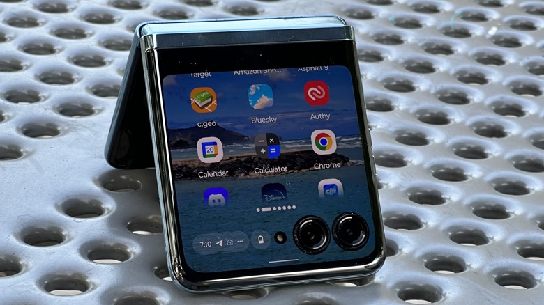
First, the cover screen is initially limited to the space above the cameras, but if you want more, you can long-press the bottom of the cover screen to expand whatever app you're using to take up the whole screen. Second, Motorola barely limits what you can do on the cover screen. You can choose app-by-app what apps you want to work on the cover screen. But it doesn't open every app up to the possibility. If we look at a collection of 200+ apps on the unit reviewing, only 167 of them appear in the cover screen's app launcher. We've reached out to Motorola to try to determine what the limiting factor is, and when we heard back, we'll update this review.
One cannot live on the cover screen alone
You might be tempted to tape that phone shut and just live full-time on the cover screen. If you're bold enough, you'll be successful ... for less than a day. Depending on your dedication, you might make it a full day, but that'll only be if you carry a second phone with you or have a computer handy, in which case you're cheating, so there's really no point.
The reality is that you simply cannot do everything on the cover screen. Some apps are not optimized; some apps don't work at all; some apps work, but it's not a great experience. Motorola never asked you to do everything on the cover screen, just a lot of things. At the end of the day, you will have to flip the phone open; you can't avoid opening this phone, eventually. But you can get through a solid 60-70% of your day with the phone closed. You can check notifications, read emails and text messengers (and write short replies), check your Google News feed, read a book, watch Netflix, and play "Call of Duty: Mobile" (seriously) on the cover screen. It's really wild.
Here's what you can't do
Some games don't work particularly well, taking photos of things that are not yourself is obviously a challenge, and as mentioned, some apps just aren't available on the cover screen like Asphalt 9, and notably a number of Google apps like Assistant, Google Street View, and Google Lens. You can still access Google Assistant from the cover screen by saying "Hey Google" but the experience isn't great, since all you get is a screen that asks "How can I help" and no other UI at all. It makes it hard to be certain Google is hearing you in the first place.
Some other annoying things you can't do on the cover screen include long-pressing notifications to turn them off, going into the phone's settings to connect to a Wi-Fi network, and — this last one is maddening — sort your apps alphabetically. This last one requires some explanation.
The cover screen includes an app launcher that lists all of your selected apps — apps that you have chosen to use on the cover screen — and allows you to edit that list. But, if you add a bunch of apps, and then go back in and add more apps, those new apps that you added will show up at the bottom of the cover screen's app launcher. You can long-press and move them manually if you want, but it would be so much nicer to just press a button and have them sorted automatically.
All that being said, you're encouraged to try everything on the cover screen and learn what works and what doesn't. You'll get a surprising amount of things done without ever opening your phone, and that is the real value proposition here.
Moto's sales pitch
In an effort to get you to use the cover screen, Moto built a whole experience there for you to use. In addition to the app launcher, Moto also built a number of widgets you can use including ten different clock faces, eight different panels for widgets, and a few other utilities built specifically for the screen.
The panels, which you can turn on or off or rearrange as you see fit, include Home, Apps, Contacts, Calendar, Weather, Games, Google News, Google Fit, and Spotify. Additionally, Motorola worked with Gamesnacks to optimize some mini-games for the cover screen. Games like Marble Mayhem and Stack Bounce are marvelously addictive and a great way to pass the time.
Bottom line, Moto wants you to spend the majority of your day on this small screen and makes it as easy as possible to do just that.
But it's not perfect
There are still some software hiccups and bugaboos that pop up here and there. The multitasking is inconsistent. Unlike when you have the phone open, not every app you had open on the cover screen stays in the multitasking menu. There's no consistency in what will stick around and what will have to be re-launched.
Some error messages or notifications will pop up and ask you to open the phone for more information, but when you open the phone, that message is gone. That wouldn't be so bad except the error message can pop up again later, and if you're using the cover screen (like Moto wants you to do) you get a rinse-and-repeat situation, which is not ideal.
Finally, you have to manually allow every app to appear on the cover screen, either through settings or with a dialogue box that opens when you launch an app for the first time on the cover screen. That's fine, but it would be better to just blanket allow everything and remove permission later — or just learn what apps to not open on the cover screen through experience. Adding an app to the cover screen app launcher and then authorizing it to open there seems like an extra unnecessary step.
While it doesn't affect functionality, you also cannot use an animated GIF as your cover screen wallpaper, which is a bit of a bummer. Reddit has an entire subreddit (which is surprisingly still around) dedicated to animated GIFs for the Galaxy Z Flip 4 cover screen. The fact that you can't have that for the Razr Plus is a bummer on multiple levels.
Battery and performance
The Moto Razr Plus has a relatively tiny 3,700 mAh battery which is not necessarily a bad thing, assuming you live by Motorola's cover screen philosophy. After all, it doesn't take as much juice to power a 3.6-inch screen. If you do slot into Moto's use case, you will be able to get through most days on a single charge. For the back half of this review, I had the phone in western Illinois where the cellular signal was not as solid as it should be. Most days this device managed to get to dinner before plugging in — it lasted an entire day just once in our testing.
If you spend most of your days connected to Wi-Fi (like most people do) then you'll get through every day with between 15% and 25% left in the tank, but again, that's only if you latch on to Motorola's cover screen philosophy.
As for performance, the phone has a Snapdragon 8+ Gen 1 SOC along with 8GB of LPDDR5 memory and 256 GB of UFS 3.1 storage, so none of the specifications are top-of-the-line when it comes to specifications. The phone still manages to turn in decent 1,249/3.991 single and multi-core scores on Geekbench. The phone can keep up with any task you throw at it, including "Call of Duty: Mobile" and "Genshin Impact", both of which are playable on the cover screen, but neither of which is a good experience on the cover screen (nor should they be).
Camera tricks
Motorola is positioning this device as a lifestyle brand suitable for influencers and those who want to capture themselves in the moment. On the one hand, this is one of the better camera setups Motorola has shipped on a flagship device. On the other hand, that was already a pretty low bar, and the Razr Plus does little to raise it.
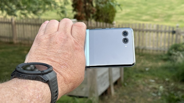
This phone ships with a 12-megapixel main camera with a f/1.5 aperture and optical image stabilization and a 13-megapixel ultrawide camera (that doubles as a macro lens) with a 108-degree field of view and a f/2.2 aperture. On the inside, you'll find a single 32-megapixel selfie camera with an f/2.4 aperture. Of course, since this is a foldable with a huge external display, you can use the main sensor to grab selfies if you so choose.
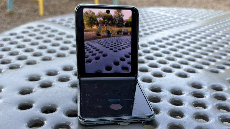
You can position this phone's hinge anywhere between 45 degrees and 135 degrees, so you can use the phone as its own tripod like the Samsung Galaxy Z Flip 4. You can hold the phone like a camcorder with the phone open to 90 degrees. You can also do an impromptu photo booth which allows you to set up the phone and take four separate shots, which is a fun add-on. Finally, you can use the cover screen as a mirror, and if you want, you can add different "frames" around photos captured in that mode.
Camera quality is just ok
Color consistency between the main and ultra-wide cameras is spot on, which is always a good way to start things off. In our initial hands-on, some concerning color quality surfaced with the selfie camera. Fortunately, those initial shots were just victims of challenging lighting and further testing allayed those concerns. Color quality is solid using all three cameras. In great lighting (outdoors) or even in decent lighting (indoors), your photos are going to be pretty good, but there are a couple of caveats.
The first caveat is that when it gets dark, the quality drops. Stationary subjects are perfectly fine, but a phone built for influencers isn't going to focus on stationary subjects; it's going to need to focus on people, and that's where this camera falls short. People are frequently victims of soft focus or subject to movement artifacts, so this phone will be questionable for something like nightclub selfies.
The second issue is that influencers and people interested in lifestyle shots aren't usually interested in photos. This is a TikTok world and we're all just living in it.
Video quality depends on the subjects
When you switch over to video, whether during the day or at night, you will be doing your phone a tremendous favor by not moving at all. Definitely don't walk with the phone. Video gets distorted and blurry even during the day when walking. Having a subject in the foreground helps a little, but you'll be best served by letting this phone sit while your subjects move around it.
The same is true at night; decent video is possible, but not if the phone (or the person holding the phone) is moving. Keep things still and the camera is capable of capturing usable footage, especially when it's going straight to social media.
The Razr Plus has the same horizon lock trick as the Moto Edge Plus, and it's just as neat, but even in broad daylight, the jarring motion of walking with the phone quickly gets unusable, unless there's a subject for the phone to latch onto.
Put simply, this is a decent camera setup, but Motorola has a long way to go to catch up to other flagships in this space, especially if it expects lifestyle-centric customers. Put even more simply, every R&D dollar for the next two years should be dumped into camera development — everything else is fine.
Some network connectivity issues
Multiple reviewers of this device across the United States — on multiple carriers (eSIM and physical SIM) — noted that the "Mobile Network" service took up a disproportionally large portion of the battery usage on a day-to-day basis. SlashGear has reached out to Motorola about that and we'll update this review when/if we get a response.
Staying on that topic, cellular network connectivity is not as strong as other phones that have been tested in this area. T-Mobile's network around my house is terrible, but while most phones have been able to keep a connection during a phone call from my house, I dropped several calls with the Razr Plus.
Additionally, I ran into another networking issue where, when I left my home network area and returned, sometimes the phone failed to reconnect to Wi-Fi. This didn't happen every time, but often enough to be annoying. SlashGear also reached out to Motorola about this issue and will update the review when/if we hear back.
Wrapping it all up
This is one of the most exciting phones to come to the flip-phone market ever because for the first time a phone manufacturer has not only made a phone that can fold in half, but it has told you why you would want that. It's easy to say that the phone is smaller so it fits better in your pocket, except does it really? Some have complained that flip phones have bad battery life, and the only counterargument you can make is "Look it folds!"
Now Motorola has not only made a folding smartphone, but it has given you a promising use case for why you want a phone that folds. Yes, it fits better in your pocket (mostly) but you can use it most of the time folded up. Suddenly the battery life isn't terrible, and the phone is still useful in most situations. That's the distinction here.
Other phones that give you a larger cover screen have tried to dictate a small number of things you can do with the screen by implementing widgets and the like. Motorola has thrown that manual in the trash and basically dared you to do anything you want on there. Like the mini-games Moto included, using the cover screen is surprisingly satisfying and addictive. But if a small screen is all we're looking for, might that not be all we need?
If flip-style foldables have seemed like a solution in search of a problem, Motorola may have found that problem — and solved it. Add to that an aggressive price point and some equally aggressive carrier deals, and this is one of the most compelling phones to hit the market in years. You'll find the Motorola Razr Plus available for sale from Motorola on Amazon for around $1000.
