7 New Android 14 Features You Can Try On Your Pixel Phone Right Now
Google I/O is on the horizon, with the keynote coming on May 10th. That's the traditional time for Google to unveil its latest version of the world's most popular mobile operating system, Android, and show off all the new features that will be gracing our devices at the end of summer.
Android 14 will power the next Pixel range, which will have the usual normal and Pro candybar phones with a new addition this year — a foldable phone. It'll also power almost every Android phone released between August of this year and August of next year.
The last significant redesign was two years ago, with Android 12. That brought the Material You design language, improvements for foldable screens, a new notification history, and a scrolling screenshot. We don't expect this year's version to have any sweeping changes, but it should come with many improvements to how we use our Androids, including battery life and accessibility.
Grab a metaphorical spoon, as it's time to dig into Upside Down Cake, better known as Android 14.
Install the Android 14 beta
In its current stage, the first Android 14 beta build only supports a handful of devices, all from Google's Pixel range. That short list includes the Google Pixel 7, Pixel 7 Pro, Pixel 6a, Pixel 6, Pixel 6 Pro, Pixel 5a, Pixel 5, and Pixel 4a 5G. If you don't have one of these devices, you'll have to wait until your manufacturer provides a beta build. Every earlier Pixel not on this list will reach its end of support before Android 14 is released.
If your Pixel is on that list and you want to try Android 14 before its launch, you have three options. There is a manual way to install the beta, an assisted method, and a way to opt-in to get the Android 14 beta as an over-the-air update.
That last option will be the best for most users, as it is the only of the three that does not erase the phone's contents while installing. To opt-in, go to Google's Android Beta for Pixel page and sign into the Google account you use on your Pixel device.
While on that page, scroll down to the "Your eligible devices" section, and select the Pixel device where you want to install the Android 14 beta. Once selected, Google will send an over-the-air update to your phone like how normal security updates arrive. Your device will keep getting beta updates as they are available until Android 14 is publicly released later this summer.
Improved Back Navigation Gesture
Android 14 has one quality-of-life improvement that will be immediately apparent — a predictive back gesture showing you where you will be swiping to.
That will remove one of the biggest frustrations with Android — not knowing where a simple back swipe will take the user. It could be to another screen in the same app, or it could be another open app or back to the home screen. There was no way of knowing previously, leaving it up to the user to remember if they were four pages or only three into an app.
In Android 14, a redesigned back navigation arrow appears halfway up the screen, which is themed according to Material You and the user's wallpaper. This bubble stretches slightly as the user moves their finger until stretching the window enough causes the next location to show up as a preview of what's next.
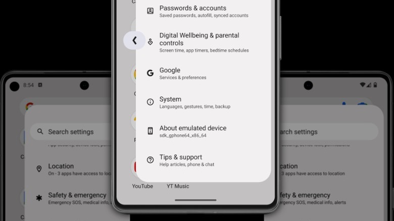
This feature is disabled by default in the beta of Android 14. Open Settings, go to "About device," and tap Build number seven times. That will give you a new "Developer options" section in the System menu. Go there, scroll down to "Predictive back animations," and toggle it on.
The predictive back navigation only works with some system apps, like Settings and Google News. It will likely get more support as the beta period goes on, and it would be nice if it worked with all third-party apps when Android 14 rolls out at the end of summer.
Health Connect
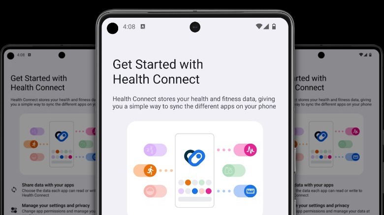
Google's Health Connect is a central hub for sharing fitness and health data between various sources. It was first announced at Google I/O 2022 as a standalone app still in beta stages, and maybe because it hasn't fully launched, it has a limited user base.
In Android 14, Health Connect is baked into the system settings, so it is enabled by default for every user. Any health-related app installed on the device will appear in the menu and offer to sync the data from them in the Health Connect database. This could bring steps in from Samsung Health into Strava or Google Fit, sync activity tracking from Oculus or Meta VR headsets into more general fitness apps, or keep all of the user's health tracking data in one place, like in Apple Health.
Health Connect has support for 50 data types, split into six categories. These are activity, body measurement, cycle tracking, nutrition, sleep, and vitals. Every metric that health measuring apps store can be siphoned into one of these categories and standardized for use elsewhere.
The best part is that all of this sensitive data is stored on the device in an encrypted data store that Google can't access. To find it, open Settings, navigate to "Security & privacy," then Privacy, and then Health Connect.
Enhanced Share Sheet
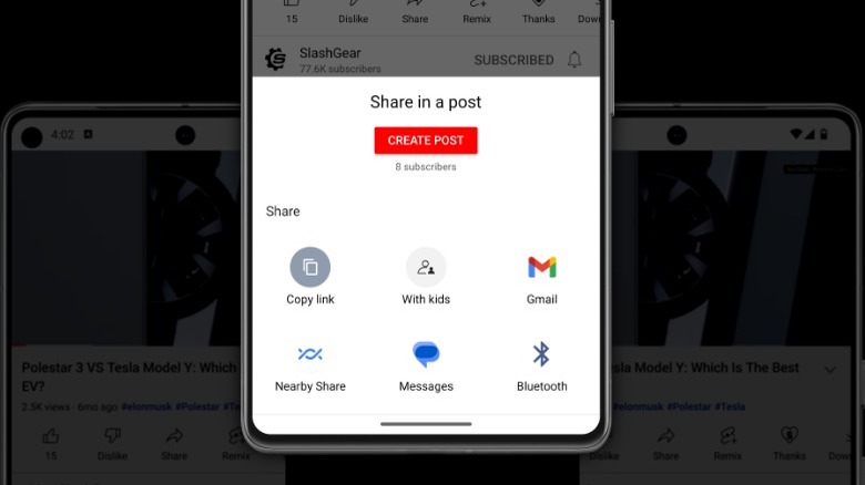
Android's sharing menu is one of the mobile operating system's more inconsistent, frustrating parts. Part of that is because the operating system lets app developers create customized versions so options can be in different places or missing. Android 14 is changing how the share sheet works so that app developers don't have to create customized versions.
The most significant change is that the regular system share sheet has a dedicated row at the top for custom app actions. On Chrome, this shows Copy, Copy link, Send to your devices, QR Code, and Print.
Google is also decoupling the system share sheet from the Android OS, and it's now a standalone app that can get updated independently from the operating system. That makes it so Google can update it while retaining control over how it displays on every Android device.
One of the common frustrations when sharing multiple images is also being addressed. When a user selects various media items and then taps the share button, sometimes they may decide to remove one or more of the selections. It's currently easy to accidentally dismiss the whole share sheet, making users start over from scratch. The updated share sheet has a dedicated shortcut to return to the app for reselecting media items.
The share sheet will also show previews for all selected images being shared, not just the first three items as it currently does.
Regional Preferences
With the billions of devices running Android worldwide, it needs a way to individually localize features, apps, and settings so that the user gets an Android experience tailored for them. Android 13 was the first time multilingual users could change language settings for individual Android apps without switching languages at a system level. That's a significant improvement, enabling multilingual users to have individual messaging apps for friends, family, and coworkers in their native languages.
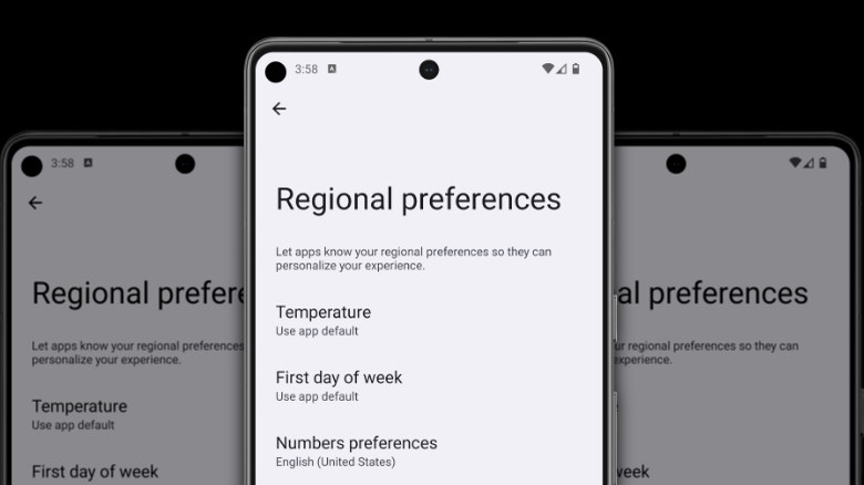
Android 14 takes this localization push and gives the user even more power. Currently, developers can change the units of temperature or calendar format based on the device's location. That's handy, but what if the user wants to use a different set of units than the commonly used one where they live? A new menu, Regional Preferences, enables the users to set their preferred temperature units, the first day of the week, calendar, and numbers.
Once updated to Android 14, find this menu in Settings, System, Languages & Input, and Regional Preferences. The first day of the week can be set to any of the seven, or app defaults can be used. The calendar can be set to various options, including Chinese, Dangi, Hebrew, and Islamic. Temperature can be toggled between Fahrenheit and Celcius, and numbers can be toggled between Western numerals and the numbering system for the user's location.
Separate Ringtone and Notification Volume Sliders
One of the features that Android device manufacturers like Samsung have introduced on their devices is separate volume sliders for notifications and ringtones. It's a handy feature, enabling ringtones to be of higher volume than the already-annoyingly-loud notification tones. It was a feature on Google Pixel devices until it was merged into one volume slider.
It seems that Google has listened to the years of Pixel users asking for the volume sliders to be separated once again. Mishaal Rahman notes that the early indicators for this change came in Android 13, but the split volume sliders needed to be toggled on in Android by setting flags instead of using a toggle in the settings app.
In Android 14, users of the second developer preview have reported that the call and notification volume sliders are separated again. It's not clear at this stage if this change will be specific to Pixel devices or if any device running Android 14 can control ringtone and notification volumes individually.
Accessibility Improvements
Android has always brought new accessibility features with major updates, like when Live Captions arrived with the Pixel 6 to caption phone calls, videos, or podcasts in real time. Android 14 doesn't appear to have any substantial accessibility features like transcription, but what is coming are some quality-of-life improvements that will make Android 14 better.
The first of these is improved font scaling that goes up to 200% scaling. That's a significant improvement over Android 13's 130% scaling limit, but that's not all that is improved. Google is changing the scaling to non-linear so that it won't scale all text on a screen – only the smaller parts. Material You is also updated to work better with the high-contrast text option.
The Accessibility options section also has a dedicated page for setting up hearing aids. This enables quick pairing, a toggle to put a shortcut to the settings on the home screen, and another toggle to improve hearing aid compatibility.
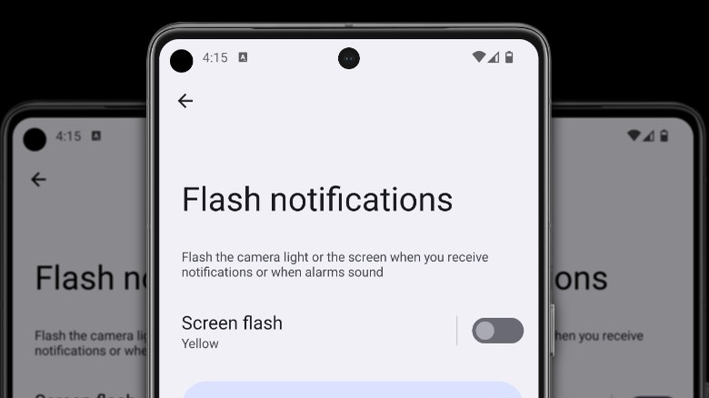
Notifications are also getting accessible options with Flash notifications. We've all missed notifications by not hearing the ringtone or leaving our device on silent. Android 14 lets the user set the camera flash or the screen to have a visual reminder of notifications as they come in. The screen flash will work even if in another app, with a translucent overlay in the chosen color.
Improved Battery Life
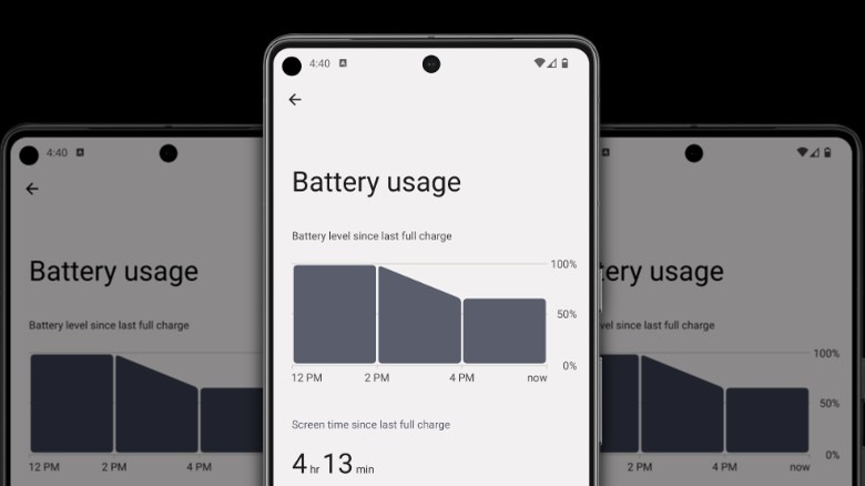
Every major Android release tries to squeeze more screen-on-time out of the devices it runs on. In Android 14, the focus on SoT is even higher, with the Battery usage menu simplifying things from the current usage stats of individual apps to first show the SoT from the last full charge.
The goal here is to make it easier to see how your daily usage affects battery life at a glance. Google appears to be taking a holistic view of battery life, with overall use front-and-center. The Battery usage screen then breaks down individual power users into individual apps or system services.
Another new battery-related feature is a final notification before an Android smartphone shuts down from low power. Android 13 sends notifications at 20% and 10%, giving enough time to find a charger, battery pack, or wall socket. Android 14 will send one additional notification at 2%, giving a few-minute warning that the device is about to shut down.
Google is also baking in more battery optimizations that happen in the background without the user noticing or even having to enable them. The memory management system on Android is being upgraded to manage multitasking better, with background app processes being frozen when not actively used. Also, notifications are being made easier to dismiss, with a quick swipe to remove when the phone is unlocked. Every second of SoT uses up battery life, so the faster users can return to not using their screen helps.
