Honor Magic Vs 5G Review: Magic Hardware And Missed Opportunities
- Great hardware
- No hinge gap
- Long-lasting battery
- Solid Design
- Camera is just ok
- Software is undercooked
- Price is a bit high
In the world of foldables, Samsung is undoubtedly leading the charge — which is both a good thing and a bad thing. It's good because Samsung has been aggressive about getting foldables into the hands of consumers, regardless of what geographic region they happen to reside in. In the U.S., the foldable race has two horses, and one of them has two hooves tied behind its back.
In the world outside of the U.S., there is a bit more competition and that's where this review is going to be the most meaningful. The Honor Magic Vs is the company's second foldable — and in many ways, that is surprising, but it's not always a pleasant surprise. Honor has done a lot to push this space forward, and it's offering Samsung a good amount of competition.
But in one key way, Honor is lagging behind — and it can't continue to do so, lest the consumer experience knocks Honor out of the space entirely. I've been here in the U.S. using an Honor Magic Vs provided by Honor connected to data on the T-Mobile USA network — a network it was not designed for in a country it wasn't designed for — and this is my full review.
A word on regions
Before we dive into the review, we need to clear the air on one key point. This phone was never destined for U.S. shores. That being the case, I didn't find my experience to be bad except in one minor way. I ran this phone on T-Mobile's network and I had zero issues with connectivity or speed. For the first day or so, I sat on LTE, but I couldn't decide if that was a network issue or the fact that T-Mobile connectivity is lacking around my house. It turns out the problem was neither, because the notification shade had a "5G" quick setting that had gotten turned off, so once I turned it back on, I was right as rain.
The main problem I had with the software was that Google Pay and contactless payments refused to work, with Google indicating that my phone doesn't meet the security standards necessary to make contactless payments. Plus, when I tried to install Netflix from the Google Play store, I was told my device was not compatible, yet I was able to install the app from the Honor app store. That's weird, but the problem is solved, so I won't complain, though I did reach out to Honor about these issues. Through a representative Honor told me that both of these issues would be fixed in an upcoming OTA update, though as of this writing, that update has not been released.
Flat as a board
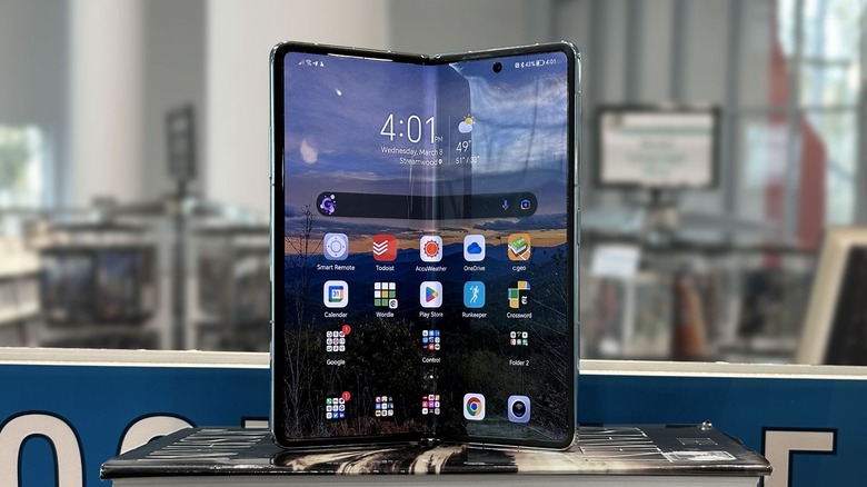
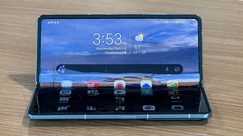
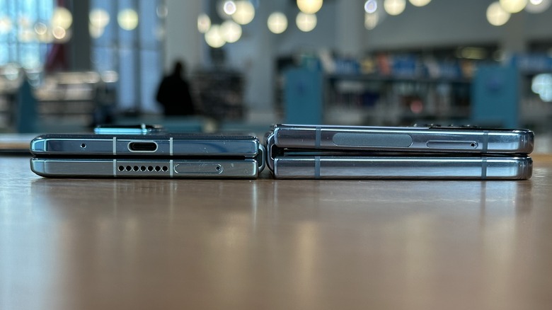
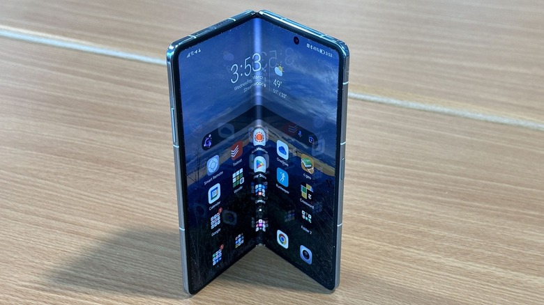
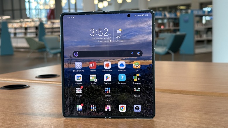
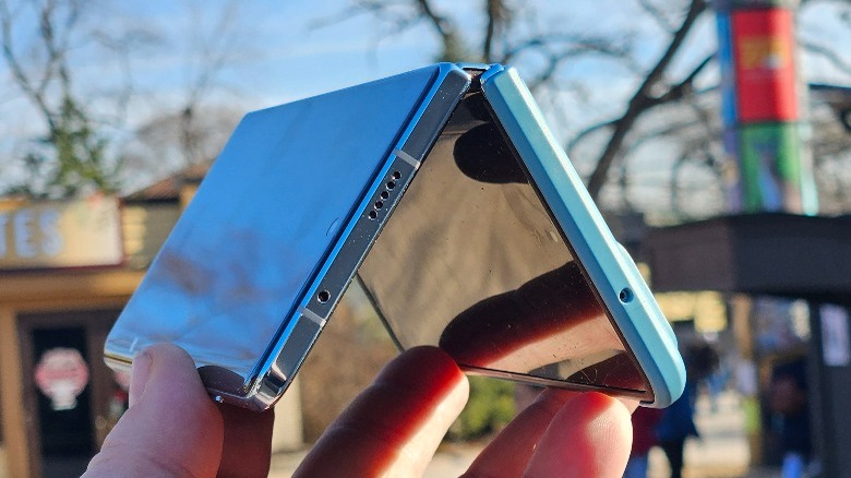
One thing that has always bothered me about Samsung's foldables is that they don't fold flat. I really don't like that gap, but at the same time, I've accepted it, as thus far it seemed that a flat fold must be impossible. Honor didn't think so, so this phone folds completely flat, and it's lovely. Honor spent a lot of time talking about its hinge and the fact that it's made up of just four parts. That's a bit mind-boggling, to be honest, but I'll go with it.
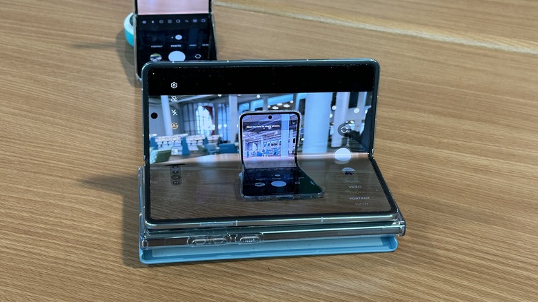
The downside to that is the hinge is not as adjustable as you'd like when it comes to having the Vs half-open. The hinge is a bit floppy when it's not completely open or completely closed. That makes it hard (but not impossible) to do things like let the phone be its own tripod for photography.
The hinge action is smooth, with no creaks or crackles, but there is also a noticeable pushback when you're closing the phone, so much so that sometimes it may reopen itself if you don't push it closed with a reassuring thwap. It's not a big deal, but after using the Samsung Galaxy Z Flip 4 and its Flex mode, it's hard to fully appreciate the engineering that went into this hinge.
As for the crease, Honor says there is no noticeable crease — and Honor is wrong, but let's face it, that's the cost of admission for a phone that folds in half. It's truly not a big deal.
On the inside
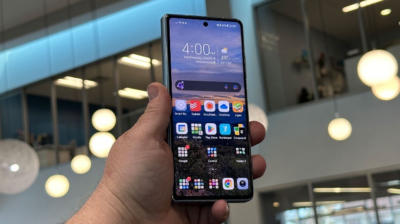
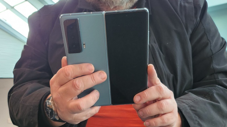
As for the rest of the hardware, the phone runs on last year's Qualcomm Snapdragon 8+ Gen 1 processor, which is honestly just fine. It comes in one configuration with 12GB of RAM and 512GB of storage. The outer display is a 6.45-inch OLED panel that can refresh up to 120Hz. The inside panel is a 7.9-inch display that refreshes at 90Hz. Overall, this is quickly becoming the standard sizing for this kind of foldable.
The outer display comes out to about a 21.5:9 aspect ratio which is a tad on the narrow side. Putting it side-by-side with the OnePlus 11, they're pretty close. I found the outer display a little hard to type on, but I think that has more to do with muscle memory and the thickness of the phone when closed. I can type just fine on the OnePlus 11 which is very similar. I think it's fair to call this screen a little cramped overall, but not terrible and certainly something I could get used to over a long enough timeline.
The inner display has a plastic screen protector that collects dust, hair, and grime like nobody's business. It's almost impossible to keep clean. Both screens have factory-instilled screen protectors. My outer screen's protector got ripped off once when I was trying to open the phone; the inner screen protector lasted just fine.
Software needs to do more
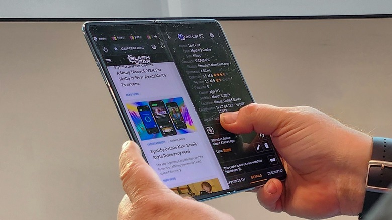
It would be unfair to call the software on the Honor Magic Vs the Achilles heel of the phone, but it just seems like it's underbaked and needs more time in the oven. Honor has done some smart things here, including a fairly easy split-screen mechanism that allows you to take advantage of the space on the inner screen. Indeed, you can run a number of apps all at the same time, and the most common way is to run them side by side.
You can make just about any window float, and open as many of those as you want. When you minimize them, they show up at the side like a floating bubble that you can tap to expand. I found this to be the most useful when I was waiting with an app open to buy something, or show a barcode while reading at the same time.
But the software needs to do more. When I look at the outer display, I see a 5x6 grid of icons and widgets. When I open the phone, I get the same 5x6 grid, but bigger. I expected opening the screen would give me a whole new layout where I could line up seven or eight icons across along with widgets or whatever else I wanted. Instead, you just get a blown-up copy of the home screen. It's a bit of a waste of space.
Apps don't take advantage
One thing Samsung and Google have done is optimize their own apps for a foldable experience, so apps like YouTube and Gmail work great on the larger screen. But Honor's own apps, like the camera, absolutely fail to take advantage of the real estate. Even the apps that are optimized are a little funky — for example, Gmail only works when the phone is in landscape mode. The maddening part here is that when unfolded, this is basically a square screen, so why does it matter? Gmail should behave the same regardless of how a square screen is rotated. But I'm not a developer, nor do I play one on TV, so I can't say for sure if this is Honor's fault or Google's fault. Regardless of whose fault it is, I need an aspirin.
Another annoyance happens when you have an app open on the outer screen and open the inner screen. When you do that, the app is forced to redraw and often results in a popup telling you, "Folding or unfolding the screen during use may cause display issue[s]..." along with buttons "got it" and "relaunch app." I think Honor is erring on the side of caution here, but honestly, there should be a way to turn that off entirely. Most apps can stretch a bit, and some of them might have to relaunch, but I don't know that I want a notification every time.
Put simply, the tablet experience on Android is not great, and it manages to get even more annoying with foldables. Again, a lot of this isn't necessarily Honor's fault, but it's not helping the situation much.
Bright software spots
That isn't to say that everything is bad on the software side. Indeed, Honor does some smart things here. Smart multi-window is a neat feature that is a version of what a lot of other phones do. Swipe in from the side of the screen and hold in order to get a sidebar of apps that you can launch. When you launch them, they open into floating windows that you can move around and resize.
Further, every app has a bar at the top that allows you to manage your windows either by closing them, minimizing them, snapping them to one side or the other, or blowing them up to full screen. It's very simple and very intuitive to learn.
Overall, the software on the phone feels like a work in progress that's almost there but just needs a few more pushes in the right direction to cross the finish line.
Battery and performance
The battery is one of the stronger arguments this phone makes. Working from home as much as I do, I can make this phone last around two days, even with some light gameplay (think "Wordle," not "Call of Duty: Mobile"). Sometimes the phone got low around the day-and-a-half mark, but those were usually days when I was out and about running errands, navigating, and listening to podcasts. I can't complain about the battery performance overall.
Charging speeds are pretty solid. The phone ships with a 66W charger with a European plug, so I wasn't able to test that. Using an Anker 65W charger I topped the phone up in a little over an hour. Mostly, I charged the phone at night, so it was a non-issue. But it's nice to know that the phone ships with a charger in the box. Other phones that I've had that have 65W charging will usually top up in 35 minutes or so, so it would be fair to expect the same here.
As for performance, the phone is a beast. The Snapdragon 8+ Gen 1 processor is no joke. This phone scored 866/3,104 single and multi-core scores on Geekbench — both of which are respectable. Honestly, the difference between a Snapdragon 8 Gen 2 processor and this one is going to be minor for most users. Considering the price and the fact that this is a flagship, I would like to see the current-gen processor in there though, if only for purposes of future-proofing.
Camera
On the camera side, on paper, Honor has some impressive specifications. The main camera is a 54-megapixel sensor with f/1.9 aperture, the ultrawide camera is a 50-megapixel sensor with f/2.0 aperture and 122-degree field of view, and the telephoto sensor is an 8-megapixel sensor with f/2.4 aperture and 3x optical zoom. So overall, they're very not bad. In practice, they are serviceable, especially the main and ultrawide sensors. The telephoto lens is just ok.
On the plus side, the benefit you get from a large ultrawide sensor is that you don't lose detail when you zoom out. Too often manufacturers will still have a tiny ultrawide sensor in the phone to complement a massive main sensor. That's not the case here. Unfortunately, the color science between the two is very different with the ultrawide clocking in a lot darker than the main sensor. You can see that above in the two shots (left: ultrawide, right: main) of chalk drawings on a friend's driveway.
Honor is also not compensating very well for the fisheye effect you get from ultrawide sensors as seen above. The rocks in the foreground appear distorted compared to the rocks further out. This is frankly a problem that most phone makers have compensated for long ago, so I'm not sure what's up with this lens. It may be a software issue, and if so, hopefully, Honor can fix it.
Zooming in
On the flip side, the telephoto sensor is also just ok. As long as your photos are going to be confined to social media, you can get serviceable shots at 3X. Go any further, where digital zoom steps in and it's like the phone has a layer of Vaseline over the lens. Images are fuzzy and completely lack depth. Most phones are capable of at least serviceable shots at 5x and 10x, but the Honor Magic Vs just isn't.
As for the main sensor, during the day it takes very good shots and portrait mode is good, but a tad on the aggressive side. The shot above of my son in portrait mode captures his face well and the outline of his hair is smooth. The aggressive blur in the background obliterates any hairs out of place, but the blur doesn't cut into his head or face at all, which is a problem I often see. I'm not in love with the background blur, it's a bit too much. You can adjust the bokeh as you shoot, but you cannot adjust it afterward and in this case, I left it a bit too heavy. Duly noted, Honor.
Night time
At night, the main problem I see is a lack of focus across the board. Even with the larger sensors at play, shots are a little fuzzy and grainy. On the device's smaller screen, they look pretty decent, so we can rate the cameras as "Social Media Good" at night, which is not great for a flagship phone, but at least they're not as bad as budget phones.
Which makes video performance at night surprisingly not terrible. I still see judder when walking with the phone at night, but it's noticeably less pronounced than what I usually see in a phone camera at night, which is a fun surprise. I wouldn't plan of shooting any late-night movies with the phone, but if you want to video your friend at karaoke, this will probably give you passable results.
One other note on video recording: during the day, when passing through a tunnel back into bright light, the phone does not handle the light at the end of the tunnel very well. Where It's very blown out and looks rather like you're walking into a supernova — anyone or anything near the light simply disappears into the brightness. Most flagship-level phones handle this situation with much more aplomb.
Other notes
This is the part where I put in the obligatory paragraph about how I'm still not sure a 7.9-inch square tablet is worth the extra expense of a foldable. I have a Samsung Galaxy S23 Ultra — a smartphone with a pretty big screen of its own. That being said, apps like the "New York Times crossword," "Knotwords," and "Kindle" absolutely belong on a screen like this. This phone almost replaces my iPad Mini entirely ... almost.
Then there's the price, which is very not pleasing. This phone retails for €1,599 which translates roughly to around $1,700. Considering the compromises this phone has, or the advances that Samsung has beyond this phone, that's a hard price to swallow.
The fingerprint embedded in the power button on the phone is fast and accurate which is a good thing, but unlocking the phone can be a bit of a pain. If you have face unlock also set up, often when you pick up the phone, it'll detect your face and unlock, so when I set my finger on the reader, nothing happens. Also, when the phone is unlocked (but not but hovering on the lock screen waiting for a swipe instead of just going to the home screen) and you swipe up from the bottom of the screen, Honor gives you four quick launch icons for flashlight and other functions. You have to swipe up starting above the bottom of the screen to unlock the phone, which can get confusing at times.
Wrapping it up
Overall, this is a second-generation product that still feels a bit like a first-generation product. Honor spent a lot more time focusing on the hardware of this phone and probably not enough on the software side of things. It's like buying a 95-inch TV without bothering to subscribe to cable or streaming services. Sure, you can watch TV over the air but ... you're missing the point.
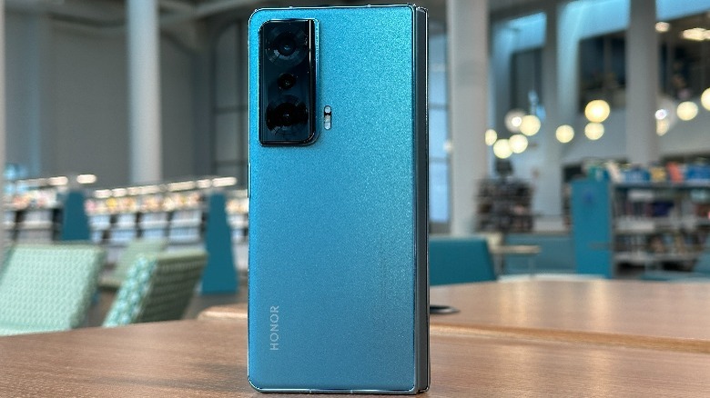
I absolutely love the hardware on this phone. It is so good, and the fact that the gap is just flat-out gone is amazing. The design on the back of the phone is a sparkly matte finish with a fun-shaped camera bump. All of that is great, but the software has a long way to go before it's on the same level as, say, a Samsung Galaxy Z Fold 4, and the price needs to be lower.
But this phone is competition for Samsung which is hugely important. Samsung has virtually owned this space, at least in western markets for years, so it's exciting to see a very good competitor slot in at number two. Plus, the issues that the Honor Magic Vs suffers from can very easily be addressed going forward with updates, so I'm happy to say, "Honor, you have my attention." In some ways, that's enough.
